For almost every form that you create, you will want some sort of validation. In React, working with and validating forms can be a bit verbose, so in this article we are going to use a package called Formik to help us out!
TLDR
- Create a React project
- Add the Formik (and Yup) packages
- Customize the Formik component with an onSubmit callback and a validate function for error messages
- then display those error messages to the user.> View the final code on CodeSandbox!
Here’s a sneak peak at what we are going to create.
https://codesandbox.io/s/4203r4582w
Creating the React Project
For this demo, I’ll be using CodeSandbox. You can use CodeSandbox as well or use your local environment. Totally up to you.
Regardless of what you use for this demo, you need to start with a new React app using Create React App. In CodeSandbox, I’m going to choose to do just that.
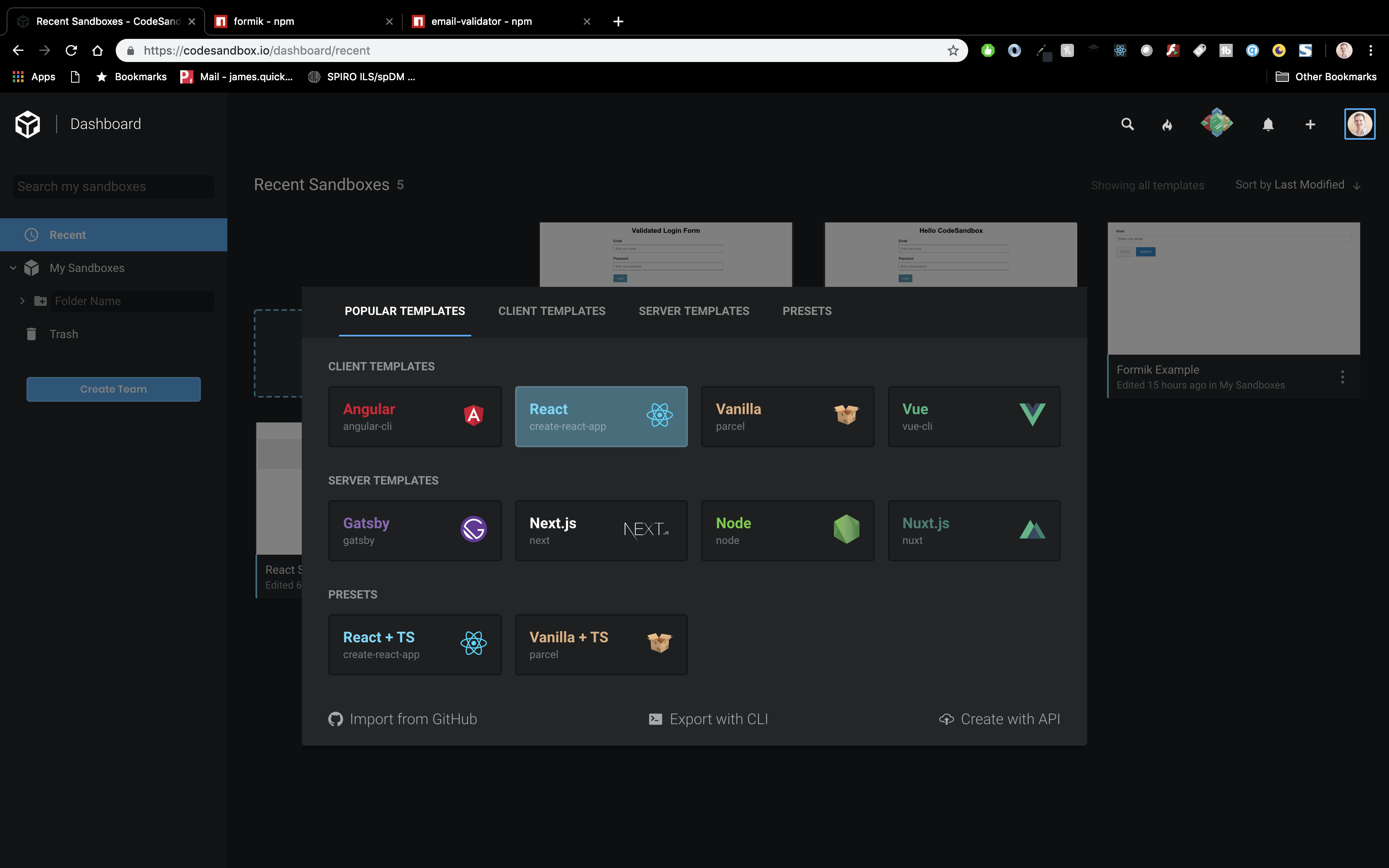
Installing Necessary Packages
Now that we have our initial project created, we need to install three packages.
- Formik – makes handling validation, error messages, and form submission easier
- Email-validator – tiny package to validate emails (I hope this one is self-explanatory : )
- Yup – schema validator that is commonly used in conjuntion with Formik
Formik
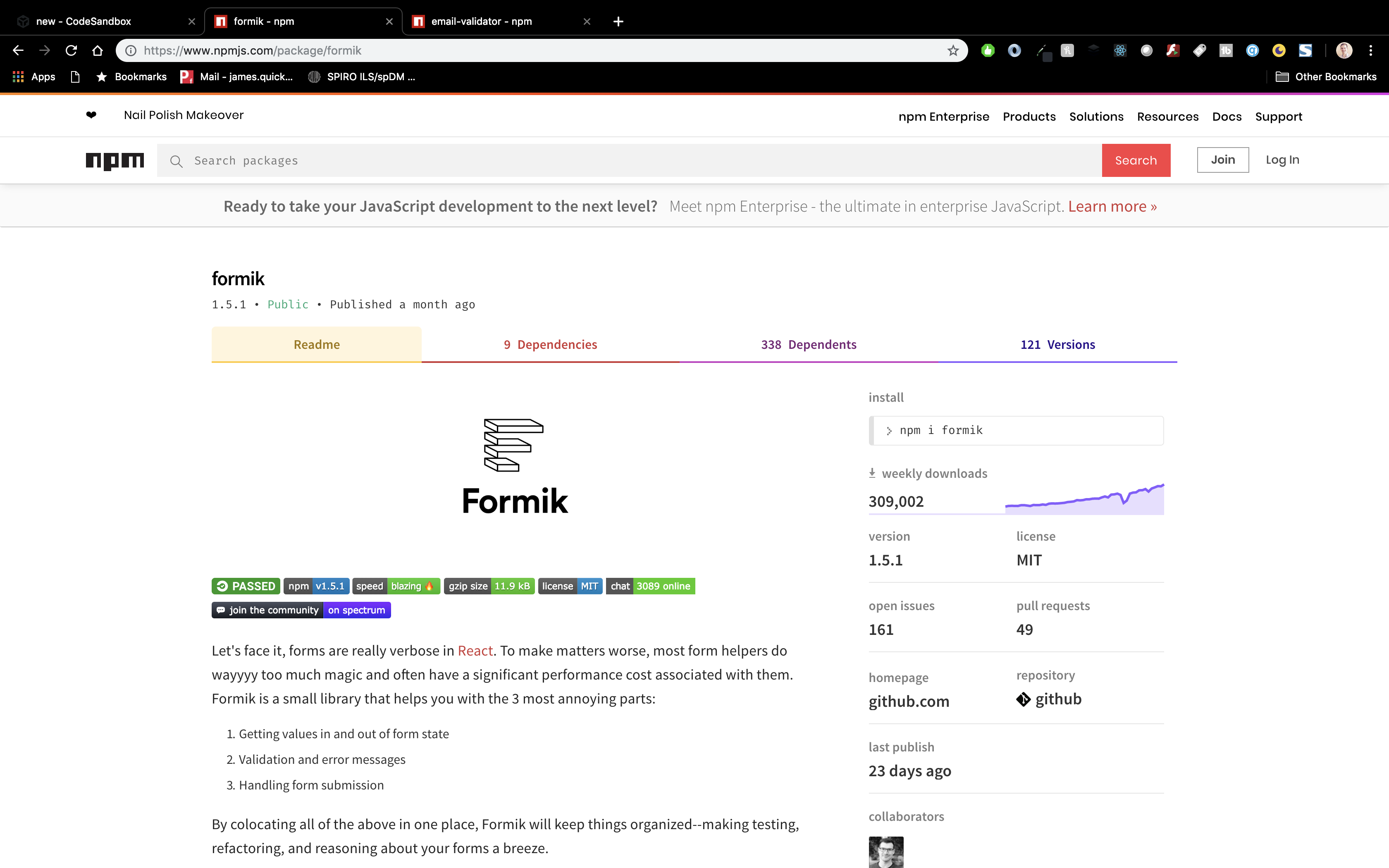
In your terminal, you’ll need to install Formik.
npm install FormikI’ll do the same in the CodeSandbox dependency GUI.
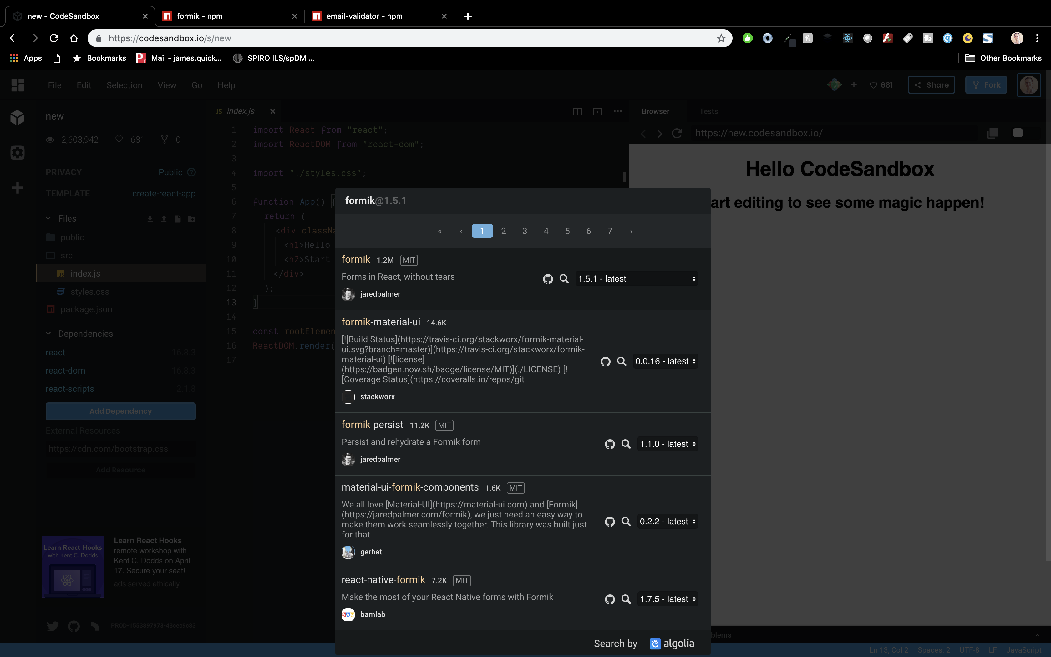
Email-Validator
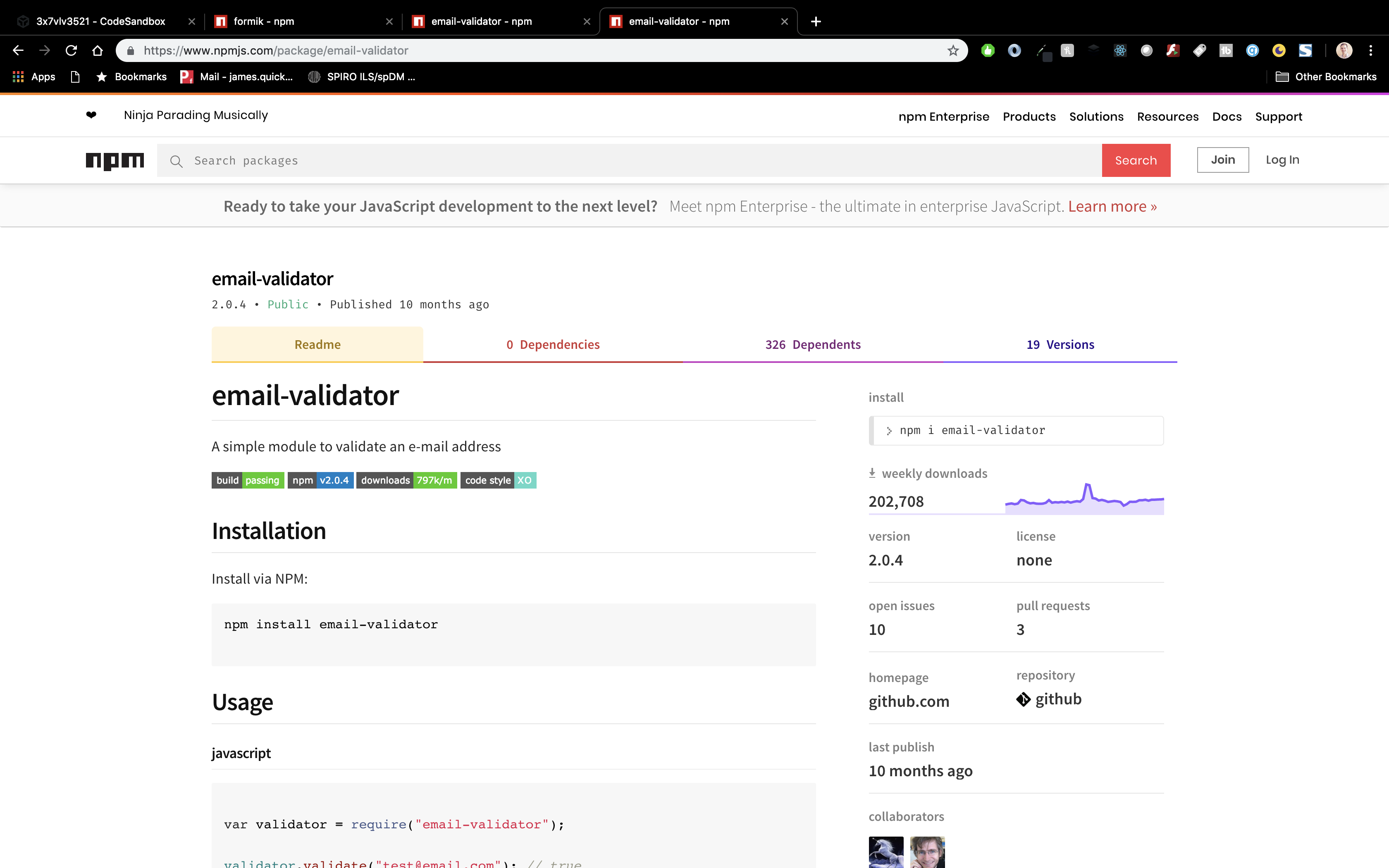
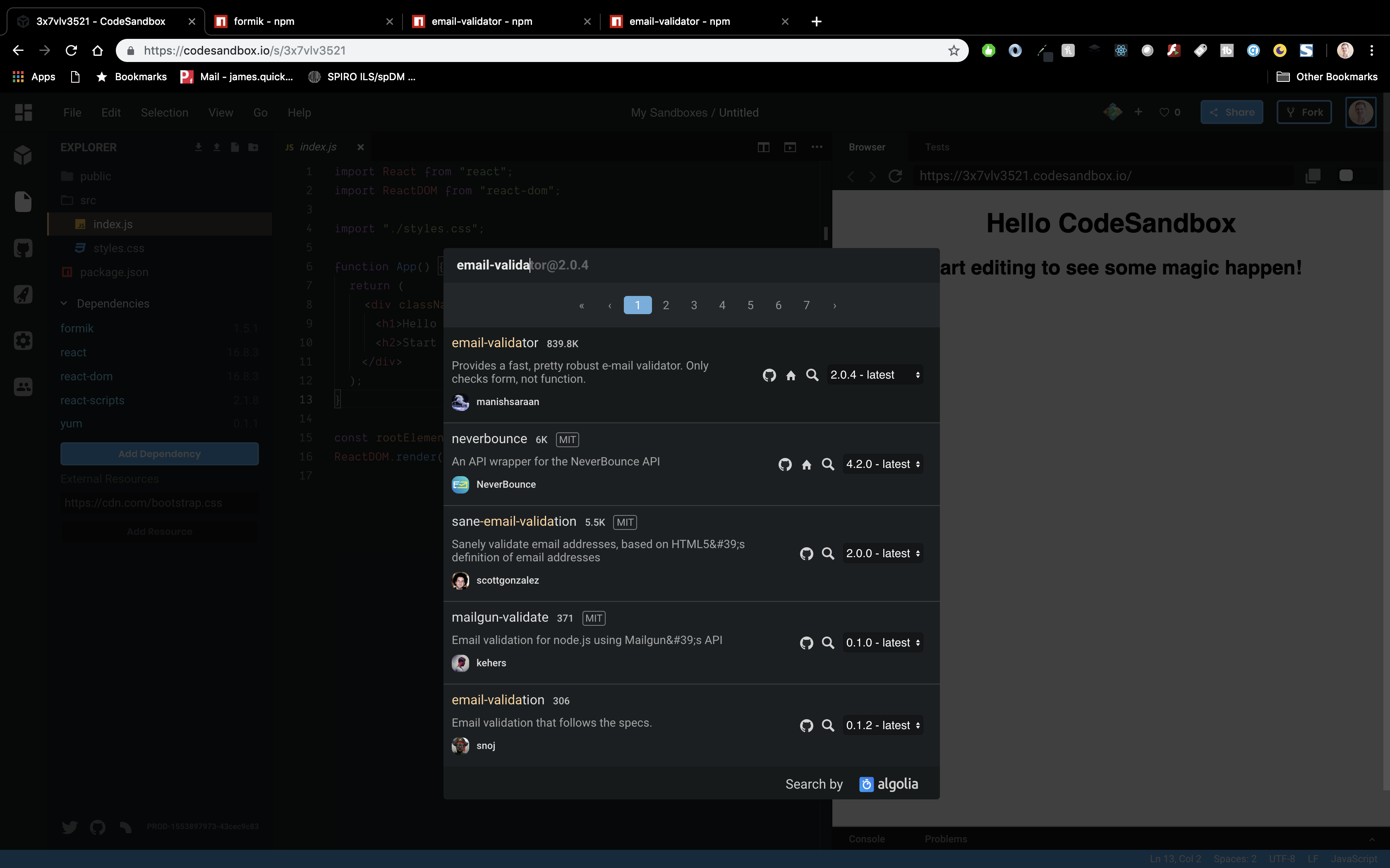
Now install email-validator.
npm install email-validatorAgain installing from the CodeSandbox GUI.
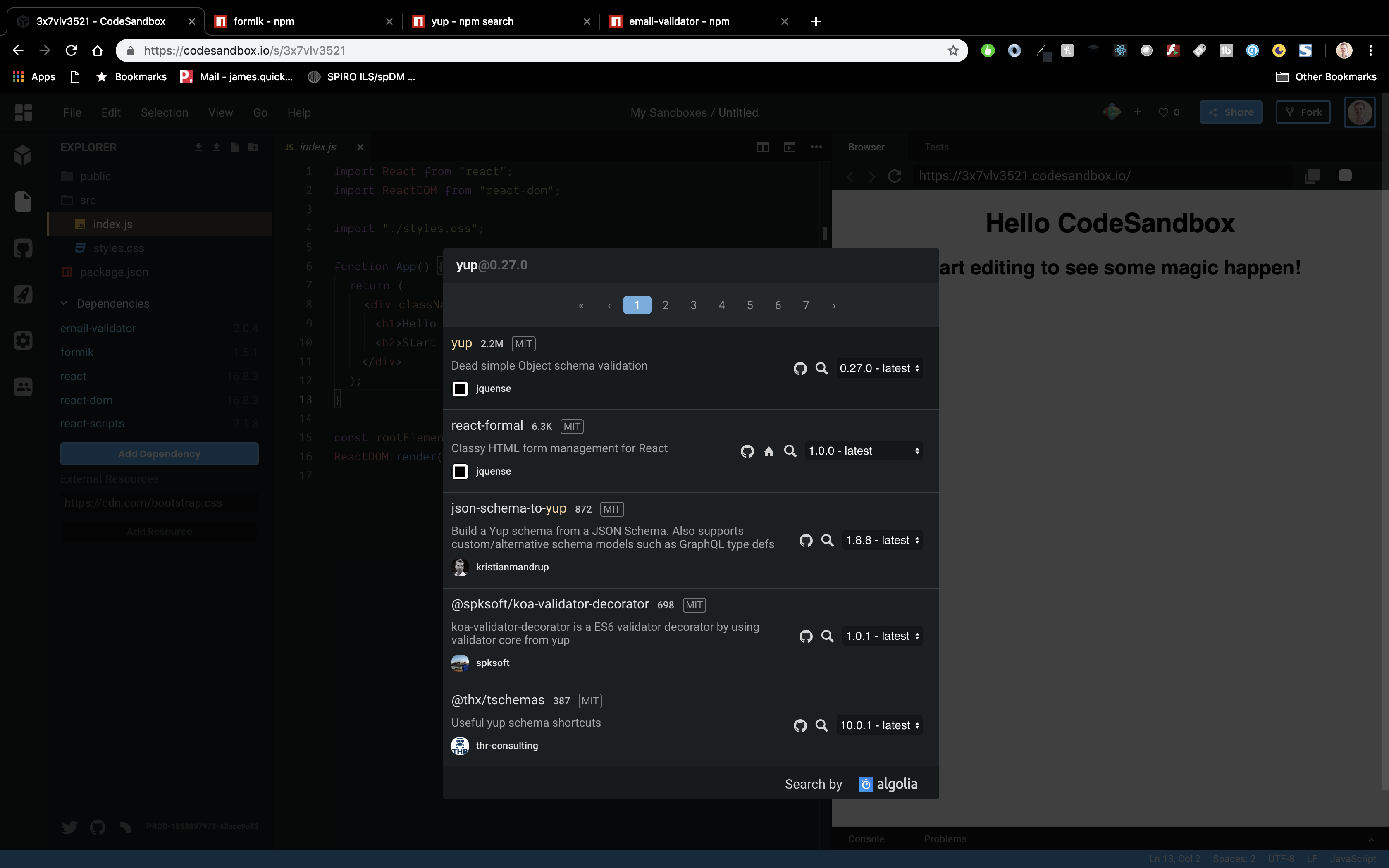
Yup
npm install YupAnd again in CodeSandbox.
Creating the Validated Form Component
Now, we can start to stub out our ValidatedFormComponent. For now, we just want to create the basics and import it into the root file in the app to see it get displayed.
- Create new functional component
- Add dummy display content
- Import in index.js
So, create a new file in your src directory called ValidatedLoginForm.js. Inside of that file, add the basic code for a functional component.
import React from "react";
const ValidatedLoginForm = () => (
  <div>
    <h1>Validated Form Component</h1>
  </div>
);

export default ValidatedLoginForm;
Then, include it in your index.js file.
function App() {
  return (
    <div className="App">
      <ValidatedLoginForm />
    </div>
  );
}
and you should see it displayed.
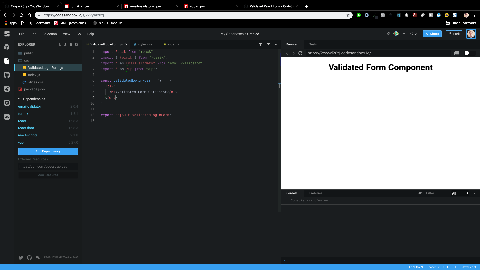
Now, let’s start with the Formik stuff. First, import Formik, Email-Valiator, and Yup in your new component.
import { Formik } from "formik";
import _ as EmailValidator from "email-validator";
import _ as Yup from "yup";
Now, let’s stub out the Formik tag with initial values. Think of initial values as setting your state initially.
You’ll also need an onSubmit callback. This callback will take two parameters, values and an object that we can destructure. The values represented the input values from your form. I’m adding some dummy code here to simulate an async login call, then logging out what the values are.
In the callback, I’m also calling the setSubmitting function that was destructured from the second parameters. This will allow us to enable/disable the submit button while the asynchronous login call is happening.
<Formik
  initialValues={{ email: "", password: "" }}
  onSubmit={(values, { setSubmitting }) => {
    setTimeout(() => {
      console.log("Logging in", values);
      setSubmitting(false);
    }, 500);
  }}
>
  <h1>Validated Login Form</h1>
</Formik>
Render Props
The Formik component uses render props to supply certain variables and functions to the form that we create. If you’re not very familiar with render props, I would take a second to check out Render Props Explained.
In short, render props are used to pass properties to children elements of a component. In this case, Formik will pass properties to our form code, which is the child. Notice that I’m using destructuring to get a reference to several specific variables and functions.
    { props => {
      const {
        values,
        touched,
        errors,
        isSubmitting,
        handleChange,
        handleBlur,
        handleSubmit
      } = props;
      return (
        <div>
          <h1>Validated Login Form</h1>
        </div>
      );
    }}
Display the Form
Now, we can actually start to write the code to display the form. For what it’s worth, in the finished CodeSandbox, I also created a LoginForm.js component to show how basic login forms are handled from scratch. You can also use that as a reference for the form we are going to add now.
The form is pretty simple with two inputs (email and password), labels for each, and a submit button.
{ props => {
      const {
        values,
        touched,
        errors,
        isSubmitting,
        handleChange,
        handleBlur,
        handleSubmit
      } = props;
      return (
        <form onSubmit={handleSubmit}>
          <label htmlFor="email">Email</label>
          <input name="email" type="text" placeholder="Enter your email" />

          <label htmlFor="email">Password</label>
          <input
            name="password"
            type="password"
            placeholder="Enter your password"
          />
          <button type="submit" >
            Login
          </button>
        </form>
      );
    }}
Notice that the onSubmit is calling the handleSubmit from the props.
I mentioned earleir that we could disable our submit button while the user is already attempting to login. We can add that small change now by using the isSubmitting property that we destructured from props above.
  <button type="submit" disabled={isSubmitting}>
      Login
  </button>
I would recommend adding the CSS from the finished CodeSandbox as well. Otherwise you won’t get the full effect. You can copy the below css into your styles.css file.
.App {
  font-family: sans-serif;
}

h1 {
  text-align: center;
}

form {
  max-width: 500px;
  width: 100%;
  margin: 0 auto;
}

label,
input {
  display: block;
  width: 100%;
}

label {
  margin-bottom: 5px;
  height: 22px;
}

input {
  margin-bottom: 20px;
  padding: 10px;
  border-radius: 3px;
  border: 1px solid #777;
}

input.error {
  border-color: red;
}

.input-feedback {
  color: rgb(235, 54, 54);
  margin-top: -15px;
  font-size: 14px;
  margin-bottom: 20px;
}

button {
  padding: 10px 15px;
  background-color: rgb(70, 153, 179);
  color: white;
  border: 1px solid rgb(70, 153, 179);
  background-color: 250ms;
}

button:hover {
  cursor: pointer;
  background-color: white;
  color: rgb(70, 153, 179);
}
Adding Validation Messages Logic
Now we need to figure out how to validate our inputs. The first question is, what constraints do we want to have on our input. Let’s start with email. Email input should…
- Be required
- Look like a real email
Password input should…
- Be required
- Be at least 8 characters long
- contain at least one number
We’ll cover two ways to create these messages, one using Yup and one doing it yourself. We recommend using Yup and you’ll see why shortly.
Doing it Yourself
The first option is creating our validate function. The purpose of the function is to iterate through the values of our form, validate these values in whatever way we see fit, and return an errors object that has key value pairs of value->message.
Inside of the Formik tag, you can add the following code. This will always add an “Invalid email” error for email. We will start with this and go from there.
    validate={values => {
      let errors = {};
      errors.email = "Invalid email";
      return errors;
    }}
Now, we can ensure that the user has input something for the email.
validate={values => {
      let errors = {};
      if (!values.email) {
        errors.email = "Required";
      }
 return errors;
}}
Then, we can check that the email is actually a valid looking email by using the email-validator package. This will look almost the same as the equivalent check for email.
  validate={values => {
      let errors = {};
      if (!values.email) {
        errors.email = "Required";
      } else if (!EmailValidator.validate(values.email)) {
        errors.email = "Invalid email address";
      }
      return errors;
    }}
That takes care of email, so now for password. We can first check that the user input something.
validate={values => {
      let errors = {};
      if (!values.password) {
        errors.password = "Required";
      }
 return errors;
}}
Now we need to check the length to be at least 8 characters.
validate={values => {
      const passwordRegex = /(?=.*[0-9])/;
      if (!values.password) {
        errors.password = "Required";
      } else if (values.password.length < 8) {
        errors.password = "Password must be 8 characters long.";
      }

      return errors;
    }}
And lastly, that the password contains at least one number. For this, we can use regex.
 validate={values => {
      let errors = {};

      const passwordRegex = /(?=.*[0-9])/;
      if (!values.password) {
        errors.password = "Required";
      } else if (values.password.length < 8) {
        errors.password = "Password must be 8 characters long.";
      } else if (!passwordRegex.test(values.password)) {
        errors.password = "Invalida password. Must contain one number";
      }

      return errors;
    }}
Here’s the whole thing.
  validate={values => {
      let errors = {};
      if (!values.email) {
        errors.email = "Required";
      } else if (!EmailValidator.validate(values.email)) {
        errors.email = "Invalid email address";
      }

      const passwordRegex = /(?=.*[0-9])/;
      if (!values.password) {
        errors.password = "Required";
      } else if (values.password.length < 8) {
        errors.password = "Password must be 8 characters long.";
      } else if (!passwordRegex.test(values.password)) {
        errors.password = "Invalida password. Must contain one number";
      }

      return errors;
    }}
Using Yup (Recommended)
Ok, you might have noticed that handling the validate logic on our own gets a bit verbose. We have to manually do all of the checks ourselves. It wasn’t that bad I guess, but with the Yup package, it gets all the more easy!
Yup is the recommended way to handle validation messages.
Yup makes input validation a breeze!
When using Yup, we no longer will see the Validate property, but insead use validationSchema. Let’s start with email. Here is the equivalent validation using Yup.
validationSchema={Yup.object().shape({
      email: Yup.string()
        .email()
        .required("Required")
    })}
Much shorter right?! Now, for password.
validationSchema={Yup.object().shape({
  email: Yup.string()
    .email()
    .required("Required"),
  password: Yup.string()
    .required("No password provided.")
    .min(8, "Password is too short - should be 8 chars minimum.")
    .matches(/(?=.*[0-9])/, "Password must contain a number.")
})}
Pretty SWEET!
Displaying Validation/Error Messages
Now that we have the logic for creating error messages, we need to display them. We will need to update the inputs in our form a bit.
We need to update several properties for both email and password inputs.
- value
- onChange
- onBlur
- className
Let’s start by updating value, onChange, and onBlur. Each of these will use properties from the render props.
<input
  name="email"
  type="text"
  placeholder="Enter your email"
  value={values.email}
  onChange={handleChange}
  onBlur={handleBlur}
/>
Then we can add a conditional “error” class if there are any errors. We can check for errors by looking at the errors object (remeber how we calculated that object ourselves way back when).
We can also check the touched property, to see whether or not the user has interacted with the email input before showing an error message.
<input
  name="email"
  type="text"
  placeholder="Enter your email"
  value={values.email}
  onChange={handleChange}
  onBlur={handleBlur}
  className={errors.email && touched.email && "error"}
/>
And lastly, if there are errors, we will display them to the user. All in all, email will look like this.
<label htmlFor="email">Email</label>
<input
  name="email"
  type="text"
  placeholder="Enter your email"
  value={values.email}
  onChange={handleChange}
  onBlur={handleBlur}
  className={errors.email && touched.email && "error"}
/>
{errors.email && touched.email && (
  <div className="input-feedback">{errors.email}</div>
)}
Password
Now we need to do the same with password. I won’t walk through each step beause they are exactly the same as email. Here’s the final code.
<label htmlFor="email">Password</label>
<input
  name="password"
  type="password"
  placeholder="Enter your password"
  value={values.password}
  onChange={handleChange}
  onBlur={handleBlur}
  className={errors.password && touched.password && "error"}
/>
{errors.password && touched.password && (
  <div className="input-feedback">{errors.password}</div>
)}
Test it Out
Let’s try it out! You can start by clicking the button without entering anything. You should see validation messages.

Now, we can get more specific for testing messages. Refresh your page to do this.Click inside of the email input, but don’t type anything.
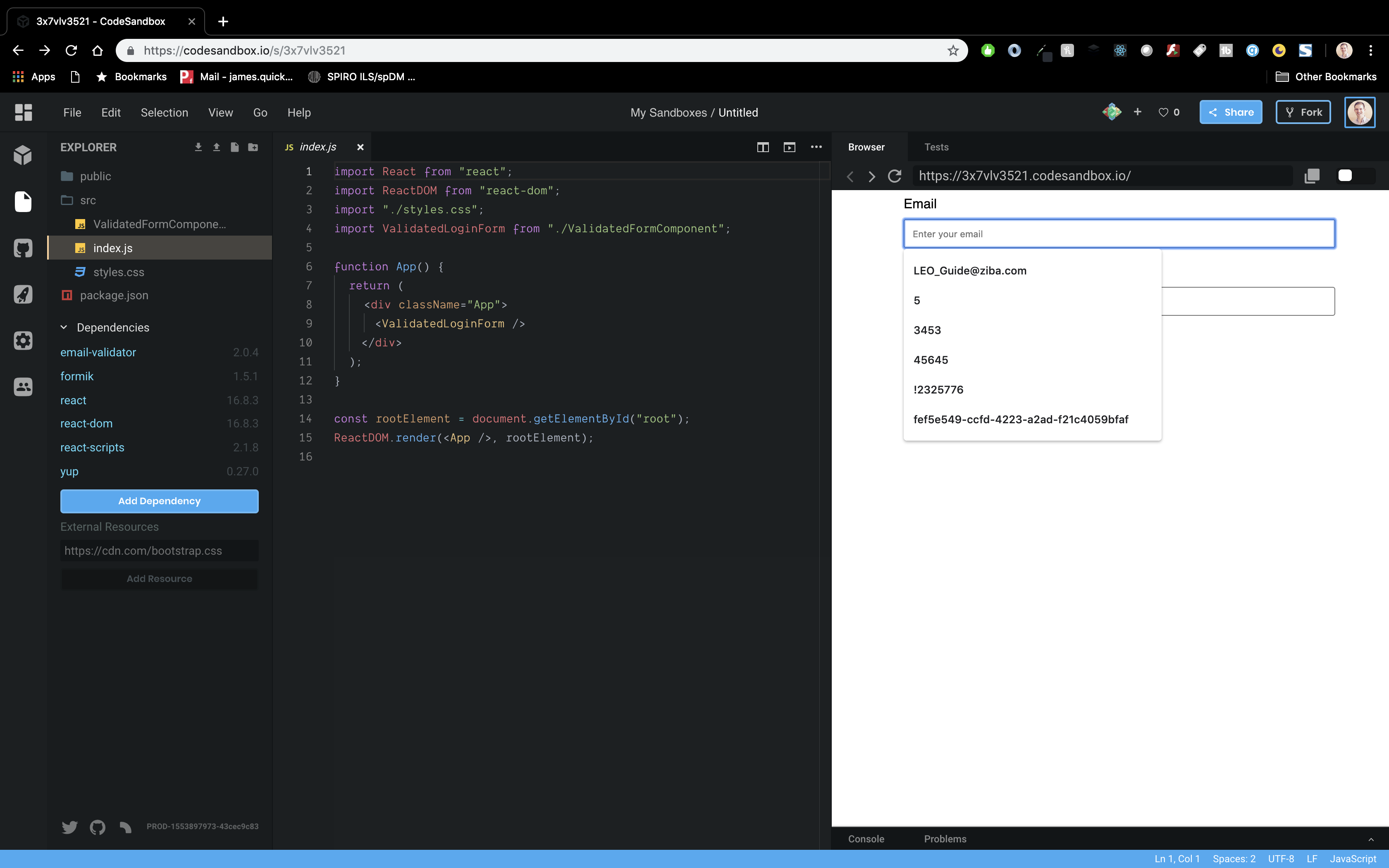
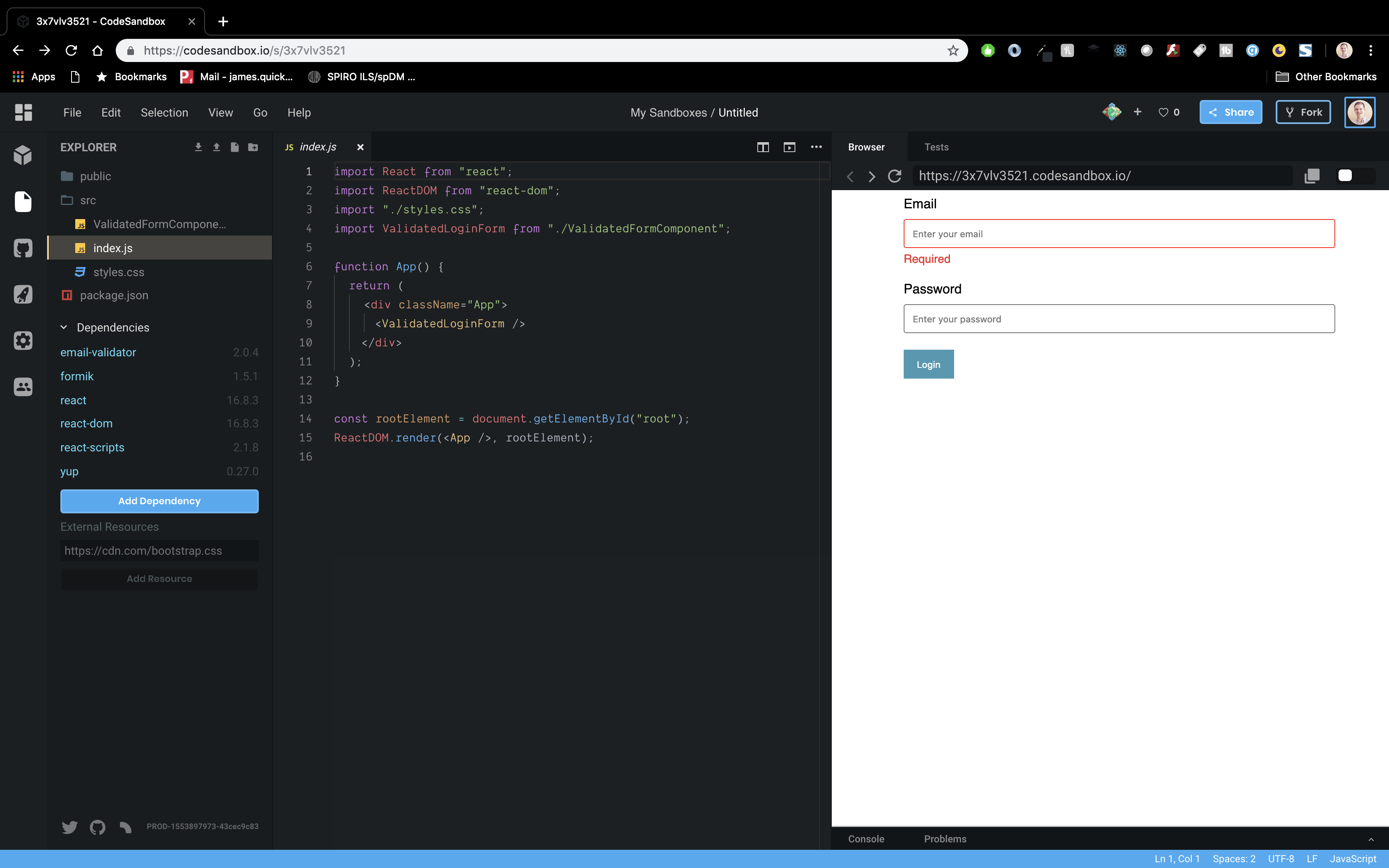
Then, click away from the input. You should see the “Required” message pop up. Notice that this message doesn’t pop up automatically when the page loads. We only want to display error messages after the user has interacted with the input.
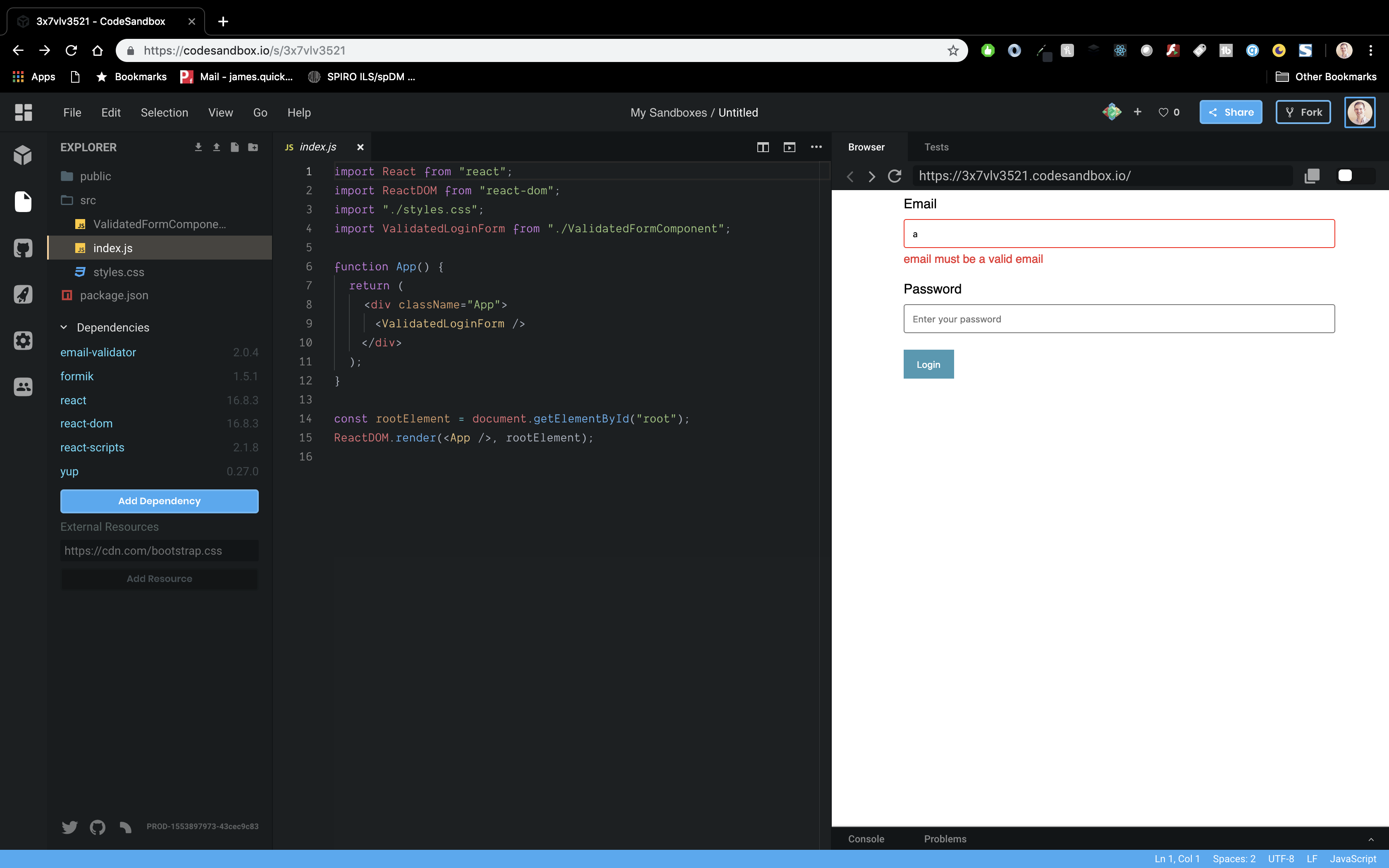
Now, start to type. You should get a message about not being a valid email.
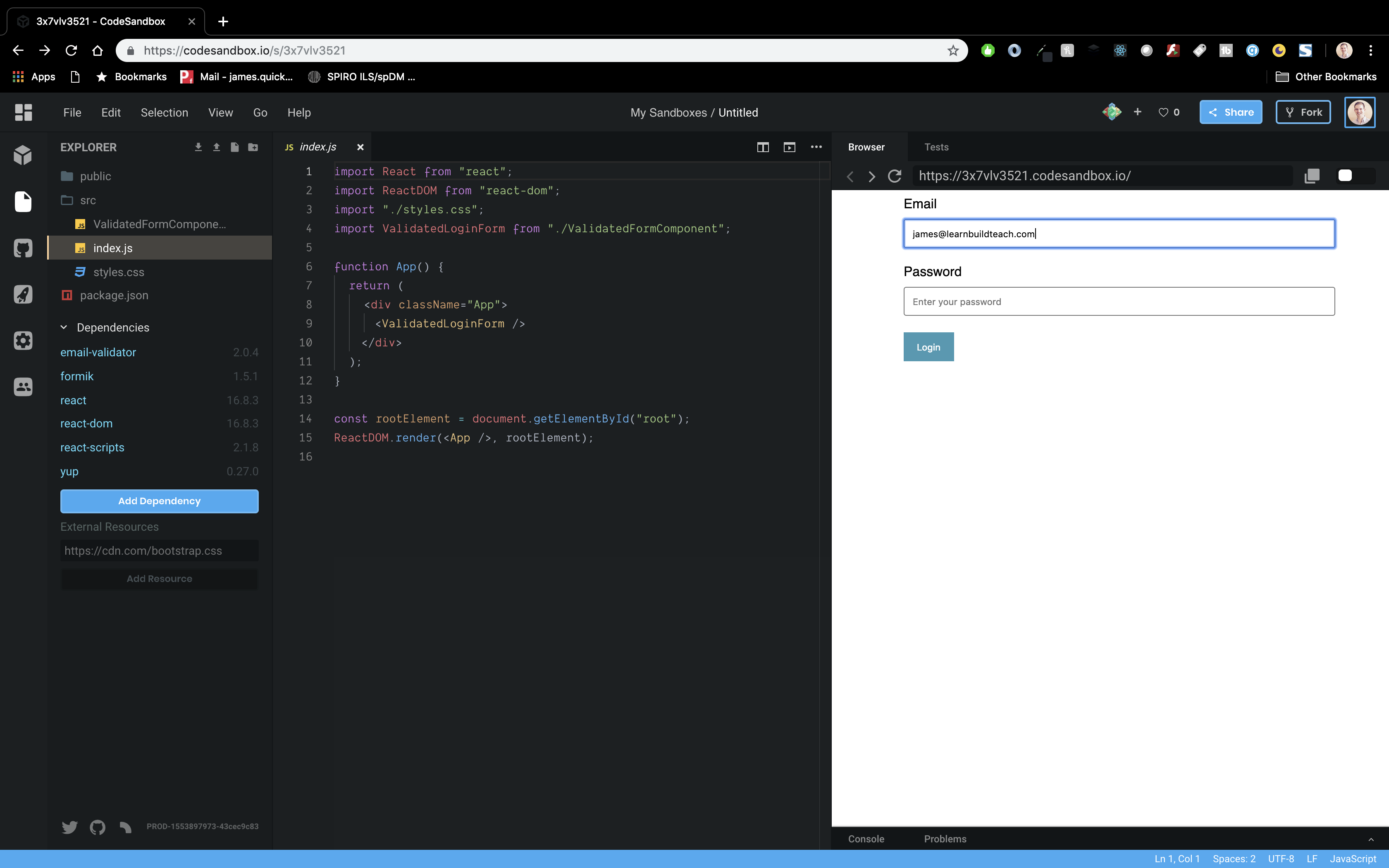
And lastly, type in a valid looking email, and your error message goes away.
Now, same for password. Click on the input, then away, and you’ll get the required message.

Then, start typing and you’ll see the length validation.
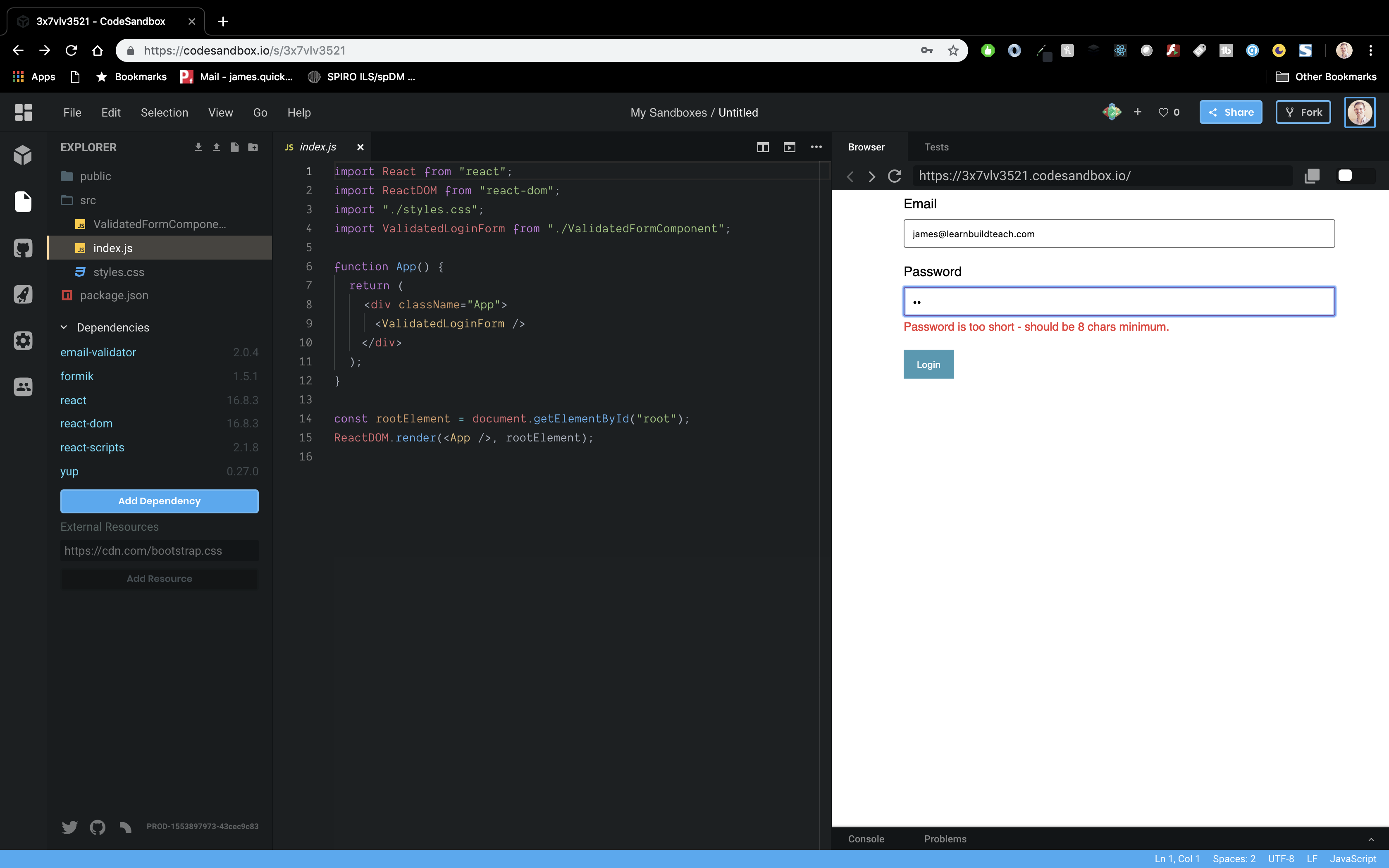
Then, type 8 or more characters that does not include a number, and you’ll see the “must contain a number” message.

And lastly, add a number, and error messages go away.

Conclusion
Whew, that was a long one! Again, validation can be a tricky thing, but with the help of a few packages, it becomes a bit easier. At the end of the day though, I think we’ve got a pretty legit login form!
Source: Scotch.io