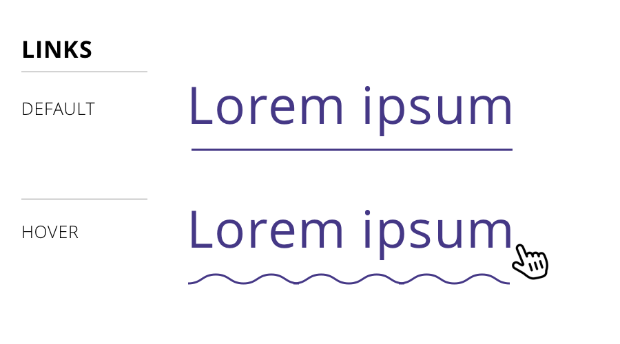
A designer I work with was presenting comps at a recent team meeting. She had done a wonderful job piecing together the concept for a design system, from components to patterns and everything in between that would make any front-end developer happy.
But there was a teeny tiny detail in her work that caught my eye: the hover state for links was a squiggle.

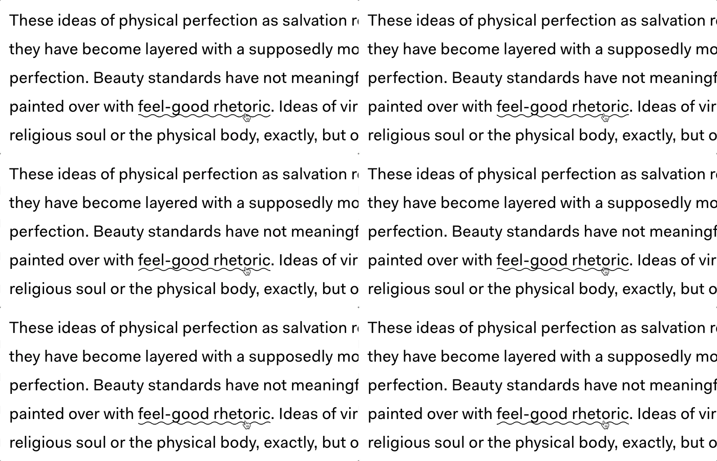
Huh! Not only had I not seen that before, the idea had never even crossed my mind. Turns out there are plenty of instances of it on live sites, one being The Outline. That was the one that was implementation that inspired the design.
Cool, I figured. We can do something like a linear background gradient or even a background image. But! That wasn’t the end of the design. Turns out it’s animated as well. Again, from The Outline:

Whoa! That’s pretty wild. I wasn’t sure how to approach that, honestly, because animating any of my initial ideas would be difficult, especially for cross-browser support.
So, how did The Outline do it? Turns out, it’s SVG. We can make a squiggly path and animate it pretty easily:
See the Pen Squiggle by Geoff Graham (@geoffgraham) on CodePen.
But how does that work with a link? Well, we can use SVG on the background-image property:
See the Pen Squiggle by Geoff Graham (@geoffgraham) on CodePen.
But that’s kinda crappy because we can’t really animate that. We need better values for that. However, we can inline CSS directly on the SVG in the background-image property. We can’t simply copy and paste the SVG code into the property, but we can with some proper encoding:
See the Pen Squiggle by Geoff Graham (@geoffgraham) on CodePen.
And, since SVG can contain its own styles within the markup, the animation can be tossed right there in the background-image property, the same way we would do it with CSS in an HTML document head or inline CSS in HTML.
See the Pen Squiggle by Geoff Graham (@geoffgraham) on CodePen.
We can style it up a little differently, if we’d like:
See the Pen Link Effectz – Squiggle by Geoff Graham (@geoffgraham) on CodePen.
This is inspiring!
I have no idea if an animated squiggle makes for a good user experience and, frankly, that’s not the point of this post. The point is that The Outline had a fun idea with a slick CSS implementation.
That got me thinking about other non-standard (perhaps even unconventional) hover styling we can do with links. Again, tossing aside usability and have a grand ol’ time with CSS…
The Border to Background Effect
Maybe that same bottom border on the default link can grow and become the full background of the link on hover:
See the Pen Link Effectz – Background on hover by Geoff Graham (@geoffgraham) on CodePen.
Heck, we can even do something similar horizontally:
See the Pen Link Effectz – Horizotonal Background by Geoff Graham (@geoffgraham) on CodePen.
The Outlined Text Effect
Let’s strip out the font color and leave an outline behind.
See the Pen Link Effectz – Outline on hover by Geoff Graham (@geoffgraham) on CodePen.
The Raised Text Effect
Another idea is to raise the text as if it grows out of the page on hover:
See the Pen Link Effectz – Raised text on hover by Geoff Graham (@geoffgraham) on CodePen.
The Font Swapper-oo Effect
This is so impractical that it makes me LOL, but why not:
See the Pen Link Effectz – Swap font on hover by Geoff Graham (@geoffgraham) on CodePen.
The “Turn it Up, Chris” Effect
Sorry, Chris. You know you love it. ❤️
See the Pen Link Effectz – Turn it up, Chris! by Geoff Graham (@geoffgraham) on CodePen.
What can you come up with?
Have ideas? Let me know in the comments and I’ll toss ’em in the CodePen collection I’ve started.
Source: CSS-tricks.com