Images should add that extra touch of beauty to your site. But what happens when the image fails to load? You end up with this annoying looking icon:

Nobody want this on their website. Luckily, there’s a fall back option that will make our page retain it’s pretty look. Let’s get started with styling broken images.
Getting Started
Now how do we create a custom style for our broken images? Before jumping into styling a broken image we first need to understand a few things about the <img> tag.
- Regular typography styles : These styles are applied to the alternate text (alt). It only shows up when the image is broken. If the image happens to load as expected then the alternate text and its styling will be ignored altogether. This doesn’t mean we wasted our time to style it, since we actually did prepare for the worst.
<img>********_** is a _replaced element! : A replaced element is any element whose appearance and dimensions are defined by an external resource. Examples include:
- Images (
<img>tags). - Plugins (
<object>tags). - Form elements (
<button>,<textarea>,<input>, and<select>tags).
Because of this, the pseudo-elements will not work when the image is loaded. However, if it has a broken image, these pseudo elements will appear.
Practical Examples
Bearing in mind the two facts above, we can now style a broken image. First, let’s create a broken image for our site. Just deliberately add in a URL to an image you know doesn’t actually exist. FYI, we will also be using the Font Awesome CDN further in this demo to pull in some icons from the Font Awesome Library. You can find it here so your demo will look like mine.
<img src="nonsoimage.jpg" alt="broken image">Now we have our broken image.
Giving Useful Information
It’s always a good practice to let the user know that an image is broken. It is also possible to display the link to the image by using the attr() expression
img {
  top: 20px;
  display: block;
  position: relative;
  font-weight: 400;
  text-align: center;
  width: 400px;
  height: 300px;
}

img:before {   content: "Unable to load image";
  font-size: 130%;
  display: block;
}

img:after {   content: "(url: " attr(src) ")";
  font-size: 130%;
  display: block;
}
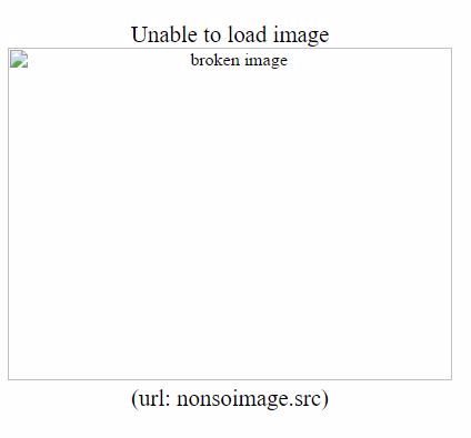
With the added CSS, our image now looks like this:

Better, but still not great.
Specifying a new alternate text
We can also use a new text to replace the default alternate text.
This can be accomplished by using pseudo elements and positioning the text on top of the alt text in such a way that the new alternate text covers and hides the default alternate text.
img {
/_ No changes made  _/
}

img:after {   content: "f1c5" " " attr(alt);
  font-family: FontAwesome;
  font-size: 120%;
  top: 0;
  left: 0;
  width: 100%;
  height: 100%;
  padding:40px;
  display: block;
  position: absolute;
  z-index: 2;
  background-color: #fff;
}
Now we have our own alt text overriding the default.

No harm in Adding a Little Extra Style
The pseudo-element is our best friend when it comes to adding more styles.
Here we can add as many styles we deem fit to make the broken image look more appealing to our users.
img {   /_ Same as first example _/
}

img:before {   content: " ";
  display: block;
  position: absolute;
  top: -10px;
  left: 0;
  height: calc(100% + 10px);
  width: 100%;
  background-color: #fff;
}

img:after {   content: "f127" " Broken Image of "  attr(src);
  display: block;
  font-size: 130%;
  font-family: FontAwesome;
  position: absolute;
  left: 40px;
  top:40px;
  width: 50%;
  text-align: center;
  padding: 10px;
  background-color: #bada55;
  border:2px dotted #f06d06;
}
We can change colors, add borders, and even add an icon into the content.

It should be noted that if the image is not broken, the pseudo-elements will not be generated and the specified styles will persist.

Compatibilty Issues
The concept of styling broken images is interesting, but some browsers do not support styling the alternate text and don’t even have support for :before and :after pseudo-elements.
Below is a list of browsers that support the concepts used in this article
| Browser | alt text | :before | :after |
|---|---|---|---|
| Chrome | Yes | Yes | Yes |
| Firefox | Yes | Yes | Yes |
| IE | Yes | IE 11 | IE 11 |
| Opera * | Yes * | Yes | yes |
| Safari * | Yes * | Yes | yes |
- Opera truncates the display of text if it is longer than the img width
- Safari does not display the text if it is longer than the img width.
- Only the recent release for Opera and Safari supports the
:beforeand:afterpseudo-elements
The latest version of all the major browsers already have these features incorporated.
For more on compatibility you can always refer to this website.
Conclusion
Styling broken images on a site is a bonus with respect to user-experience (UX) as it prevents page jumps. More sites ought to implement it.
It should be noted that the concept of styling broken image can also be applied to HTML email. This would be covered in a separate article
I hope you enjoyed this write up on styling broken images.
Showing your users a customized style when an image fails to load is an awesome way to handle broken images.
There is a demo on Codepen.
Source: Scotch.io