Once Upon A Time: Using Story Structure For Better Engagement
John Rhea 2018-06-11T14:00:52+02:00
2018-06-11T17:52:46+00:00
Stories form the connective tissue of our lives. They’re our experiences, our memories, and our entertainment. They have rhythms and structures that keep us engaged. In this article, we’ll look at how those same rhythms and structures can help us enrich and enhance the user experience.
In his seminal work Hero With A Thousand Faces, Joseph Campbell identified a structure that rings true across a wide variety of stories. He called this “The Hero’s Journey,” but his book explaining it was 300+ pages so we’ll use a simplified version of Campbell’s work or a jazzified version of the plot structure you probably learned about in elementary school:
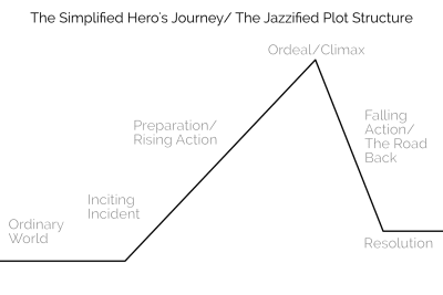
The ordinary world/exposition is where our hero/protagonist/person/thing/main character starts. It’s the every day, the safe, the boring, the life the hero already knows.
The inciting incident is the event or thing that pulls or (more often) pushes the hero into the story. It’s what gets them involved in the story whether they want to be or not.
In the rising action/preparation phase, the hero prepares (sometimes unknowingly) for the ordeal/climax which is when they go up against the villain (and prevail!).
After the hero prevails against the villain, they must return to their ordinary world and bring back the new knowledge and/or mythical object they got from/for defeating the villain.
Finally, in the Resolution, we tie up all the loose ends and throw a dance party.
We can apply this same structure to the experience of the user or — as I like to call it — the “user journey.”
- Ordinary World
Where the user starts (their every day). - Inciting Incident
They have a problem they need solved. - Rising Action
They’ve found your product/service/website and they think it might work to solve their problem, but they need to decide that this is the product/service/website will solve their problem. So in this step they gather facts and figures and feelings to determine if this thing will work. It could be deciding if the type of video game news covered on this site is the kind of news they want to consume or deciding whether this type of pen will solve their writing needs or whether the graphic design prowess of this agency can make their new website super awesome. - The Ordeal
The fight to make a decision about purchasing that pen or adding that news site to your regularly checked sites or contacting that agency for a quote. - The Road Back
Decision made, the road back is about moving forward with that purchase, regular reading, or requesting the quote. - Resolution
Where they apply your product/service/website to their problem and it is mightily solved.
If we consider this structure as we look at user interactions, there are lots of ways we can put ourselves in the user’s shoes and optimize their experience, providing support (and sometimes a good shove) exactly when they need it.
Here are some techniques. Some apply to just one part of the User Journey while some apply to several parts at once:
Journey With Your Users
Stories take time. Movies aren’t done in two minutes; they take two hours to watch and absorb. They are a journey.
If you always only ever shout “BUY! BUY! BUY!” you may make a few quick sales, but you won’t encourage long-term loyalty. Journey with your users, and they’ll count on you when they have a problem you can solve.
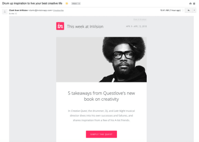
InVision’s newsletter journeys with you. In this recent newsletter, they sent an article about Questlove and what we can learn from him concerning creativity. If you click through, other than the URL, the word “InVision” does not appear on the page. They’re not pushing the sale, but providing relevant, interesting content to the main audience of people who use their products. I haven’t yet been in the market for their services, but if/when I am, there won’t be much of an Ordeal or fight for approval. They’ve proven their worth as a traveling companion. They’re someone I can count on.
Journeying with your users can take many forms, only one of which is content marketing. You could also build training programs that help them move from beginner to expert in using your app or site. You could add high touch parts to your sales process or specific technical support that will help you come alongside your user and their needs. In contexts of quick visits to a website you might use visuals or wording that’s down-to-earth, warm, welcoming, and feels personable to your main audience. You want to show the user they can count on you when they have a problem.
Give ‘Em A Shove
Users need an inciting incident to push them into the user journey, often more than one push. They have a lot going on in their lives. Maybe they’re working on a big project or are on vacation or their kid played frisbee with their laptop. They may have lost or never opened your first email. So don’t hesitate to send them a follow-up. Show them the difference between life without your product or service and life with it. Heroes are pushed into a story because their old life, their ordinary world, is no longer tenable given the knowledge or circumstances they now have.
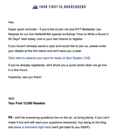
Nick Stephenson helps authors sell more books (and uses the hero’s journey to think through his websites and marketing). Last fall he sent out a friendly reminder about a webinar he was doing. He gets straight to the point reminding us about his webinar, but provides value by giving us a way to ask questions and voice concerns. He also lets us know that this is a limited time offer, if we want the new life his webinar can bring we’ve got to step into the story before it’s too late.
Give your users more than one opportunity to buy your product. That doesn’t mean shove it down their throat every chance you get, but follow up and follow through will do wonders for your bottom line and help you continue to build trust. Many heroes need a push to get them into the story. Your users may need a shove or well-placed follow up email or blaring call to action too.
Give Out Magic Swords
By now you know your users will face an ordeal. So why not pass out magic swords, tools that will help them slay the ordeal easily?
Whenever I have tried to use Amazon’s Web Services, I’ve always been overwhelmed by the choices and the number of steps needed to get something to work. A one button solution it is not.
But on their homepage, they hand me a magic sword to help me slay my dragon of fear.
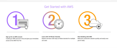
They use a 1-2-3 graphic to emphasize ease. With the gradient, they also subtly show the change from where you started (1) to where you’ll end (3) just like what a character does in a story. My discussion above could make this ring hollow, but I believe they do two things that prevent that.
First, number two offers lots of 10-minute tutorials for “multiple use cases” There seems to be meat there, not a fluffy tutorial that won’t apply to your situation. Ten minutes isn’t long, but can show something substantially and “multiple use cases” hints that one of these may well apply to your situation.
Second, number three is not “You’ll be done.” It’s “Start building with AWS.” You’ll be up and running in as easy as 1, 2, 3. At step 3 you’ll be ready to bring your awesome to their platform. The building is what I know and can pwn. Get me past the crazy setup and I’m good.
Find out what your user’s ordeal is. Is it that a competitor has a lower price? Or they’re scared of the time and expertise it’ll take to get your solution to work? Whatever it is, develop resources that will help them say Yes to you. If the price is a factor, provide information on the value they get or how you take care of all the work or show them it will cost them more, in the long run, to go with a different solution.
No One is Average
So many stories are about someone specific because we can identify with them. Ever sat through a movie with a bland, “everyman” character? Not if you could help it and definitely not a second time. If you sell to the average person, you’ll be selling to no one. No one believes themselves to be average.
Coke’s recent “Share a Coke” campaign used this brilliantly. First, they printed a wide variety of names on their products. This could have backfired.
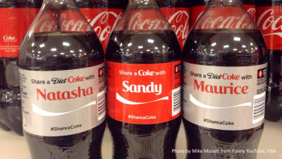
My name isn’t Natasha, Sandy or Maurice. But it wasn’t “Buy a Coke,” it was “Share a Coke.” And I know a Natasha, a Sandy, and a Maurice. I could buy it for those friends for the novelty of it or buy my name if I found it ( “John” is so uncommon in the U.S. it’s hard to find anything that has my name on it besides unidentified men and commodes.)
So often we target an average user to broaden the appeal for a product/service/website, and to an extent, this is a good thing, but when we get overly broad, we risk interesting no one.
You Ain’t The Protagonist
You are not the protagonist of your website. You are a guide, a map, a directional sign. You are Obi-Wan Kenobi on Luke’s journey to understand the force. That’s because the story of your product is not your story, this isn’t the Clone Wars (I disavow Episodes I-III), it’s your user’s story, it’s A New Hope. Your users are the ones who should take the journey. First, they had a big hairy problem. They found your product or service that solved that big hairy problem. There was much rejoicing, but if you want them to buy you aren’t the hero that saves the day, you’re the teacher who enables them to save their day. (I am indebted to Donald Miller and his excellent “Story Brand” podcast for driving this point home for me.)
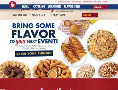
Zaxby’s focuses on how they’ll help you with messages like “Cure your craving” and “Bring some FLAVOR to your next Event!” The emphasis on “flavor” and “your” is borne out in the design and helps to communicate what they do and how they will help you solve your problem. But “you”, the user, is the hero, because you’re the one bringing it to the event. You will get the high fives from colleagues for bringing the flavor. Zaxby’s helps you get that victory.
Furthermore, we’re all self-centered, some more than others, and frankly, users don’t care about you unless it helps them. They only care about the awards you’ve won if it helps them get the best product or service they can. They are not independently happy for you.
At a recent marketers event I attended, the social media managers for a hospital said one of their most shared articles was a piece about the number of their doctors who were considered the top doctors in the region by an independent ranking. People rarely shared the hospital’s successes before, but they shared this article like crazy. I believe it’s because the user could say, “I’m so great at choosing doctors. I picked one of the best in the region!” Rather than “look at the hospital” users were saying “look at me!” Whenever you can make your success their success you’ll continue your success.
Celebrate Their Win
Similar to above, their success is your success. Celebrate their success and they’ll thank you for it.
Putting together any email campaign is arduous. There are a thousand things to do and it takes time and effort to get them right. Once I’ve completed that arduous journey, I never want to see another email again. But MailChimp turns that around. They have this tiny animation where their monkey mascot, Freddie, gives you the rock on sign. It’s short, delightful, and ignorable if you want to. And that little celebration animation energizes me to grab the giant email ball of horrors and run for the end zone yet again. Exactly what Mailchimp wants me to do.
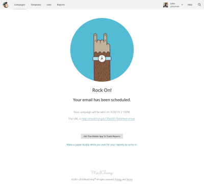
So celebrate your user’s victories as if they were your own. When they succeed at using your product or get through your tutorial or you deliver their website, throw a dance party and make them feel awesome.
The Purchase Is Not The Finish Line
The end of one story is often the beginning of another. If we get the client to buy and then drop off the face of the Earth that client won’t be back. I’ve seen this with a lot of web agencies that excel in the sales game, but when the real work of building the website happens, they pass you off to an unresponsive project manager.
Squarespace handles this transition well with a “We got you” email. You click purchase, and they send you an email detailing their 24/7 support and fast response times. You also get the smiling faces of five people who may or may not, have or still work there. And it doesn’t matter if they work there or never did. This email tells the user “We’ve got you, we understand, and we will make sure you succeed.”
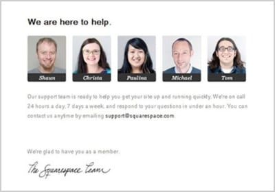
This harkens all the way back to journeying with your user. Would you want to travel with the guy who leaves as soon as you got him past the hard part? No, stick with your users and they’ll stick with you.
The Resolution
We are storytelling animals. Story structure resonates with the rhythms of our lives. It provides a framework for looking at user experience and can help you understand their point of view at different points in the process. It also helps you tweak it such that it’s a satisfying experience for you and your users.
You got to the end of this article. Allow me to celebrate your success with a dance party.

 (cc, ra, il)
Source: Smashingmagazine.com