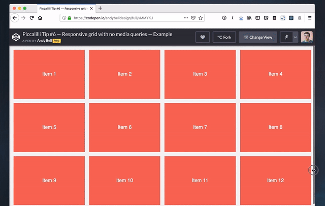
Andy Bell made a really cool demo that shows us how to create a responsive grid layout without any media queries at all. It happens to look like this when you change the size of the browser window:
I think this is a wonderful layout technique that’s just 6 lines (!) of CSS.
.auto-grid {
  --auto-grid-min-size: 16rem;
  display: grid;
  grid-template-columns: repeat(auto-fill, minmax(var(--auto-grid-min-size), 1fr));
  grid-gap: 1rem;
}
What this shows us is that we don’t have to write a million media queries to change the number of columns in a grid. Andy also proves that CSS Grid can automate so much of the tedious work of styling layouts.
Source: CSS-tricks.com