Friday, November 22

CSS Tricks

“View Source” in DevTools
CSS Tricks

“View Source” in DevTools

When the conversation about the value of "View Source" rolls around, the #1 response I hear is along these lines: No way, Jose! I use View Source all the time! It's very useful when you want to look at the raw HTML, not the DOM. Yes, that is useful, and yes, there is a difference. But just because you are looking at DevTools doesn't mean the DOM is the only thing you can see.   This is Chrome DevTools. Safari has a Resources tab There is also a Network tab in DevTools for every browser. That's where you find a way to look at the document. Firefox's Network tab So, if your concern about losing View Source is that you'd have no possible way to see the document instead of just the DOM, that's just not true. You can rest assured that you have the same affordance in DevTools. ...
An Intro to Web Site Testing with Cypress
CSS Tricks

An Intro to Web Site Testing with Cypress

End-to-end testing is awesome because it mirrors the user’s experience. Where you might need a ton of unit tests to get good coverage (the kind where you test that a function returns a value you expect), you can write a single end-to-end test that acts like a real human as it tests several pieces of your app at once. It’s a very economical way of testing your app. Cypress is a new-ish test runner with some features that take some of the friction out of end-to-end testing. It sports the ability to automatically wait for elements (if you try to grab onto an element it can’t find), wait for Ajax requests, great visibility into your test outcomes, and an easy-to-use API. Note: Cypress is both a test runner and a paid service that records your tests, allowing you to play them back later. This ...
Super-Powered Grid Components with CSS Custom Properties
CSS Tricks

Super-Powered Grid Components with CSS Custom Properties

A little while ago, I wrote a well-received article about combining CSS variables with CSS grid to help build more maintainable layouts. But CSS grid isn’t just for pages! That is a common myth. Although it is certainly very useful for page layout, I find myself just as frequently reaching for grid when it comes to components. In this article I’ll address using CSS grid at the component level. Grid is neither a substitute for flexbox nor vice versa. In fact, using a combination of the two gives us even more power when building components. Building a simple component In this demo, I’ll walk through building a text-and-image component, something you might commonly find yourself building on a typical site, and which I have frequently built myself. This is what our first component should look...
CSS Tricks

​Reinvest Your Time With HelloSign API

(This is a sponsored post.)G2 Crowd says HelloSign's API is 2x faster to implement than any other eSign provider. What are you going to do with all the time you save? Try it free Today! Direct Link to Article — PermalinkThe post ​Reinvest Your Time With HelloSign API appeared first on CSS-Tricks. Source: CSS-tricks.com
CSS Tricks

A Tale of Two Buttons

I enjoy front-end developer thought progression articles like this one by James Nash. Say you have a button which needs to work in "normal" conditions (light backgrounds) and one with reverse-colors for going on dark backgrounds. Do you have a modifier class on the button itself? How about on the container? How can inheritance and the cascade help? How about custom properties? I think embracing CSS’s cascade can be a great way to encourage consistency and simplicity in UIs. Rather than every new component being a free for all, it trains both designers and developers to think in terms of aligning with and re-using what they already have. Direct Link to Article — PermalinkThe post A Tale of Two Buttons appeared first on CSS-Tricks. Source: CSS-tricks.com
CSS Tricks

A native lazy load for the web platform

A new Chrome feature dubbed "Blink LazyLoad" is designed to dramatically improve performance by deferring the load of below-the-fold images and third-party <iframe>s. The goals of this bold experiment are to improve the overall render speed of content that appears within a user’s viewport (also known as above-the-fold), as well as, reduce network data and memory usage. ✨ ?‍? How will it work? It’s thought that temporarily delaying less important content will drastically improve overall perceived performance. If this proposal is successful, automatic optimizations will be run during the load phase of a page: Images and iFrames will be analysed to gauge importance. If they’re seen to be non-essential, they will be deferred, or not loaded at all: Deferred items will only be loaded if t...
CSS Tricks

Using CSS Clip Path to Create Interactive Effects, Part II

One of the biggest drawbacks of CSS clipping, at the time of writing, is browser support. Not having 100% browser coverage means different experiences for viewers in different browsers. We, as developers, can’t control what browsers support — browser vendors are the ones who implement the spec and different vendors will have different agendas. One thing we can do to overcome inconsistencies is use alternative technologies. The feature set of CSS and SVG sometimes overlap. What works in one may work in the other and vice versa. As it happens, the concept of clipping exists in both CSS and SVG. The SVG clipping syntax is quite different, but it works the same. The good thing about SVG clipping compared to CSS is its maturity level. Support is good all the way back to old IE browsers. Most...
CSS Tricks

::before vs :before

Note the double-colon ::before versus the single-colon :before. Which one is correct? Technically, the correct answer is ::before. But that doesn't mean you should automatically use it. The situation is that: double-colon selectors are pseudo-elements. single-colon selectors are pseudo-selectors. ::before is definitely a pseudo-element, so it should use the double colon. The distinction between a pseudo-element and pseudo-selector is already confusing. Fortunately, ::after and ::before are fairly straightforward. They literally add something new to the page, an element. But something like ::first-letter is also a pseudo-element. The way I reason that out in my brain is that it's selecting a part of something in which there is no existing HTML element for. There is no <span> around ...
A Basic WooCommerce Setup to Sell T-Shirts
CSS Tricks

A Basic WooCommerce Setup to Sell T-Shirts

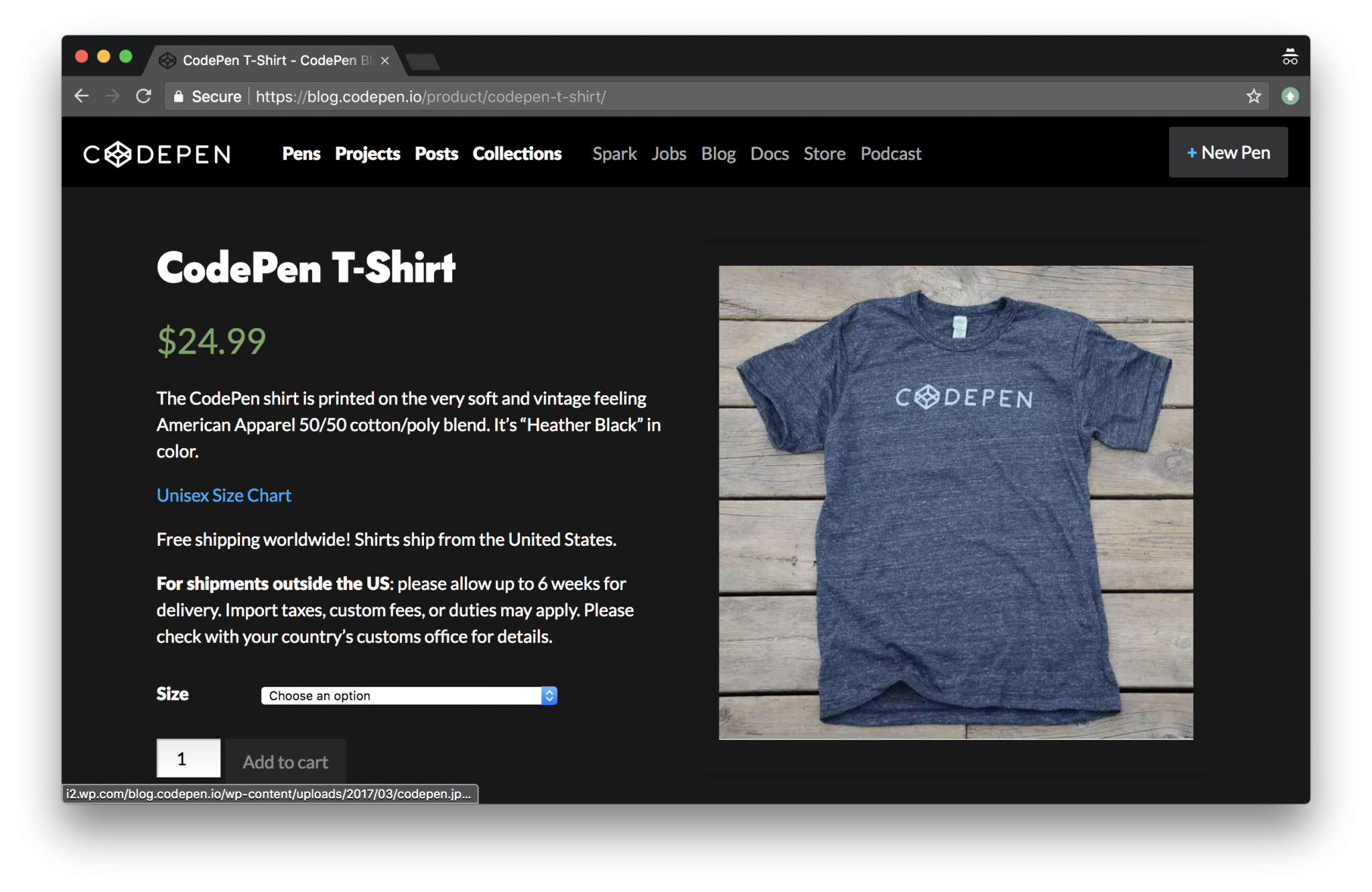
WooCommerce is a powerful eCommerce solution for WordPress sites. If you're like me, and like working with WordPress and have WordPress-powered sites already, WooCommerce is a no-brainer for helping you sell things online on those sites. But even if you don't already have a WordPress site, WooCommerce is so good I think it would make sense to spin up a WordPress site so you could use it for your eCommerce solution. Personally, I've used WooCommerce a number of times to sell things. Most recently, I've used it to sell T-Shirts (and hats) over on CodePen. We use WordPress already to power our blog, documentation, and podcast. Makes perfect sense to use WordPress for the store as well! What I think is notable about our WooCommerce installation at CodePen is how painless it was, while doing...
Using feature detection to write CSS with cross-browser support
CSS Tricks

Using feature detection to write CSS with cross-browser support

In early 2017, I presented a couple of workshops on the topic of CSS feature detection, titled CSS Feature Detection in 2017. A friend of mine, Justin Slack from New Media Labs, recently sent me a link to the phenomenal Feature Query Manager extension (available for both Chrome and Firefox), by Nigerian developer Ire Aderinokun. This seemed to be a perfect addition to my workshop material on the subject. However, upon returning to the material, I realized how much my work on the subject has aged in the last 18 months. The CSS landscape has undergone some tectonic shifts: The Atomic CSS approach, although widely hated at first, has gained some traction through libraries like Tailwind, and perhaps influenced the addition of several new utility classes to Bootstrap 4. CSS-in-JS exploded in p...
CSS Tricks

CSS Logical Properties

A property like margin-left seems fairly logical, but as Manuel Rego Casasnovas says: Imagine that you have some right-to-left (RTL) content on your website your left might be probably the physical right, so if you are usually setting margin-left: 100px for some elements, you might want to replace that with margin-right: 100px. Direction, writing mode, and even flexbox all have the power to flip things around and make properties less logical and more difficult to maintain than you'd hope. Now we'll have margin-inline-start for that. The full list is: margin-{block,inline}-{start,end} padding-{block,inline}-{start,end} border-{block,inline}-{start,end}-{width,style,color} Manuel gets into all the browser support details. Rachel Andrew also explains the logic: ... these values have moved aw...
ABeamer: a frame-by-frame animation framework
CSS Tricks

ABeamer: a frame-by-frame animation framework

In a recent post, Zach Saucier demonstrated the awesome things that the DOM allows us to do, thanks to the <canvas> element. Taking a snapshot of an element and manipulating it to create an exploding animation is pretty slick and a perfect example of how far complex animations have come in the last few years. ABeamer is a new animation ecosystem that takes advantage of these new concepts. At the core of the ecosystem is the web browser animation library. But, it's not just another animation engine. ABeamer is designed to build frame-by-frame animations in the web browser and use a render server to generate a PNG file sequence, which can ultimately be used to create an animated GIF or imported into a video editor. First, a little about what ABeamer can do A key feature is its ability...
CSS Tricks

“Old Guard”

Someone asked Chris Ferdinandi what his biggest challenge is as a web developer: ... the thing I struggle the most with right now is determining when something new is going to change the way our industry works for the better, and when it’s just a fad that will fade away in a year or three. I try to avoid jumping from fad to fad, but I also don’t want to be that old guy who misses out on something that’s an important leap forward for us. He goes on explain a situation where, as a young buck developer, he was very progressive and even turned down a job where they weren't hip to responsive design. But now worries that might happen to him: I’ll never forget that moment, though. Because it was obvious to me that there was an old guard of developers who didn’t get it and couldn’t see the big ...
What I learned by building my own VS Code extension
CSS Tricks

What I learned by building my own VS Code extension

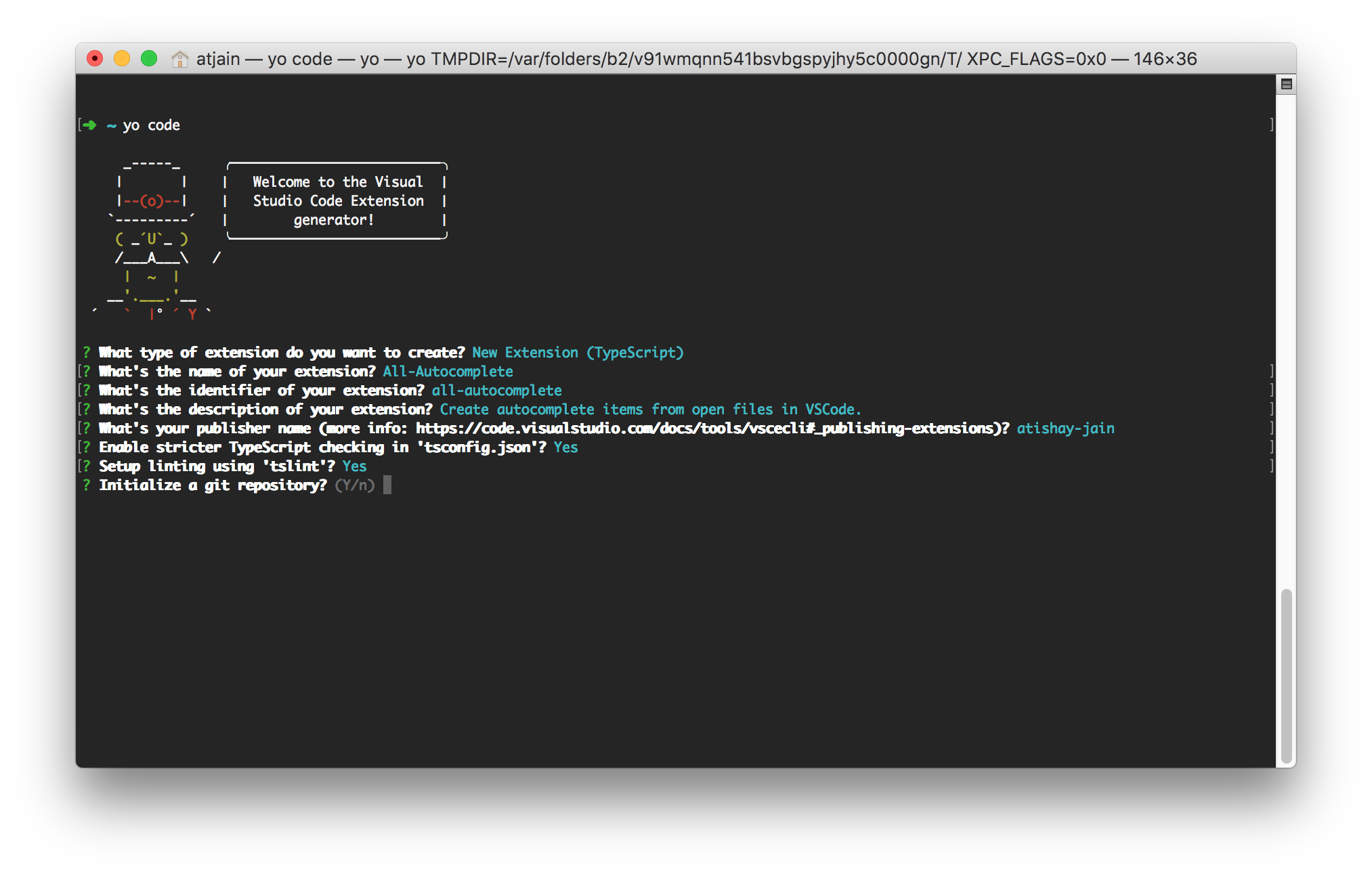
VS Code is slowly closing the gap between a text editor and an integrated development environment (IDE). At the core of this extremely versatile and flexible tool lies a wonderful API that provides an extensible plugin model that is relatively easy for JavaScript developers to build on. With my first extension, VS Code All Autocomplete, reaching 25K downloads, I wanted to share what I learned from the development and maintenance of it with all of you. Trivia! Visual Studio Code does not share any lineage with the Visual Studio IDE. Microsoft used the VS brand for their enterprise audience which has led to a lot of confusion. The application is just Code in the command line and does not work at all like Visual Studio. It takes more inspiration from TextMate and Sublime Text than Visual Stu...
CSS Tricks

Firefox Multi-Account Containers

It's an extension: Each Container stores cookies separately, so you can log into the same site with different accounts and online trackers can’t easily connect the browsing. A great idea for a feature if you ask me. For example, I have two Buffer accounts and my solution is to use different browsers entirely to stay logged into both of them. I know plenty of folks that prefer the browser version of apps like Notion, Front, and Twitter, and it's cool to have a way to log into the same site with multiple accounts if you need to — and without weird trickery. This is browsers competing on UI/UX features rather than web platform features, which is a good thing. Relevant: Opera Neon and Refresh. Direct Link to Article — PermalinkThe post Firefox Multi-Account Containers appeared first on CSS-T...