Everyone has special and perhaps, particular, tastes when it comes to their code editor. There are literally thousands of themes out there, and for good reason: a thing of beauty and enhancement to productivity for one can be a hindrance to another.
It’s been an item on my bucket list to create my own theme. I was coding very late the one night, well into the small hours of the morning. Everyone in my house was sleeping and so, as usual, the only light was the glow of my screen. I know it’s not necessarily healthy to code like this, but it’s literally the time I’m most productive: there are minimal distractions, I’m not dealing with work stuff, family stuff, friend stuff, or puppy stuff. I can focus.
I had some preferences set for the theme I had been using and, though they all worked well for daytime or plane rides, I always felt like something was missing for late night coding sessions. I decided it was time to craft my own theme.
We’ll talk first about the general process for creating a theme in case you’d like to create one of your own, and then we’ll dive into some of the research and testing that went into mine in particular to peek into the process.
Fire It Up
Before you do anything, you’re going to install vsce (short for Visual Studio Code Extensions) and establish yourself as a publisher. All of the instructions to do so are here. I know it looks like a lot, but it takes anywhere from 5-10 minutes, and then you’ll never have to do it again, for any extension you create.
Now that you’ve got that under your belt, here are the steps you need to start work.
First, you need to run:
npm install -g yo generator-codeThis makes the generator globally available on your machine (meaning you can now create a theme in any directory). You can then execute this command to kick off your theme:
yo codeYou will be prompted by a screen that looks like this:

Note that I’ve used the arrows here to navigate to the “New Color Theme” option. Note also that this is how you’d want to make any other extension.
When selecting this, it asks if this is a new theme or if we want to import from an existing one. We want to create a new one.

Next, you’ll have to answer a few other questions, including:
- What’s the extension’s name?
- What is the the identifier? (I just went with the name, that’s probably typical.)
- What is the the description? (I just put something silly in initially. Don’t worry, you can update this in your
package.jsonin the future.) - What’s the publisher’s name? (See earlier instructions.)
- What name should be shown to the user? (I used the same as the extension name.)
- Is this theme dark, light, or high contrast?
It will set you up with a base theme to start skinning your color preferences. The full scoop and all the details are here. More details about themes in general are here.
Test Drive
We have our base theme and we have some concepts for the palette. So, how do we test it out? When you open the directory with your theme, you can press fn + f5 on Mac (or just f5 on Windows) and a new window immediately pops open where you can test your theme! You’ll see in the original theme window that you now have a little control panel where you can reload, pause, and stop. Don’t forget to save before you do!

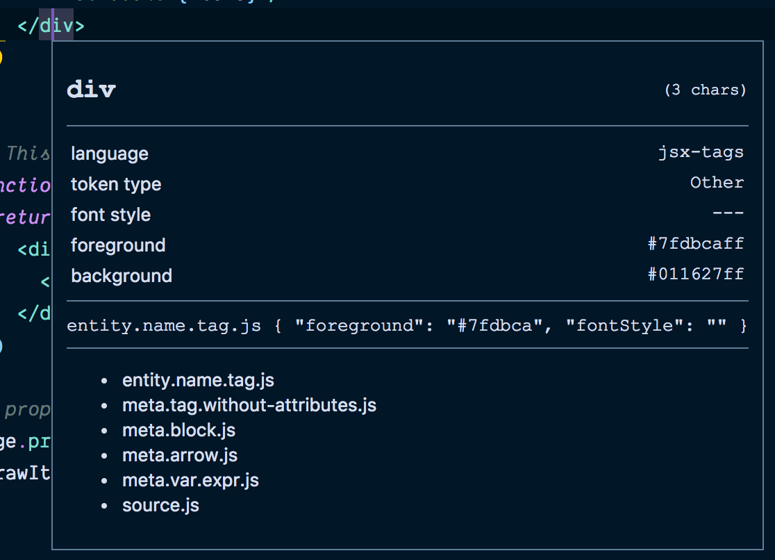
OK, now that you have the other window open, hit Command + Shift + P to get the command explorer. In there type, “Developer: Inspect TM Scopes” and you’ll see a prompt come up that allows you to look through all the tags and attributes: it will tell you their color, their font styles, and how you need to target it.

There is one problem, though. There are a lot of things in the editor you can’t target because VS Code will interpret that as you trying to drive the rest of the editor (i.e. the file viewer, the terminal, and the search boxes). Here are the two ways I found to figure out the rest of the scopes:
- This page is extremely helpful in understanding some of the base things you need to configure. In fact, you might want to start with some of these.
- There are DevTools! You can open them the same way you do with Chrome:
Command + Option + I. What I did was look for the color in the computed styles and look them up in the text editor to target them. You’ll notice that the default in the DevTools is RGBA, so you will have toShift + click on the colorto change it’s format until you get to the equivalent hex values. I could then scan through the matching colors in my theme json until I found the matching value and change it.
Another Small Tip!
When I first started to develop the theme, I thought I would try forking someone else’s theme as a starting point. I tried out Wes Bos’ Cobalt Two. Though I didn’t end up using it, one thing he had that I found valuable was a demos directory with examples of all of a whole slew of different languages. I started by moving his over, but realized quickly that the files weren’t long enough for my testing needs. So I created my own. In the course of correcting issues people filed, I also created a React stateless functional component example, a Ruby example, and of course I created a .vue single file component ? This is also helpful in maintenance because if people are seeing an issue on a file type I previously didn’t test on, they can PR the file into the demos directory, and I can target what they’re seeing. It makes duplication and testing really simple.
Research
Research for a code theme? Isn’t that over the top? Probably! But I was genuinely curious: what would work best for legibility for the vast majority of people, while still being something I liked?
Color and contrast
The first step was considering accessibility. I always liked how solarized themes made legibility a central theme to their palettes. I read about color retention and accessibility, and it turns out that men have a really high incidence of colorblindness (around 8% for men, 1% for women). The majority of programmers are men, so even though I am not colorblind, it was a no-brainer to craft the theme at least partially around including those with colorblindness. The most typical is red/green deficiency so I found a few good ways to test with my favorite being, funnily enough, a bit manual.
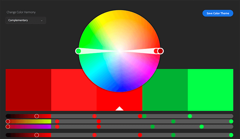
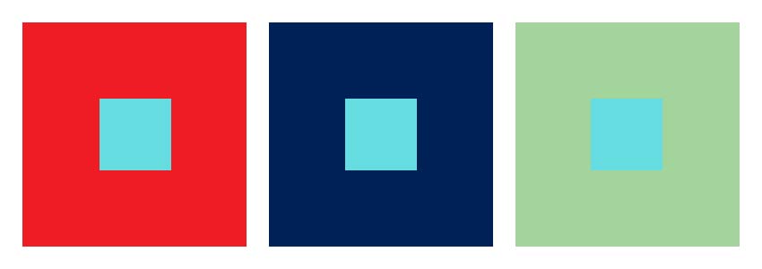
I originally started by testing random images to see if I could discern a pattern that I could match. One thing I noticed while testing was that complementary colors seemed to perform the best across all tests. However, if three colors needed to be tested at once, a triad color composition also produced good results.
If you’re unfamiliar with color relationships, Adobe Color CC (previously Kuler) makes it easier to visualize and you can even create a color palette directly in the editor.


It’s extremely important to know that a color is only a color in reference to another color. This is part of what makes crafting a color theme so difficult. Color isn’t static, it’s all about relationships. You’re probably a little familiar with this in terms of accessibility. A light green on a black may be accessible, but when you change it to a white background it no longer is.

Accessibility in color can be measured with a number of tools. Here are some of my favorites:
It’s also really nice to set up your palette for accessibility from the start. Color Safe is a great tool that helps with that.
I cover more details about color and perception in this post: A Nerd’s Guide to Color on the Web.
Colors and Reading Comprehension
Another piece of this was learning which colors, if any, had an effect on reading comprehension. In some studies, it’s been shown that black text on white background, such as used in some light themes, can be difficult for comprehension. The theory is that the use of overlays to change the text color has improved cognitive awareness for many, especially those with dyslexia and autism. However, these studies are controversial and it’s inconclusive whether the overlays are effective in comprehension or a preference.
There is a syndrome called Irlen, or Scotopic Sensitivity Syndrome (SSS) that is known to interfere with the ability to discern letters and words. It is a visual perception disability on the magnocellular level — the visual pathway that can help with scanning and comprehension. This has been thought to be connected to — reading with impairment under certain types of light, and some think it can affect up to 50% of people (again, this figure is controversial and inconclusive).
We’re still learning about SSS, but there are some studies that color overlays can help focus attention to the text and reduce eyestrain. The colors found to increase readability and contrast so far for those with SSS have been beige, goldenrod, green, pink and blue. Blue has shown thus far to have the strongest link for people with Reading Disability and Attention Deficit/Hyperactivity Disorder.
Despite the fact that these studies haven’t reached statistical signifigance from what I can gather, I couldn’t find evidence that there was any harm in following them, and it seemed safest to keep them in mind while developing the theme. I chose a dark theme with blue as the primary color and used the other colors that tested well in supportive and contrasting roles throughout the theme.
Other Theme Inspiration
There were a few palettes I looked at for inspiration. For example, I did an exploratory study into what kind of tone I wanted.
- Palenight Material: the reds and purples in my theme started with this one, and I adjusted the purples values.
- Dracula: this theme’s base was a bit darker and provided contrast to the pastels I wanted in my theme.
- Panda: I borrowed the turquoise color and adjusted it a bit.
I also looked at the work of Maggie Appleton quite a bit. I especially like her work on Egghead.io, which is amazing on every level.


Those greens and oranges are where I started with my palette. I made adjustments while working on accessibility. The blackest blue-black that’s in the lower right of the image became the base of my main background.
Decisions, Decisions
There were a lot of decisions to make at this point. Thankfully, my research was done. Remember, I wanted pastels, like the ones used in the Material Palenight, Panda and Dracula Dark themes. Specifically, I wanted to use beige, goldenrod, green, pink and blue based on what I had read in the research phase. But the most important part to me was contrast across the color spectrum. That’s what I felt some of the other themes lacked, even if they nailed the colors.
I went to work, creating blue and a golden color as the base standard for working across the color spectrum.
I used purple for keywords that are informative but I didn’t want to call out as strongly — if you’re trying to create contrast, you also need to consider what colors to make subtle so that it gives attention to what’s most important. If everything is important, nothing is. I also wanted to offset the fact that the purple had a shallow contrast by making it different in some other way. I did this with the use of italics. Some people like that, some hate it. I decided to buy a font called Dank Mono, similar to Operator Mono, or Fira Code (the latter being the free open source version), partially because I enjoyed the presentation of the italic glyphs. They also have font ligatures, which can be quite stylish. You set them in your user preferences with "editor.fontLigatures": true. Some people aren’t super into the italics, though, so I created a no italic version that people could switch to if it bothered them.
I wanted to call out state/data strongly because it tends to be important for me when when scanning code. I started with red because I had seen that in many other themes, but I couldn’t get away from the fact that my eyes would only go there and the fact that red is often associated with error states. So, instead, I used the strongest color against the background I had chosen, white, and italicized it to offset it even more. It also has the benefit of being a midpoint between blue and gold. I saved the red/orange distinction for React components, which needed to have some separation from the standard HTML elements.
Contrast is a zero-sum game: if everything is important, nothing is. I tried my best to be sure things that were conceptually similar or could fall back, did so that strong contrast was intentional and everything didn’t turn into a rainbow, because that hurts your ability to scan the document.
One such decision was to keep the sidebar contrast low in order to keep the focus on the editor. I found that if I tried to bring the contrast up in other parts of my editor, my eyes actually began to hurt. This can be a challenging thing about some accessibility- because not all humans are the same, things like color and font can become a spectrum rather than a hard rule.
After running a lot of tests, the compromise I decided on was to keep the theme to what I myself could use without strain, and update the readme with the preferences I would recommend for someone who was different from me and needed the contrast levels to be higher. If you go into your user settings in VS Code (Code > Preferences > Settings), in the righthand pane, you can add your own customizations. With the help of some people in the community who filed issues because they wanted this feature, we arrived at these possible color preference updates for those who need the contrast:
"workbench.colorCustomizations": {
  "activityBar.background": "#000C1D",
  "activityBar.border": "#102a44",
  "sideBar.background": "#001122",
  "sideBar.border": "#102a44",
  "sideBar.foreground": "#8BADC1"
},
You can actually drop any colors in here, this was just a suggestion for a starting point based on the existing theme colors. These workbench color customizations are really handy, they allow people to use a theme, and then make small tweaks as they feel they need them. If you’re using a theme and it’s allllmost perfect but not quite, you can always make small changes this way.
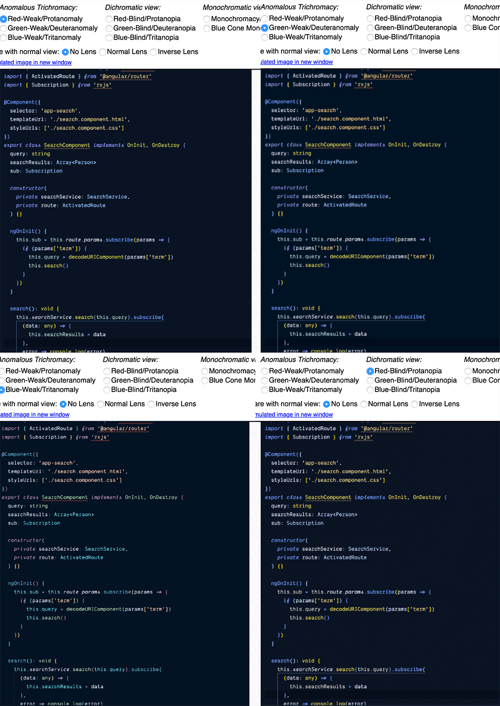
There were hundreds of other small decisions I made over the course of creating it (and am still making now that I’m maintaining it), but after I had made a good amount of tweaks, I would check my work against the colorblind simulator. It wasn’t terribly easy getting it to work right in every language for every setting, but I did my best. This is where that demo folder came in really handy. Now that it’s launched, if someone needs particular language support, I can encourage them to PR the folder so that I can support it.
Here’s an example Angular file:

…and here are some of the tests I ran to determine if there was enough contrast. Remember, what I was looking for was contrast across the color spectrum for meaningful distinctions, and slight contrast for things that require less attention:

It took a good amount of tests to get something that didn’t become monochrome, especially across languages. The amount of color combinations possible are a bit endless, and it’s pretty difficult to make something that works perfectly in every scenario. That’s why I spent a lot of time crafting the demo folder and making small tweaks to try to cover as much ground as possible.
Bugfixes
I launched it! Everyone party! ?
The most helpful thing to me were the contributions of people using the theme and letting me know their pain points by logging issues in the GitHub repo. It’s hard to see every failure scenario across a theme, and have so far had 16 subsequent releases to fix over 50 bugs so far, some with help from the community. The more people who let me know what they’re seeing, the better the theme gets. Not everything gets in of course — there are times when people want things that conflict with other requests, so I have to make a judgement call in some cases. Still, this this is rare and the majority of feedback so far have been very clean-cut and actionable.
That’s it! If you’d like to check out the theme, it’s available here for free. I hope you found this useful, either for background into the theme and the decisions that were made, or for a process in creating your own.
The post Creating a VS Code Theme appeared first on CSS-Tricks.
Source: CSS-tricks.com