In this article, I’ll cover the process of data visualization with the Webix JavaScript UI Library. The most convenient and intuitive form of visualized data is, naturally, a chart. That’s why we’ll talk about different types of charts in this article.
Webix is JavaScript UI library of HTML5 components that you can use for creating mobile and desktop web apps. There’s a wide variety of components from a simple button to the SpreadSheet Widget that can be used for developing Excel-like office web applications. Besides the UI components collection, there’s an event handling mechanism, offline mode support, and a bunch of development tools. For example, you can create your own skins using the Skin Builder, use the visual designer for drag-and-drop UI creation, or experiment with the code in online source code playground.
##Webix Initialization
To use Webix, you should include one CSS and one JavaScript file to your project. You can either download the library package or use the CDN. To do so, you can add the following code to your HTML file:
index.html
<head>
    <script src="http://cdn.webix.com/edge/webix.js"></script>
    <link rel="stylesheet" href="http://cdn.webix.com/edge/webix.css"></link>
</head>
The full library package contains some extra content such as web skins collection and a bunch of samples which are useful if you want to check various stuff you can build with this library.
After the required files are included, you can initialize the UI:
<body>
    <script>
        webix.ui({
            /_ application code _/
        })
    </script>
</body>
That’s all the info you should know to create your first Webix application.
##Charts Basics
To learn how the things work, let’s build a simple Bar Chart and add some features to it.
###Data Types
Before we create our first chart let’s take a look at the possible data types. There’s a possibility to use JSON format. You can insert the following code between the <script></script> tags of your index.html file or store them in a separate JavaScript file and include it to your project.
index.html
var sales = [
    { id: 1, sales: 20, year: "05"},
    { id: 2, sales: 55, year: "06"},
    { id: 3, sales: 40, year: "07"},
    { id: 4, sales: 78, year: "08"},
    { /_ more items _/}
];
Another opportunity is XML. Here’s an example of an XML file that you can use:
<?xml version="1.0" encoding="UTF-8"?>
<data>
    <item id="1" sales="20" year="05"/>
    <item id="2" sales="55" year="06"/>
    <item id="3" sales="40" year="07"/>
    <item id="4" sales="78" year="08"/>
    <!-- some more items -->
</data>
###Creating a Simple Bar Chart
After you get the data you want to visualize, you can create the chart. Since we don’t want to build the Webix application, it will be better to create a DIV container to work with. Add the following code between the <body></body> tags:
index.html
<body>
    <div id="my_chart" style="width:600px;height:250px;margin:20px"></div>
    <script>
        var sales = [
            /_ ... _/
        ];
        webix.ui({
            /_ application code _/
        })
    </script>
</body>
After all the preparations are done we can create a basic chart. You can insert the following code between the <script></script> tags:
index.html
webix.ui({
    view: "chart",
    container:"my_chart",
    type: "bar",
    value: "#sales#",
    xAxis: {
        template: "'#year#"
    },
    yAxis: {
        start: 0,
        end: 100,
        step: 10,
    },
    data: sales,
    /_more properties_/
 })
Let’s consider the properties used in the above code:
If you want to use an XML file instead, here’s the needed code that you can use instead the data property:
index.html
webix.ui({
/_ other properties _/
url: "data.xml",
datatype: "xml"
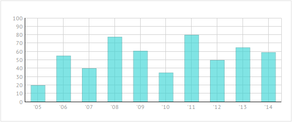
})This code is enough to visualize your data in the form of a chart:

As you can see, Webix uses a rainbow-like palette by default. If it’s not what you expected, there’s always a possibility to change the default properties.
###Bar Configuration and Coloring
To change the color of the bar, you should use the color property. You can either change the color of a single bar by adding the color definition to the sales array:
index.html
var sales = [
    { id: 1, sales: 20, year: "05", color: "#2CD2D2"},
]
Or use one and the same color for the whole chart by adding the color property to the chart definition code:
index.html
webix.ui({
    view: "chart",
    type: "bar",
    /_ some more properties _/
    color: "#2CD2D2"
})
Other handy properties are radius and alpha. You can use them to change the bar’s rounding and opacity.
For example, you can add the following code to the widget’s definition:
index.html
webix.ui({
    /_ chart properties _/
    alpha: 0.6,
    radius: 0
})
After you change the color and use these two properties you’ll get something like this:
###Charts Combination
It may be useful to combine two or more charts to compare the data they represent. To create a combination of charts, you can use the series property.
Here’s how it works:
series: [
    { /_ 1-st chart properties _/},
    { /_ 2-nd chart properties _/}
]
The main idea behind this approach is that you should use the properties are common for all of your charts within the chart definition (like we did it before). But the properties that relate to a particular chart from the chart series should be placed within the series array.
Here’s an example of how you can change the definition of your chart:
index.html
webix.ui({
view: "chart",
type: "bar",
/_ some more properties _/
series: [
{ value: "#sales#",
color: "#2CD2D2",
},
{ value: "#sales2#",
color: "#E8CE27",
}
],
data: sales
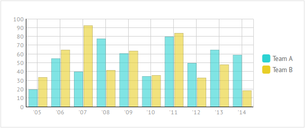
})In this code we’ve defined two charts that use different data and have different colors.
The result is shown below:

###Legend and Tooltips
To avoid misunderstanding, you can use Map Legend and Tooltips.
Map legend can be pretty useful in case you combine two or more charts. To create a legend, you should add the legend property to your chart configuration.
Let’s add the one to our chart to let users know what these bars are about. Add the folloeing code to the chart definition:
index.html
webix.ui({
    /_ chart definition _/
    legend: {
        values: [
            {text: "Team A", color: "#2CD2D2"},
            {text: "Team B", color: "#E8CE27"}
        ],
        align: "right",
        valign: "middle",
        width: 80
    },
})
Let’s take a look at the result:
Another handy feature is a tooltip. You can use it to show the exact value of a bar and some extra information, if any. Let’s add this feature to our chart. If you use a combination of charts like in our example, you should create as many tooltips as many charts you have.
Here’s an example:
index.html
webix.ui({
    /_ chart definition _/
    series: [
        { /_ first chart properties _/           tooltip:{
            template:"Team A. Year: 20#year#. Sales: #sales#"
          }
        },
        { /_ second chart properties _/
          tooltip:{
            template:"Team B. Year: 20#year#. Sales: #sales2#"
          }
        }
    ]
})
The tooltip property creates a popup message that appears on the screen when a mouse cursor is over the related chart item. The template property defines the contents of this message.
We’ve created a string that takes the year and sales values from the data source. Don’t be confused with 20#year# definition. Remember that the year values are as follows: 05, 06, 07, and so on. So, such format only makes everything clear.
Now, when you mouse over the bar you’re interested in, you’ll see a tooltip:

If you want to check out the source code and the demo, you can visit this snippet page. Feel free to play with the code!
##Different Types of Charts
Obviously there are much more chart types than a good old bar chart. To switch between different types of charts, you have to change the value of the type property.
###Horizontal Bar Chart and Stacked Bar Chart
Let’s start from the easy one. You can turn your vertical bar chart into the Horizontal Bar Chart in a few steps. First of all, you need to change the type property:
index.html
webix.ui({
view: "chart",
type: "barH",
/_ more properties _/
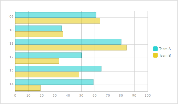
})Remaining steps are swapping the X-axis and Y-axis properties and changing the size of the DIV container.
And it’s done:
Let’s talk a little bit more about chart combinations. If you plan to compare three or more graphs, the overall picture may become a little bit messy. Here’s a possible solution for you. You can use Stacked Bar Chart. To turn your chart into the Stacked Bar one, just change the type property:
index.html
webix.ui({
    view: "chart",
    type: "stackedBar",
    /_ more properties _/
})
The result is shown below:

To turn this chart into a horizontal one, use this property:
index.html
webix.ui({
    view: "chart",
    type: "stackedBarH",
    /_ more properties _/
})
###Area Chart and Stacked Area Chart
Let’s move further. Another way of data presentation is Area Chart. It looks pretty much the same as the Bar Chart, so there’s not so much work you should do to create this one:
index.html
webix.ui({
view: "chart",
type:"area",
/_ more properties _/
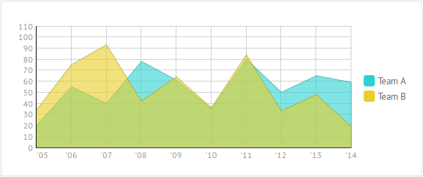
})And here it is:
And remember that there’s always a possibility to combine a couple of charts in the form of a Stacked Area Chart:
index.html
webix.ui({
    view: "chart",
    type:"stackedArea",
    /_ more properties _/
})
Here’s the result:

###Line Chart and Spline Chart
The configuration process for the Line Chart differs from the previous ones, so let’s take a look at it in detail.
Once again, you should use the type property to create a Line Chart. But there are some unique properties. Unlike the previous chart types, Line and Spline Charts use the line property to define the chart appearance.
Moreover, there’s another property you may find handy. If you look closer at the bar charts we created earlier, you’ll notice that the first bar is drawn with an offset. To change this behavior, you can use the offset property.
Assuming this knowledge, you can create a combination of the Line Charts:
index.html
webix.ui({
    view: "chart",
    type: "line",
    offset: 0,
    /_ some more properties _/
    series: [
        { value: "#sales#",
          line: {
            color: "#2CD2D2",
            width: 3
          },         },

        { value: "#sales2#",
          line: {
            color: "#E8CE27",
            width: 3
          },
        }
    ],
})
Here’s the result:

You can build the Spline chart in a pretty much the same way. Just use the type: “spline” setting and you’ll get something like this:

###Pie, 3DPie, and Donut Charts
Pie, 3D Pie, and Donut Charts are similar to each other. The main difference between them is their appearance that is defined by the type property.
Let’s start from the pie chart:
index.html
webix.ui({
    view:"chart",
    type: "pie",
    value: "#sales#",
    pieInnerText:"#sales#",
    legend: {
        template:"20#year#",
        align:"right",
        valign:"middle",
        width:60
    },
    data: sales
})
This code doesn’t differ much from the Bar Chart we’ve created earlier. But this time there’s a pieInnerText property that allows setting a template for pie inner labels.
The result is shown below:

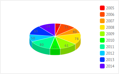
Or you can prefer the 3D Pie chart. To do so, use the type:”pie3d” setting:
If you think that using legend along with pie chart is not the best decision, you can always choose the label property.
Let’s use it with the Donut Chart:
index.html
webix.ui({
    view: "chart",
    type: "donut",
    label: "'#year#"
    /_ some more properties _/
})
The result is as follows:

##Conclusion
Webix allows creating charts without wasting a lot of your precious time. It’s not so hard to change the chart type. Just change the value of its type property and you’ll see what happens. This article covers the basics of the chart creation process. There’s a possibility to change the foreground color, redefine the appearance of markers that present chart data items, etc. To learn which type of chart is better for this or that situation, read this article about different types of charts.
And, of course, Webix is not limited to charts functionality. It provides you with a wide variety of controls, such as Buttons, Sliders, Forms and other useful stuff. Combining the available components you can create an online app that gives users a possibility to visualize the existing data in different ways, make on-the-fly changes and who knows what else. If you want to take a look at how different Webix components can work together, check GanttPRO. It’s an online service that was build with Webix components. It allows visualizing the workflow in the form of a Gantt chart.
Well, seems that all for now. Hope you liked it.
Source: Scotch.io