What I mean by “CSS images” is images that are created using only HTML elements and CSS. They look as if they were SVGs drawn in Adobe Illustrator but they were made right in the browser. Some techniques I’ve seen used are tinkering with border radii, box shadows, and sometimes clip-path. You can find a lot of great examples if you search daily css images” on CodePen. I drew some myself, including this Infinity Gauntlet, but in one element with only backgrounds and minimal use of other properties.
Let’s take a look at how you can create CSS images that way yourself.
The Method
Understanding the shorthand background syntax as well as how CSS gradients work is practically all you need to draw anything in one element. As a review, the arguments are as follows:
background: <'background-color'> || <image> || <position> [ / <size> ]? || <repeat> || <attachment> || <origin> || <clip>;They can occur in any order except that there must be a / between the position and size. We must keep those two arguments in that order as well, or else we’ll get unexpected results. Not all of these need to be included, and for this purpose we won’t be using the color, repeat, attachment, origin, or clip arguments. This leaves us with image, size, and position. Since backgrounds repeat by default, however, we must place background-repeat: no-repeat; right under everything in background (if certain backgrounds ought to be repeat, we can use repeating-linear-gradient() and repeating-radial-gradient()). In that case, the skeleton CSS will be this:
.image {
  background: <image> <position> / <size>;
  background-repeat: no-repeat;
}
We can even use multiple sets of background arguments! Therefore, we can stack and separate them with commas like this:
.image {
  background:
    <image> <position> / <size>,
    <image> <position> / <size>,
    <image> <position> / <size>;
  background-repeat: no-repeat;
}
The structure above is the basis of how we’ll draw images—one line per shape. Keep in mind that the rendering order is the opposite of how absolutely- or fixed-position elements are ordered. The first one will show up on top instead of at the bottom. In other words, the circles (radial gradients) below would be rendered from bottom to top (blue on bottom, red on top).
.circles {
	background:
    radial-gradient(7em 7em at 35% 35%, red 50%, transparent 50%),
    radial-gradient(7em 7em at 50% 50%, gold 50%, transparent 50%),
    radial-gradient(7em 7em at 65% 65%, blue 50%, transparent 50%);
  background-repeat: no-repeat;
  width: 240px;
  height: 240px;
}
Drawing
We’ll use Sass (SCSS) to draw these images so we can make use of variables for a color palette. That will make the code shorter, easier to read and change darkened or lighter variants of colors. We could use variables in normal CSS instead and forget Sass, but due to Internet Explorer’s lack of support, let’s stick with Sass. To explain how this works, we’ll experiment with shapes using both linear and radial gradients.
Setting Up a Color Palette
Our palette will consist of RGB or HSL colors. I’ll explain later why to keep the colors in either of those formats. For this example, we’ll use RGB.
$r: rgb(255,0,0); // hsl(0,100%,50%)
$o: rgb(255,128,0); // hsl(32,100%,50%)
What I like to do to keep code short and easy to read is use a minimum of one letter to represent each color (e.g. $r for red). If using darker or lighter shades of one color, I add a d before the base letter or letters for dark or an l for light. I’d use $dr for dark red and $lr for light red. If there’s a need for more than two other shades, then I add a number at the end to indicate the shade level. For instance, $dr1 for dark red, $dr2 for a darker red, and $lr1 for light red, $lr2 for a lighter red. Such a palette would look like this (with dark first, normal next, and light last):
$dr1: rgb(224,0,0);
$dr2: rgb(192,0,0);
$r: rgb(255,0,0);
$lr1: rgb(255,48,48);
$lr2: rgb(255,92,92);
Setting the Scale and Canvas
We’ll use em units for the image dimensions so that the image can easily be resized proportionally. Since 1em is equal to the element’s font size, each unit of the image will be adjusted accordingly if changed. Let’s set a font size of 10px and set both the width and height to 24em. Units of 10px is the easiest to think in because if you mentally do the math, you instantly get 240 × 240px. Then just to see where the edges of the canvas are, we’ll use a 1px gray outline.
$r: rgb(255,0,0); // hsl(0,100%,50%)
$o: rgb(255,128,0); // hsl(32,100%,50%)

.image {
  background-repeat: no-repeat;
  font-size: 10px;
  outline: 1px solid #aaa;
  width: 24em;
  height: 24em;
}
Be mindful about using smaller font sizes, however; browsers have a minimum font size setting (for accessiblity reasons). If you set a font size of 4px and the minimum is 6px, it’ll be forced at 6px.
Furthermore, you can enable responsiveness just by using calc() and viewport units. Perhaps we can use something like calc(10px + 2vmin) if desired, but let’s stick with 10px for now.
Drawing Shapes
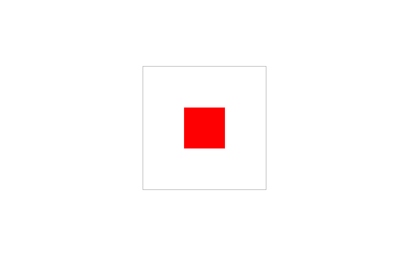
The fun part begins here. To draw a square that is 8 × 8em in the center, we use a linear-gradient() with two same-colored stops.
.image {
  background:
    linear-gradient($r, $r) 50% 50% / 8em 8em;
  ...
}
To mold it into something more like a trapezoid, set an angle of 60deg. At the same time, let’s add $T for transparent to our palette and then place both the stops for $r and $T at 63% (right before the bottom-right corner gets cut off).
$T: transparent;

.image {
  background:
    linear-gradient(60deg,$r 63%, $T 63%) 50% 50% / 8em 8em;
  ...
}
Setting both stops at the same value makes the slanted side as crisp as the others. If you look at it more closely though, it appears to be pixelated:
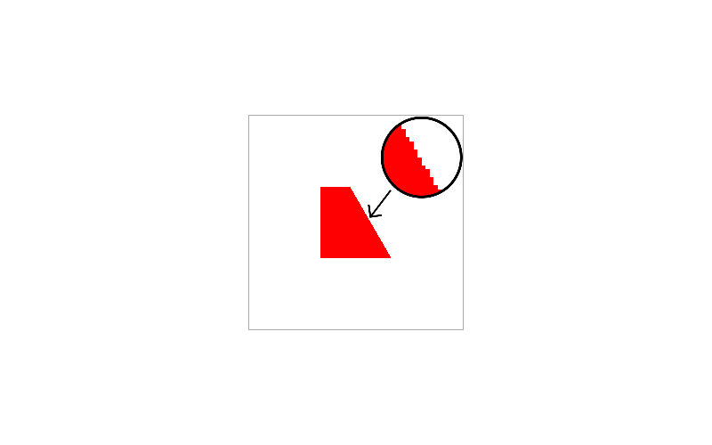
To correct this, we slightly adjust one of the stops (by 1% or roughly so) so that the edge is smooth enough. So, let’s change $r’s 63% to 62%.
This will be an issue with round edges as well while working with radial gradients, which we’ll see later. If you’re viewing this in a browser other than Safari, everything looks great even if transitioning to a non-transparent color instead (say orange). The problem with transitioning to transparent in Safari is that you’ll notice a bit of black lining at the slanted side.

This is because the transparent keyword in Safari is always black transparency, and we see some black as a result. I really wish Apple would fix this, but they never will. For the time being, let’s add a new $redT variable for red transparency under $r. Scrap the $T we used for transparent as we’ll no longer use it.
$rT: rgba(255,0,0,0); // hsla(0,100%,50%,0)Then let’s replace transparent with $redT. This takes care of our Safari problem!
.image {
  background:
    linear-gradient(60deg,$r 62%, $rT 63%) 50% 50% / 8em 8em;
  ...
}
If you’ve been wondering why we weren’t using hex colors, Internet Explorer and Edge don’t support the #rgba and #rrggbbaa notations (yep, hex has had an alpha channel since late 2016 if you never knew), and we want this to work as cross-browser as possible. We also want to stay consistent with our choice of color format.
Now let’s move the shape vertically to 20% and draw an orange circle of the same dimensions. Also, add another variable for its transparent version. For the smooth edge, insert a 1% gap between the solid and transparent oranges.
$oT: rgba(255,128,0,0); // hsla(32,100%,50%,0)

.image {
  background:
    linear-gradient(60deg,$r 62%, $rT 63%) 50% 20% / 8em 8em,
    radial-gradient(8em 8em at 50% 80%, $o 49%, $oT 50%);
  ...
}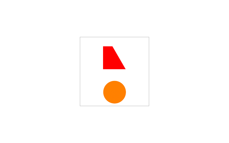
To maintain consistency with our sizing, the second color stop should be at 50% instead of 100%.
Positioning Shapes
The way gradients are positioned is based on whether the unit is fixed or a percentage. Suppose we turn both of the gradients into squares and try to place them all the way across the div horizontally.
.image {
  background:
    linear-gradient($r, $r) 24em 20% / 8em 8em,
    linear-gradient($o, $o) 100% 80% / 8em 8em;
  ...
}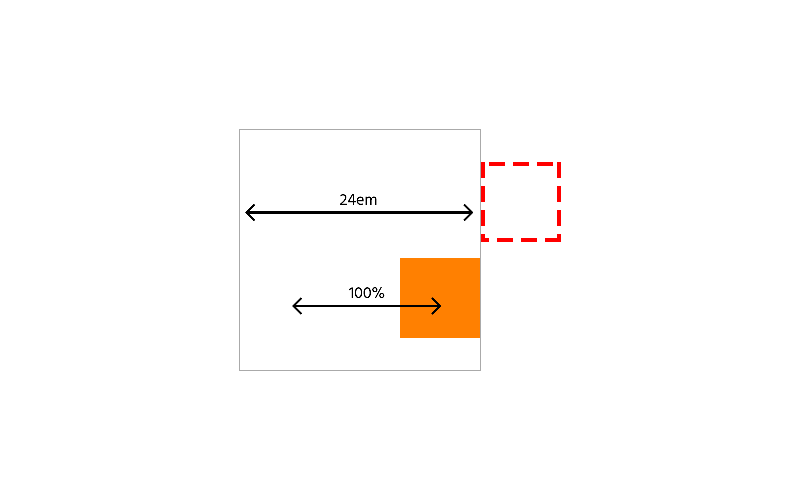
The red square ends up completely off canvas (outlined), and the right side of the orange square touches the other side. Using fixed units is like placing absolutely positioned elements or drawing shapes in HTML5 canvas. It’s true in that sense that the point of origin is at the top left. When using percent and a set background size, the div gets “fake padding” of half the background size. At the same time, the background’s point of origin is centered (not to be confused with background-origin, which regards box corners).
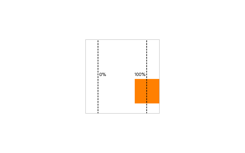
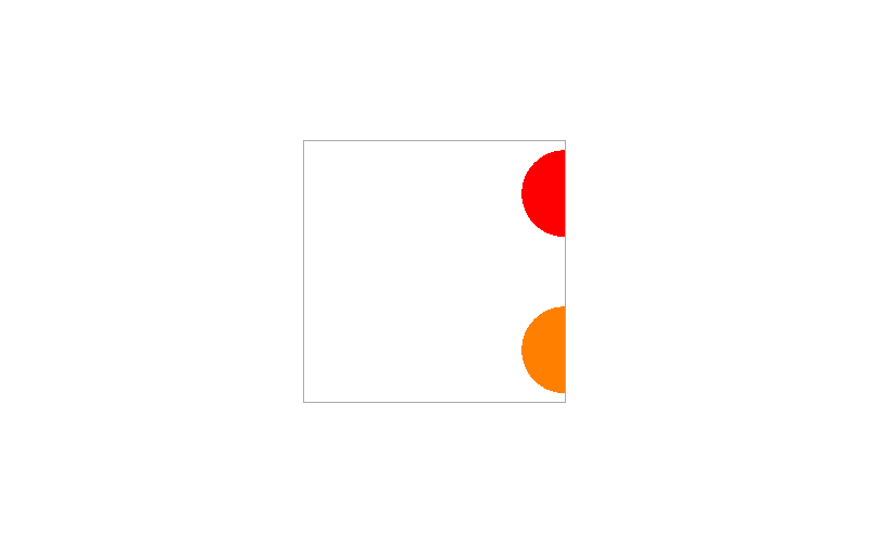
Now, if we turned these gradients into radial gradients as circles and applied the same x-positions 24em and 100%, both end up at the other side cut in half. This is because the point of origin is always in the center if we write the background like so:
.image {
	background:
  	radial-gradient(8em 8em at 24em 20%, $r 49%, $rT 50%),
  	radial-gradient(8em 8em at 100% 80%, $o 49%, $oT 50%);
	...
}
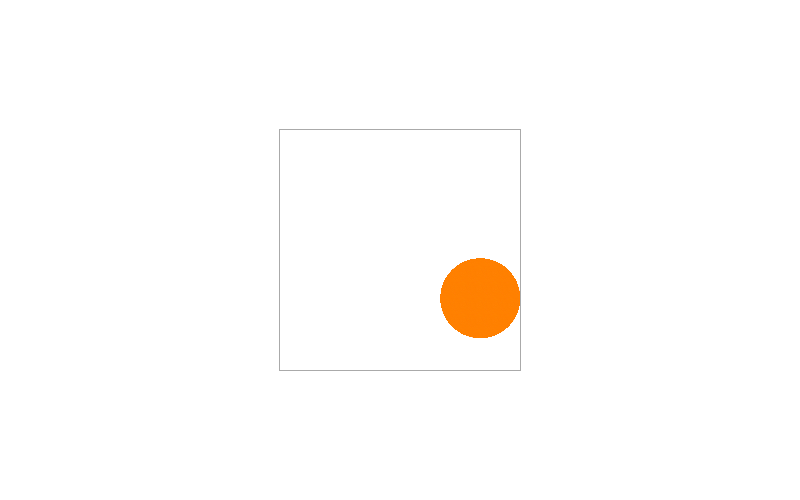
If we rewrote the background so that the position and size are after the gradient and used 100% 100% at center, they’ll be positioned like the linear gradients. The red one ends up outside, and the orange one touches the right edge. The “fake padding” occurs once again with the orange.
.image {
  background:
    radial-gradient(100% 100% at center, $r 49%, $rT 50%) 24em 20% / 8em 8em,
    radial-gradient(100% 100% at center, $o 49%, $oT 50%) 100% 80% / 8em 8em;
  ...
}
There’s no single proper way to position shapes, but to place it like an absolutely or fixed positioned HTML element, use fixed units. If in need of a quick way to place a shape (using the position / size parameters) in the dead center, 50% is the best option as the shape’s origin will be its center. Use 100% if it should touch the very right side.
Sizing Shapes
Sizing in CSS backgrounds works as we’d expect, but it’s still influenced by the kind of unit used for position—fixed or percent. If we take our squares again and change their width to 10em, the red one expands to the right, and the orange one expands sideways.
.image {
  background:
    linear-gradient($r, $r) 12em 20% / 10em 8em,
    linear-gradient($o, $o) 50% 80% / 10em 8em;
  ...
}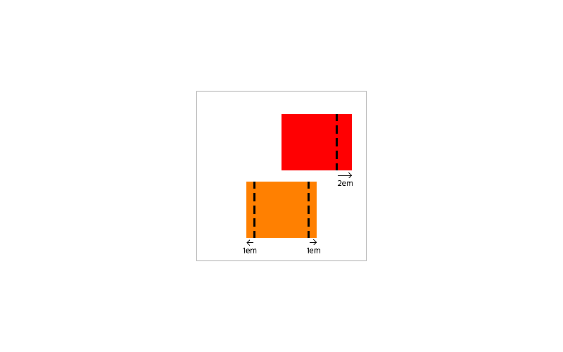
If we used em units for the y-position, the shape will grow downwards or shrink upwards after changing height. If we use a percentage, then it will expand both vertical directions.
A moment ago, we looked at two ways to draw circles with radial gradients. The first way is to specify the width and height between the ( and at and then the position after that:
.image {
  background:
    radial-gradient(8em 8em at 50% 50%, $r 49%, $rT 50%);
  ...
}
The second way is to use 100% 100% in the center and then give the position and size:
.image {
  background:
    radial-gradient(100% 100% at 50% 50%, $r 49%, $rT 50%) 50% 50% / 8em 8em;
  ...
}
These methods both draw circles but will result in different outputs because:
- The first way occupies the whole div since there was no real background position or size.
- Giving a real position and size to the second sets it a bounding box. Consequently, it’ll behave just like a linear gradient shape.
Suppose we replaced $rT with $o. You’ll see that the orange will cover what was white or shapes under it (if we added any) for the first way. Using the second way, you’ll easily notice the bounding box revealed by the orange.
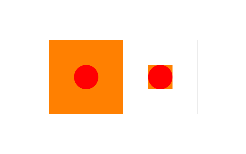
Additionally, the purpose of 100% 100% instead of using circle or ellipse is to allow the circle to occupy whole bounding box. It even gives us complete control over its dimensions. That way, it’ll remain the same if you change the 50% 50% position to something else. If using one of the two keywords, the edge of the circle stops only about 71% of the way when centered and becomes more distorted if its position is adjusted. For example, here’s what happens when we change the x-position to 0 for circle and ellipse:

In the long run, you can reimagine the syntax as radial-gradient(width height at x y) or radial-gradient(100% 100% at x-in-bounding-box y-in-bounding-box) x y / width height. If you are drawing just a circle or oval, you can simplify the code with the first way. If drawing part of a circle or part of a ring, then the second way comes into play. There will be many applications of that in the examples we’ll create next.
Examples
Ready to draw something for real now? We’ll walk through three examples step by step. The first two will be static—one with lots of half-circles and the other dealing with some rounded rectangles. The last example will be smaller but focused on animation.
Static Image
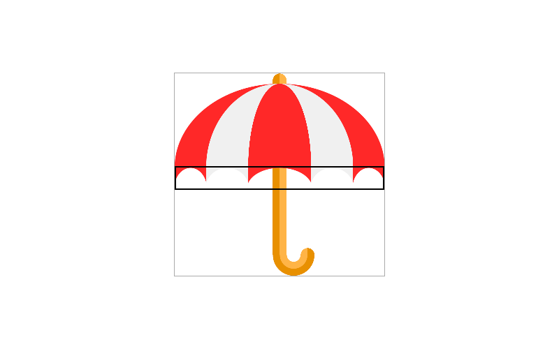
This parasol will be our first static image:

We’ll use a palette with red ($r and $rT), white ($w and $wT), orange ($o and $oT), and dark orange ($do and $doT).
$r: rgb(255,40,40);
$rT: rgba(255,40,40,0);

$w: rgb(240,240,240);
$wT: rgba(240,240,240,0);

$o: rgb(255,180,70);
$oT: rgba(255,180,70,0);

$do: rgb(232,144,0);
$doT: rgba(232,144,0,0);
Let’s set up our drawing area of 30 × 29em.
.parasol {
  // background to go here
  background-repeat: no-repeat;
  font-size: 10px;
  outline: 1px solid #aaa;
  width: 30em;
  height: 29em;
}
Above the background-repeat, we’ll begin drawing the parts of the parasol. First, add the gradients that make up the pole (since neither overlap one another, the bottom-to-top order doesn’t matter at this point):
.parasol {
   background:
     // 1
     radial-gradient(200% 200% at 100% 100%, $do 49%, $doT 50%) 14em 0 / 1em 1em,
     radial-gradient(200% 200% at 0% 100%, $o 49%, $oT 50%) 15em 0 / 1em 1em,
     // 2
     linear-gradient(90deg, $do 50%, $o 50%) 14em 1em / 2em 25em,
     // 3
     radial-gradient(100% 200% at 50% 0, $oT 0.95em, $o 1em, $o 1.95em, $do 2em, $do 2.95em, $doT 3em) 14em 26em / 6em 3em,
     // 4
     radial-gradient(200% 200% at 100% 100%, $o 49%, $oT 50%) 18em 25em / 1em 1em,
     radial-gradient(200% 200% at 0% 100%, $do 49%, $doT 50%) 19em 25em / 1em 1em;
   ...
}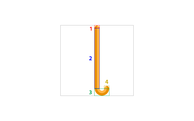
- To draw each side of the top of the pole, we used quarters of a circle that are 1 × 1em. To make them occupy their bounding boxes, we used circles that are twice the size (
200% 200%) positioned at the bottom right and at the bottom left. We could also use keyword pairs likeright bottomorleft bottom, but it’s shorter to use the percent equivalents. Notice the 1% gaps between the stops to ensure smoothness. - For the long part, we used a long rectangle with an abrupt dark orange-to-orange. There’s no need for a fractional tiny gap since we’re not working with a curve or slant.
- This part of the pole is a bit trickier to draw than the others because we have to maintain the 2em diameter. To draw this arc, we use a box of 6 × 3em so that there is a 2em space between the ends that are also 2em. Then we use a radial gradient at the center top where each stop occurs 1em each (and spread by 0.05em for smoothness).
- The last two are just like the first except they are positioned at the right end of the arc so that they seamlessly fit. Also, the colors swap places.
Then above the previous gradients, add the following from bottom to top to draw the top of the umbrella without the pointy ends:
.parasol {
  background:
    radial-gradient(100% 200% at 50% 100%, $r 50%, $rT 50.25%) 50% 1.5em / 9em 12em,
    radial-gradient(100% 200% at 50% 100%, $w 50%, $wT 50.25%) 50% 1.5em / 21em 12em,
    radial-gradient(100% 200% at 50% 100%, $r 50%, $rT 50.25%) 50% 1.5em / 30em 12em,
  ...
}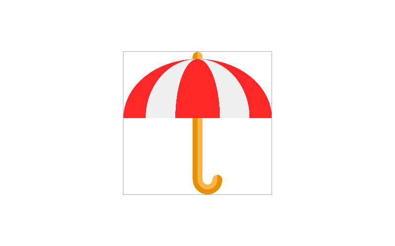
To draw the half circles that make up this part, we used a gradient size of 100% 200%, which makes each diameter fit into its background width but have twice the height and centered at the bottom. By ordering them bottom to top so that the largest is on bottom and smallest on top, we get the curves we want.
As our stack of gradients grows taller, it’ll become difficult after a while to identify which background or group of backgrounds corresponds to what part of the image. So to make it easier to pin them down, we can split them into groups lead by a comment describing what each group is for. Right now, we have split the stack to groups for the top of the parasol and the pole.
.parasol {
  background:
    /* top */
    radial-gradient(100% 200% at 50% 100%, $r 50%, $rT 50.25%) 50% 1.5em / 9em 12em,
    radial-gradient(100% 200% at 50% 100%, $w 50%, $wT 50.25%) 50% 1.5em / 21em 12em,
    radial-gradient(100% 200% at 50% 100%, $r 50%, $rT 50.25%) 50% 1.5em / 30em 12em,

    /* pole */
    radial-gradient(200% 200% at 100% 100%, $do 49%, $doT 50%) 14em 0 / 1em 1em,
    radial-gradient(200% 200% at 0% 100%, $o 49%, $oT 50%) 15em 0 / 1em 1em,
    linear-gradient(90deg, $do 50%, $o 50%) 14em 1em / 2em 25em,
    radial-gradient(100% 200% at 50% 0, $oT 0.95em, $o 1em, $o 1.95em, $do 2em, $do 2.95em, $doT 3em) 14em 26em / 6em 3em,
    radial-gradient(200% 200% at 100% 100%, $o 49%, $oT 50%) 18em 25em / 1em 1em,
    radial-gradient(200% 200% at 0% 100%, $do 49%, $doT 50%) 19em 25em / 1em 1em;
    ...
}
Then, in between the top and the pole, we’ll add the next chunk of backgrounds to render the pointy ends. To determine the widths of each segment, we must get the distance between each point where red and white meet. They all must add up to 30em.
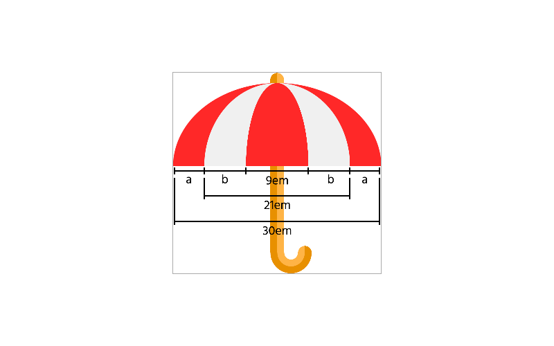
Starting with the white and narrowest red half circles, we subtract the red’s width of 9em from the white’s width of 21em and divide the result by 2 to get the width of the two white segments (point “b” in the figure). So, the result would be 6em ( b = (21 – 9) / 2 = 6 ). Then the middle red segment would be 9em (21 – (6 + 6) = 9). What we have left now are the outer red segments (point “a” in the figure). Subtract the sum of what we have now from the width of the larger red half circle and divide that result by 2. That would be make the value of point a: (30em – (6 + 6 + 9)) / 2 = 4.5em.
.parasol {
   background:
     ...
     /* pointy ends */
     radial-gradient() 0 13.5em / 4.5em 3em,
     radial-gradient() 4.5em 13.5em / 6em 3em,
     radial-gradient() 50% 13.5em / 9em 3em,
     radial-gradient() 19.5em 13.5em / 6em 3em,
     radial-gradient() 25.5em 13.5em / 4.5em 3em,
     ...
}
To draw the half circles similar to how we drew the top part, we start with the transparent counterpart of the color for each shape so that they resemble arc bridges. We’ll also add an extra 5% to each gradient width (not the background box width) so that each point formed by adjacent backgrounds won’t overly sharp and thin.
.parasol {
   background:
     ...
     /* pointy ends */
     radial-gradient(105% 200% at 50% 100%, $rT 49%, $r 50%) 0 13.5em / 4.5em 3em,
     radial-gradient(105% 200% at 50% 100%, $wT 49%, $w 50%) 4.5em 13.5em / 6em 3em,
     radial-gradient(105% 200% at 50% 100%, $rT 49%, $r 50%) 50% 13.5em / 9em 3em,
     radial-gradient(105% 200% at 50% 100%, $wT 49%, $w 50%) 19.5em 13.5em / 6em 3em,
     radial-gradient(105% 200% at 50% 100%, $rT 49%, $r 50%) 25.5em 13.5em / 4.5em 3em,
     ...
}
Finally, you’ll no longer need that 1px solid #aaa outline. Our parasol is complete!
See the Pen Parasol by Jon Kantner (@jkantner) on CodePen.
Something With Rounded Rectangles
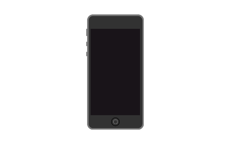
This next example will be an old iPhone model in which there are more details than the newer models. The thing about this one is the two rounded rectangles, which are the outside and middle of the home button.

The palette will consist of black ($bk and $bkT) for the home button edge, dark gray ($dg and$dgT) for the body, gray ($g and $gT) for the camera and speaker, light gray ($lg and $lgT) for the outside border, blue ($bl and $blT) for the camera lens, and a very dark purple ($p and $pT) for the screen.
$bk: rgb(10,10,10);
$bkT: rgba(10,10,10,0);

$dg: rgb(50,50,50);
$dgT: rgba(50,50,50,0);

$g: rgb(70,70,70);
$gT: rgba(70,70,70,0);

$lg: rgb(120,120,120);
$lgT: rgba(120,120,120,0);

$bl: rgb(20,20,120);
$blT: rgba(20,20,120,0);

$p: rgb(25,20,25);
$pT: rgba(25,20,25,0);
Let’s set up our canvas at 20 × 40em and use the same font size we used for the parasol, 10px:
.iphone {
  // background goes here
  background-repeat: no-repeat;
  font-size: 10px;
  outline: 1px solid #aaa;
  width: 20em;
  height: 40em;
}
Before we begin drawing our first rounded rectangle, we need to think about our border radius, which will be 2em. Also, we want to leave some space at the left for the lock switch and volume buttons, which will be 0.25em. For this reason, the rectangle will be 19.75 × 40em. Considering the 2em border radius, we’ll need two linear gradients intersecting each other. One must have a width of 15.75em (19.75em – 2 × 2), and the other must have a height of 36em (40em – 2 × 2). Position the first 2.25em from the left and then the second 0.25em from the left and 2em from the top.
.iphone {
  background:
    /* body */
    linear-gradient() 2.25em 0 / 15.75em 40em,
    linear-gradient() 0.25em 2em / 19.75em 36em;
  ...
}
Since the light gray border will be 0.5em thick, let’s make each gradient stop immediately switch from light gray ($lg) to dark gray ($dg) and vice versa at 0.5em and 0.5em before the end (40em – 0.5 = 39.5em for the first gradient, 19.75em – 0.5 = 19.25em for the second). Set an angle of 90deg for the second to make it go horizontal.
.iphone {
  background:
    /* body */
    linear-gradient($lg 0.5em, $dg 0.5em, $dg 39.5em, $lg 39.5em) 2.25em 0 / 15.75em 40em,
    linear-gradient(90deg, $lg 0.5em, $dg 0.5em, $dg 19.25em, $lg 19.25em) 0.25em 2em / 19.75em 36em;
  ...
}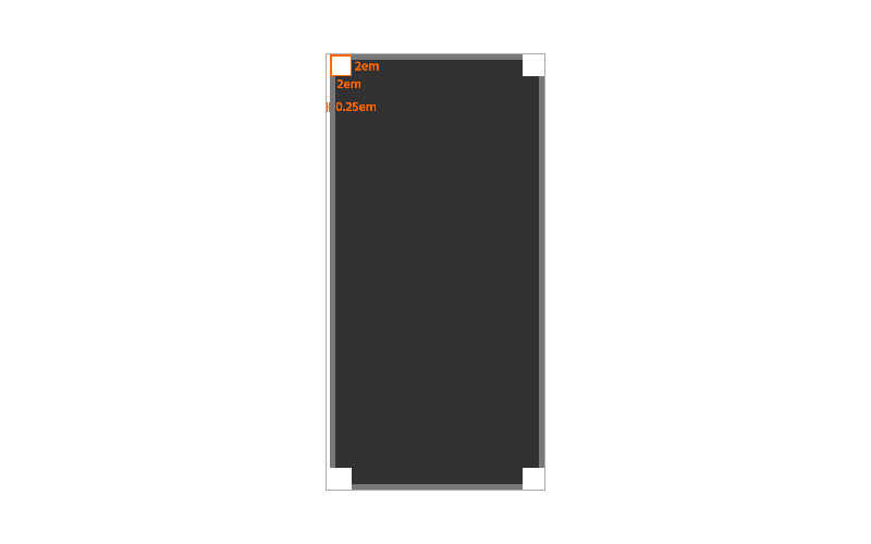
In each square corner, as indicated by the orange box in the figure, we’ll place the rounded edges. To create those shapes, we use radial gradients that are twice the size of their bounding boxes and located in each corner. Insert them above the body backgrounds.
.iphone {
  background:
    /* corners */
    radial-gradient(200% 200% at 100% 100%, $dg 1.45em, $lg 1.5em, $lg 50%, $lgT 51%) 0.25em 0 / 2em 2em,
    radial-gradient(200% 200% at 0% 100%, $dg 1.45em, $lg 1.5em, $lg 50%, $lgT 51%) 18em 0 / 2em 2em,
    radial-gradient(200% 200% at 100% 0%, $dg 1.45em, $lg 1.5em, $lg 50%, $lgT 51%) 0.25em 38em / 2em 2em,
    radial-gradient(200% 200% at 0% 0%, $dg 1.45em, $lg 1.5em, $lg 50%, $lgT 51%) 18em 38em / 2em 2em,
    ...
}
To get the 0.5em-thick light gray ends, think about where the gradient starts and then do the math. Because the light gray is at the end, we subtract 0.5em from 2em to properly place first stop. For the smoothness, we take off a tiny bit from the first 1.5em and add 1% to the second 50% so that the round edges blend in with the flat edges.
Now if we enlarged the image by changing the font size to 40px or more, we notice seams between the rounded and flat edges (circled in orange):

Since they appear to be so tiny, we can easily patch them by going back to the body backgrounds and slightly altering the gradient stops as long as everything still looks right when changing the font size back to 10px.
.iphone {
  background:
    /* body */
    linear-gradient($lg 0.5em, $dg 0.55em, $dg 39.5em, $lg 39.55em) 2.25em 0 / 15.75em 40em,
    linear-gradient(90deg, $lg 0.5em, $dg 0.55em, $dg 19.175em, $lg 19.25em) 0.25em 2em / 19.75em 36em;
  ...
}
Then in one linear gradient, we’ll add the lock switch and volume buttons to fill the 0.25em space on the left. If a 1px space is going to happen between the buttons and body, we can add a tiny bleed of 0.05em to the background width (making it 0.3em) so that it won’t stick out into the dark gray.
.iphone {
  background:
    /* volume buttons */
    linear-gradient($lgT 5em, $lg 5em, $lg 7.5em, $lgT 7.5em, $lgT 9.5em, $lg 9.5em, $lg 11em, $lgT 11em, $lgT 13em, $lg 13em, $lg 14.5em, $lgT 14.5em) 0 0 / 0.3em 100%,
    ...
}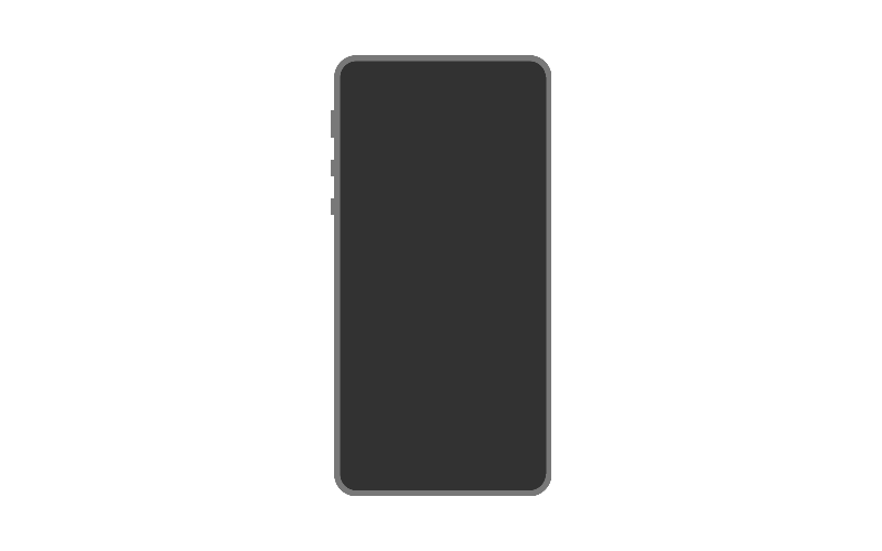
It looks like we could’ve used three light gray-to-light gray gradients, but since it was possible, only one was needed. It’s just lots of sudden transitions between the transparent and opaque light grays running downwards.
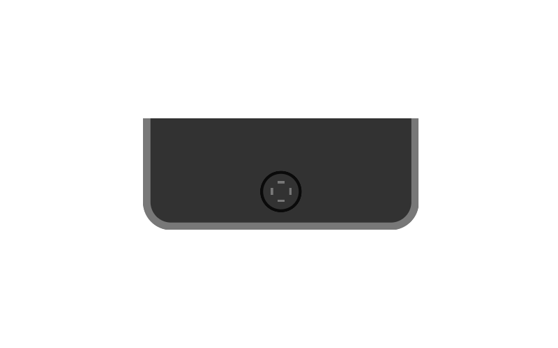
Next, let’s add the edge of the home button as well as the flat edges of the square inside it. Now the square inside home button will be 1.5 × 1.5em and follow basically the same procedure as the body: two intersecting linear gradients and radials to fill the corners. To place them horizontally in the center, calc() comes in handy. 50% + 0.125em will be the expression; if we centered only the phone body, there will be 0.125em spaces on each side. Therefore, we move it 0.125em more to the right. The same x-positioning will apply to the upper two backgrounds.
.iphone {
  background:
    /* home button */
    linear-gradient() calc(50% + 0.125em) 36.5em / 0.5em 1.5em,
    linear-gradient() calc(50% + 0.125em) 37em / 1.5em 0.5em,
    radial-gradient(3em 3em at calc(50% + 0.125em) 37.25em, $bkT 1.25em, $bk 1.3em, $bk 49%, $bkT 50%),
    ...
}
Similar to how we shaded the linear gradient parts of the phone body, the stops will begin and end with light gray but with transparent in the middle. Notice we left 0.05em gaps between each gray-to-transparent transition (and vice versa). Just like the corners of the body, this is to ensure the blend between a round corner and flat end inside.
.iphone {
  background:
    /* home button */
    linear-gradient($lg 0.15em, $lgT 0.2em, $lgT 1.35em, $lg 1.35em) calc(50% + 0.125em) 36.5em / 0.5em 1.5em,
    linear-gradient(90deg, $lg 0.15em, $lgT 0.2em, $lgT 1.3em, $lg 1.35em) calc(50% + 0.125em) 37em / 1.5em 0.5em,
    radial-gradient(3em 3em at calc(50% + 0.125em) 37.25em, $bkT 1.25em, $bk 1.3em, $bk 49%, $bkT 50%),
    ...
}
By the way, because the outlines will be so small as you’ve seen earlier, we can better see what we’re doing by increasing the font size to at least 20px. It’s like using the zoom tool in image editing software.
Now to get the corners of the gray square to exactly where they should be, let’s focus on the x-position first. We start with calc(50% + 0.125em), then we add or subtract the width of each piece, or should I say the square’s border radius. These backgrounds will go above the last three.
.iphone {
  background:
    /* home button */
    radial-gradient(200% 200% at 100% 100%, $lgT 0.3em, $lg 0.35em, $lg 0.48em, $lgT 0.5em) calc(50% + 0.125em - 0.5em) 36.5em / 0.5em 0.5em,
    radial-gradient(200% 200% at 0% 100%, $lgT 0.3em, $lg 0.35em, $lg 0.48em, $lgT 0.5em) calc(50% + 0.125em + 0.5em) 36.5em / 0.5em 0.5em,
    radial-gradient(200% 200% at 100% 0%, $lgT 0.3em, $lg 0.35em, $lg 0.48em, $lgT 0.5em) calc(50% + 0.125em - 0.5em) 37.5em / 0.5em 0.5em,
    radial-gradient(200% 200% at 0% 0%, $lgT 0.3em, $lg 0.35em, $lg 0.48em, $lgT 0.5em) calc(50% + 0.125em + 0.5em) 37.5em / 0.5em 0.5em,
    ...
}
Then the screen will be a 17.25 × 30em rectangle. Just like parts of the home button, we’ll horizontally center it using calc(50% + 0.125em). From the top, it’ll be 5em.
.iphone {
  background:
    /* screen */
    linear-gradient($p, $p) calc(50% + 0.125em) 5em / 17.25em 30em,
    ...
}
Lastly, we’ll add the camera and speaker. The camera is a straightforward 1 × 1 blue-to-gray radial with no fancy calculations. The pure-gray speaker though will be a bit more involved. It will be a 5 × 1em rectangle and have a 0.5em border radius. To draw that, we first draw a rectangle with the first 4ems of the width and center it with calc(50% + 0.125em). Then we use 0.5 × 1em half circles in which the gradient positions are 100% 50% and 0% 50%. The best way to position these left and right of the rectangle is to use some new calc() expressions. For the left, we’ll subtract half the rectangle width and half the half circle width from the body center (50% + 0.125em - 2em - 0.25em). The right will follow the same pattern but with addition, so 50% + 0.125em + 2em + 0.25em.
.iphone {
  background:
    /* camera */
    radial-gradient(1em 1em at 6.25em 2.5em, $bl 0.2em, $g 0.21em, $g 49%, $gT 50%),
    /* speaker */
    radial-gradient(200% 100% at 100% 50%, $g 49%, $gT 50%) calc(50% + 0.125em - 2em - 0.25em) 2em / 0.5em 1em,
    radial-gradient(200% 100% at 0% 50%, $g 49%, $gT 50%) calc(50% + 0.125em + 2em + 0.25em) 2em / 0.5em 1em,
    linear-gradient($g, $g) calc(50% + 0.125em) 2em / 4em 1em,
    ...
}
Remove the gray outline around the div, and the iPhone is complete!
See the Pen iPhone by Jon Kantner (@jkantner) on CodePen.
Animated Images
You might be thinking you could use background-position to animate these sorts of images, but you can only do so much. For instance, it’s impossible to animate the rotation of an individual background by itself. In fact, background-position animations don’t typically perform as well as transform animations, so I don’t recommend it.
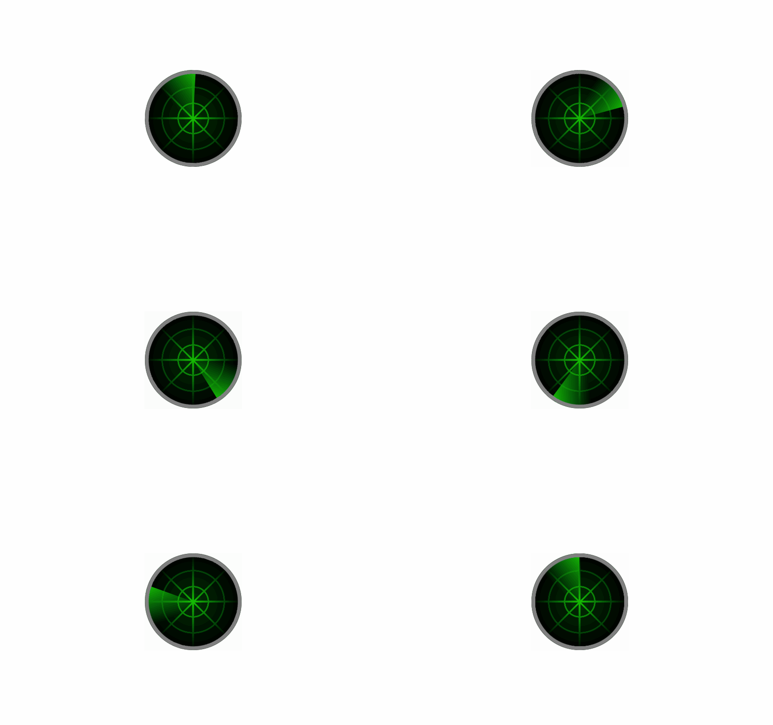
To animate any part of an image any way we wish, we can let the :before or :after pseudo-elements be responsible for that part. If we need more selections, then we can revert to multiple child divs, yet not needing one for each little detail. For our animated image example, we’ll create this animated radar:
We draw the static part first, which is everything except the gray frame and rotating hand. Before that, let’s supply our palette (note: We won’t need a $dgnT for $dgn) and base code.
$gn: rgb(0,192,0);
$gnT: rgba(0,192,0,0);
$dgn: rgb(0,48,0);
$gy: rgb(128,128,128);
$gyT: rgba(128,128,128,0);
$bk: rgb(0,0,0);
$bkT: rgba(0,0,0,0);

.radar {
  background-repeat: no-repeat;
  font-size: 10px;
  outline: 1px solid #aaa;
  width: 20em;
  height: 20em;
}
Since this image is going to be completely round, we can safely apply a border radius of 50%. Then, we can use a repeating radial gradient to draw the rings—about 1/3 way apart from each other.
.radar {
  background:
    /* rings */
    repeating-radial-gradient($dgn, $dgn 2.96em, $gn 3em, $gn 3.26em, $dgn 3.3em);
  background-repeat: no-repeat;
  border-radius: 50%;
  ...
}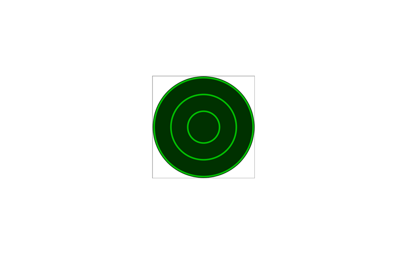
Also note the extra $dgn at the start. For repeating gradients to start, end, and loop as expected, we need to specify the starting color at 0 (or without 0).
Unlike the previous example, we’re not using calc() to center the lines because Internet Explorer will render the whole thing awkwardly when we use a pseudo-element later. To draw four 0.4em lines that intersect one other in the center, know that half of the line should be half the div at 10em. So then, we subtract and add half of 0.4 (0.4 / 2 = 0.2) on each side. In other words, the left of the green should be 9.8em, and the right should be 10.2em. For the 45deg diagonals though, we must multiply 10em by the square root of 2 to get their center (10 × √2 ≈ 14.14). It’s the length of the longest side of a 10em right triangle. As a result, the sides of each diagonal would be approximately at 13.94 and 14.34em.
.radar {
  background:
    /* lines */
    linear-gradient($gnT 9.8em, $gn 9.8em, $gn 10.2em, $gnT 10.2em),
    linear-gradient(45deg,$gnT 13.94em, $gn 13.98em, $gn 14.3em, $gnT 14.34em),
    linear-gradient(90deg,$gnT 9.8em, $gn 9.8em, $gn 10.2em, $gnT 10.2em),
    linear-gradient(-45deg,$gnT 13.94em, $gn 13.98em, $gn 14.3em, $gnT 14.34em),
  ...
}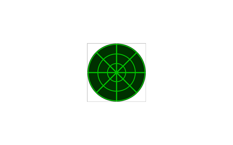
To prevent the pixelation of the diagonals, we left a tiny 0.04em gap between green and transparent green. Then, to create some lighting, add this transparent-to-black radial gradient:
.radar {
  background:
    /* lighting */
    radial-gradient(100% 100%, $bkT, $bk 9.9em,$bkT 10em),
  ...
}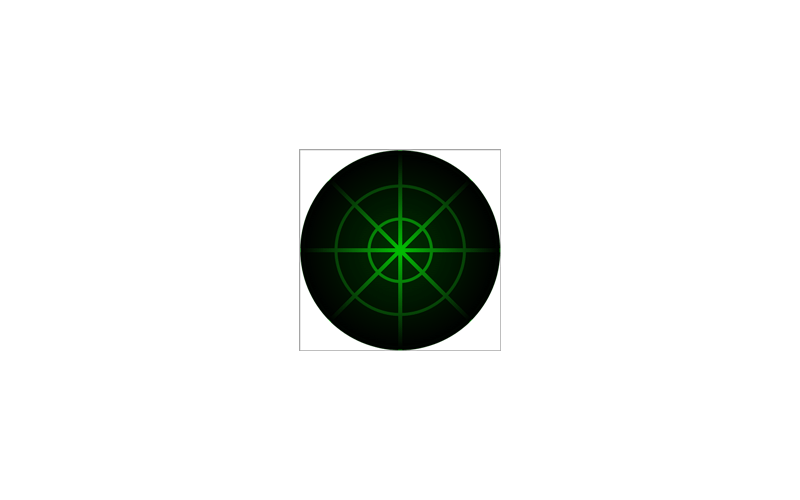
That completes the static part of the radar. Now we draw the gray frame and hand in another background stack under :before and add the animation. There’s a reason we didn’t include the frame here. Because the hand container should fit the whole div, we don’t want it to overlap the frame.
This pseudo-element shall fill the space, and to ensure it stays in there, let’s absolutely position it. We’ll use the same border radius so that it stays round while animated in Safari.
.radar {
  ...
  position: relative;
  &:before {
    background-repeat: no-repeat;
    border-radius: 50%;
    content: "";
    position: absolute;
    width: 100%;
    height: 100%;
  }
}
Then, to draw the hand, we make it half the size of its container and keep it at the top left corner. Finally, on top of that, we draw the frame.
.radar {
  ...
  &:before {
    animation: scan 5s linear infinite;
    background:
      /* frame */
      radial-gradient($gyT 9.20em, $gy 9.25em, $gy 10em, $gyT 10.05em),
      /* hand */
      linear-gradient(45deg, $gnT 6em, $gn) 0 0 / 50% 50%;
    ...
  }
}

@keyframes scan {
  from {
    transform: rotate(0);
  }
  to {
    transform: rotate(1turn);
  }
}
Now our little gadget is complete!
See the Pen Radar by Jon Kantner (@jkantner) on CodePen.
Benefits (Plus a Drawback)
This approach of drawing CSS images has several advantages. First, the HTML will be very lightweight compared to a rasterized image file. Second, it’s great for tackling images that are impossible to draw well without using experimental properties and APIs that might not be widely supported.
It’s not to say that this method is better than using a parent element nested with children for the shapes. There is a drawback though. You have to give up being able to highlight individual shapes using the browser dev tools. You’ll need to comment and uncomment a background to identify which it is. As long as you group and label each chunk of backgrounds, you can find that particular background faster.
Conclusion
In a nutshell, the method for drawing of CSS images we’ve covered in this post allows us to:
- Set up a palette made up of variables for the colors.
- Disable the background repeat, set a scale with
font-size, and a canvas width and height inemunits for the target element. - Use a temporary
outlineto show the edges as we work. - Draw each shape from bottom to top because backgrounds are rendered in that order. The
backgroundsyntax for each shape followsimage position / size(with or without the position and size).
There’s a lot of thinking outside the box going on as well as experimentation to get the desired result. The three examples we created were just enough to demonstrate the concept. We’ve looked at how we order each background, drawing parts of circles, rounded rectangles, and slightly adjusting gradient stops for smooth edges. To learn more, feel free to dissect and study other examples I’ve made in this CodePen collection!
The post Drawing Images with CSS Gradients appeared first on CSS-Tricks.
Source: CSS-tricks.com