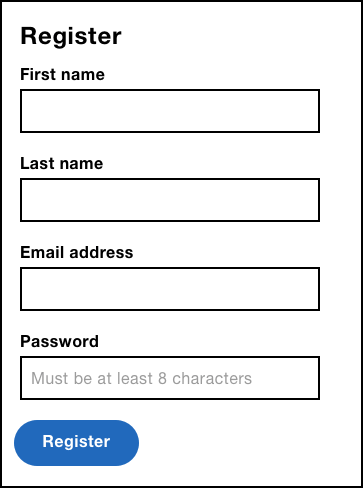
Despite the registration form’s basic appearance, there are many things to consider: the primitive elements that make up a form (labels, buttons, and inputs), ways to reduce effort (even on small forms like this), all the way through to form validation.
In choosing such a simple form, we can zoom in on the foundational qualities found in well-designed forms.
How It Might Look
The form is made up of four fields and a submit button. Each field is made up of a control (the input) and its associated label.
Here’s the HTML:
<form>
  <label for="firstName">First name</label>
  <input type="text" id="firstName" name="firstName">
  <label for="lastName">Last name</label>
  <input type="text" id="lastName" name="lastName">
  <label for="email">Email address</label>
  <input type="email" id="email" name="email">
  <label for="password">Create password</label>
  <input type="password" id="password" name="password" placeholder="Must be at least 8 characters">
  <input type="submit" value="Register">
</form>
Labels are where our discussion begins.
Labels
In Accessibility For Everyone, Laura Kalbag sets out four broad parameters that improve the user experience for everyone:
- Visual: make it easy to see.
- Auditory: make it easy to hear.
- Motor: make it easy to interact with.
- Cognitive: make it easy to understand.
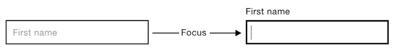
By looking at labels from each of these standpoints, we can see just how important labels are. Sighted users can read them, visually-impaired users can hear them by using a screen reader, and motor-impaired users can more easily set focus to the field thanks to the larger hit area. That’s because clicking a label sets focus to the associated form element.

For these reasons, every control that accepts input should have an auxiliary <label>. Submit buttons don’t accept input, so they don’t need an auxiliary label — the value attribute, which renders the text inside the button, acts as the accessible label.
To connect an input to a label, the input’s id and label’s for attribute should match and be unique to the page. In the case of the email field, the value is “email”:
html
<label for="email">Email address</label>
<input id="email">
Failing to include a label means ignoring the needs of many users, including those with physical and cognitive impairments. By focusing on the recognized barriers to people with disabilities, we can make our forms easier and more robust for everyone.
For example, a larger hit area is crucial for motor-impaired users, but is easier to hit for those without impairments too.
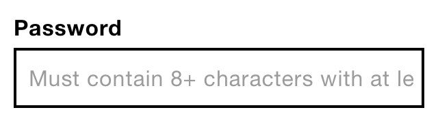
Placeholders
The placeholder attribute is intended to store a hint. It gives users extra guidance when filling out a field — particularly useful for fields that have complex rules such as a password field.
As placeholder text is not a real value, it’s grayed out so that it can be differentiated from user-entered values.

Unlike labels, hints are optional and shouldn’t be used as a matter of course. Just because the placeholder attribute exists doesn’t mean we have to use it. You don’t need a placeholder of “Enter your first name” when the label is “First name” — that’s needless duplication.

Placeholders are appealing because of their minimal, space-saving aesthetic. This is because placeholder text is placed inside the field. But this is a problematic way to give users a hint.
First, they disappear when the user types. Disappearing text is hard to remember, which can cause errors if, for example, the user forgets to satisfy one of the password rules. Users often mistake placeholder text for a value, causing the field to be skipped, which again would cause errors later on. Gray-on-white text lacks sufficient contrast, making it generally hard-to-read. And to top it off, some browsers don’t support placeholders, some screen readers don’t announce them, and long hint text may get cut off.
That’s a lot of problems for what is essentially just text. All content, especially a form hint, shouldn’t be considered as nice to have. So instead of using placeholders, it’s better to position hint text above the control like this:
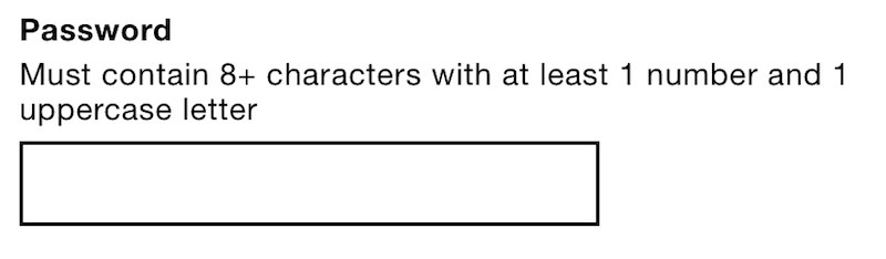
<div class="field">
  <label for="password">
  <span class="field-label">Password</span>
  <span class="field-hint">Must contain 8+ characters with at least 1 number and 1 uppercase letter.</span>
  </label>
  <input type="password" id="password" name="password">
</div>
The hint is placed within the label and inside a <span> so it can be styled differently. By placing it inside the label it will be read out by screen readers, and further enlarges the hit area.
As with most things in design, this isn’t the only way to achieve this functionality. We could use ARIA attributes to associate the hint with the input:
<div class="field">
  <label for="password">Password</label>
  <p class="field-hint" id="passwordhint">Must contain 8+ characters with at least 1 number and 1 uppercase letter.</p>
  <input type="password" id="password" name="password" aria-describedby="passwordhint">
</div>
The aria-describedby attribute is used to connect the hint by its id — just like the for attribute for labels, but in reverse. It’s appended to the control’s label and read out after a short pause. In this example, “password [pause] must contain eight plus characters with at least one number and one uppercase letter.”
There are other differences too. First, clicking the hint (a <p> in this case) won’t focus the control, which reduces the hit area. Second, despite ARIA’s growing support, it’s never going to be as well supported as native elements. In this particular case, Internet Explorer 11 doesn’t support aria-describedby. This is why the first rule of ARIA is not to use ARIA:
“If you can use a native HTML element or attribute with the semantics and behaviour you require already built in, instead of re-purposing an element and adding an ARIA role, state or property to make it accessible, then do so.”
Float Labels
The float label pattern by Matt Smith is a technique that uses the label as a placeholder. The label starts inside the control, but floats above the control as the user types, hence the name. This technique is often lauded for its quirky, minimalist, and space-saving qualities.
Unfortunately, there are several problems with this approach. First, there is no space for a hint because the label and hint are one and the same. Second, they’re hard to read, due to their poor contrast and small text, as they’re typically designed. (Lower contrast is necessary so that users have a chance to differentiate between a real value and a placeholder.) Third, like placeholders, they may be mistaken for a value and could get cropped.
And float labels don’t actually save space. The label needs space to move into in the first place. Even if they did save space, that’s hardly a good reason to diminish the usability of forms.
“Seems like a lot of effort when you could simply put labels above inputs & get all the benefits/none of the issues.”
— Luke Wroblewski on float labels
Quirky and minimalist interfaces don’t make users feel awesome — obvious, inclusive, and robust interfaces do. Artificially reducing the height of forms like this is both uncompelling and problematic.
Instead, you should prioritize making room for an ever-present, readily available label (and hint if necessary) at the start of the design process. This way you won’t have to squeeze content into a small space.
We’ll be discussing several, less artificial techniques to reduce the size of forms shortly.
The Question Protocol
One powerful and natural way to reduce the size of a form is to use a question protocol. It helps ensure you know why you are asking every question or including a form field.
Does the registration form need to collect first name, last name, email address and password? Are there better or alternative ways to ask for this information that simplify the experience?
In all likelihood, you don’t need to ask for the user’s first and last name for them to register. If you need that information later, for whatever reason, ask for it then. By removing these fields, we can halve the size of the form. All without resorting to novel and problematic patterns.
No Password Sign-In
One way to avoid asking users for a password is to use the no password sign-in pattern. It works by making use of the security of email (which already needs a password). Users enter only their email address, and the service sends a special link to their inbox. Following it logs the user into the service immediately.

Not only does this reduce the size of the form to just one field, but it also saves users having to remember another password. While this simplifies the form in isolation, in other ways it adds some extra complexity for the user.
First, users might be less familiar with this approach, and many people are worried about online security. Second, having to move away from the app to your email account is long-winded, especially for users who know their password, or use a password manager.
It’s not that one technique is always better than the other. It’s that a question protocol urges us to think about this as part of the design process. Otherwise, you’d mindlessly add a password field on the form and be done with it.
Passphrases
Passwords are generally short, hard to remember, and easy to crack. Users often have to create a password of more than eight characters, made up of at least one uppercase and one lowercase letter, and a number. This micro-interaction is hardly ideal.
“Sorry but your password must contain an uppercase letter, a number, a haiku, a gang sign, a hieroglyph, and the blood of a virgin.”
— Anonymous internet meme
Instead of a password, we could ask users for a passphrase. A passphrase is a series of words such as “monkeysinmygarden” (sorry, that’s the first thing that comes to mind). They are generally easier to remember than passwords, and they are more secure owing to their length — passphrases must be at least 16 characters long.
The downside is that passphrases are less commonly used and, therefore, unfamiliar. This may cause anxiety for users who are already worried about online security.
Whether it’s the no password sign-in pattern or passphrases, we should only move away from convention once we’ve conducted thorough and diverse user research. You don’t want to exchange one set of problems for another unknowingly.
Field Styling
The way you style your form components will, at least in part, be determined by your product or company’s brand. Still, label position and focus styles are important considerations.
Label Position
Matteo Penzo’s eye-tracking tests showed that positioning the label above (as opposed to beside) the form control works best.
“Placing a label right over its input field permitted users to capture both elements with a single eye movement.”
But there are other reasons to put the label above the field. On small viewports there’s no room beside the control. And on large viewports, zooming in increases the chance of the text disappearing off screen.
Also, some labels contain a lot of text, which causes it to wrap onto multiple lines, which would disrupt the visual rhythm if placed next to the control.
While you should aim to keep labels terse, it’s not always possible. Using a pattern that accommodates varying content — by positioning labels above the control — is a good strategy.
Look, Size, and Space
Form fields should look like form fields. But what does that mean exactly?
It means that a text box should look like a text box. Empty boxes signify “fill me in” by virtue of being empty, like a coloring-in book. This happens to be part of the reason placeholders are unhelpful. They remove the perceived affordance an empty text box would otherwise provide.
This also means that the empty space should be boxed in (bordered). Removing the border, or having only a bottom border, for example, removes the perceived affordances. A bottom border might at first appear to be a separator. Even if you know you have to fill something in, does the value go above the line or below it?
Spatially, the label should be closest to its form control, not the previous field’s control. Things that appear close together suggest they belong together. Having equal spacing might improve aesthetics, but it would be at the cost of usability.
Finally, the label and the text box itself should be large enough to read and tap. This probably means a font size of at least 16 pixels, and ideally an overall tap target of at least 44px.
Focus Styles
Focus styles are a simpler prospect. By default, browsers put an outline around the element in focus so users, especially those who use a keyboard, know where they are. The problem with the default styling is that it is often faint and hard to see, and somewhat ugly.
While this is the case, don’t be tempted to remove it, because doing so will diminish the user experience greatly for those traversing the screen by keyboard. We can override the default styling to make it clearer and more aesthetically pleasing.
input:focus {
  outline: 4px solid #ffbf47;
}
The Email Field
Despite its simple appearance there are some important details that have gone into the field’s construction which affect the experience.
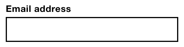
As noted earlier, some fields have a hint in addition to the label, which is why the label is inside a child span. The field-label class lets us style it through CSS.
<div class="field">
  <label for="email">
  <span class="field-label">Email address</span>
  </label>
  <input type="email" id="email" name="email">
</div>
The label itself is “Email address” and uses sentence case. In “Making a case for letter case,” John Saito explains that sentence case (as opposed to title case) is generally easier to read, friendlier, and makes it easier to spot nouns. Whether you heed this advice is up to you, but whatever style you choose, be sure to use it consistently.
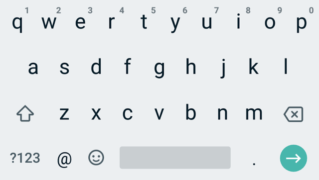
The input’s type attribute is set to email, which triggers an email-specific onscreen keyboard on mobile devices. This gives users easy access to the @ and . (dot) symbols which every email address must contain.
People using a non-supporting browser will see a standard text input (<input type="text">). This is a form of progressive enhancement, which is a cornerstone of designing inclusive experiences.
Progressive Enhancement
Progressive enhancement is about users. It just happens to make our lives as designers and developers easier too. Instead of keeping up with a set of browsers and devices (which is impossible!) we can just focus on features.
First and foremost, progressive enhancement is about always giving users a reasonable experience, no matter their browser, device, or quality of connection. When things go wrong — and they will — users won’t suffer in that they can still get things done.
There are a lot of ways an experience can go wrong. Perhaps the style sheet or script fails to load. Maybe everything loads, but the user’s browser doesn’t recognize some HTML, CSS, or JavaScript. Whatever happens, using progressive enhancement when designing experiences stops users having an especially bad time.
It starts with HTML for structure and content. If CSS or JavaScript don’t load, it’s fine because the content is there.
If everything loads OK, perhaps various HTML elements aren’t recognized. For example, some browsers don’t understand <input type="email">. That’s fine, though, because users will get a text box (<input type="text">) instead. Users can still enter an email address; they just don’t get an email-specific keyboard on mobile.
Maybe the browser doesn’t understand some fancy CSS, and it will just ignore it. In most cases, this isn’t a problem. Let’s say you have a button with border-radius: 10px. Browsers that don’t recognize this rule will show a button with angled corners. Arguably, the button’s perceived affordance is reduced, but users are left unharmed. In other cases it might be helpful to use feature queries.
Then there is JavaScript, which is more complicated. When the browser tries to parse methods it doesn’t recognize, it will throw a hissy fit. This can cause your other (valid and supported) scripts to fail. If your script doesn’t first check that the methods exist (feature detection) and work (feature testing) before using them, then users may get a broken interface. For example, if a button’s click handler calls a method that’s not recognized, the button won’t work. That’s bad.
That’s how you enhance. But what’s better is not needing an enhancement at all. HTML with a little CSS can give users an excellent experience. It’s the content that counts and you don’t need JavaScript for that. The more you can rely on content (HTML) and style (CSS), the better. I can’t emphasize this enough: so often, the basic experience is the best and most performant one. There’s no point in enhancing something if it doesn’t add value (see inclusive design principle 7).
Of course, there are times when the basic experience isn’t as good as it could be — that’s when it’s time to enhance. But if we follow the approach above, when a piece of CSS or JavaScript isn’t recognized or executed, things will still work.
Progressive enhancement makes us think about what happens when things fail. It allows us to build experiences with resilience baked in. But equally, it makes us think about whether an enhancement is needed at all; and if it is, how best to go about it.
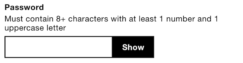
The Password Field
We’re using the same markup as the email field discussed earlier. If you’re using a template language, you’ll be able to create a component that accommodates both types of field. This helps to enforce inclusive design principle 3, be consistent.

<div class="field">
  <label for="password">
    <span class="field-label">Choose password</span>
    <span class="field-hint">Must contain 8+ characters with at least 1 number and 1 uppercase letter.</span>
  </label>
  <input type="password" id="password" name="password">
</div>
The password field contains a hint. Without one, users won’t understand the requirements, which is likely to cause an error once they try to proceed.
The type="password" attribute masks the input’s value by replacing what the user types with small black dots. This is a security measure that stops people seeing what you typed if they happen to be close by.
A Password Reveal
Obscuring the value as the user types makes it hard to fix typos. So when one is made, it’s often easier to delete the whole entry and start again. This is frustrating as most users aren’t using a computer with a person looking over their shoulder.
Owing to the increased risk of typos, some registration forms include an additional “Confirm password” field. This is a precautionary measure that requires the user to type the same password twice, doubling the effort and degrading the user experience. Instead, it’s better to let users reveal their password, which speaks to principles 4 and 5, give control and offer choice respectively. This way users can choose to reveal their password when they know nobody is looking, reducing the risk of typos.
Recent versions of Internet Explorer and Microsoft Edge provide this behavior natively. As we’ll be creating our own solution, we should suppress this feature using CSS like this:
input[type=password]::-ms-reveal {
  display: none;
}
First, we need to inject a button next to the input. The <button> element should be your go-to element for changing anything with JavaScript — except, that is, for changing location, which is what links are for. When clicked, it should toggle the type attribute between password and text; and the button’s label between “Show” and “Hide.”
function PasswordReveal(input) {
  // store input as a property of the instance
  // so that it can be referenced in methods
  // on the prototype
  this.input = input;
  this.createButton();
};

PasswordReveal.prototype.createButton = function() {
  // create a button
  this.button = $('<button type="button">Show password</button>');
  // inject button
  $(this.input).parent().append(this.button);
  // listen to the button’s click event
  this.button.on('click', $.proxy(this, 'onButtonClick'));
};

PasswordReveal.prototype.onButtonClick = function(e) {
  // Toggle input type and button text
  if(this.input.type === 'password') {
    this.input.type = 'text';
    this.button.text('Hide password');
  } else {
    this.input.type = 'password';
    this.button.text('Show password');
  }
};
JavaScript Syntax and Architectural Notes
As there are many flavors of JavaScript, and different ways in which to architect components, we’re going to walk through the choices used to construct the password reveal component, and all the upcoming components in the book.
First, we’re using a constructor. A constructor is a function conventionally written in upper camel case — PasswordReveal, not passwordReveal. It’s initialized using the new keyword, which lets us use the same code to create several instances of the component:
var passwordReveal1 = new PasswordReveal(document.getElementById('input1'));

var passwordReveal2 = new PasswordReveal(document.getElementById('input2'));
Second, the component’s methods are defined on the prototype — for example, PasswordReveal.prototype.onButtonClick. The prototype is the most performant way to share methods across multiple instances of the same component.
Third, jQuery is being used to create and retrieve elements, and listen to events. While jQuery may not be necessary or preferred, using it means that this book can focus on forms and not on the complexities of cross-browser components.
If you’re a designer who codes a little bit, then jQuery’s ubiquity and low-barrier to entry should be helpful. By the same token, if you prefer not to use jQuery, you’ll have no trouble refactoring the components to suit your preference.
You may have also noticed the use of the $.proxy function. This is jQuery’s implementation of Function.prototype.bind. If we didn’t use this function to listen to events, then the event handler would be called in the element’s context (this). In the example above, this.button would be undefined. But we want this to be the password reveal object instead, so that we can access its properties and methods.
Alternative Interface Options
The password reveal interface we constructed above toggles the button’s label between “Show password” and “Hide password.” Some screen reader users can get confused when the button’s label is changed; once a user encounters a button, they expect that button to persist. Even though the button is persistent, changing the label makes it appear not to be.
If your research shows this to be a problem, you could try two alternative approaches.
First, use a checkbox with a persistent label of “Show password.” The state will be signaled by the checked attribute. Screen reader users will hear “Show password, checkbox, checked” (or similar). Sighted users will see the checkbox tick mark. The problem with this approach is that checkboxes are for inputting data, not controlling the interface. Some users might think their password will be revealed to the system.
Or, second, change the button’s state — not the label. To convey the state to screen reader users, you can switch the aria-pressed attribute between true (pressed) and false (unpressed).
<button type="button" aria-pressed="true">
  Show password
</button>
When focusing the button, screen readers will announce, “Show password, toggle button, pressed” (or similar). For sighted users, you can style the button to look pressed or unpressed accordingly using the attribute selector like this:
[aria-pressed="true"] {
  box-shadow: inset 0 0 0 0.15rem #000, inset 0.25em 0.25em 0 #fff;
}
Just be sure that the unpressed and pressed styles are obvious and differentiated, otherwise sighted users may struggle to tell the difference between them.
Microcopy
The label is set to “Choose password” rather than “Password.” The latter is somewhat confusing and could prompt the user to type a password they already possess, which could be a security issue. More subtly, it might suggest the user is already registered, causing users with cognitive impairments to think they are logging in instead.
Where “Password” is ambiguous, “Choose password” provides clarity.
Button Styles
What’s a button? We refer to many different types of components on a web page as a button. In fact, I’ve already covered two different types of button without calling them out. Let’s do that now.
Buttons that submit forms are “submit buttons” and they are coded typically as either <input type="submit"> or <button type="submit">. The <button> element is more malleable in that you can nest other elements inside it. But there’s rarely a need for that. Most submit buttons contain just text.
Note: In older versions of Internet Explorer, if you have multiple <button type="submit">s, the form will submit the value of all the buttons to the server, regardless of which was clicked. You’ll need to know which button was clicked so you can determine the right course of action to take, which is why this element should be avoided.
Other buttons are injected into the interface to enhance the experience with JavaScript — much like we did with the password reveal component discussed earlier. That was also a <button> but its type was set to button (not submit).
In both cases, the first thing to know about buttons is that they aren’t links. Links are typically underlined (by user agent styles) or specially positioned (in a navigation bar) so they are distinguishable among regular text. When hovering over a link, the cursor will change to a pointer. This is because, unlike buttons, links have weak perceived affordance.
In Resilient Web Design, Jeremy Keith discusses the idea of material honesty. He says: “One material should not be used as a substitute for another. Otherwise the end result is deceptive.” Making a link look like a button is materially dishonest. It tells users that links and buttons are the same when they’re not.
Links can do things buttons can’t do. Links can be opened in a new tab or bookmarked for later, for example. Therefore, buttons shouldn’t look like links, nor should they have a pointer cursor. Instead, we should make buttons look like buttons, which have naturally strong perceived affordance. Whether they have rounded corners, drop shadows, and borders is up to you, but they should look like buttons regardless.
Buttons can still give feedback on hover (and on focus) by changing the background colour, for example.
Placement
Submit buttons are typically placed at the bottom of the form: with most forms, users fill out the fields from top to bottom, and then submit. But should the button be aligned left, right or center? To answer this question, we need to think about where users will naturally look for it.
Field labels and form controls are aligned left (in left-to-right reading languages) and run from top to bottom. Users are going to look for the next field below the last one. Naturally, then, the submit button should also be positioned in that location: to the left and directly below the last field. This also helps users who zoom in, as a right-aligned button could more easily disappear off-screen.
Text
The button’s text is just as important as its styling. The text should explicitly describe the action being taken. And because it’s an action, it should be a verb. We should aim to use as few words as possible because it’s quicker to read. But we shouldn’t remove words at the cost of clarity.
The exact words can match your brand’s tone of voice, but don’t exchange clarity for quirkiness.
Simple and plain language is easy for everyone to understand. The exact words will depend on the type of service. For our registration form “Register” is fine, but depending on your service “Join” or “Sign up” might be more appropriate.
Validation
Despite our efforts to create an inclusive, simple, and friction-free registration experience, we can’t eliminate human error. People make mistakes and when they do, we should make fixing them as easy as possible.
When it comes to form validation, there are a number of important details to consider. From choosing when to give feedback, through to how to display that feedback, down to the formulation of a good error message — all of these things need to be taken into account.
HTML5 Validation
HTML5 validation has been around for a while now. By adding just a few HTML attributes, supporting browsers will mark erroneous fields when the form is submitted. Non-supporting browsers fall back to server-side validation.
Normally I would recommend using functionality that the browser provides for free because it’s often more performant, robust, and accessible. Not to mention, it becomes more familiar to users as more sites start to use the standard functionality.
While HTML5 validation support is quite good, it’s not implemented uniformly. For example, the required attribute can mark fields as invalid from the outset, which isn’t desirable. Some browsers, such as Firefox 45.7, will show an error of “Please enter an email address” even if the user entered something in the box, whereas Chrome, for example, says “Please include an ‘@’ in the email address,” which is more helpful.
We also want to give users the same interface whether errors are caught on the server or the client. For these reasons we’ll design our own solution. The first thing to do is turn off HTML5 validation: <form novalidate>
Handling Submission
When the user submits the form, we need to check if there are errors. If there are, we need to prevent the form from submitting the details to the server.
function FormValidator(form) {
  form.on('submit', $.proxy(this, 'onSubmit'));
}

FormValidator.prototype.onSubmit = function(e) {
  if(!this.validate()) {
    e.preventDefault();
    // show errors
  }
};
Note that we are listening to the form’s submit event, not the button’s click event. The latter will stop users being able to submit the form by pressing Enter when focus is within one of the fields. This is also known as implicit form submission.
Displaying Feedback
It’s all very well detecting the presence of errors, but at this point users are none the wiser. There are three disparate parts of the interface that need to be updated. We’ll talk about each of those now.
Document Title
The document’s <title> is the first part of a web page to be read out by screen readers. As such, we can use it to quickly inform users that something has gone wrong with their submission. This is especially useful when the page reloads after a server request.
Even though we’re enhancing the user experience by catching errors on the client with JavaScript, not all errors can be caught this way. For example, checking that an email address hasn’t already been taken can only be checked on the server. And in any case, JavaScript is prone to failure so we can’t solely rely on its availability.
Where the original page title might read “Register for [service],” on error it should read “(2 errors) Register for [service]” (or similar). The exact wording is somewhat down to opinion.
The following JavaScript updates the title:
document.title = "(" + this.errors.length + ")" + document.title;As noted above, this is primarily for screen reader users, but as is often the case with inclusive design, what helps one set of users helps everyone else too. This time, the updated title acts as a notification in the tab.

Error Summary
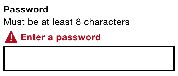
In comparison with the title element, the error summary is more prominent, which tells sighted users that something has gone wrong. But it’s also responsible for letting users understand what’s gone wrong and how to fix it.
It’s positioned at the top of the page so users don’t have to scroll down to see it after a page refresh (should an error get caught on the server). Conventionally, errors are colored red. However, relying on color alone could exclude colorblind users. To draw attention to the summary, consider also using position, size, text, and iconography.
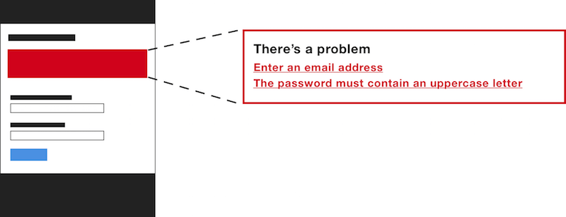
The panel includes a heading, “There’s a problem,” to indicate the issue. Notice it doesn’t say the word “Error,” which isn’t very friendly. Imagine you were filling out your details to purchase a car in a showroom and made a mistake. The salesperson wouldn’t say “Error” — in fact it would be odd if they did say that.
<div class="errorSummary" role="group" tabindex="-1" aria-labelledby="errorSummary-heading">
  <h2 id="errorSummary-heading">There’s a problem</h2>
  <ul>
    <li><a href="#emailaddress">Enter an email address</a></li>
    <li><a href="#password">The password must contain an uppercase letter</a></li>
  </ul>
</div>
The container has a role of group, which is used to group a set of interface elements: in this case, the heading and the error links. The tabindex attribute is set to -1, so it can be focused programmatically with JavaScript (when the form is submitted with mistakes). This ensures the error summary panel is scrolled into view. Otherwise, the interface would appear unresponsive and broken when submitted.
Note: Using tabindex="0" means it will be permanently focusable by way of the Tab key, which is a 2.4.3 Focus Order WCAG fail. If users can tab to something, they expect it will actually do something.
FormValidator.prototype.showSummary = function () {
  // ...
  this.summary.focus();
};
Underneath, there’s a list of error links. Clicking a link will set focus to the erroneous field, which lets users jump into the form quickly. The link’s href attribute is set to the control’s id, which in some browsers is enough to set focus to it. However, in other browsers, clicking the link will just scroll the input into view, without focusing it. To fix this we can focus the input explicitly.
FormValidator.prototype.onErrorClick = function(e) {
  e.preventDefault();
  var href = e.target.href;
  var id = href.substring(href.indexOf("#"), href.length);
  $(id).focus();
};
When there aren’t any errors, the summary panel should be hidden. This ensures that there is only ever one summary panel on the page, and that it appears consistently in the same location whether errors are rendered by the client or the server. To hide the panel we need to add a class of hidden.
<div class="errorSummary hidden" ...></div>.hidden {
display: none;
}Note: You could use the hidden attribute/property to toggle an element’s visibility, but there’s less support for it. Inclusive design is about making decisions that you know are unlikely to exclude people. Using a class aligns with this philosophy.
Inline Errors
We need to put the relevant error message just above the field. This saves users scrolling up and down the page to check the error message, and keeps them moving down the form. If the message was placed below the field, we’d increase the chance of it being obscured by the browser autocomplete panel or by the onscreen keyboard.
<div class="field">
  <label for="blah">
    <span class="field-error">
    <svg width="1.5em" height="1.5em"><use xmlns:xlink="http://www.w3.org/1999/xlink" xlink:href="#warning-icon"></use></svg>
    Enter your email address.
    </span>
    <span class="field-error">Enter an email address</span>
  </label>
</div>
Like the hint pattern mentioned earlier, the error message is injected inside the label. When the field is focused, screen reader users will hear the message in context, so they can freely move through the form without having to refer to the summary.
The error message is red and uses an SVG warning icon to draw users’ attention. If we’d used only a color change to denote an error, this would exclude color-blind users. So this works really well for sighted users — but what about screen reader users?
To give both sighted and non-sighted users an equivalent experience, we can use the well-supported aria-invalid attribute. When the user focuses the input, it will now announce “Invalid” (or similar) in screen readers.
<input aria-invalid="false">Note: The registration form only consists of text inputs. In chapter 3, “A Flight Booking Form,” we’ll look at how to inject errors accessibly for groups of fields such as radio buttons.
Submitting the Form Again
When submitting the form for a second time, we need to clear the existing errors from view. Otherwise, users may see duplicate errors.
FormValidator.prototype.onSubmit = function(e) {
  this.resetPageTitle();
  this.resetSummaryPanel();
  this.removeInlineErrors();
  if(!this.validate()) {
    e.preventDefault();
    this.updatePageTitle();
    this.showSummaryPanel();
    this.showInlineErrors();
  }
};
Initialization
Having finished defining the FormValidator component, we’re now ready to initialize it. To create an instance of FormValidator, you need to pass the form element as the first parameter.
var validator = new FormValidator(document.getElementById('registration'));To validate the email field, for example, call the addValidator() method:
validator.addValidator('email', [{
  method: function(field) {
    return field.value.trim().length > 0;
  },
  message: 'Enter your email address.'
},{
  method: function(field) {
    return (field.value.indexOf('@') > -1);
  },
  message: 'Enter the ‘at’ symbol in the email address.'
}]);
The first parameter is the control’s name, and the second is an array of rule objects. Each rule contains two properties: method and message. The method is a function that tests various conditions to return either true or false. False puts the field into an error state, which is used to populate the interface with errors as discussed earlier.
Forgiving Trivial Mistakes
In The Design of Everyday Things, Don Norman talks about designing for error. He talks about the way people converse:
“If a person says something that we believe to be false, we question and debate. We don’t issue a warning signal. We don’t beep. We don’t give error messages. […] In normal conversations between two friends, misstatements are taken as normal, as approximations to what was really meant.”
Unlike humans, machines are not intelligent enough to determine the meaning of most actions, but they are often far less forgiving of mistakes than they need to be. Jared Spool makes a joke about this in “Is Design Metrically Opposed?” (about 42 minutes in):
“It takes one line of code to take a phone number and strip out all the dashes and parentheses and spaces, and it takes ten lines of code to write an error message that you left them in.”
The addValidator method (shown above) demonstrates how to design validation rules so they forgive trivial mistakes. The first rule, for example, trims the value before checking its length, reducing the burden on the user.
Live Inline Validation
Live inline validation gives users feedback as they type or when they leave the field (onblur). There’s some evidence to show that live inline validation improves accuracy and decreases completion times in long forms. This is partially to do with giving users feedback when the field’s requirements are fresh in users’ minds. But live inline validation (or live validation for short) poses several problems.
For entries that require a certain number of characters, the first keystroke will always constitute an invalid entry. This means users will be interrupted early, which can cause them to switch mental contexts, from entering information to fixing it.
Alternatively, we could wait until the user enters enough characters before showing an error. But this means users only get feedback after they have entered a correct value, which is somewhat pointless.
We could wait until the user leaves the field (onblur), but this is too late as the user has mentally prepared for (and often started to type in) the next field. Moreover, some users switch windows or use a password manager when using a form. Doing so will trigger the blur event, causing an error to show before the user is finished. All very frustrating.
Remember, there’s no problem with giving users feedback without a page refresh. Nor is there a problem with putting the error messages inline (next to fields) — we’ve done this already. The problem with live feedback is that it interrupts users either too early or too late, which often results in a jarring experience.
If users are seeing errors often, there’s probably something wrong elsewhere. Focus on shortening your form and providing better guidance (good labeling and hint text). This way users shouldn’t see more than the odd error. We’ll look at longer forms in the next chapter.
Checklist Affirmation Pattern
A variation of live validation involves ticking off rules (marking them as complete) as the user types. This is less invasive than live validation but isn’t suited to every type of field. Here’s an example of MailChimp’s sign-up form, which employs this technique for the password field.

You should put the rules above the field. Otherwise the onscreen keyboard could obscure the feedback. As a result, users may stop typing and hide the keyboard to then check the feedback.
A Note on Disabling Submit Buttons
Some forms are designed to disable the submit button until all the fields become valid. There are several problems with this.
First, users are left wondering what’s actually wrong with their entries. Second, disabled buttons are not focusable, which makes it hard for the button to be discovered by blind users navigating using the Tab key. Third, disabled buttons are hard to read as they are grayed out.
As we’re providing users with clear feedback, when the user expects it, there’s no good reason to take control away from the user by disabling the button anyway.
Crafting a Good Error Message
There’s nothing more important than content. Users don’t come to your website to enjoy the design. They come to enjoy the content or the outcome of using a service.
Even the most thought out, inclusive and beautifully designed experience counts for nothing if we ignore the words used to craft error messages. One study showed that showing custom error messages increased conversions by 0.5% which equated to more than £250,000 in yearly revenue.
“Content is the user experience.”
— Ginny Redish
Like labels, hints, and any other content, a good error message provides clarity in as few words as possible. Normally, we should drive the design of an interface based on the content — not the other way around. But in this case, understanding how and why you show error messages influences the design of the words. This is why Jared Spool says “content and design are inseparable work partners.”
We’re showing messages in the summary at the top of the screen and next to the fields. Maintaining two versions of the same message is a hard sell for an unconvincing gain. Instead, design an error message that works in both places. “Enter an ‘at’ symbol” needs context from the field label to make sense. “Your email address needs an ‘at’ symbol” works well in both places.
Avoid pleasantries, like starting each error message with “Please.” On the one hand, this seems polite; on the other, it gets in the way and implies a choice.
Whatever approach you take, there’s going to be some repetition due to the nature of the content. And testing usually involves submitting the form without entering any information at all. This makes the repetition glaringly obvious, which may cause us to flip out. But how often is this the case? Most users aren’t trying to break the interface.

Different errors require different formatting. Instructions like “Enter your first name” are natural. But “Enter a first name that is 35 characters or less” is longer, wordier, and less natural than a description like “First name must be 35 characters or less.”
Here’s a checklist:
- Be concise. Don’t use more words than are necessary, but don’t omit words at the cost of clarity.
- Be consistent. Use the same tone, the same words, and the same punctuation throughout.
- Be specific. If you know why something has gone wrong, say so. “The email is invalid.” is ambiguous and puts the burden on the user. “The email needs an ‘at’ symbol” is clear.
- Be human, avoid jargon. Don’t use words like invalid, forbidden, and mandatory.
- Use plain language. Error messages are not an opportunity to promote your brand’s humorous tone of voice.
- Use the active voice. When an error is an instruction and you tell the user what to do. For example, “Enter your name,” not “First name must be entered.”
- Don’t blame the user. Let them know what’s gone wrong and how to fix it.
Summary
In this chapter we solved several fundamental form design challenges that are applicable well beyond a simple registration form. In many respects, this chapter has been as much about what not to do, as it has about what we should. By avoiding novel and artificial space-saving patterns to focus on reducing the number of fields we include, we avoid several usability failures while simultaneously making forms more pleasant.
Things to Avoid
- Using the
placeholderattribute as a mechanism for storing label and hint text. - Using incorrect input types.
- Styling buttons and links the same.
- Validating fields as users type.
- Disabling submit buttons.
- Using complex jargon and brand-influenced microcopy.
Source: Smashingmagazine.com