 Once upon a time in the long lost world of the 1997 (more or less), a little boy was growing up watching Hercules: the Legendary Journeys, and Xena: Warrior Princess on the weekends. He got a Hotmail account because all of his siblings had one; but he didn’t really know anyone else who had email. Still, the spark was struck, and his interest in the Internet was born.
Around the same time, GoDaddy was born; born into a world of wondrous possibility, creativity, and hope for a technocratic utopia that we were all sure would be made possible by the Internet. Well, that didn’t work out so well, but GoDaddy, at least, would go on to become the largest ICANN-approved domain registrar by 2005, and was the first place that little boy ever bought a domain name.
In that time, it was common for Internet companies to embrace the wild west of the Internet with branding that reflected the “wacky”, “zany”, and generally Nickelodeon-ish aesthetic preferred by those who were engineers first, and designers second…or fifth–look, it took a while to get the print guys on board. Anyway, anyone who was anyone used either a sort of “hand-made” look in all of their branding, or super-corporate branding a la IBM.
That age is long gone, with both the informal-looking branding and our dreams of technocracy drifting into the past. GoDaddy had already updated the text in their logo to look a little more modern back in 2016, but now, the mascot informally known as “Daddy” is going away, too. It’s the end of an era.
(For comparison, we turn now to these images sourced from Logopedia, which is a real thing I just found out about. I plan to waste a fair amount of time there.)

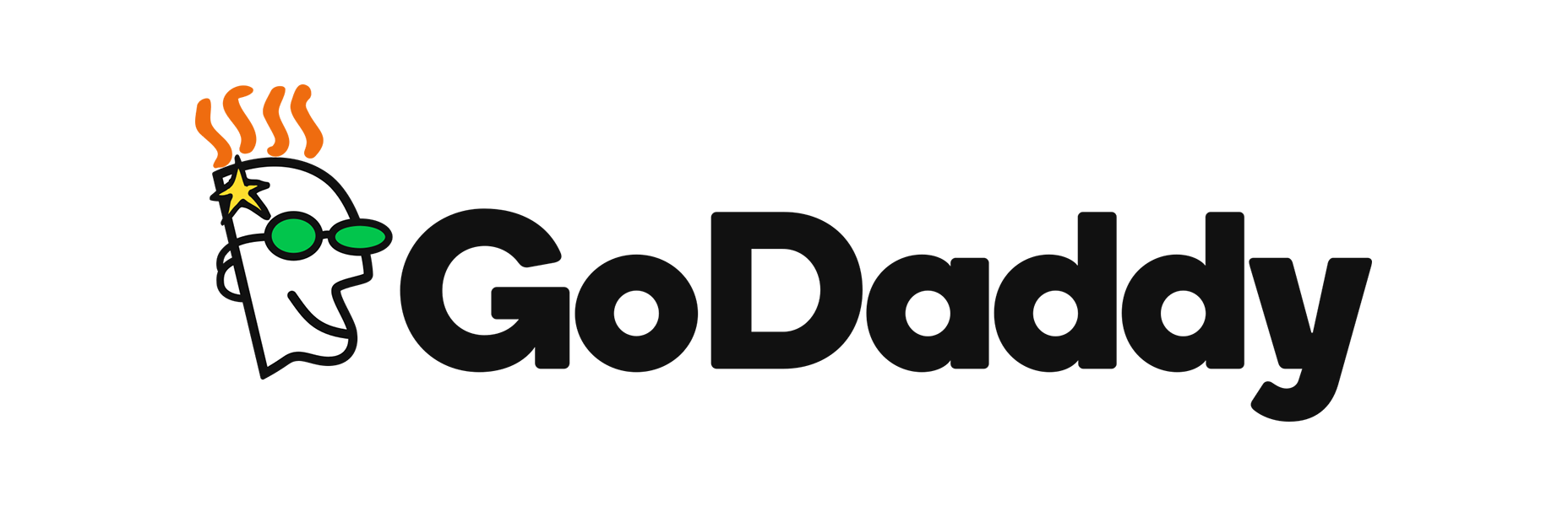
So that’s the original logo. Nice and ‘90s.
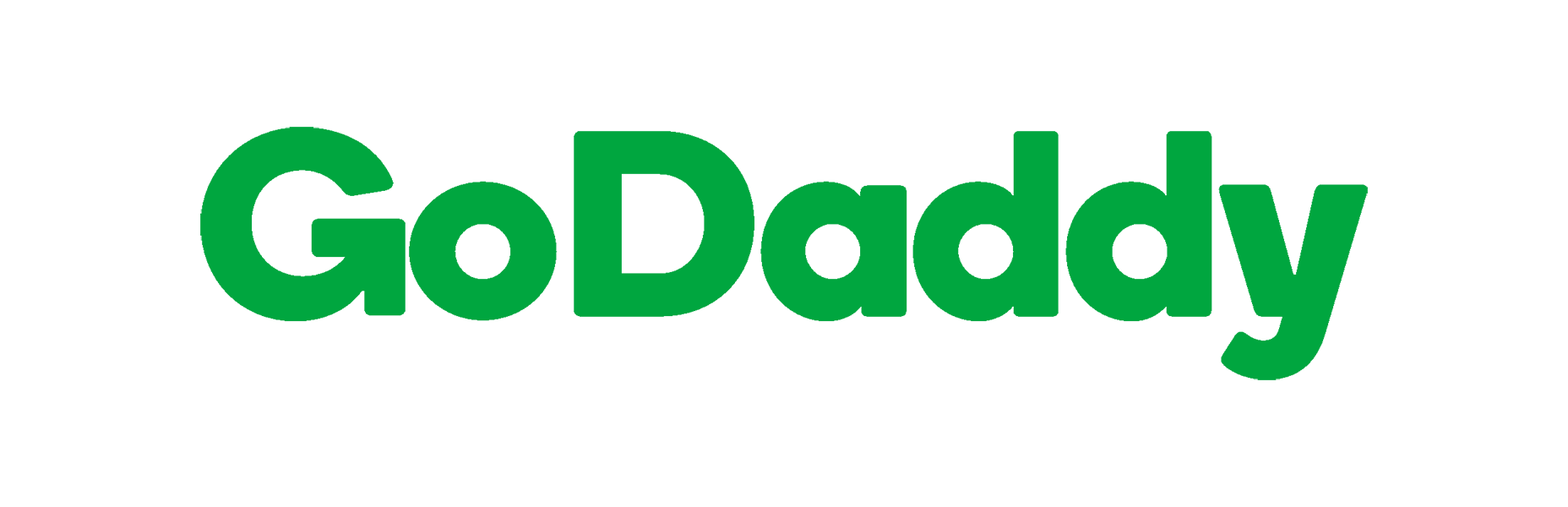
Here, then, is the 2016 variant where they first updated their type. As you can see, the type has a few playful touches, but the whole aesthetic is more in line with what you’d expect from a multi-million dollar corporation.
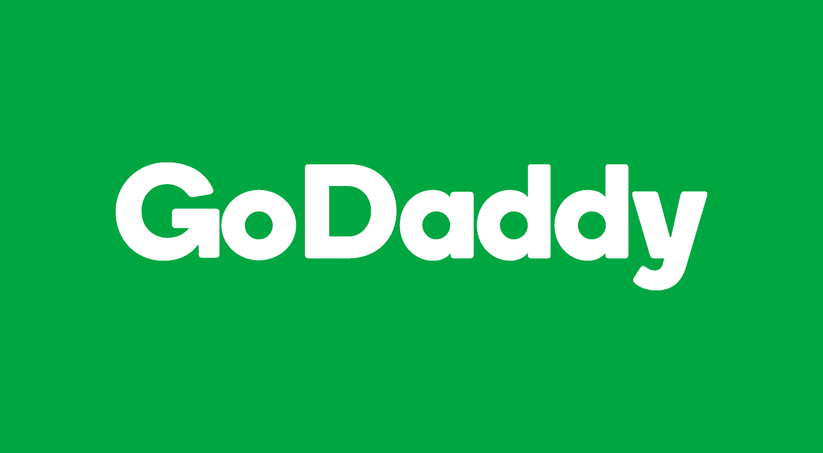
And here’s the new logo. As you can tell, it’s just the 2016 type without the Daddy that made GoDaddy a thing.
GoDaddy is following a trend that has been happening for years, now. Hotmail, Yahoo, Google, and pretty much every major Internet company has modernized their logos and branding. The fact that they’ve all done this in almost the exact same way, with sans-serif type, has drawn criticism from those who feel like their new identities lack any sense of personality.
if corporate really is the new “trendy”…they nailed it, but it makes me a little sad.
I can’t say that’s wrong, exactly, but I have a theory about where this trend is coming from. The companies that were once plucky startups are now entirely beholden to stockholders and boards. Investors often seem to prefer companies with a stable, mature, and even boring image. Where their value was once in their ability to challenge the status quo, they now focus on maintaining their market value, and increasing it at a more reasonable pace.
A part of that shift is a shift in branding. Is this a bad thing? If you long for the old days of the Internet, it probably seems like it. If you’ve invested in those companies, it’s probably alright with you.
An alternate theory is that the new branding actually looks more like the branding for recent startups, which have steadily moved toward corporate-looking branding. This could actually be an effort by GoDaddy to stay on-trend. And if that’s the case, if corporate really is the new “trendy”, I just don’t know what to say. They nailed it, but it makes me a little sad.
| Add Realistic Chalk and Sketch Lettering Effects with Sketch’it – only $5! |
|
p img {display:inline-block; margin-right:10px;}
.alignleft {float:left;}
p.showcase {clear:both;}
body#browserfriendly p, body#podcast p, div#emailbody p{margin:0;}
Source: Webdesignerdepot.com