Compared to Universal Analytics, Google Analytics is missing a lot of predefined reports that we are familiar with (e.g. landing page, site search, etc.). I don’t know if this will change in the future, but I hope so!
In the meantime, we got a pretty powerful suite of reporting capabilities called Analysis Hub. It’s the place where you can do ad-hoc analysis and dig deeper into your data. In today’s blog post, I wanted to focus on one particular part of it, Exploration Reports in Google Analytics 4.
Table of contents
- Main components
- Examples of Exploration reports
- Landing pages report
- Order coupon code report
- Additional things
- Final words
#1. Main components
To get started, log in to your Google Analytics 4 property click Analysis > Analysis Hub (on the left sidebar). Then select Exploration (or Blank). If you choose Exploration, you will see a sample report with some configuration. And with Blank, well, you’ll get a blank piece of paper to start from scratch.
The interface in the Analysis hub is split into 3 main parts/columns:
- Variables
- Tab settings
- The output (the report that you is generated based on your configuration)
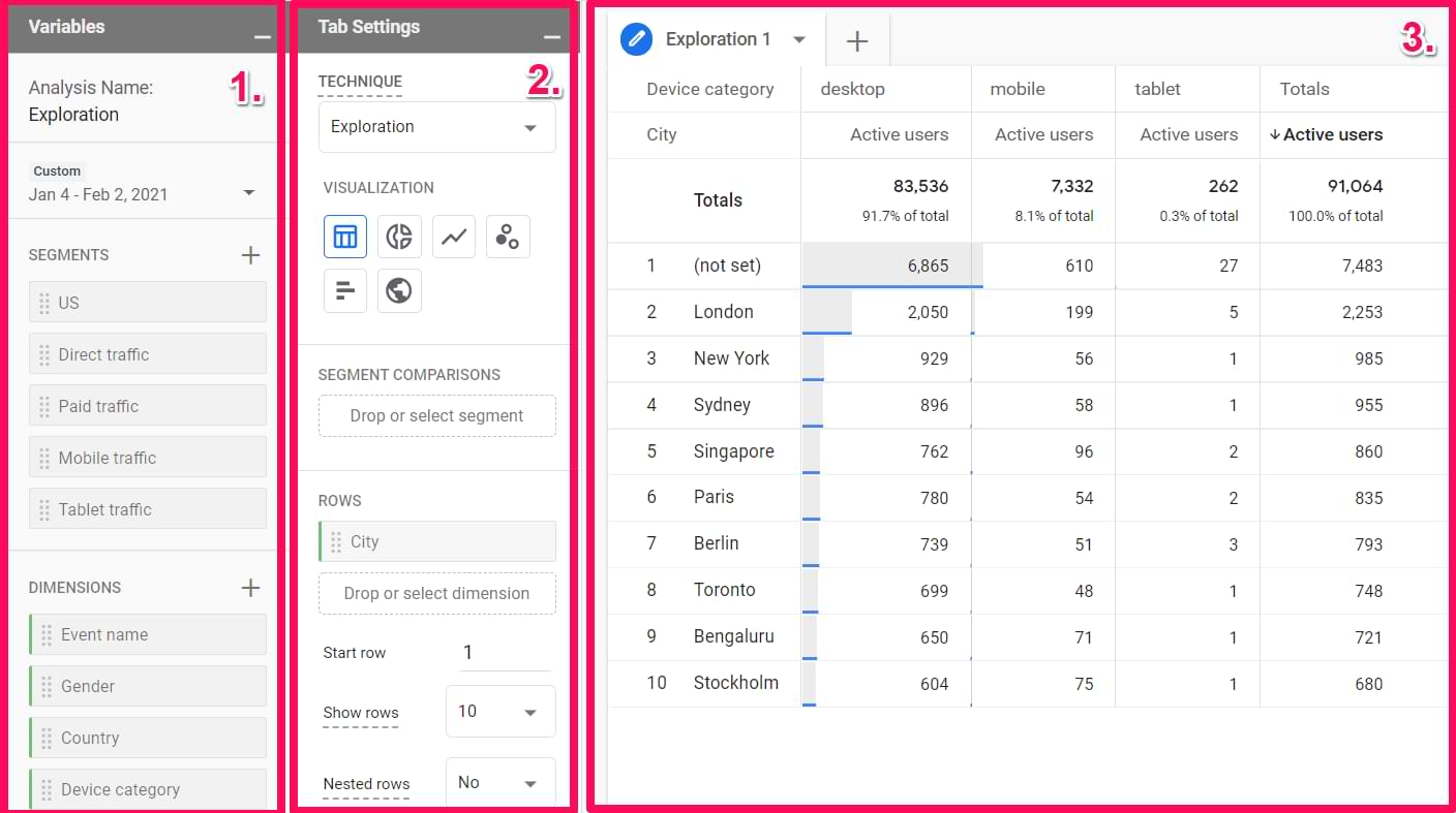
Let’s take a closer look at each part.
#1.1. Variables
This has nothing to do with Google Tag Manager’s variables. The Variables section in the GA4 Exploration reports is the place where you select data that you plan to use in a report:
- Date range
- Segments
- Dimensions
- Metrics
Also, you can change the name of the analysis in the top-left corner of the interface.

To select a different date range, click the date in the top-left corner (below the analysis name) and select whatever you need (like “last 7 days”, “Last 30 days”, etc.).

#1.1.1. Segments
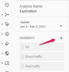
If you want to compare how different groups of your users/visitors are behaving, you should include those segments in the Segments section first (I will later show how to add them to the actual report).
You can choose from several segments that are already included or you can add your own. You can do that by clicking the plus icon:
Then you can either create a custom segment or select a suggested one.
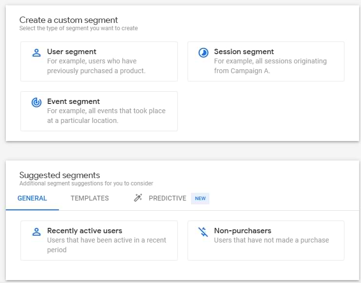
Speaking of custom segments, there are 3 types:
- User segment where you can include data of all users that match certain user criteria. Example: show all events of users who are from the US. This is equivalent to user segments in Universal Analytics.
- Session segment where you can include data of sessions that match certain criteria. Example: show all events of sessions where visitors downloaded an ebook. This is equivalent to session segments in Universal Analytics.
- Event segment where you include ONLY events based on certain criteria. This was not available in Universal Analytics. Example: Show data of all events that are lead_generated.
#1.1.2. Dimensions and metrics
Dimensions in Google Analytics are parameters/attributes of an event, product, transaction, user, etc. Basically, they are attributes that describe something. For example:
- Event name
- Transaction ID
- User’s pricing plan
- Product category, etc.
Metrics help us measure. For example, how many events were made yesterday, how many transactions were complete last week, what was the conversion rate last month, etc.
Speaking of the actual metric names (and examples) that you can find in GA4, here are some examples:
- Event count
- Number of active users
- Number of transactions
- Engagement rate
Now that we got some very basics, here’s the catch in the Analysis hub. If you want to use a metric or a dimension in any analysis technique within that report, you have to include the dimension/metric in the Variables column first. You can do that by clicking the Plus icon and then selecting what you need.
After you select the needed metric/dimension, click Apply button in the top-right corner.

By the way, some analysis techniques might not allow you to use certain parts of the Variables column. Example: Funnel report does not allow to include/use metrics.
To sum up, the Variables column is responsible for the data input. If you want to use some segments/metrics/dimensions, they must be included in that column. If you are missing something later down the line, you can add new items on-the-fly. Also, you can change the date range (which, obviously, also affects the scope of data input).
#1.2. Tab settings
In this column, you can configure what the report will look like. First, there is a Technique drop-down menu (where you can select from things like Exploration, Funnel Analysis, etc.). In this blog post, I focus only on the Exploration part.
Then you will find the visualization section where you can select from:
- Table
- Donut chart
- Line chart
- Scatterplot
- Bar chart
- Geo map

Each visualization method affects which customization options will be available in that very same column. I usually find myself working with the Table, thus it will get most of my attention in this blog post.
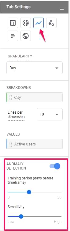
But before that, let me briefly mention some unique settings available in the Line Chart.
Line chart allows you to select the level of granularity (hour, day, week, month). Also, by default, anomaly detection is enabled. This means that you can quickly see if something is not right. There are even two ways how you can tweak it:
- Training period (the longer the period, the more data will be taken into account while calculating the expected value). That’s why I set higher values here.
- Sensitivity. The higher it is, the narrower the area of the expected value will be.
Now back to the Table visualization.
#1.2.1. Segment comparisons
In the Segment comparisons section, you can include up to 4 segments that are already included in the Segments section of the Variables tab.
You can add segments to the Tab Settings column by dragging them from the Variables tab. Also, you can just do double-click in the Variables tab and they will be added automatically.
If you have at least one segment added to the comparisons section, a new field will appear, Pivot. This field is responsible for the placement of segments in the table. It offers 4 options: first row, last row, first column, last column. To better explain the difference, let me show you an example.
I have an exploration report where:
- Two segments are selected: US visitors and Non-US visitors
- Browser dimension is in the Rows section
- Device category dimension is in the Columns section
- Active users is the only metric
All other settings are default. Now I will show you 4 different screenshots. One for each pivot option.
Pivot – first row. The segment is displayed first in every row.

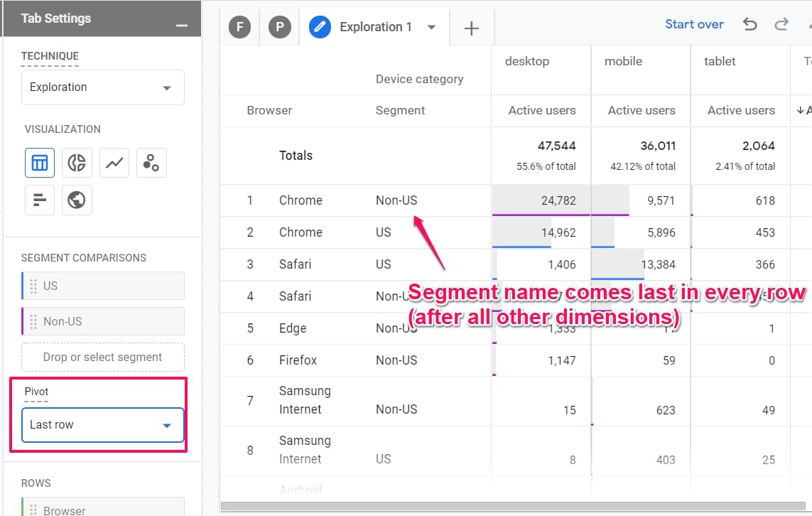
Pivot – last row. Segment comes last after all dimensions in a row.
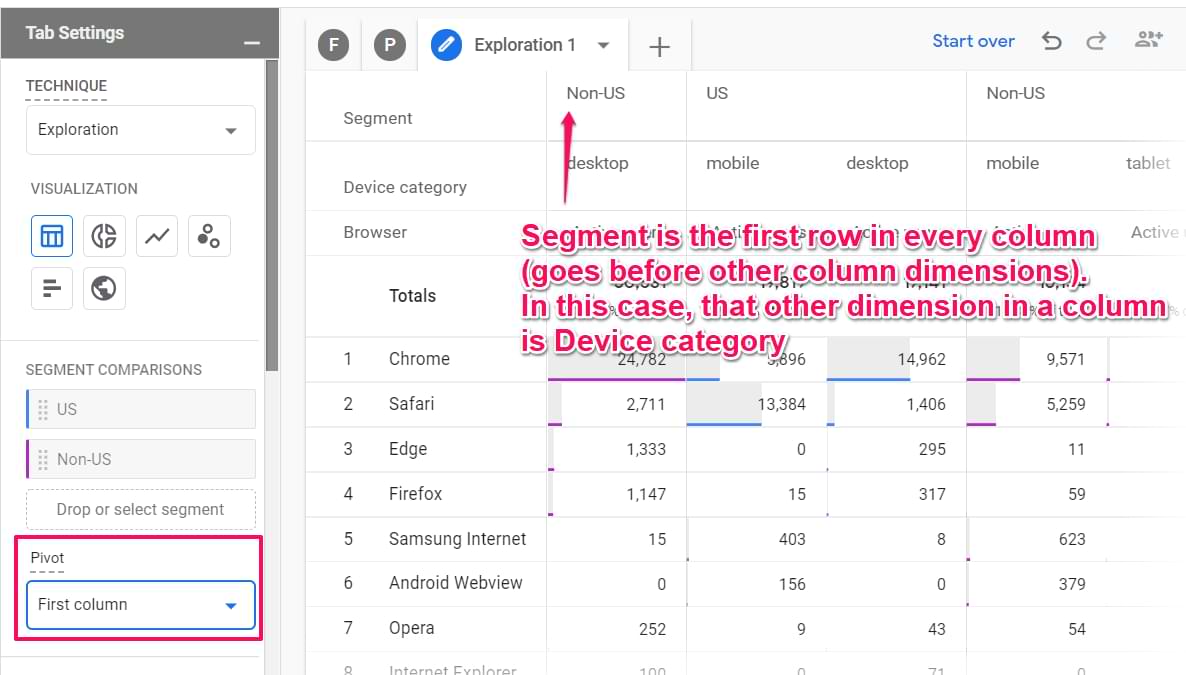
Pivot – first column. A segment is visible in the first row in each column.
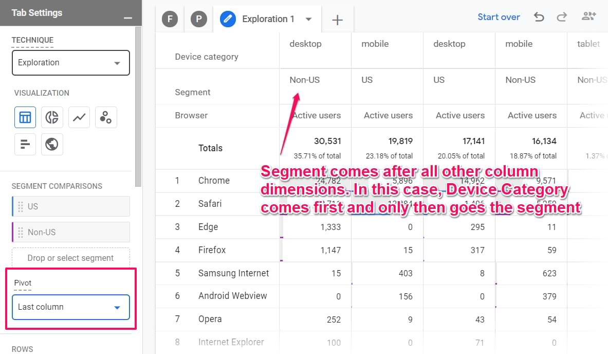
Pivot – last column. The segment name is visible below all dimensions in every column.
#1.2.2. Rows
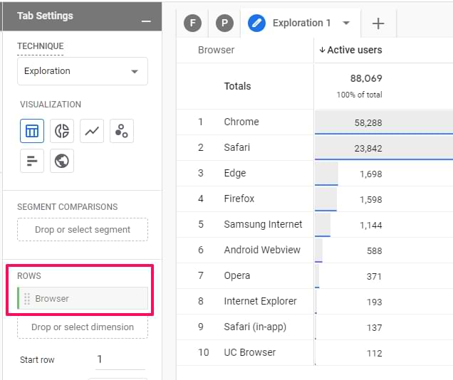
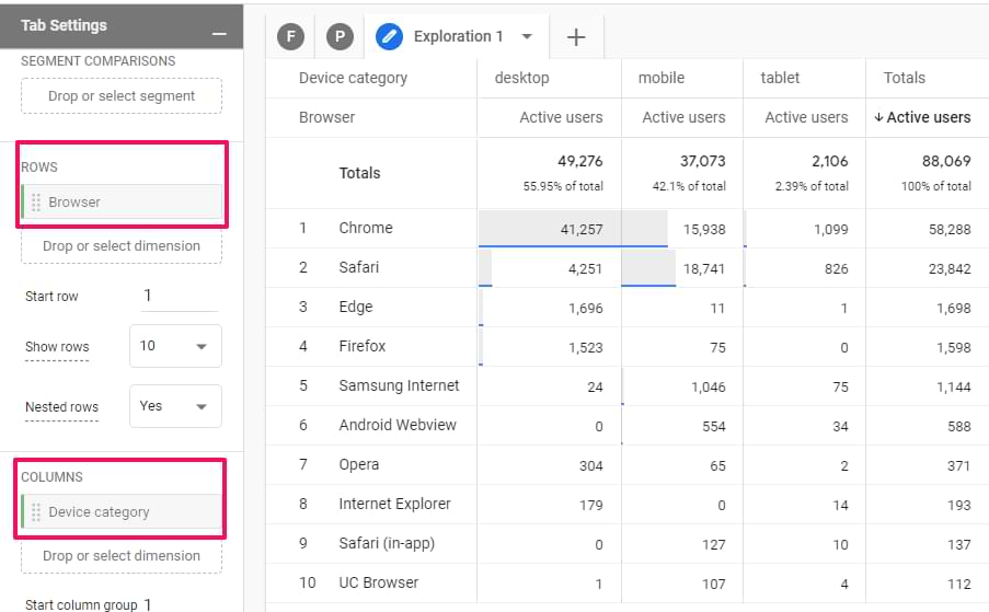
Here you can decide what dimensions do you want to use in the rows of the table. In the screenshot below, you will see what the report looks like when the Browser dimension is inserted in the Rows section. Every row of that report contains a different browser name.
If you want, you can include multiple dimensions as rows. Then different combinations of all dimensions will be displayed as a separate row. Here’s an example of a report where I have device category and browser as two Row dimensions.

Also, you can select from which row to start and how many rows to display at the same time.

If you work with multiple dimensions, consider switching to nested rows.

Remember my previous report example with two dimensions, browser and device category? Both dimensions were displayed in the same row. If you switch to nested rows, it will look like this:

#1.2.3. Columns
Then you can also add dimensions as columns. Let’s continue the example of browsers and device categories. If I dragged the device category dimension from Rows to Columns, the report would look like this:
Now, every device category has its own column.
Additionally, you can choose from which column do you want to start displaying data.
Also, you can select the maximum number of columns per single dimension. For example, if a dimension has 10 unique values but you set the Show column groups to 5, only the first five dimensions will be displayed.

#1.2.4. Values
Here you can drag metrics that you want to display as columns in the report. The maximum number of metrics added to the Values section of a single report (a.k.a. Tab in the Analysis hub) is 10.
Also, you can select the cell type:
- Bar chart (this will show horizontal bar charts in every metric cell based on its value and the ratio to other rows in the same column)
- Plain text (this will display all cells without any additional visual enhancements)
- Heat map (this will color cells darker if their values are higher compared to other rows of the same dimension column)

#1.2.5. Filters
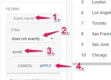
Here you can quickly narrow down the scope of data you are using. For example, maybe you want to exclude a certain event from the report? Then you can click on the place holder and select the dimension that you are going to use in the filter.

Let’s say that I have a report of events and I want to exclude scrolling events. In that case, I would have to select Event name exactly matches scroll (or whatever name you use for that event).
If multiple filters are included in the report, ALL of them apply to the data.
#1.3. The Output (report)
Once you configure all the necessary things in the Variables and Tab Settings columns, the report should appear. Here you can do several things.
Add new tabs if needed. Every tab can use a different analysis technique (exploration, funnel analysis, etc.). Also, duplicate and delete them by clicking the Triangle icon next to a tab name:

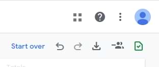
Start over, undo, redo, share the report, download report:
Click the metric label to change the sorting:

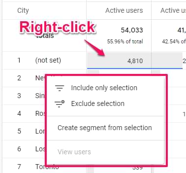
Do the right-click on a cell to see additional options:
- Include selection
- Exclude selection
- Create segment from selection
- View users (in User Explorer report)
Include only selection will add an Include filter (or multiple filters if needed) to the report based on which cell did you click. For example, you can quickly narrow down your report to users, events, etc.
Exclude selection will add an Exclude filter (or multiple filters if needed) to the report based on which cell did you click.
If you accidentally included or excluded selection, you can delete those newly added filters from the Filters section in the Tab Settings column. Or you can click the Undo icon in the top-left corner of the report.
If you click the Create segment option, you will see an interface of segment creation will some conditions will be prefilled.
View users option will open a user explorer report with users that belong to that particular selection. In my screenshot, that option is disabled because I was working with the official GA4 demo account where this feature is not available.
#2. Examples of Exploration reports in Google Analytics 4
Let’s create two sample reports that will help you better understand how Exploration reports (with Table visualization) work.
- Landing page report
- Coupon codes + revenue
#2.1. Landing pages report
If you are an avid Universal Analytics user, you probably visit the Landing Pages report quite often, therefore, you probably miss at least part of it in Google Analytics 4.
Because of an entirely different data model, the Landing Page dimension does not exist anymore. But at the same time, GA4 tracks events called session_start. So what we could do is to create a report where we include only session_start events and display page URLs on which these pages occurred.
Important: the definition of a session is very different between GA4 and Universal Analytics. In UA, many things can affect sessions (UTM parameters, referrer, etc.). In GA4, a session always ends after 30 minutes of inactivity. As a result, your landing page data in GA4 and UA will be quite different.
So here are the settings of the Landing pages report in GA4:
- Technique: Exploration
- Visualization: Table
- Segment comparisons: None
- Rows: Page Path (you might need to add it to the Variables column)
- Values: Event Count, Users
- Filters: Event name exactly matches session_start
I left all other settings as they are. This report is a bare minimum of what you could do. Feel free to add more metrics. The final report will look like this (click the image to view it in greater detail):

I have hidden some fields (from the screenshot above) that I did not use (just so that you could see all the edited settings in the same screenshot.
#2.2. Order coupon code report
If you have implemented Ecommerce tracking in Google Analytics 4, you might be tracking not only purchases but also order coupons that were used at the checkout. If you want to see the report of coupon codes in GA4, here’s what you could do.
This report will show the list of coupon codes that were used and the total value of all orders where those coupons were applied.
Obviously, keep in mind that Google Analytics reports will not be as nearly as accurate as your payment gateway’s reports or something else that allows you to view the data in the backend.
So here are the settings of the order coupon code report in GA4:
- Technique: Exploration
- Visualization: Table
- Segment comparisons: None
- Rows: Order coupon (you will need to add it to the Variables column)
- Values: Transactions, Total Revenue
- Filters: Event name exactly matches purchase
- Then you might see a lot of (not set) values. Do the right click on them and select Exclude selection. This will automatically create an additional filter Order coupon does not exactly match (not set)

#3. Additional things
Some of the following tips were already mentioned in this guide but I just wanted to quickly remind you about them.
- If you go too far with the report and want to quickly start from scratch, click Start over in the top-right corner of the Analysis Hub
- Want to undo one change? Use the undo button (arrow back) in the top-right corner of the Analysis hub. Undid too much? Click the redo button (arrow forward).
- By default, your Analysis Hub reports are visible only to you. If you want to share the report (with Read-only permissions), click the Share icon in the top-right corner. Then other users who have access to the property will be able to see it as well (but not edit it) in the list of Analysis hub. If you want to do changes to a report (created by someone else), you will have to duplicate the report first.
- A green shield in the top-right corner means that no sampling was applied to the report. If the shield is yellow, then sampling has kicked in.
- If you want to unshare the report that is already shared, in the top right corner you will see an un-share icon. You can also go to the list of all reports in the Analysis hub, click 3-dots next to that report, and then un-share.
- Double-click on a segment/dimension/metric in the Variables tab and it will be automatically added to the Tab Settings column.
- Drag a segment/dimension/metric over another metric (in the Tab Settings tab) and it will be replaced.
- Don’t forget to do the right click on the actual report to see what kind of options are available. This applies not only to the Exploration reports.
Exploration reports in Google Analytics 4: Final words
I hope that you are now more familiar with the Exploration reports in Google Analytics 4. It can definitely be tricky to get started (especially if you are not experienced with doing ad-hoc reports) but practice makes it perfect.
Eventually, you will get used to it. Also, I really hope that in the near future, we will have a community template gallery for reports in the analysis hub. That would save us a lot of time. If you are reading this paragraph and you already have the community template gallery, well, then good for you  I wish I had it sooner.