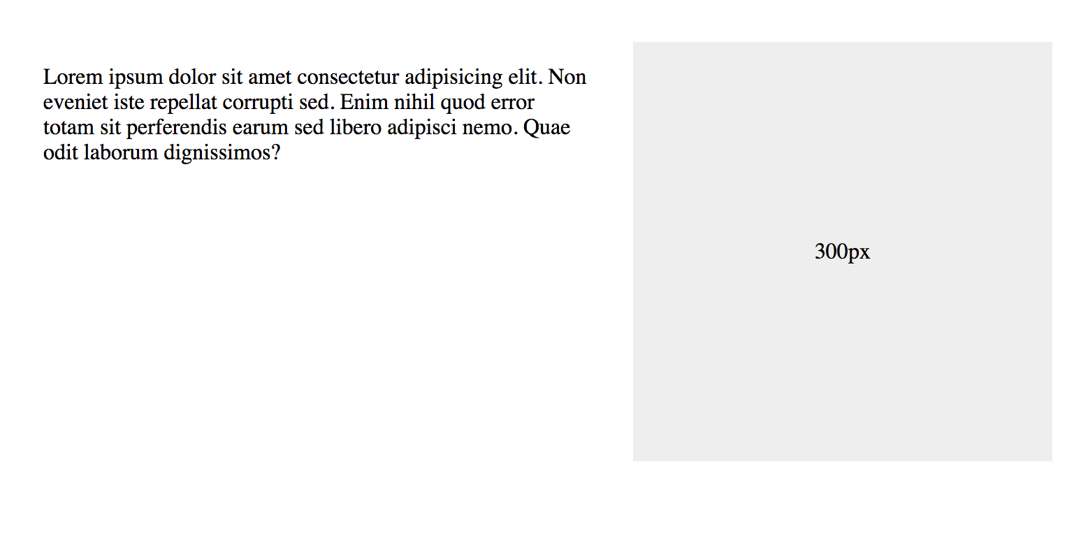
Say you have a very simple CSS grid layout with one column fixed at 300px and another taking up the rest of the space at 1fr.
.grid {
  display: grid;
  grid-template-columns: 1fr 300px;
}
That’s somewhat robust. That 1fr column will take up any remaining space left behind by the fixed 300px column. It’s true that the auto value would do the same, but auto isn’t quite as robust since it’s size is based on the content inside. So, if you had too little content, then your column might not fill the entire space you want it to. But while 1fr is slightly more robust, it won’t quite protect you from content that is too big!
Here’s the grid behaving just fine with some text content:

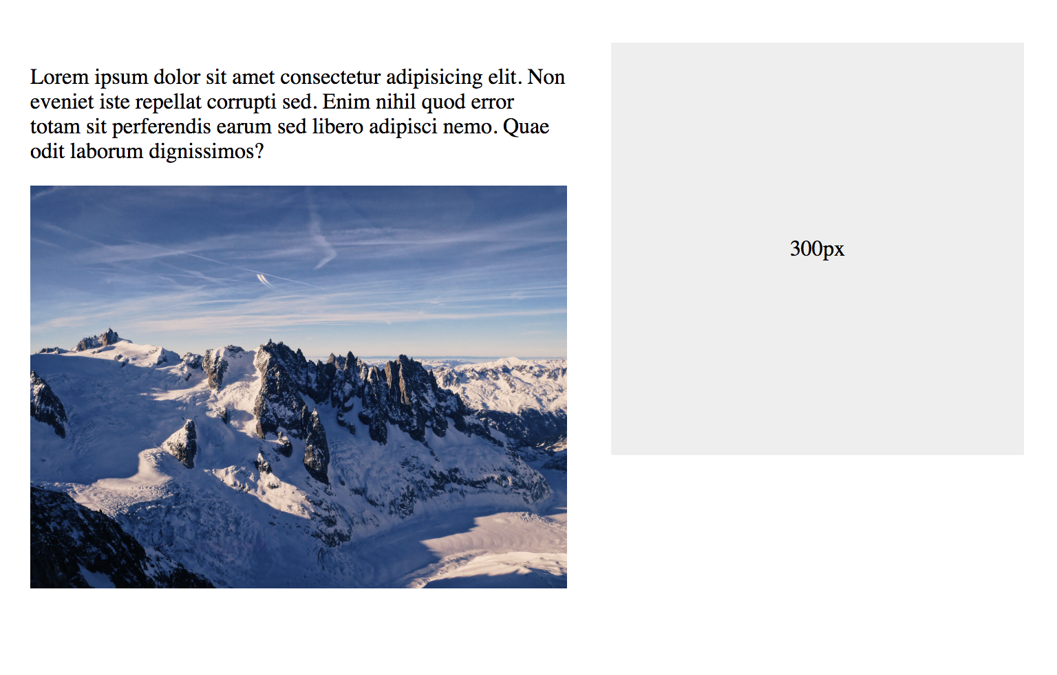
Now, watch that right column get blown off the page when we drop a gigantic image in that column:

That one is easy to fix — and you may never even have it happen to you, because this snippet is so common in our stylesheets:
img {
  max-width: 100%;
}
But some elements aren’t so friendly. Take the notorious <pre> tag. Say we toss one of those in our 1fr column with a long string of text. We’re back to wrecked:

This time, things aren’t so easily fixed! Even attempting to limit the width and hide the overflow of <pre> isn’t going to help:
pre {
  max-width: 100%;
  overflow: hidden;
}
The real fix isn’t all that difficult — we only need to understand what is happening. I can’t promise I’m explaining this 100% accurately, but the way I understand it, the minimum width of a grid column is auto. (The same is true for flex items, by the way.)
And since auto is entirely based on content, we can say it is “indefinitely” sized, its dimensions flex. If we were to put an explicit width on the column, like 50% or 400px, then we would say it is “definitely” sized.
To apply our fix, we need to make sure that there is the column has a definite minimum width instead of auto.
So, we can either fix it like this:
.grid {
  /* auto minimum width, causing problem */
  grid-template-columns: 1fr 300px;

  /* fix: minimum width of 0 */
  grid-template-columns: minmax(0, 1fr) 300px;
}
Or, we put an actual min-width on the element that occupies that grid column. In our simple demo, the <main> element automatically places itself in that first column as it is the first child of the grid.
That give us this:
main {
  min-width: 0;
}
I think it’s a bit more robust to do this at the grid definition level. Anyway, it does the trick! See how the <pre> tag now respects the width of the column and can overflow as expected?

Nice.
Source: CSS-tricks.com