Smashing Book 6 Excerpt: Bringing Personality Back To The Web
Vitaly Friedman 2018-06-14T14:40:27+02:00
2018-06-14T17:15:49+00:00
Generic web layouts have become somewhat of a misnomer in conversations circling around web design these days. We’re bored and slightly annoyed by how predictable and uninspired most web experiences have become. Not without reason, though. Every single landing page seems to be a twin of pretty much every other web page.
In the header, a compelling hero image with a short main heading is followed by a lengthier subheading. Beneath them, uniform blocks of media objects are alternated — an image and a few paragraphs of text. First, text on the left, image on the right; then image on the left, text on the right. Rinse and repeat. Rounded profile photos and a square grid of thumbnails complete the picture, with perfect shapes perfectly aligned along the 12-column grid. The only variations come from sporadic parallax transitions and notorious carousels, positioned at the top or bottom of the page — or perhaps both.
It’s not that somebody imposed these rules or limitations on our creative output; usually they originate from good motives and the best intentions. After all, one of the main tenets of web design has always been creating a subtle, almost invisible and functional interface — an interface that doesn’t make users think, where less is more, and form follows function, where simplicity prevails — an interface where everything feels just right.
Yet when everything is structured in a predictable way, nothing really stands out. Given how remarkably similar names, logos, icons, typography, layouts, and even shades of gradients on call-to-action buttons often are, it’s not surprising our users find it difficult to distinguish between brands, products, and services these days.
Very few people miss the golden times of the infamous Flash, with its strikingly experimental layouts and obscure mystery-meat navigation. Admittedly, in many cases the focus has shifted from creating an experience to merely providing content in a structured form. Yet unlike in those good ol’ days when we talked about how wonderful or horrible websites were, today most experiences are almost invisible, making it exceptionally difficult to connect emotionally with them.
If I asked you to think of a recently visited website that left a lasting, memorable impression on you, or what websites you truly love and admire for their unique design, or what website had a truly remarkable personality, would you be able to answer these questions immediately? Would you be able to provide more than one or two examples? Chances are that you won’t.
Not every website has to be unforgettable. It’s not that memorable websites automatically perform better, or hit better key performance indicators. However, if you want your product or service to stand out in a highly competitive and challenging environment, you need to be different in some way. Many of us would consider this to be the task of the marketing team. After all, they are supposed to place the product in the right light, at the right spot, for the right audience, at the right price. Yet in a world where many digital products are fairly usable and feature-rich, this would be a daunting undertaking that would often require months of extensive research and testing without the guarantee of a successful outcome. And even then, unless you are extremely good at predicting and shaping the next shiny big thing, it might not be good enough.
Customers are used to and expect decent experiences. They aren’t always fast or straightforward, but simply because of the sheer number of offerings, there are always decent tools and services out there that would be good enough.
We tend to believe we rationalize our decisions to extremes, choosing the best candidates, but it’s not necessarily true. According to well-known Herbert A. Simon’s satisficing theory, we tend to prefer the first option that meets an acceptability threshold, just because we don’t know if we can find a better option or how much effort it would take. We rarely study the entire spectrum of options in detail (and sometimes it’s nearly impossible), and as a result, we satisfice with a candidate that meets our needs or seems to address most needs.
To draw an audience’s attention, we need to be better than “good enough.” Nothing can beat word of mouth, but to get there we need to come up with something that’s worth looking at. What if I told you that there was a shortcut to getting there?
It’s not just about price. It’s not just about features. It’s not just about choosing the right placement of buttons, or the right shades of colors in endless A/B tests. And it’s not about choosing a cute mascot illustration that shows up in email campaigns. In the end, it’s about creating an experience that people can fall in love with, or connect deeply with — an experience that, of course, drives the purpose of the site, but also shows the human side of it, like the personality of the people building it, their values and principles, their choices and priorities.
That means designing voice and tone, interface copy, and embracing storytelling, authenticity, inclusivity, and respect; and all of that while establishing a unique visual language supported by original layout compositions and interaction patterns. Together with clear and honest messaging, these create a unique signature, which, used consistently, makes the product stand out from the rest. This task might sound as daunting as months of marketing research, but it doesn’t necessarily require an enormous amount of effort or resources.
In this chapter, we’ll look into a few practical techniques and strategies that might help you find, form, and surface your personality efficiently. By doing so, we’ll explore how doing so consistently could fit into existing design workflows, along with plenty of examples to give you a good start. But before we get there, we need to figure out how omnipresent design patterns and best practices fit into the equation.
Breaking Out By Breaking In
The creative process isn’t linear. Every single design decision — from colors and type to layout and interactivity — requires us to consider options and evaluate combinations. While the creative process is often seen as a straightforward, iterative process, in reality it’s very rare that we smoothly move from one mock-up to another through a series of enhancements and adjustments. More often than not, we tend to float and diverge, heading from one dead end to another, resolving conflicts and rerouting our creative direction along the way.
Those dead ends happen when we realize we aren’t really getting anywhere with the result exposed on our digital canvas. We’ve been there so many times, we know how to explore uncharted territories and how to maneuver the flanks, and so as we keep sculpting our ideas, we keep making progress, slowly but steadily moving towards a tangible result. Two steps forward, one step back, revisiting what we’ve done so far and refining those precious pixels — based on… frankly, based on intuition and random experiments. Eventually the back-and-forth brings us to a calm, peaceful, and beautiful place — just where we think we’ve found a solution — the solution.
We know, of course, that it’s unlikely it’s going to be the one, though, don’t we?
This journey from nothing to something isn’t just full of conflicting micro-decisions; it’s crammed with unknowns, traps, friction, and difficult constraints, be they of a technical nature or time-sensitive. And at every moment of the process, the beautiful, harmless creatures of our imagination can be mercilessly smashed against the harsh reality of user interviews and client revisions. So we swizzle around from one direction to another in a fertile yet remarkably hostile place. As a result, usually we can’t afford the luxury of losing time, as we know that the path to that deadline, harmlessly floating in the remote future, will be full of surprises and unexpected turnarounds.
To avoid losing time, we rely on things that worked well in our previous projects — the off-canvas navigation, the accordion pattern, rounded profile images, and the holy 12-column grid layout. It’s not for lack of knowledge, skill, or enthusiasm that we fall back to all those established practices — it’s just infinitely more difficult and time-consuming to come up with something different every single time. And because we lack time, we use all those wonderful, tried-and-tested design patterns — all of them tangible, viable solutions for a particular kind of problem. Obviously, this process might be slightly different for different people, but broken down into its essence, that’s what’s happening behind the scenes as we make progress in our designs.
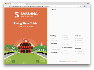
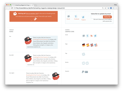
When we started working on the redesign of Smashing Magazine a few years ago, one of the first steps we took was listing and exploring components and micro-interactions. We built the article layout and a style guide, responsive tables and forms, and used many of the established best practices to keep them accessible, fast, and responsive. Yet when putting all these perfect components together, we realized that while they were working well as standalone solutions, they just didn’t work together as a whole. The building blocks of the system weren’t sufficient to maintain and support the system. We had to redesign what we’d built so far, and we had to introduce overarching connections between those components that would be defined through the personality and voice and tone of the new identity.
When we apply design patterns to our interfaces, we essentially bring together a group of loose modules or interactions that lack any connection to everything else. Rather than asking how a particular pattern helps drive the purpose of the experience, we often explore a micro-problem in isolation, putting micro-solutions together. With design patterns, we run the risk of adding a component just because it’s trendy these days — like a parallax-effect, slow and impactful transitions, and fade-ins. By doing so, sometimes we might lose the big picture of what role that component would play at a bigger scale, and how it could be connected to everything else. As a result, we produce soulless, dull, bloated designs with generic compositions and generic visual treatments. That’s how we create something that looks like everything else.
It’s not that design patterns and best practices are necessarily evil, though. They are merely a double-edged sword helping and troubling the visual output.,When applying them, we need to do so carefully and thoughtfully. Whenever you consider resolving a problem with a design pattern, it’s a good idea to ask yourself a few questions:
- What problem exactly are we solving?
- Is the pattern really the best solution for the problem?
- How do people experience this interaction, and what pain points do they encounter while doing so?
- How does this component help us reach the overarching goal of the system?
- How do we connect that component to the rest of the system — in terms of both aesthetics and interaction design?
- Is the solution really universally understood, or do we need to provide more clarity to the design (labels, better copy, affordance, replacing icons with words)?
- Is it a good idea to keep the pattern as is at all times? Or is it better to load or adjust it conditionally, perhaps based on the viewport, or how many times a customer has visited the page?
Essentially, we try to break down a design pattern by exploring when and how it’s useful or damaging, and how it helps in achieving our goals. We break out of predictable patterns by breaking in to their nature and understanding why we actually use them. First, we examine the component in its bare, abstract form, without the context of where it’s typically used and how it’s usually designed; for example, rather than thinking of an off-canvas navigation sliding from the left to right, or right to left, we look into the interaction pattern on its own — essentially, progressive disclosure in which content is hidden by default and displayed on click/tap. Then, for every pattern, we explore its usability issues and problems, resolve them, and then style and design the module in a way that feels connected to everything else. That last step could be something as simple as a consistently used transition, or a geometric pattern, or a non-conventional position in the layout. Finally, once everything is in place, we repackage the design pattern and add it to the library, ready to be served for the rest of the system.
Of course, best practices and design patterns are fantastic shortcuts for getting on the right track faster. They let us tap into predictable interactions and sequential knowledge that most of our users will have. In fact, they are as relevant today as they’ve always been. The key is in finding a way to apply them meaningfully within the context of the visual language used throughout the site, and knowing when to break them deliberately to trigger an emotional connection.
Humans Connect To Humans
Do you remember the good ol’ days when we used an omnipresent “we” to make our little web shops appear bigger than they actually were? You might have been the only person freelancing from home in slippers and a bathrobe, or one of the very few people in a small design agency, but that profound “we” made the company sound more serious, and hence more trustworthy, didn’t it? We’ve pretended to be somebody else to get projects we wouldn’t be entrusted with otherwise — and I’ll be the first to admit that I am as guilty of it as everybody else.
These days, when so many things around us are exaggerated and deceptive, authenticity remains one of the few qualities people genuinely connect to. Too often, however, it’s not exhibited through a website at all, regrettably creating a vague image of yet another obscure entity covered with corporate stock photos and meaningless jargon. When every brand promises to disrupt or be different, nothing truly feels disruptive or any different, and this causes alienation and skepticism.
Humans can genuinely connect to brands they trust, but brands need to earn that trust first. Obviously, it comes from reliable recommendations and positive experiences. But as designers communicating on behalf of companies, how do we efficiently elicit trust in people who aren’t yet aware of the brand? As it turns out, trust can also come from the appearance of the brand, which can be influenced by its values, beliefs, principles, and activities. It isn’t easy to fall in love with a company or organization without knowing somebody who admires it almost contagiously. It’s much easier to connect with people whose values you support, and with people who stand behind their beliefs and principles.
If humans connect best to humans, perhaps if our interfaces reflected the values of the people creating them, we might be one step closer to triggering that desired emotional connection. We’ve been there before, of course, and so that’s why we show the people working in the company on a “Team” page or in the footer of the front page, right? Well, let’s look into it from a slightly different perspective.
What if you were asked to describe the personality of your brand? What adjectives would you use? Think about it for a minute, and write them down.
Ready? Chances are high that you’ve come up with common and predictable answers. Perhaps words such as “simple,” “clean,” “strong,” “dynamic,” “flexible,” or “well-structured” have come to mind. Or maybe “attentive to details,” “focused,” “user-centric,” and “quality-driven.”
Can you see a problem with these answers? These words describe our intention rather than our personality. While the former is usually very specific and stable, the latter is usually very fuzzy and ever-changing. The qualities outlined above don’t provide a good answer to the question, as they describe how we want to be perceived, but not necessarily how we actually are. In fact, usually we don’t really know who we are or how we are perceived outside of the comfortable company bubble we find ourselves in.
Instead, what if you asked your colleagues and customers a slightly different question: what they care about most in their work, and what they value the most about the company or the product. Maybe they care about the diversity of talented, motivated co-workers who are knowledgeable and experienced, yet also approachable and humble? Maybe it’s the fact that the company is actively contributing to pro bono projects for non-profit organizations that make a real difference in the world. Maybe because it supports schools and newcomers to the industry by providing an annual scholarship. Or because it ties in the profits with a fair salary bonus for all employees. Or just because it allows you to play with the latest fancy technologies and crazy experiments, and contribute to open-source in five percent of your working time. The company doesn’t need huge ambitions, idealist goals, or a fancy working environment to stand out.
Sidenote: Designing humane experiences means being kind and humble, and emphasizing qualities that matter to the company and to users. That means highlighting privacy, respect, ethics, and transparency, but also reflecting the personality of people working on the product.
Here’s an example. Your company could care deeply about diversity, data privacy, accessibility, and transparent pricing. That would mean your interface is accessible and honest, you publicly take a stand against giving away customer data to third parties, and you include features that support pricing comparison without pushing your agenda over the edge. You could highlight those values prominently along with the competitive pricing tiers, and measure the outcome.
Now, can you spot a similar thread among all of the statements above? Because they come from personal experiences, they seem much more human and relatable than more general and abstract terms you might come up with initially.
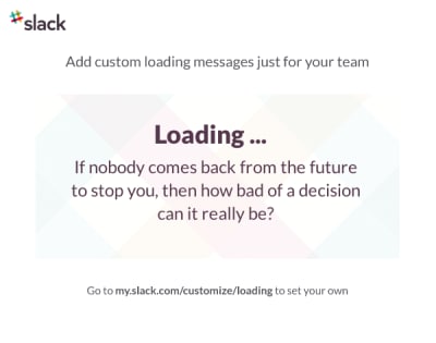
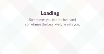
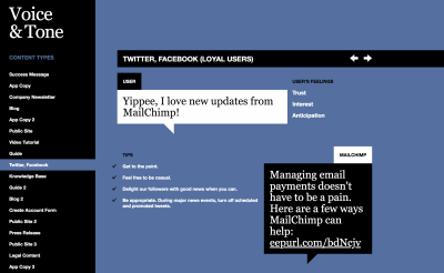
That’s why companies like Slack or MailChimp feel so much more tangible than brands like Uber or General Electric. They employ quirky and informal microcopy and illustrations that reflect their human side. They don’t shine through a mission statement or press releases, but through the quirks in the interface and how they communicate publicly, via email, or in social channels. That’s the underlying foundation of a character deeply integrated into the user experience.

To avoid a generic appearance, you need to define your personality first. That means asking the right questions and finding accurate answers. When conducting user interviews with our readers, we quickly realized they had a quite different perspective on the Smashing brand than we did. Frankly, we confidently described the brand by listing all the usual suspects, the qualities you probably came up with initially. The truth was baffling, though: we couldn’t have been further away from how the brand was actually perceived.
We always wanted the magazine to be a professional, respectable publication with a strong voice in the industry, highlighting important work done by members of the community. User interviews brought up qualities that didn’t really describe that goal in the way we always strived for. Instead, we heard words such as “informal,” “quirky,” “friendly,” “approachable,” “supportive,” “community,” and — most importantly — “cats.”
Now, we never wanted our legacy to be cats, but it wasn’t really up to us at this point. Back in 2012, our dear illustrator Ricardo Gimenes chose to bring a Smashing cat to life as a mascot for our very first Smashing Conference. There was no conscious decision for or against it. We didn’t even properly discuss it, as we didn’t know if we’d host more conferences in the future anyway. This small decision put something in motion that we couldn’t dismiss years later. Because conferences turned out to become one of our central products, we’ve been promoting them heavily in our mailings, announcements, release posts, and social media messages.
Over time, every conference had to put up with a cat illustration of its own, and all these cats were facing our customers over and over again for years. Cat illustrations heavily influenced the perception of the brand without us actively fostering or guiding it. So we had to make a decision: either let the cats slowly fade away into oblivion, or integrate them heavily into the new design. You probably have discovered by now what we’ve settled with. As of this point, we have over 70 quirky and friendly cats freely wandering all over the new Smashing Magazine website.

However, as much as a mascot can help make the brand more approachable, it’s rarely enough to convey the full story. Interviews also helped us realize how important the community aspect of Smashing Magazine actually was. The words “community” and “people” appeared in user interviews a lot, and not without reason — the magazine wouldn’t exist without humble and generous open-source contributions from people behind the scenes. Our design didn’t really reflect it, though. So we chose to shift the focus slightly towards highlighting the people behind the scenes — authors, editors, and members of the community. Showing people prominently has become another attribute defining our design signature — and that explains why author thumbnails take up such a prominent position in the design, and why we highlight authors publishing on their own blogs or other platforms on our front page.
What does it all mean for you? Ask questions to surface humane qualities that lie in the very heart of the company first. This will give you a foundation to build a visual language on — a language that would translate your qualities to the interface design. Every company has a unique signature in some way, and often it’s reflected through the people working there. Ultimately, it’s just about finding the time and courage to explore it — and to embrace the fact that our flaws and quirks are a part of it as much as our big ambitions and good intentions are.
Personality Is Never Perfect
As designers, we often take pride in being perfectionists. Every pixel has to be polished, every angle has to be just right, and all components should be aligned to the grid. Remember that never-ending discussion about the perfect border-radius on call-to-action buttons? After an eloquent and long-winded debate, the design team eventually settles on 11px, just to switch over to 13px a few months later, just to move back to 12px by the end of the year. In many companies, these changes are prompted through numerous ongoing A/B tests, in which nothing is left to chance, and everything — from assumptions to design decisions — has to be tested and proved first.
We restlessly strive to reach the most effective, the best performing solution — a solution that’s just right. However, aren’t we riding our horses to death trying to improve the same tiny component over and over again, just to find a slightly better variant of it, with all those minimal, microscopic changes?
Espen Brunborg, a creative lead for a graphic design agency in Norway, suggests to never conduct A/B tests alone.1 According to Espen, A/B tests help us reach a local maximum of the user experience, but often they aren’t far-reaching enough to encompass the big picture in its entirety, effectively stopping us from reaching a global maximum.2 That’s why in addition to A/B tests (in which microcopy and colors and positions in the layout are tested), they run so-called A/Z tests, testing an existing “baseline” design against completely different designs. Their differences lie not only in the shade of a button or copy, but in absolutely different layouts and visual treatments. The branding and the core principles remain the same, but pretty much everything else keeps evolving. This allows Espen and his team to reach new absolute maxima in terms of conversion and KPIs every few months.
1 Jakob Nielsen wrote an article called “Putting A/B Testing in Its Place” back in 2005. The article highlights some of the limitations and downsides of A/B testing; most notably, that it should never be the only method used on a project — observation of user behavior often generates deeper insights.
2 Bill Buxton was probably the first to discuss this problem in his book Sketching User Experiences back in 2007. According to Bill Buxton, designers often end up with a local hill-climbing problem when the design gets plateaued on a local maximum.
In one of our conversations years back, Elliot Jay Stocks, who was involved in the 2012 redesign of Smashing Magazine, briefly mentioned one fine detail of his design process that stayed with me for quite some time. He said that a good design possesses one of two qualities: it’s either absolutely perfect in every way, with perfect alignment, sizing, and hierarchy (which is usually quite hard to achieve), or it’s deliberately imperfect in a few consistent ways (which is much easier to achieve). According to Elliot, in a good design there shouldn’t be anything in between. In other words, buttons should either be perfectly aligned to the grid, or not aligned at all — offset by 20–30 pixels and more. Being off just by a few pixels would feel wrong, while being off by 20–30px looks deliberate, and hence less broken.
So what if, instead of chasing the perfect solution for every single component, we ran and tested various expressions of our personalities? In interface design, it would mean entirely different creative directions. Perhaps a multicolumn layout with bold typography, against a geometric layout with a single accent color? What if, rather than seeking the perfect roundness of a button, you deliberately introduced slight inconsistencies? A custom animation on one of the call-to-action buttons, or a dynamic placement of an image outside of the box in which it’s usually supposed to be placed? Or perhaps rotating a subheading by 90 degrees? The personality can be expressed in many entirely different ways, so the task is to discover variations that are promising enough for testing.
A personality is never perfect, and so perhaps our websites shouldn’t be perfect either. What if you set up a publicly visible art board in your company, with magnets representing the qualities on one side, and magnets representing components or visual treatments on the other side, and then randomly clashed one against the other to produce a visual direction for the next A/Z test? Apply perfectionism to the level of detail required to produce deliberately imperfect designs.
This approach won’t always win, but complemented with A/B tests, it might bring you to new heights you wouldn’t be able to achieve otherwise. Ultimately, we want customers to fall in love with their experience and consequently the brand, to form a lasting bond. A deliberately imperfect yet humane interface can help us get there. It requires you to find just one distinguishable quality that nobody else has, and boost it up.
Choose One Thing And Boost It Up
In our interfaces, personality can be expressed through a design signature — a recurring visual treatment, the voice and tone of the copy, or an interaction pattern used consistently from one page to another. It might be tempting to explore a diverse mix of sophisticated, non-conventional treatments that would be seen in the interface miles away from the mouse cursor. However, that’s a recipe for a disastrous experience that prioritizes a designer’s expression over users’ intentions. However bold the personality is, its design signature should remain subtle.
When working with Dan Mall on the Smashing redesign, one interesting detail Dan brought up at the very start of the project was the role of the signature in the final outcome. According to Dan, choosing a few distinct, competing expressions of the personality is often too much: it’s enough to choose just one little detail and boost it up all the way. In more practical terms, that means picking one pattern and using it consistently, everywhere: on every page, and in every user interaction. How do you find that sacred detail? You go back to the roots of the company.
In the very early days of Smashing Magazine, we didn’t have any branding at all. We chose a pretty random WordPress theme, placed the name in Arial, and that was it. Eventually, in early 2007 Ryan Denzel from South Africa designed Smashing Magazine’s logo, which included a letter S tilted by 11.6 degrees. Despite minor alterations in the shade and colors of the logo, we stayed true to the design for over a decade, and with the recent redesign, we weren’t considering changing it. However, when seeking a design signature that would be deeply connected with the brand, we actually took the tilting of the logo very close to our heart — from the very start.
Early design explorations with Andy Clarke used the tilting consistently for every single visual element on the site. This signature carried over to the final design as well. Today, all icons, author images, conference flags, job board logos, illustrations on product panels, and book covers on product pages are all consistently tilted. That tiny detail doesn’t break the experience, yet it lends a unique visual treatment to the design that’s clearly distinguishable from everything else as a result.
Admittedly, we did redesign the tilting through the process, moving away from 11.6 degrees to 11 degrees, and adding 11px roundness to all components. It was months later that the bold colors and typography and layout came into play, supporting the quirkiness and informal style of the tilted elements — all slowly crawling up into the design mock-ups eventually.
At this point you might be slightly worried that you don’t really have any distinctive element that could be promoted to become your signature. You might not have the tilting or a particular color palette that stands out. As it turns out, anything can become a design signature. In the next sections, we’ll explore some examples and ideas you could use for you own particular situation.
Why Custom Illustrations Work Better Than Stock Photos
Once the qualities of the personality have been identified, the next step is to translate these qualities into a distinct visual language. Initially it happens via color and typography, so when defining the visual style, look out for these qualities in color combinations and type families.
Probably the easiest way to come up with your own design signature is by using custom illustrations designed specifically for the brand. Every artist has their own unique style, and unlike stock images or stock photos that often almost enforce generic appearance into layouts, custom illustrations give a brand a unique voice and tone. You don’t need to go overboard and create dozens of illustrations; just a few would probably do. Think about replacing all the stock photos you’ve purchased with custom illustrations — this should give you a good enough baseline to start with.
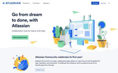
Atlassian is a wonderful example of an illustrative style applied thoroughly and beautifully at every touchpoint of the experience. The illustrations are more approachable than stock photos. Notice, however, that they rarely appear on a plain background — they are supported by the color palette and typographic choices that complement the illustration style.
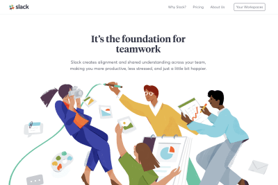
Why are custom illustrations not enough to stand out? Because just like many other attributes on the web, illustrative style also follows trends. Compare Atlassian’s style to Slack’s visual language. Yes, the fine details are different, but the pastel color combinations are similar. The illustrations from these different projects could happily coexist within one single website, and many customers wouldn’t notice a difference.
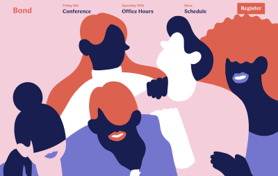
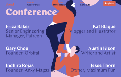
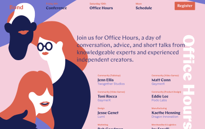
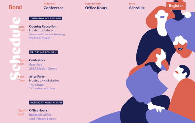
A distinct visual style requires further attention to other elements on the page, primarily backgrounds, typography, shapes, and layout. Notice how all of these elements play together on Bond. Illustrations aren’t just added to a blank white canvas — they interplay with the background, text colors, and the layout.
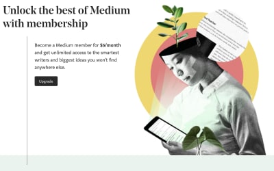
Medium uses a collage-like style for all its illustrations on landing pages and help pages. The key is that illustrations are used consistently across pages. They might not make sense to every visitor, but they contribute to the unique visual appearance of the brand.

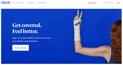
Health insurance is a very competitive and not particularly friendly nor transparent environment for citizens and business. With custom illustrations, subtle animated GIFs, and straightforward copywriting, Oscar, a newcomer to the industry, appears more approachable and relatable.
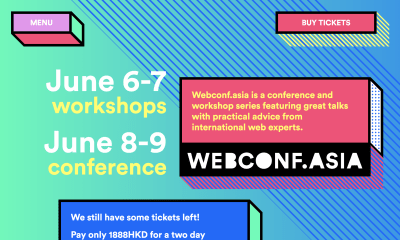
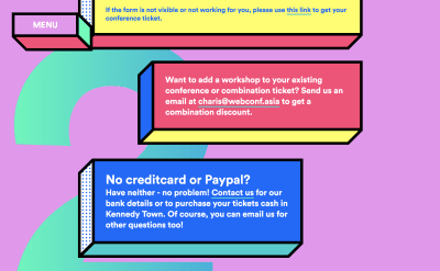
WebConf.Asia is a conference website with vivid color combinations and background, and boxy components designed as if they were three-dimensional. This is enough to set the design apart. The visual treatment produces depth, which is used for speakers, talks, and main navigation.
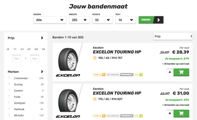
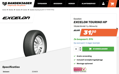
Bandenjager uses slanted shapes and compositions consistently on call-to-action buttons, in the navigation, and even in the quantity selector on the product page. That’s their design signature. Notice how even micro-components such as product labels use the same pattern.
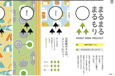
Maru Mori Project uses a tree shape… everywhere, accompanying custom illustrations that highlight the ongoing activities of the foundation.
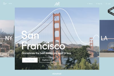
Storytrail lets its visitors explore cities with an interactive guide, complemented with videos and photos. Every single city has its own signature which is a wavy horizontal line, outlining that city’s most important landmark. The cities differ in the curves of the lines, and the design uses lines as a signature for animations, transitions, and arrangement of items in the layout.
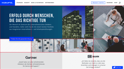
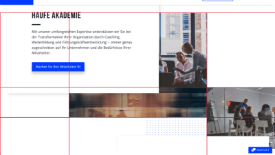
Haufe uses overlapping backgrounds to add more dynamics to the design. The main structure of the grid is derived from the letter H, which is the main character of the company’s identity. All components are laid out on the grid to support that personality trait. A nice play of photos, original compositions, and a variety of geometric backgrounds at once. Haufe’s design system beautifully describes the underlying principle of Haufe’s dynamic grid.
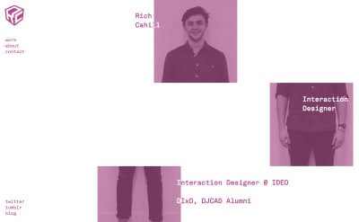
Another way of drawing attention is by adding randomness to your compositions. Rich Cahill’s portfolio contains illustrations split into three vertical parts, randomly offset horizontally and colored with a set of predefined colors. It’s really not that difficult to add a little bit of personality to stand out. It’s a nice example of introducing some chaos in the design language by combining predictable parts of the system in seemingly random, unpredictable ways.
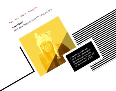
Lynn Fisher also adds some randomness to her portfolio. The layout changes completely between different breakpoints, creating a totally different experience on mobile and desktop devices. Even the favicon changes dynamically as well.
When considering the visual direction of a site, it’s a good idea to consider custom illustration style, backgrounds, typography, and shapes. Establish strong connections between all of these attributes by reusing design decisions, such as the choice of colors and spacing. While doing so, of course, it wouldn’t hurt avoiding predictable options used widely everywhere else. One of the effective ways to achieve this is by keeping tabs on ongoing design trends, then pick the most prevalent one and… smash it to pieces.
Pick A Trend And Smash It To Pieces
When talking about great design, Yves Saint-Laurent, a well-known French fashion designer, once noted that “Fashions fade; style is eternal.” According to Saint-Laurent, to create timeless designs it’s important to take note of trends, yet serve an interpretation of trends through the lens of your own personal style. That’s not what we usually see on the web.
It’s almost ironic that it has become trendy to dislike trends these days, and for good reason: usually their primary purpose is visual embellishment, rather than driving a designer’s intent, and often they don’t add much to the experience beyond friction, confusion, and fancy whistles and bells. No wonder then that designers have started to fight back with “brutalist designs” — websites that aim to exhibit the essence of a website in its unstructured form, exposing the website’s functions to extremes.3
3 It’s worth noting that brutalism in architecture is characterized by unconcerned aesthetics, not intentionally broken aesthetics. When applied to web design, this style often goes along with deliberately broken design conventions and guiding principles.
While doing so, designers often deliberately break design patterns, usability practices, and design trends. At first glance they might appear as designs created with the sole purpose of being different, but because they have a striking personality, they draw attention to themselves. Admittedly, sometimes they seem to be too far-fetched in how they deliberately turn their back on well-established design principles. Not everybody can afford it, and not everybody would feel comfortable connecting such non-conventional aesthetics to their brand.

A slightly more pragmatic strategy, of course, lives somewhere between generic designs and brutalist designs. To get there, you could pick a trend, find a unique perspective and apply your personality to it. For example, if you see many websites using smooth and silky animations, think about how they would fit into your story, and find the twist that would enrich it, and make it more personal. Break down the trend into pieces to understand its mechanics and what’s happening behind the scenes, then twist some parts of it, repackage, and integrate into your design.
Instead of using bouncy animations, you could introduce an artificial delay, effectively slowing down the appearance of items on the page. If most profile images you see have a perfect circular shape, try to come up with another shape that would work well for you to display avatars. If most photos are rectangular, think of another shape that might do the job well.
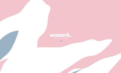
Instead of using off-canvas transitions, think about a particular kind of transition or animation that would best reflect your brand. For more corporate entities, a fast-paced transition might work best; for creative projects, a slightly more playful and slow transition might be a better fit. Waaark is a wonderful example of the latter. If all transitions were removed, the portfolio website would look pretty much like every other portfolio out there.
Implement Consulting Group uses a short and subtle geometric animation to highlight the featured article on the site. Foreground and background images are a bit offset and animated, with a geometric shape in the background and a story preview in the foreground. That’s enough to give the experience some personality.
Imagine for a second that you have to redesign your ongoing project, but can’t use any basic shapes such as circles, rectangles, or triangles. What would you choose? We all know there is an infinite amount of options, but why is it then that so often we are constrained by highly predictable and heavily used choices? What is neither a circle nor a rectangle nor a triangle? Well, slanted or tilted elements aren’t. Neither are letters and large typography. Nor are custom responsive illustrations or iconography. Nor whitespace, audio, and video. Nor transitions and animations. Nor pretty much any other shape created via a polygon, with content embedded via SVG masks.
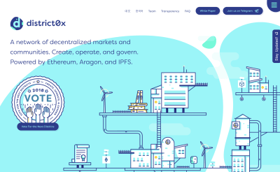
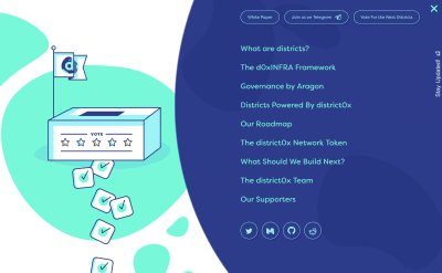
District0x is a network of decentralized markets and communities. The site uses custom shapes, smooth transitions, and animations to provide a distinct experience. No rectangles or circles. And notice how well the colors, background images, and typography work together on the site.
It’s not that all basic shapes should be ignored and dismissed from now on, of course. Avoiding basic shapes deliberately is one of the very first exercises we do when we try to come up with a slightly more original art direction. Once you’ve come up with a decent idea without basic shapes, you can start bringing them back sparingly when necessary. Chances are high, however, that you might be able to get away without them altogether.
Do Make People Think
Why is it that when we are puzzling our way around a foreign city and a souvenir shop owner is desperately trying to catch our attention on the street and push a sale, we pass by in haste; yet we slowly walk into a beautifully designed souvenir store that is silent and humble just around the corner? Perhaps it’s because we seek authentic, honest, and respectful experiences, and tend to ignore everything that doesn’t fit the bill. In his fantastic book Blink, Malcolm Gladwell outlined an interesting phenomenon related to how humans value their experiences.
According to Gladwell, we tend to be more satisfied with our experiences when we feel valued, listened to, and understood. Doctors who take a disproportionate amount of time listening, asking questions, and taking notes with their patients tend to get significantly better reviews and higher ratings despite the fact that other doctors might be as proficient and knowledgeable. They might jump to correct conclusions faster, yet their efficiency doesn’t elicit trust and connection in their patients. Of course, primarily we want the problem to be solved, but we also love falling in love with a charming personality, wisdom, expertise, and human kindness.
We know by now that we can enable human connections by embedding compassion into our interfaces. However, these connections don’t just happen overnight — they take time. But where does it leave us in the age of instant gratification and invisible interfaces, when it has become the essence of our job to avoid interruptions and distractions, and create a clear path for customers to follow seamlessly? If we aren’t supposed to make people think, how do we even get a chance to establish an emotional connection in the first place?
We do so by slowing down. Deliberately. By making people think. Not much. Just a little bit. Just enough to make them feel valued, or smile, or get curious. We do so by adding friction. A few bumps here and there, enough to offer a chance of being directly confronted with the personality infused in our interfaces. It might even mean confusing the customer every now and again just to enable a speedy recovery from that confusion with a dash of positive emotion in their eyes. That’s how memorable experiences emerge.
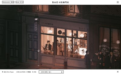
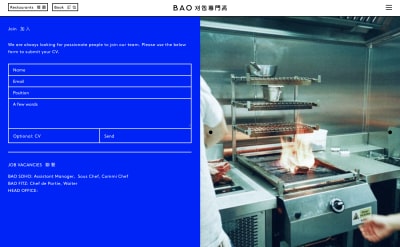
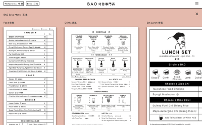
Everything is a little bit off on BAO London — the spacing, the color combinations, the form layout, the hierarchy, the buttons, the cursor, the lightboxes, the illustrations. This consistent breaking of predictable patterns makes the website appear interesting and appealing. Breaking things slowly and deliberately, one component at a time. That’s not a regular restaurant website.
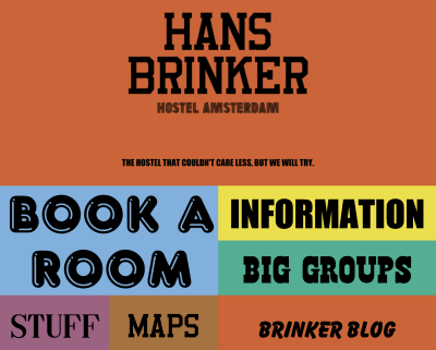
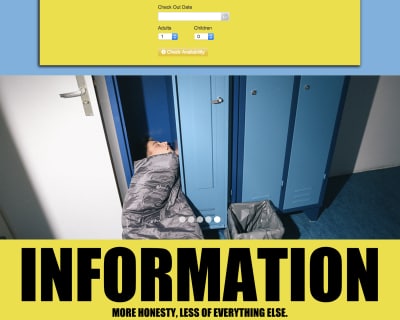
Everything is way off on the Hans Brinker Budget Hostel website, and it’s done deliberately as well. The hostel was struggling to sell rooms as the competition was quite tough in Amsterdam. Rather than improving the design, they made it worse to fit well within their story. If you can’t make it better, make it worse. Even if you don’t have a wonderful product to sell, it’s always possible to wrap a story around it and make it more interesting. Pretty much every element on the page actively makes people confused — from color combination to typography to interactions. It worked though — they are expanding to Lisbon now.
Now, of course, not everybody will like it, and some people will find it annoying, confusing, misleading, childish, or just over the top. Very much like we find it difficult to connect to some people, we might experience the same issue with an interface that attempts to show its human side. But isn’t it worth it? Perhaps in times when everything is remarkably similar and doesn’t really stand for anything, it’s worth striving for our product to be genuinely loved by many people for the price of being genuinely disliked by some people, rather than eliciting no feelings at all.
In his “How I Built This” interview on NPR, Mike Krieger, the co-founder and creative mind behind Instagram, mentioned that rather than spending a significant amount of time trying to understand why people abandoned the service, one of the fundamental principles that drives growth is focusing on customers who deeply love your product and stay around for years. By prioritizing existing customers and what they truly love about your product, you might not only attach them to your product, but also boost the word-of-mouth marketing that’s infinitely more effective than traditional landing pages.
It doesn’t mean, though, that we shouldn’t take good care of experiences customers have when abandoning the product, or — even worse — that we should make it harder for them to leave. The humane qualities of the interface should shine consistently through all the touchpoints of the experience — and it holds true for onboarding as much as offboarding. In fact, the latter is often neglected as it isn’t deemed as being that important — after all, at the point when the customer will face it, they have almost abandoned the product.
Offboarding Matters
Just like human relationships sometimes end abruptly and badly, leaving a lasting negative aftermath, so can our relationships with digital products. It’s highly unlikely that a person abandoning a product with a mysteriously long-winded journey through cancellation redirects would praise the product to friends and colleagues. People leave for very different reasons, and sometimes it has literally nothing to do with the service or the experience. They might have moved on, or just want to save money for something more important, or perhaps they just found an alternative that better fits their needs.
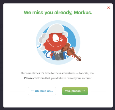
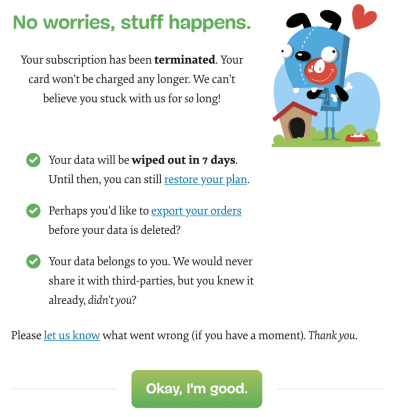
What if at the moment of departure we make them feel deeply valued and understood? Admittedly, with Smashing Magazine’s redesign, we didn’t spend too much time designing the offboarding UX, but it was important for us that the experience fitted well within the overall personality of the interface. When our customers cancel their membership subscription, we greet them with a respectful and even encouraging notice, providing a little gift for sticking around with us for so long, and explaining what happens to their personal data.
The result was surprising: we discovered that customers who cancel the subscription and go through the offboarding UX, sometimes tend to be even more eager to recommend us to their friends and total strangers than some loyal members who stick around for a long time. They just admire how respectfully and thoughtfully we deal with their decision, and that we don’t pull all the shady tricks from the trenches to make it difficult for them to leave.
Make Boring Interesting
It’s difficult to introduce playful elements into an experience which is otherwise very much corporate and formal. However, whenever you are designing a particular interaction, be it as simple as hovering a button, or moving from one section to another, or filling in a form, there is always some room to make the experience slightly more interesting.
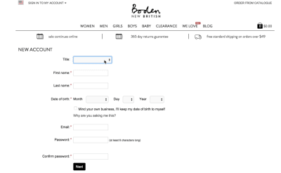
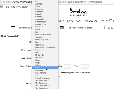
For example, out of all the wonderful form elements on a given page, what could be less exciting than a “Title” input? Sometimes appearing alongside radio button counterparts or a dropdown, rigorously asking customers for very personal information about their marital status, without any obvious reason whatsoever. And that’s exactly the moment when we can make it shine beautifully. A great way of creating memorable experiences is adding a bit of surprise at the point where it’s most unexpected. Pick the most boring, unnoticeable part of the experience and try to make it interesting. Now, is there a way to make this interaction more interesting?
When creating a new account on Boden, customers are dazzled with a quite unusual selection of options, ranging from Admiral to Squadron Leader and Baroness. Who hasn’t wanted to be a Squadron Leader at some point in their life? This little design decision elicits smiles, and prompts customers to share this gem with their friends and colleagues. By the way, the list of options is quite lengthy.
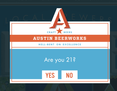
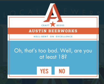
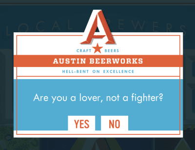
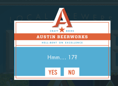
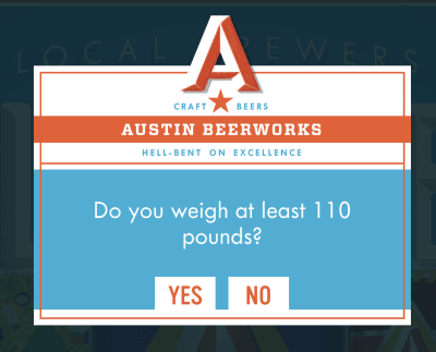
Austin Beerworks is just one of many local breweries in the US. When customers enter the site, as always they are prompted with an age check that’s supposed to ensure they are over a certain age limit. Most people — honestly or dishonestly — would click on “Yes” and move on, but if the customer chooses to click on “No,” they embark on a “choose-your-own-adventure” trip to be guided to a video that best describes their personality.
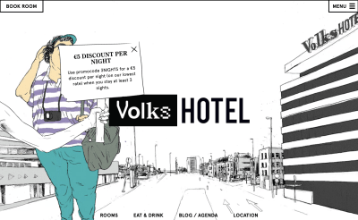
Who doesn’t love disliking a pop-up? However, pop-ups can be made interesting too. Volkshotel uses the most annoyingly delightful pop-up out there, beautifully illustrated as a person holding a sign in front of the website. As the visitors hover over it to close it, the pop-up sneakily moves away a little bit, making it just a tad more difficult to close it. Personally, I wish every single website had a pop-up like that.
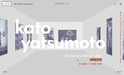
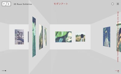
Tympanus 3D Room Exhibition doesn’t look particularly exceptional until the visitor chooses to interact with it. When moving from one exhibition detail page to another, rather than just loading another page, the user is moved from one room to another within a 3D space. Unexpected and memorable.
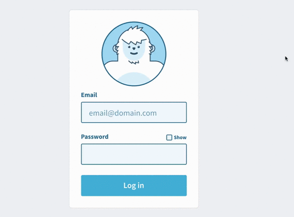
What’s a slightly more common interaction on the web? Forms, in all their different flavors and appearances. In fact, chances are high that you have some sort of a login and password input on your site, and, of course, that’s a pretty boring interaction. Adding a character responding to a user’s input might spice things up a little. As a result, people might spend more time interacting with the form before signing in. That’s better engagement at hand. Darin Senneff’s Yeti character does just that.
The strategy is simple: choose one predictable, boring pattern, study user expectations and… break them mercilessly by adding something unexpected and uplifting to it. Please note that it doesn’t mean breaking usability just for the sake of breaking it; rather, it’s about making a handful of boring elements more interesting by adding some unconventional treatments to their design.
Find A Pain Point And Solve It Well
Can you hear restless voices of skepticism whispering from the corner of the room? Not every corporate setting will sustain a funky custom illustration, a quirky animation, or an unconventional interaction. A striking visual identity might not really fit into your digital presence, custom illustrations might not be within the budget, and you might not want to break customer’s expectations anyway.
In these cases, you might want to explore a slightly different route. If you can’t convey your personality through unconventional aesthetics or interaction, an alternative is to convey it through superior problem solving. It means you need to uncover painful moments of interaction — when customers are annoyed or disappointed or confused — on similar sites, and sweep through experimental and seemingly far-fetched solutions to try to trump the experience that your competitors provide. Take on a problem, and tackle it meticulously, head on.
Surprisingly, most of the time these pain points aren’t particular features; it’s the perceived complexity of the interaction and the lack of transparency. Too many form fields; too much time investment; too slow an interaction; too many repeated questions; too many unnecessary requirements. The angle is to find a way to make seemingly complex interactions deceptively easy, hence surpassing expectations.
It goes without saying that solving a particular pain point won’t help much if basics aren’t covered properly. Accessibility, performance, proper visual hierarchy, and responsive behavior are the founding pillars of every experience, and have to be considered first.
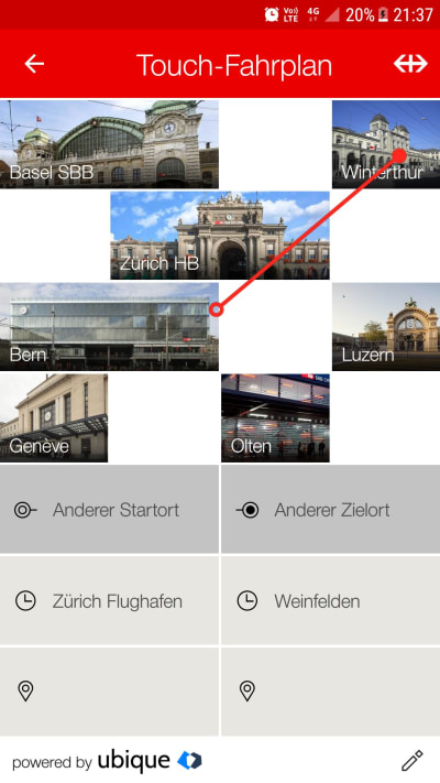
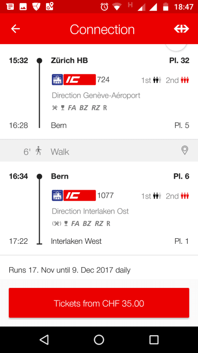
SBB Mobile is a Swiss trip planner app that allows customers to check the schedule of trains and purchase train tickets. On its own, it’s a trip planner like every single similar app out there, except for one thing. The app provides a “touch timetable”; customers can define their common destinations and arrange them on a grid. To purchase a ticket from Zurich to Lausanne, for example, it’s enough to draw a line on the grid connecting Zurich and Lausanne and then confirm the selection. Booking tickets has never been that fast and easy. That’s a great example of making a conventionally complex interaction straightforward, especially for people who commute frequently. Also, it’s a unique design signature that nobody else has (yet).
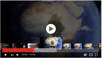
What would it take to provide a remarkable video-playing experience? It might sound as simple as designing a track and a thumb with a few ticks on the track for quick jumps. However, if you study common problems users experience frequently, you’ll find one particular issue that stands out. People tend to pause videos and then continue watching later, yet restoring the state of where things were left off is unnecessarily complex in many video player UIs.
In fact, you might encounter people writing down the exact time stamp when they paused the video, just to return to it later on another device — but then again, in most UIs it’s impossible to jump precisely to a particular second, and most of the time you have to guess and tap the position of a thumb on the track correctly. In the same way, jumping back and forward by 30 seconds or even by a few minutes can be remarkably challenging, especially on mobile, as most interfaces aren’t designed around that particular case.
Not only does YouTube provide fully accessible controls for navigation, it also contains a keyframes preview with thumbnails appearing on hover, and navigation via keyboard — and it stores the current state of the video, allowing customers to save a particular time stamp with a unique URL to continue watching later. YouTube also contains many lengthy videos, like documentaries or tutorials, so users can slide up the thumb vertically to adjust the scale of the track and hence jump to the point of interest more precisely. Unfortunately, only a few users know of the feature, and the interaction isn’t particularly self-explanatory, but those who do know of it, use it frequently. One pain point, solved well.

Most academic publications contain dozens of endnotes, footnotes, and references, listed in the order of appearance. If a reader is interested in a particular footnote, they have to jump to the end of the article to read it, and then jump back to continue reading the article. This experience might be a bit too tedious for frequent use, yet it’s the default experience we all are accustomed to.
The Harvard Law Review solves this problem in a different way. References are always located right next to the point where they are mentioned. Every side note and footnote either appears on the sides on larger screens, or displayed inline via an accordion. Once a user has tapped on the footnote, it expands in its entirety, while the footnote turns into a “close” button. A simple problem solved well.

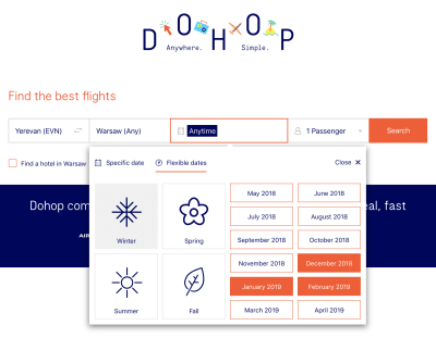
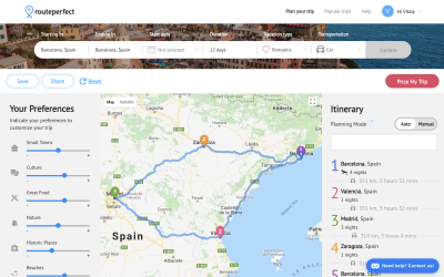
Imagine you want to book a wonderful vacation with your family, but you haven’t picked your dates yet. You have an idea of when you’d like to go, and you have some flexibility regarding the dates for your next vacation. DoHop allows its users to choose a flexible date for traveling; for example, particular months of the year, or a particular season, (winter or fall, perhaps). It then suggests dates and a time span with the best price. And if you have a public holiday weekend coming up in a few weeks, and you’d love to make a plan, RoutePerfect suggests a route based on your preferences. That’s a real problem case solved well. Most traveling websites ask for specific dates for inbound and outbound flights.
Good solutions require time and focus. They require us to really understand what pain points users experience first. Users might not be very good at articulating those paint points, so we developed a simple technique that helps us get to the root of the problem.
We ask testers to complete a particular task on a competitor’s website, and record their session on video, along with a webcam, using the device that they are used to. It could be as easy as finding an item in a catalog, or checking out on a retail store, or finding a particular section in the navigation. Of course, we observe their behavior and ask questions if something appears to be unusual, but too often many things that happen during the sessions go unnoticed — they are just too difficult to spot right away. That’s why we rewatch recorded user sessions in slow motion, often slowing down the playback five or six times.
We look for repeated movements and imprecise hits, as well as negative facial expressions and gestures. More specifically, we search for little moments of despair — fleeting moments of confusion when movements or gestures don’t make any sense: circling around a button or a link over and over again; focusing on a particular interactive element for far too long; selecting the same text a few times in a row and then continuing to navigate without acting on it. The playback sessions usually happen right after the test, so we still have an opportunity to ask questions and validate our assumptions with the tester. Even a few recordings usually provide actionable insights — and it doesn’t require many resources or much investment. It’s also a good idea to examine customer support logs, and ask the support team about common complaints.
Once we’ve identified some issues, we explore solutions that would provide more clarity and ease the interaction, sometimes by designing without any particular visual language in mind. The point is to find an interaction pattern that would be way more superior to the experience customers had on the competitor’s sites. We then produce a digital mock-up and invite the same customers to try to solve the same tasks, along with a new group of testers who haven’t seen both interfaces yet. We measure the time needed to complete an interaction and ask them to choose which interaction they find more straightforward and useful, and why. Surprisingly, faster interactions aren’t necessarily perceived as being faster, and slower interactions aren’t necessarily perceived as being slower. Based on that, we iterate and evolve those prototypes. In many ways, those pain points become the heart of our experience that we tackle first and radiate the entire experience out from. That’s why sometimes, instead of running a test on a competitor’s website, we test our own solutions in the same way.
Good solutions trigger an emotional attachment with or without non-conventional aesthetics or interaction. The more pain points you can address well within your interface, the more likely the difference in experience is to be noticed. Only a few websites make it to customers’ browser toolbars, so think about that one pain point and the one solution that would make them do just that.
Exceeding Expectations By Default
Here’s another question for you: of all the hotel experiences you ever had, which ones are the most memorable? Think about it for a moment. Think about what made them so special and why they are so memorable. It might have been an extraordinary natural backdrop, or remarkably attentive personnel, or a lavish breakfast buffet. Or something entirely different. In fact, for many of us it could have been a pretty average dormitory as much as an exquisite 5-star chalet in the Swiss alps. The environment matters, but it’s not the environment alone that matters.
The reason why these experiences are memorable is because they aren’t average.4 In fact, they are the very opposite of average in *some* way, as *something* was exceptional about them. It’s not necessarily the hotel itself — it’s the timing and the people we happen to spend these experiences with. A good hotel provides a setting that enables wonderful experiences, and so does a good website interface. A *memorable* hotel adds a fine detail to the experience that exceeds our expectations, and it does so without telling us up front. And so do memorable websites.
4 According to Daniel Kahneman’s peak-end rule, we tend to judge experiences largely based on how we felt at its peak (that is, its most intense point) and at its end, rather than on the total sum or average of every moment of the experience. The effect occurs whether the experience is pleasant or unpleasant. Other information aside from the peak and end of the experience is not lost, but it is not used. That means we can tap into very negative and very positive parts of the experience, and tweak them to create an emotional connection.
As Brené Brown, a research professor at the University of Houston, so beautifully expressed in her books on empathy, “good design is a function of empathy, while non-empathic design is self-indulgent and self-centered.” The key, then, is to empathize with customers both in their negative and positive experiences, rather than pushing your own agenda. To our customers, that extra fine attention to a few little details can make all the difference in the world. So we could sprinkle a little bit of human kindness here and there, adding extra value silently, without even mentioning it. That fine detail could be as simple as a custom-designed profile illustration, based on the photo the customer has uploaded. It could be a handwritten thank-you note, signed by the entire team and sent via good ol’ snail mail. It could also be an unexpectedly straightforward resolution of a problem after a mistake has been made.
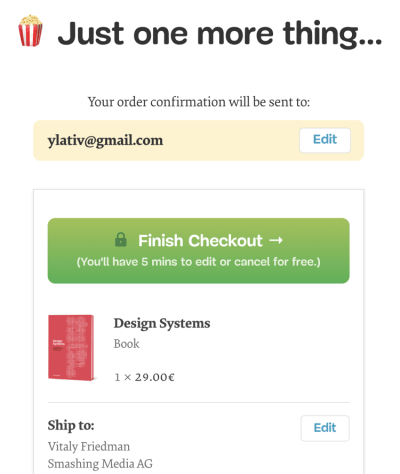
In an eCommerce setting, it could mean the ability to modify or cancel a finished order within five mins after the successful checkout. On the one side, it could help a customer avoid a time-consuming interaction with the support team; and on the other side, just imagine the look on the customer’s face when they realize that the date of the booking was wrong, yet it’s possible to cancel the booking with a click of a button — without any charges applied.
In the same way, an interface could suggest to a signed-in customer to use a saved coupon code, or inform them about a similar — and hence potentially duplicate — booking made a while back. The personality of the brand shines best in those little moments when it helps customers prevent mistakes. By acting on behalf of the experience rather than business every now and again, the interface makes the customer feel genuinely valued, respected, and helped, and that works much better than any ingenious interface copy ever would.
One way of preventing mistakes is by writing adaptive and helpful error messages. That’s one of the most obvious points of frustration for customers, and it’s remarkable how little effort is put into recovery experience, often falling back to generic and abstract messages. Perhaps they don’t cost a sale but they can damage the long-term perception of the brand. People who experience unrecoverable issues during one of the key interactions on a site tend to not use it in the future at all as they expect the issue to creep out in other interactions too.
Overall, error messages deserve slightly more credit than they are usually given. By nature, they appear at the point where the customer’s progress is blocked. That’s also the point where the customers have to slow down and pay full attention to resolve the problem. That’s quite unusual for the entire spectrum of experiences on a site, and we can use the situation to our advantage to infuse a bit of personality into the experience. Every single time our interfaces fail to meet expectations, we should see it as an opportunity to create a memorable impact in the process of speedy recovery. If we manage to turn an annoyance into the feeling of being valued or understood along the way, we might be heading off on the right track.
One of the very first things I started working on when we embarked on the redesign was filling elaborate spreadsheets with alternate wordings for our checkout error messages. It wasn’t done with the intention to A/B test the “best performing” error message, though; it was done primarily to discover better expressions of the personality through the interface. On their own, error messages don’t really make sense, but they fit well within the story being told throughout the site. Obviously, we try to make it as difficult as possible to make mistakes in the first place, but once an error has occurred, we try to use both adaptive and playful copywriting to address the issue while also raise the occasional smile.
Seek critical pain points that customers often experience on the site by looking into customer support logs and user interviews, and design these experiences with extra care and attention. It goes without saying that a quirky personality won’t help much if the customer isn’t able to solve a problem, so take care of the basics first. Ultimately, it doesn’t take that much effort to turn negative experiences into positive ones — it’s just a matter of having it on your to-do list when designing an interface.
The Two Sides Of Personality
As much as we love sharing our experiences and showing our better side to people around us, we can’t stand that one person spending the entire evening talking about themselves. In our interfaces, every time we add yet another parallax transition or a slow bouncy animation to people who have seen it a dozen times already, we are essentially letting the interface highlight its fanciness without helping the user along the way. Eventually, after a few visits, all those whistles and bells that achieve a strong first impact become annoying as they add too much friction.
Nobody loves self-centered characters, and so a website shouldn’t be self-centered either. The design signature should never take the leading role in the user experience as it’s never the main reason why people access the website. It should be humble and remain in the shadows, noticeable but not obstructing the smooth flow frequent visitors have got used to.
In her brilliant talk on designing animations, Val Head, a designer from Pittsburgh, US, suggested using prominent animations very sparingly, as they should be reserved for very special occasions, while subtle micro-animations could accompany the user all along the way. Val suggests using animation only for key compositions of your story, like sending a marketing campaign, or favoriting an item, or seeing a successful purchasing page, while everything else should remain calm and as normal. With this idea in mind we could think of designing our interfaces with two kinds of interactions: the prominent “showroom” ones, used rarely; and subtle “workhorse” ones, used frequently.
Reserve special visual treatments and interactions for special occasions, but also embed subtle treatments used consistently across the entire site. Twitter, for example, uses an elaborate animation when a user “hearts” a tweet. Facebook displays a confetti animation when you congratulate a friend on their birthday or a wedding. In Smashing’s case, we use vibrant colors and cat illustrations as our showroom signature, while tilting, hover-animations, and shadows beneath them make up our workhorse signature.
We are used to the idea of our designs adjusting to the viewport or network conditions, but it might be worth looking into adjusting the design based on the frequency of usage too. The technique is often called progressive reduction, essentially a dynamic simplification of an interface as users become familiar with it. The idea is simple: identify the major features in your interface, and assign levels to these features. Then, track your user’s usage by monitoring the frequency of use within a certain time period and create proficiency profiles for the user. Based on the current level, you could then adjust components of the interface to reduce hand-holding.
As Allan Grinshtein noticed, it’s worth noting at this point that a user’s proficiency in a given product decays over time without usage (also known as experience decay), so if a user’s frequency of use and usage volume have gone down, then their interface should regress a level or two, depending on how far down their numbers have dropped. This automatic regression is necessary to balance progression; without it, you lose the ability to fully respond to dynamic changes in user behavior, adds Dan Birman in his article.
The more often customers visit the site, the less likely they want to be confronted with anything that would slow them down. Therefore, it might be a good idea to slowly fade out showroom signatures with growing frequency of use, perhaps removing parallax-effects or speeding up transitions for returning users. In the end, it’s all about the choreography: don’t be that person at a dinner party filling the room with an extensive story of their life.
The Signature at the Heart of the Design
The design process is a mythical creature. Everybody somehow manages to come up with their own workflow, tooling, and processes, yet it’s very rare that anybody is really satisfied with it. When it comes to infusing personality into the design, when and where would be the right point to include it in the design process?
In one of her talks from 2014, Patty Toland, a senior UX designer from Filament Group in Boston mentioned the hierarchy of priorities the team uses when designing and building responsive experiences. The main goal of the process is to create the “leanest, fastest-loading, most optimized page.” The main foundation is and has always been a fully accessible experience, in which text, images, data, charts, audio, video, forms and so on are all broadly accessible and function fully in their default form. Applied to the context of the design process, it means meaningful markup and properly defined relationships between components.
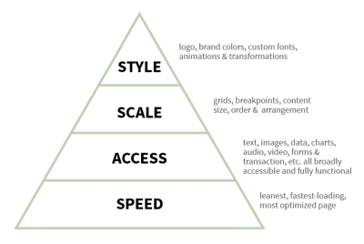
With accessible components ready to be served, the next step is taking care of the scale of the design. That’s where the decisions about grid, content size, order, and arrangement, as well as breakpoints, come into play. Often the proportions will be defined using content wireframes: low-fidelity mock-ups with gray boxes; the height of each box in proportion to others defines its weight in the layout. Sometimes we add notes about the personality across the content blocks, and then reflect them when it comes to visual design.
With low-fidelity prototypes in place, the next step for the design is to gain style, with logo, brand colors, custom fonts, transitions, and animations added to the mix. Sometimes this hierarchy will be perfectly mapped in the order we write React components and CSS properties with Sass. Even seemingly unrelated tasks, like BEM naming for classes, will happen in that order as well. The prototypes will gain abstract utility classes first, and more elaborate relationships will be reflected through more specific class names throughout the process. The process establishes a clear separation of responsibilities for modules.
This process seems plausible at first, but it raises a very critical question: what pages to design and prototype first? When we start designing, we design the heart of the experience first: the most critical and impactful part of the experience. More specifically, we try to capture the very essence of the experience by exploring key interactions, then break it down into reusable components, and then radiate outwards from that essence. For an online magazine, it would be reading experience and typography first. For a landing page, it would be the pricing plans and a feature comparison first.
For an ecommerce site it means looking into the components that would make up an extraordinary relevant and useful product page first. That means large image thumbnails, concise copywriting, transparent pricing, exposed ratings and testimonials, psychological anchors, and call-to-action buttons. The visual design decisions made there are then translated to other parts of the interface, specifically forms and labels and error messages in the checkout. Only then, eventually, we reach the category pages and the FAQ pages living on the far outer edges of the experience spectrum. Somewhere in between we explore the front page, but usually we design it late rather than early in the process — at the point when we’ve established a strong identity already, so we use the front page to amplify and explore it prominently, potentially with a bold design that would exhibit the main qualities of the personality.
Remember overarching connections mentioned earlier in the chapter? A critical part of the design process is to connect modules, so they don’t appear as standalone solutions when put together in the interface. When we have enough modules to build the first prototype, we jump into the browser and build mobile-first. It’s in this process that we finally decide on the grid and the layout and the structure, and implement the connections between modules. In fact, for us, the signature is that magical bond that ties things together.
That’s why we start thinking about the signature of the design when we start designing the heart of the experience, and sometimes even before that. Spreadsheets exploring error messages, visual experiments around shapes and colors and type, as well as user interviews help us get there. Eventually, decisions made for the first prototype can be reused for other pages, yet sometimes we need to run the process from the start again — as some pages clearly will be one-offs, such as the landing page or a front page. They will still exhibit relationships to everything else because they are designed and built using the personality traits that have been solidified by this point.
It’s these relationships that would then lay the main foundation of a design system, along with components and examples of the interface in use. Too often style guides show a component in isolation, along with Sass class names and a code snippet, without including how that component should appear and behave in relation to other modules on the page. Examples matter both for designers and developers, and they give a good reason to both visit and keep the design system up to date in the long-term.


We often create user journey maps to understand the flow users go through to accomplish their tasks, and with personality traits in mind, we could even complement them with storyboards, adding some personality highlights at different points of user experience. Besides, in the context of design systems, we could explore not only components in isolation, but also how the design language can use components to slow down or speed up the experience, or provide greater or lesser impact, as well as dynamic and static layout compositions — very much like we do with showroom and workhorse interactions.
You could even print them out and put them as magnets on a storyboard, so designers can freely move them around and thus explore ways of combining predictable components in unpredictable ways. That’s what Andrew Clarke does when embedding art direction and storytelling in his designs — very much like comic strip designers arrange the frames according to narrative dynamics and impact when laying out a comic story.
The design signature lies at the very heart of the design. It’s an strand that connects the components in the interface, and it’s what helps designers stay on track when maintaining or evolving a design language. Deciding on the personality traits first helps drive the direction of the design, and can be just a good enough constraint to dissolve initial intentions and goals into tangible, distinguishable attributes that could eventually become the heart of the experience.
Wrapping Up
As much as we could get seduced by the charm of a website, in the end, the main purpose of it shouldn’t be self-indulgence. Expressions of the personality of the site enable emotional connections with customers and visitors, and because they are human by their nature, they outline a path to authentic, honest, and respectful interfaces. It’s up to us to figure out how to shape that path and the outcome ahead of us.
Now, it might not be for everybody, and perhaps not every site needs a personality in the first place, or perhaps it should be subtle and express itself in little nuances here and there. I hope that in either of these cases, once flipping over the last page of this book, you’ll have a good enough tool belt of ideas and techniques to create unique and humane experiences — experiences people could fall in love with.
I’d like to express sincere gratitude to Jen Simmons, Rachel Andrew, Andrew Clarke, Dan Mall, Espen Brunborg, and Elliot Jay Stocks for inspiring work, contributions, and help in discussing the idea of art direction on the web, and making the web more diverse and experimental. I’d also like to thank Marko Dugonjić, Alberta Soranzo, Sashka Maximova, Lilia Zinchenko, Stefan Bucher, Benoit Henry, Nils Mielke, Thord D. Hedengren, and Bertrand Lirette for reviewing the chapter, as well as our fantastic community, which has shared techniques and lessons learned from its work for everybody to use. You are truly smashing!
The brand new Smashing Book 6 is now available for pre-order. It contains everything you need to know on how to tackle the new adventures web design and development are bringing along. No theory — just things that worked in practice.
 (ra, og, yk, il)
Source: Smashingmagazine.com