 I’m not going to lie, I’ve been biased toward the Vivaldi project ever since its first release in 2015. While it has (until now) lacked the sort of polish that would make it my go-to browser on a long term basis, the developers have been chugging along steadily. Now, it’s looking pretty… well… pretty. And pretty stable/fast.
Plus, Vivaldi doesn’t track any of your data unless you opt in to the sync function (more on that below). In the blog post detailing their latest changes, they state:
Vivaldi has always honored its users’ rights to data privacy and protection. There is no need to collect your personal information. We don’t track you. Period.
I’m not saying they’re taking a veiled shot at Google, but they probably are.
Vivaldi Sync
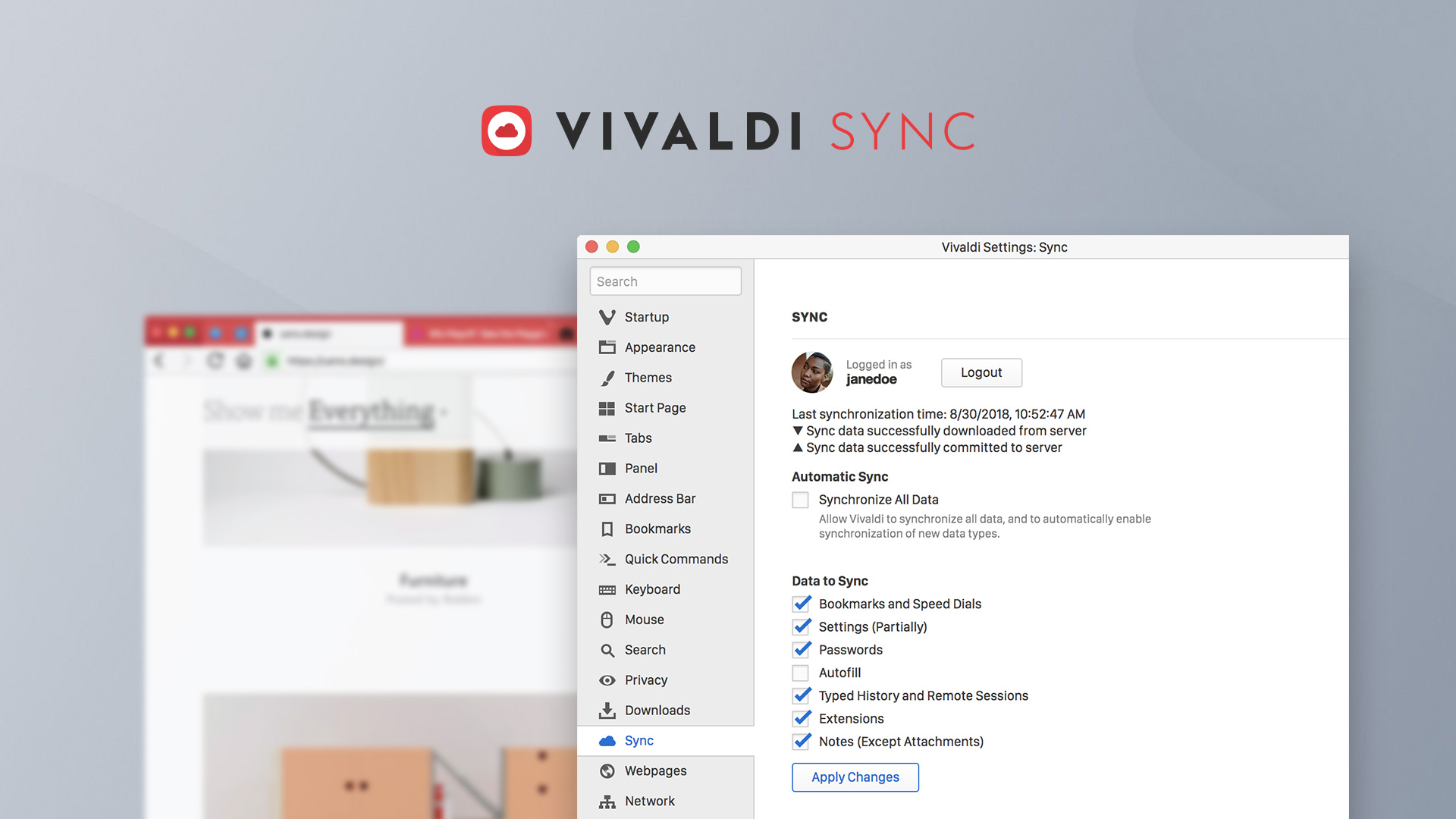
If you use Vivaldi on more than one device, you can now opt in to Vivaldi Sync which does about what you’d expect it too. Privacy advocates need not freak out just yet, though. You can choose exactly what data you want to share. For example, you can share passwords, but not history, or vice versa. You get pretty granular control.
What’s more, it’s all encrypted end-to-end, so Vivaldi—barring some enormous mistake—never gets to actually see what’s in your data. And like I said, it’s opt-in. Signing into Gmail will only sign you into Gmail.
New Visuals
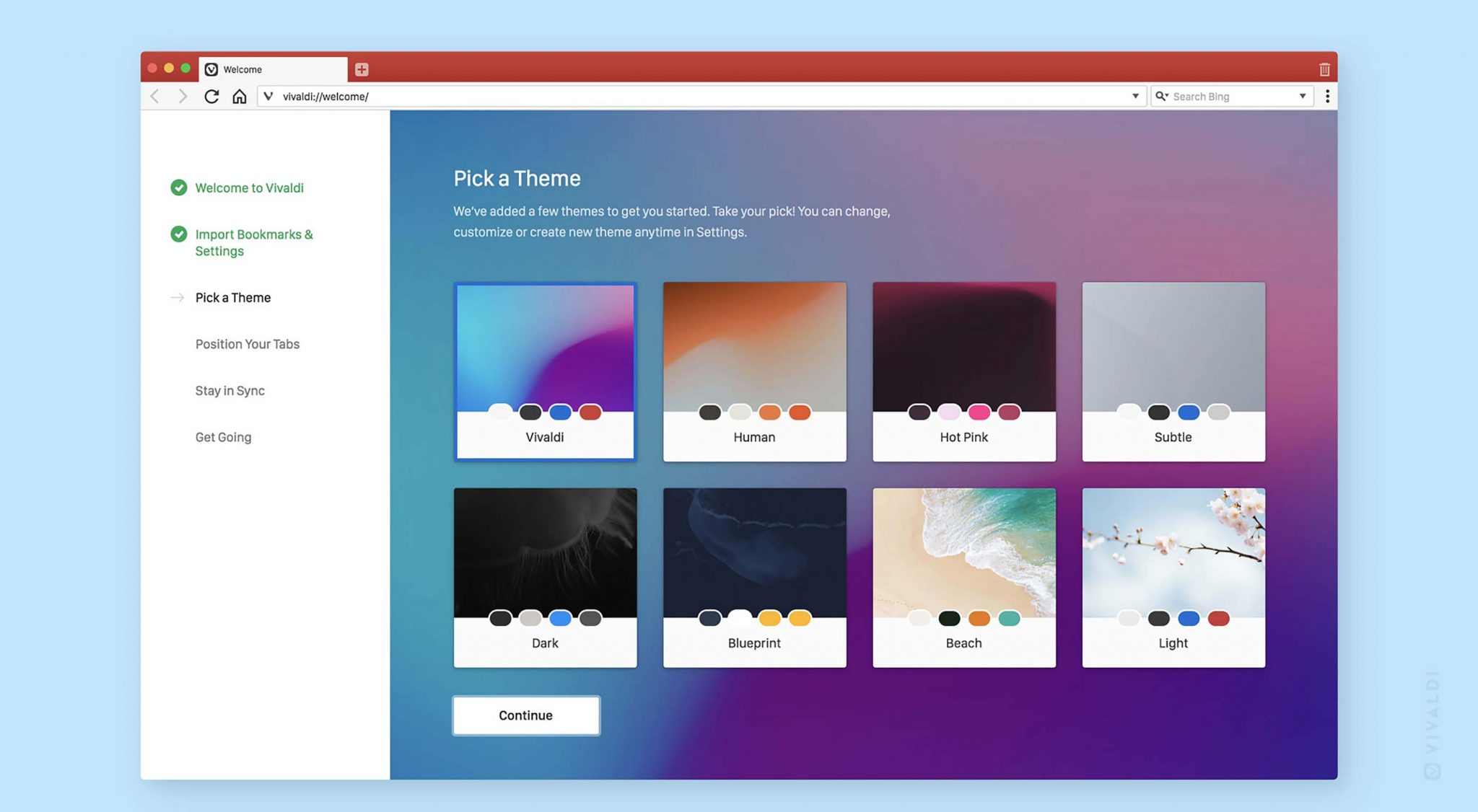
There’s been an overall visual refresh, the addition of several new themes and background images for new tabs, and of course it’s all very customizable, with easy ways to make your own themes. One interesting little feature of note is that you can schedule themes. That is, the browser can actually change its whole appearance at any time of day you specify. Plus, the current default theme feels compact, which I like very much.
Improvements to Panels
Like Opera before it, Vivaldi comes with a sidebar by default. It hold various panels for things like bookmarks, your recent history, file downloads, and more. There’s a custom note-taking app, and custom web panels that can keep any website you want handy.
One of the recent additions to this feature is suggestions, which basically just suggests commonly-visited sites for inclusion in your web panels. The panels can also float over your current web page, instead of using the split-screen approach.
Improvements to Tabs
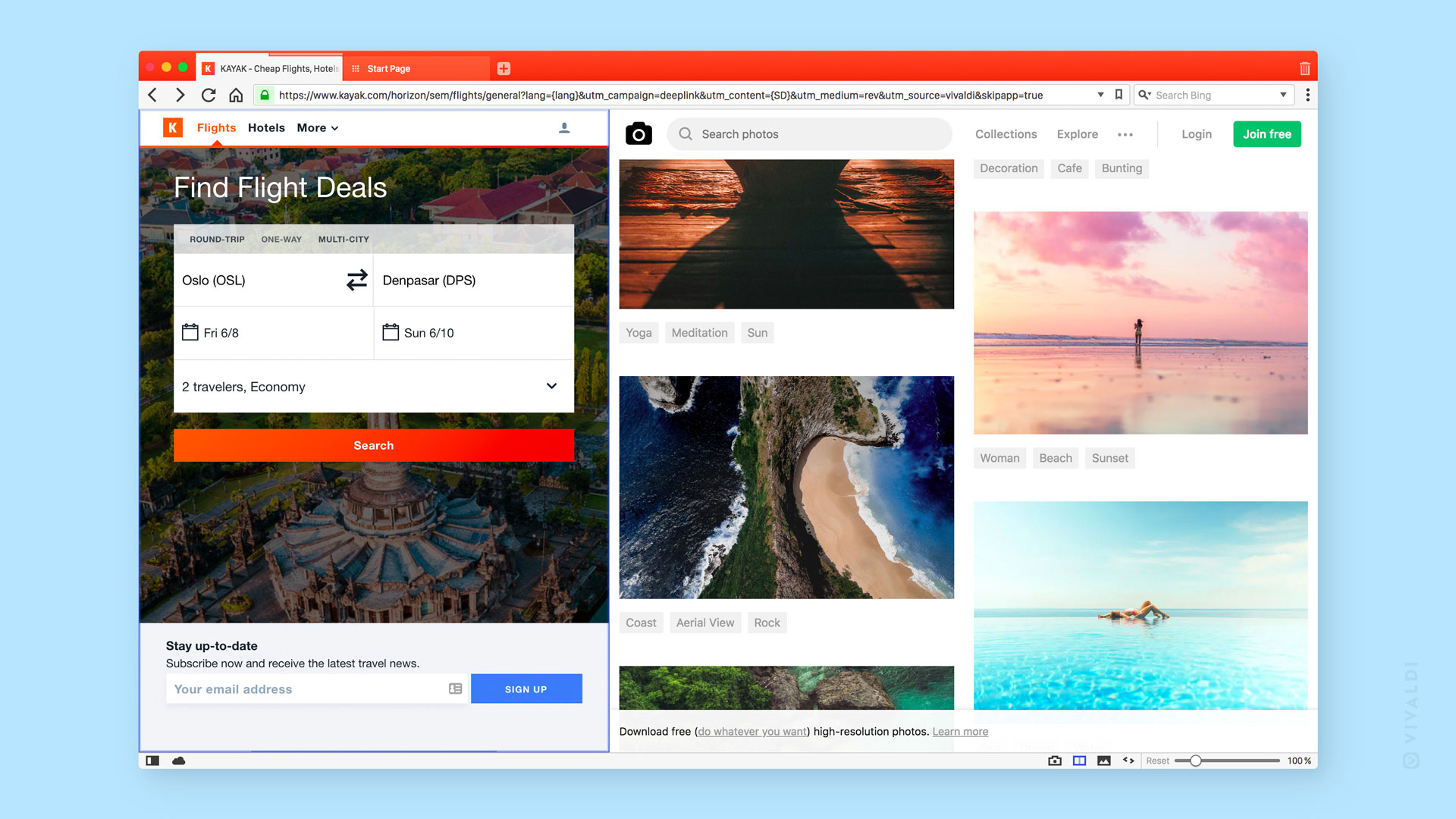
Those who like Tab Tiling and split screen views: rejoice; you can now resize the various tabs by clicking and dragging. They’ve also made some additions to their Tab Cycler feature to help you find the tab you want faster.
Try It
I could go on, but I really shouldn’t. If you haven’t already given Vivaldi a look, do it. Give it a ten minute tryout, then clear your schedule a bit if you find something you like. If you spend a lot of time on the Internet, I bet you will.
| Add Realistic Chalk and Sketch Lettering Effects with Sketch’it – only $5! |
|
Source
p img {display:inline-block; margin-right:10px;}
.alignleft {float:left;}
p.showcase {clear:both;}
body#browserfriendly p, body#podcast p, div#emailbody p{margin:0;}
Source: Webdesignerdepot.com


