 A website is a place where a business can educate its audience about its brand. What it does. Why it does it. What they’ll get out of being there. That, in and of itself, is a lot of information.
When designing a website for your clients, the last thing you want is to overdo it. The web is not a place for excess and its users typically don’t have the patience to sift through pages and pages stuffed full of information just to get to the relevant bits.
That’s why minimalism will endure as a design trend. It allows web designers to convey a lot about a brand and its message, without having to spell it all out on the page. It gives brands a cleaner, more buttoned-up look while also clearing a path to conversion for visitors.
But just because you design with simplicity and minimalism in mind, doesn’t mean you can’t share additional messages with visitors. You just have to find less cumbersome and intrusive ways to do so.
Years ago, the pop-up was introduced as a means to do this. It kept related and relevant information within the website without having to intrude on the well-designed page. However, Google has since cracked down on the usage of pop-ups that it deems disruptive to the user experience, which has some designers and developers confused about what they’re supposed to do now.
So, what does it mean? Is the pop-up no longer a viable way to promote special offers, share value-add content, subscribe new followers, or recover nearly-lost sales? In this article, I’m going to cover the current state of website pop-ups and give you some best practices to adhere to when using them.
The Current State of Website Pop-ups
First, let’s talk about what pop-ups look like today, how they’re used, and why you would even want to include them in your web design plan.
Types of Pop-ups
A modal is the most common type users encounter on the web.

It can literally pop open on a web page, slide into the page, or just be there right from the point of entry. While these usually can be found in the dead-center of the page, some websites now place them closer to the bottom of the page or even stick them in the corner.
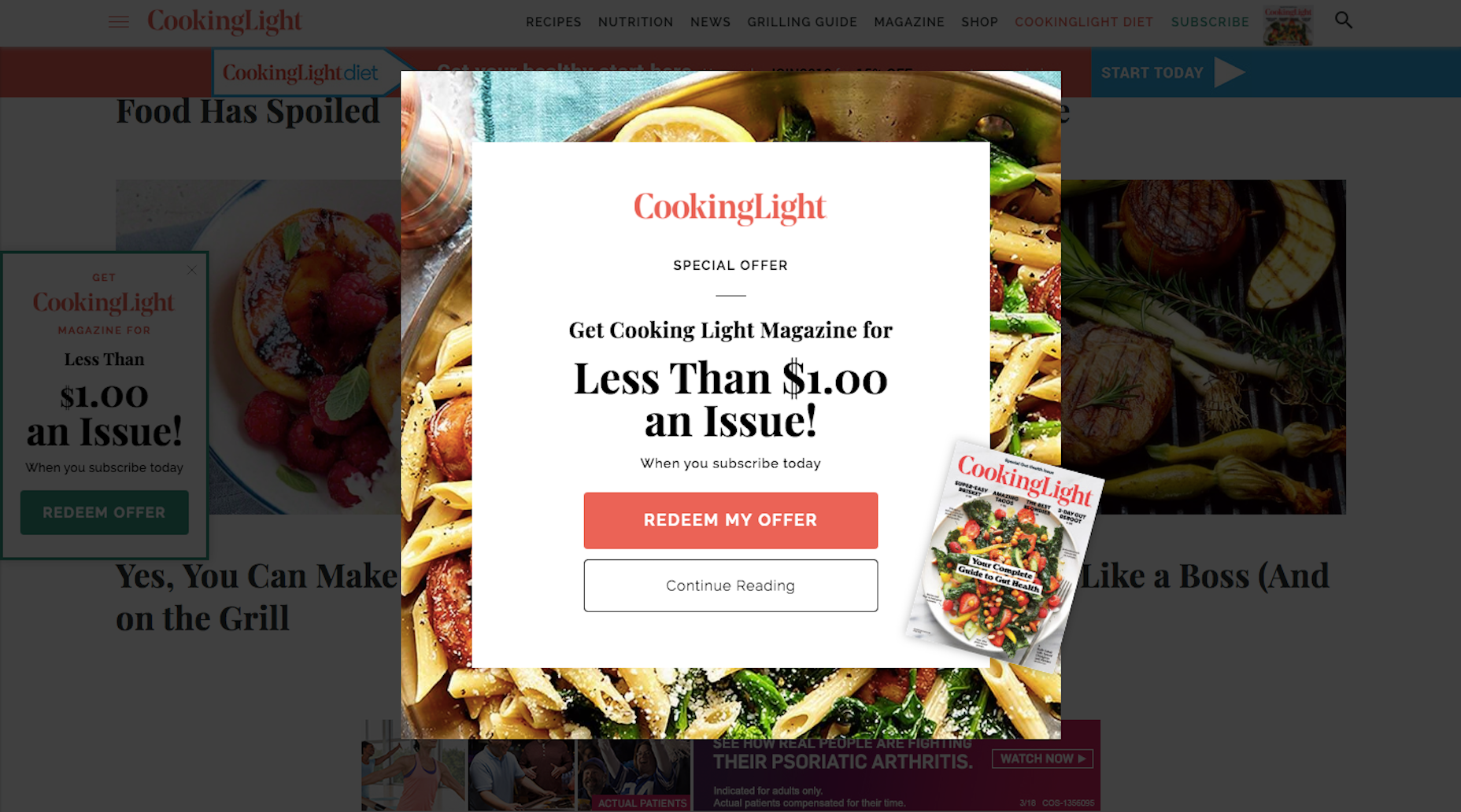
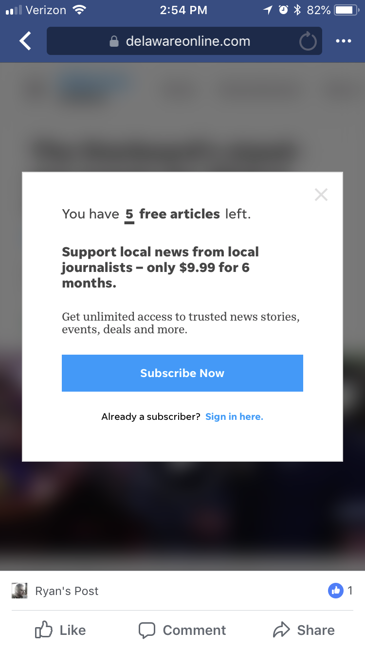
An interstitial or overlay pop-up is one that covers the entire screen, usually upon entering a website.

A notification bar is one that can permanently stick to the top or bottom of a website.
5 Very Good Reasons to Use Pop-ups
You might think that with the backlash from Google on mobile pop-ups (I’m getting to that soon…) that it would be best to stay away from pop-ups altogether. However, I’ll give you 5 very good reasons why most of the websites you design should include them:
1. They’re Attention-Grabbing
No one has patience to read anymore, which is why delivering attention-grabbing micro-messages in pop-ups are so great.
2. They Draw the Eyes to What’s Most Important
Pop-ups deliver extra value to online visitors—and they know it. So, when a pop-up appears, they’re going to immediately be drawn to that offer or value-added opportunity.
3. They’re Versatile
Pop-ups no longer move visitors out of the browser window or clog up their desktop with ads they weren’t aware of. You now have so many different types to work with and they can be triggered at different points of the website experience:
- Upon entry
- After a certain point of scrolling
- Triggered by an action
- Right before exiting
4. They Keep the Site Clean
As I mentioned before, minimalism is important for making a website aesthetically pleasing. But if you have a special message you really want to get in front of visitors and don’t want to take up precious and limited real estate to do it, you can use pop-ups to deliver it.
5. They Increase Conversions
Sumo studied its users’ pop-ups and the conversion rates associated with them. What they found was that pop-ups have the potential to convert at a rate of about 3%, on average. Pop-ups that are designed really well, however, have the potential to convert 9% of visitors that encounter them.
You can also use them to increase engagement on the site. Ask them to fill out a survey, share something on social media, or to watch a video on a landing page.
But What’s the Deal with Mobile Pop-ups?
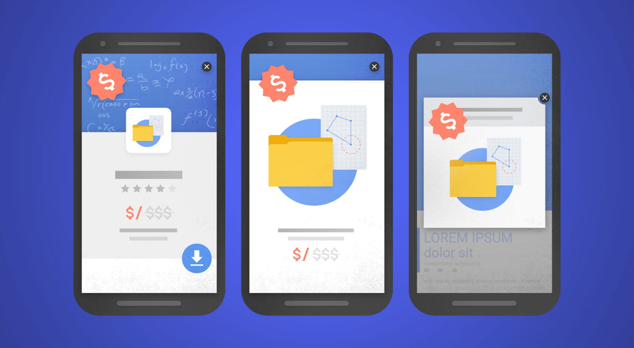
Okay, so Google doesn’t hate mobile pop-ups. It just wants web developers to be smarter about how they use them since pop-ups can be disruptive for users, in general, though definitely more so on smaller mobile screens.
As a result, Google has begun issuing penalties to mobile websites that use these three kinds of pop-ups:
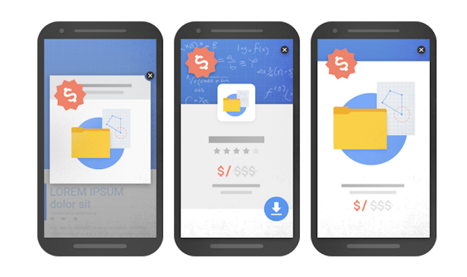
In summary, stay away from:
- Pop-ups on the first page of a mobile user’s visit
- Pop-ups that hide the majority of the web page behind it
- Interstitials
Got it? Now, let’s talk about what you should do when using website pop-ups.
18 Best Practices for Using Website Pop-ups
- Never use pop-ups for the sole purpose of having a trendy design element in place. If you waste visitors’ time with a meaningless disruption, you’ll lose their trust.
- Design the pop-up to look just as good as the rest of your website.
- Make sure they’re responsive.
- Keep copy short and to the point.
- Don’t use the passive aggressive Yes/No calls-to-action unless it’s your brand’s personality to be that way. If you’re including two CTAs, do it in a way that positively encourages them to take action on the primary one.
- If you’re going to collect contact information, ask only for one thing: their email address.
- Make sure the content of the pop-up is relevant to the page it appears on.
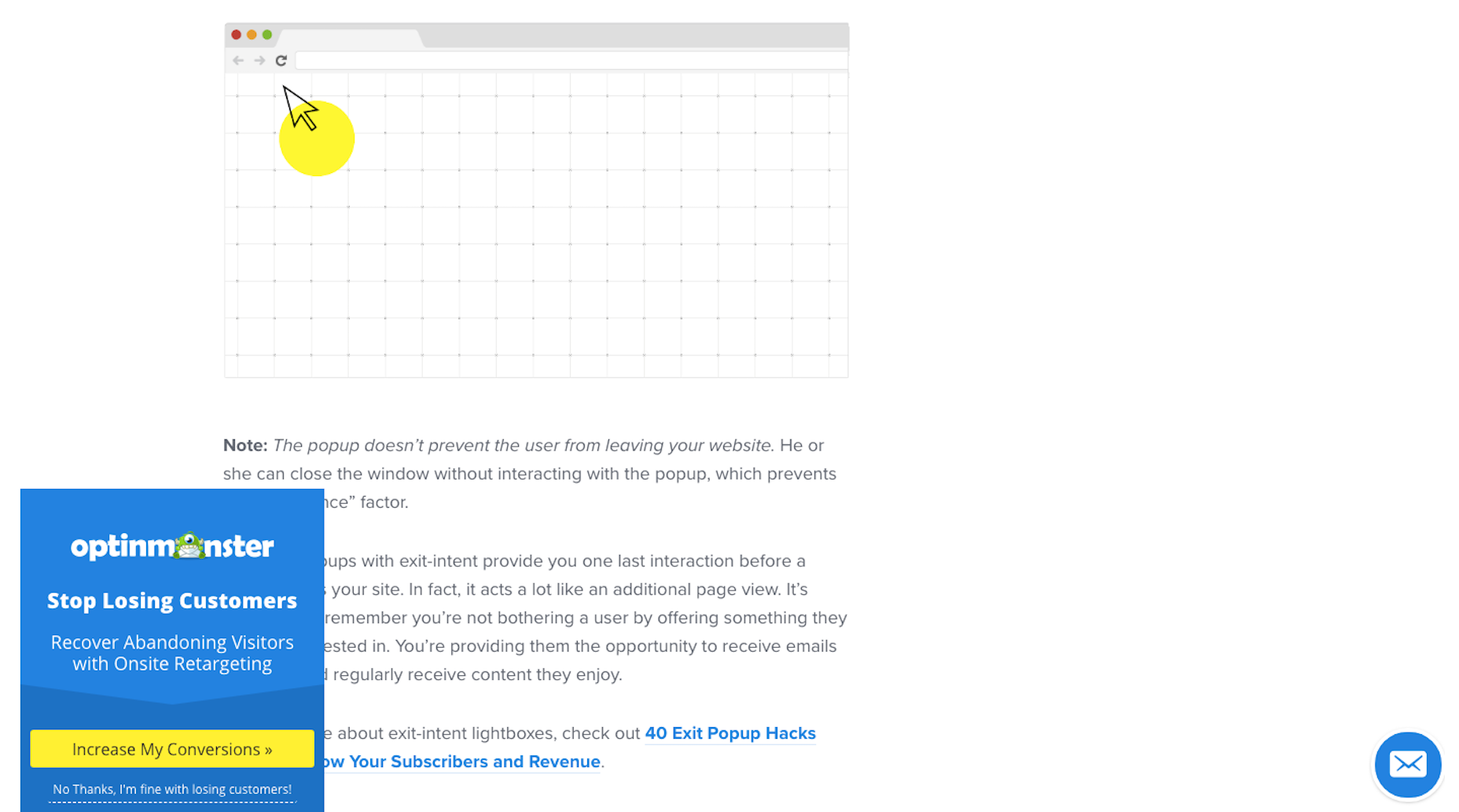
- If you can, avoid showing pop-ups on the first page. Give visitors a chance to acclimate first. For the record, though, this is one of the entry pop-up types Google does allow for (since privacy is so important):
- Follow Google’s rules for mobile: no interstitials, no oversized modals, and no pop-ups on the first page.
- Don’t feel like desktop and mobile pop-ups need to be identical. Design pop-ups for each device type.
- Always include an easy way to get out of the pop-up: either click outside of it or place an “X” button in the top-right.
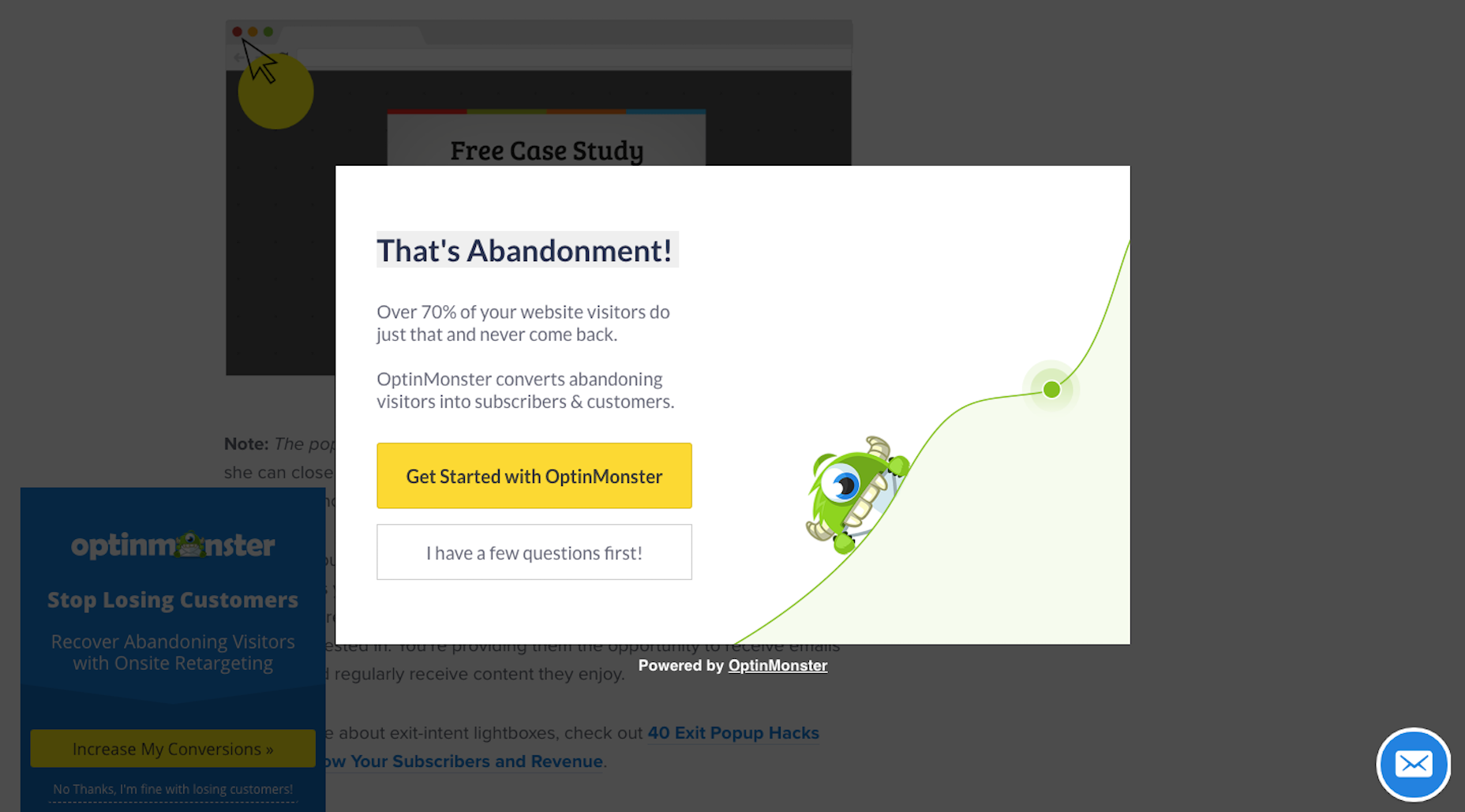
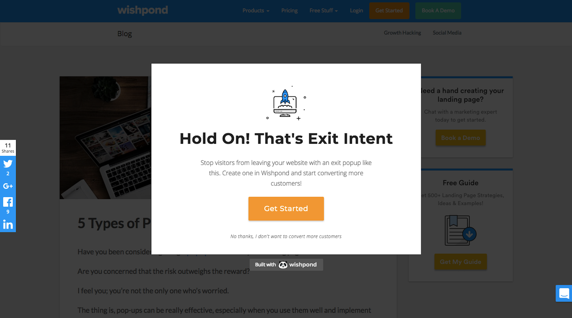
- Time your pop-ups to appear at just the right moment of the on-site experience (like right before visitors are about to exit).
- Set frequency rules, so visitors don’t keep seeing pop-ups on every page or on every visit.
- Place pop-ups in the right location.
- If you want to intrude (and think visitors will be okay with it), put them in the center of the screen.
- If you want to share a special offer, use a sticky bar.
- If you want to give them something to think about as they move around the site, put the pop-up off to the side.

- Use audience segmentation and targeting to create customized pop-up messages.
Wrapping Up
If you have something really valuable to share with visitors or know you have a way to positively lure them back to your site, give website pop-ups a shot. And don’t be afraid to A/B test them the way you do other elements on your site. There’s so much here to play with, including design, copy, placement, CTA, triggers, and more.
| Add Realistic Chalk and Sketch Lettering Effects with Sketch’it – only $5! |
|
Source
p img {display:inline-block; margin-right:10px;}
.alignleft {float:left;}
p.showcase {clear:both;}
body#browserfriendly p, body#podcast p, div#emailbody p{margin:0;}
Source: Webdesignerdepot.com