Part of the job of being a front-end developer is applying different techniques and technologies to pull of the desired UI and UX. Perhaps you work with a design team and implement their designs. I know when I look at a design (heck, even if I know I’m not going to be building it), my front-end brain starts triggering all sorts of things I know will be related to the task.
Let’s take a look at what I mean.
Check out this lovely Dribbble shot for a Food Recipe Website from Riko Sapto Dimo.
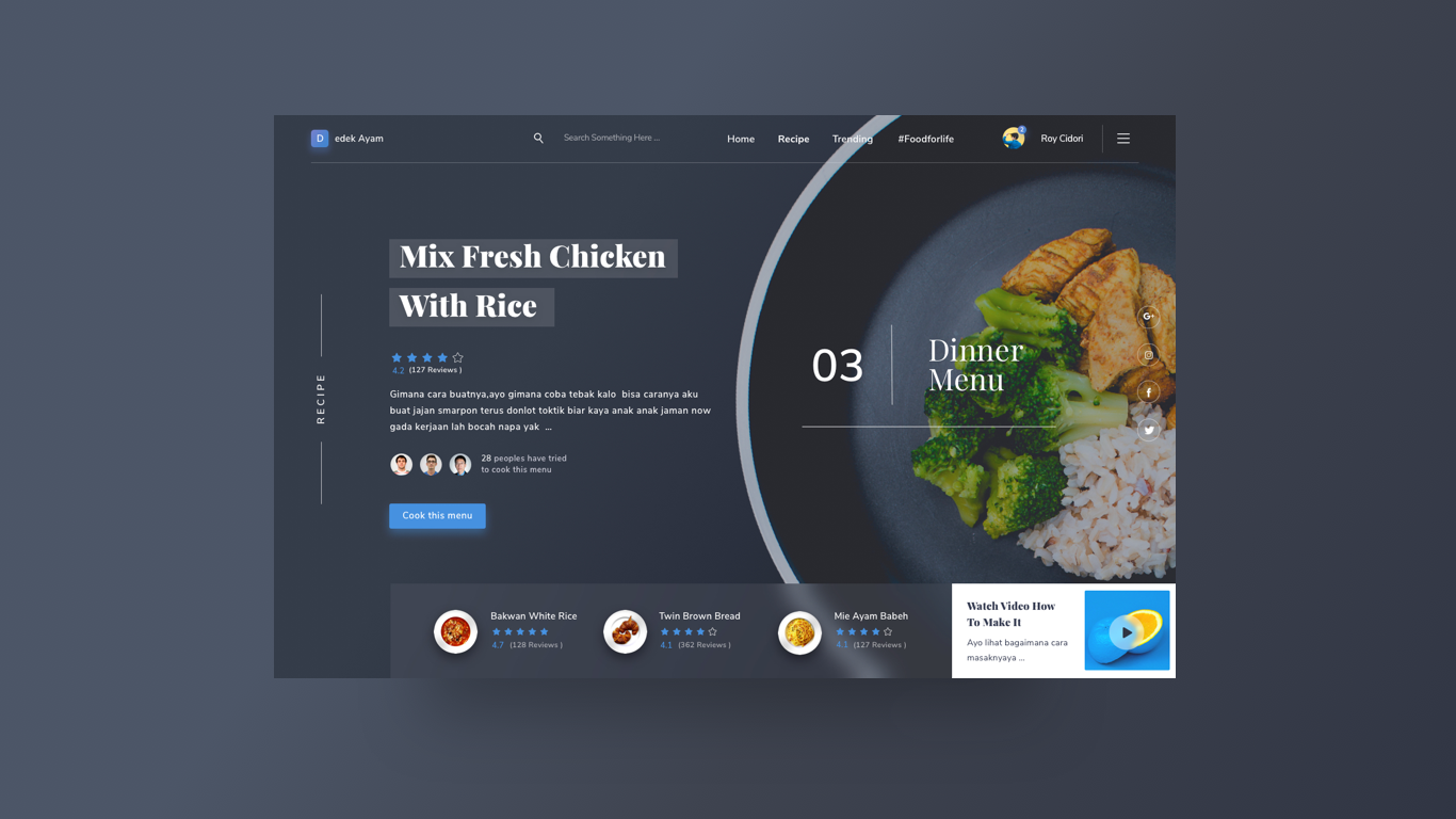
It’s a very appealing design, and there is loads in there to think about from a front-end web design and development standpoint.
We’re going to mostly be talking about design pattern choices and HTML/CSS tech choices. There is much more to the job of front-end development. Accessibility! Performance! Semantics! Design systems! All important stuff as well.
Multi-line padded text

Ah yes, that look where text has a background that follows the length of the lines of text. We’ve called that Multi-Line Padded Text in the past and looked at a number of ways to do it. The easiest and most modern way to handle it is with box-decoration-break.
See the Pen Multiline Padding with box-decoration-break by Chris Coyier (@chriscoyier) on CodePen.
Flexbox header
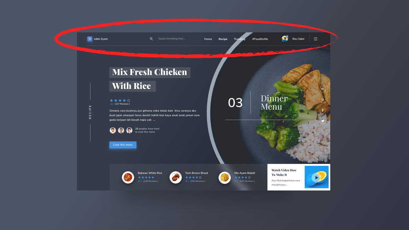
That header area is just begging for flexbox. It’s a single-direction layout with elements of different sizes and different space between them. Expressing that in flexbox is going to be easier than any other method and not require any fixed sizing or magic numbers — not to mention flexible!
Grid layout
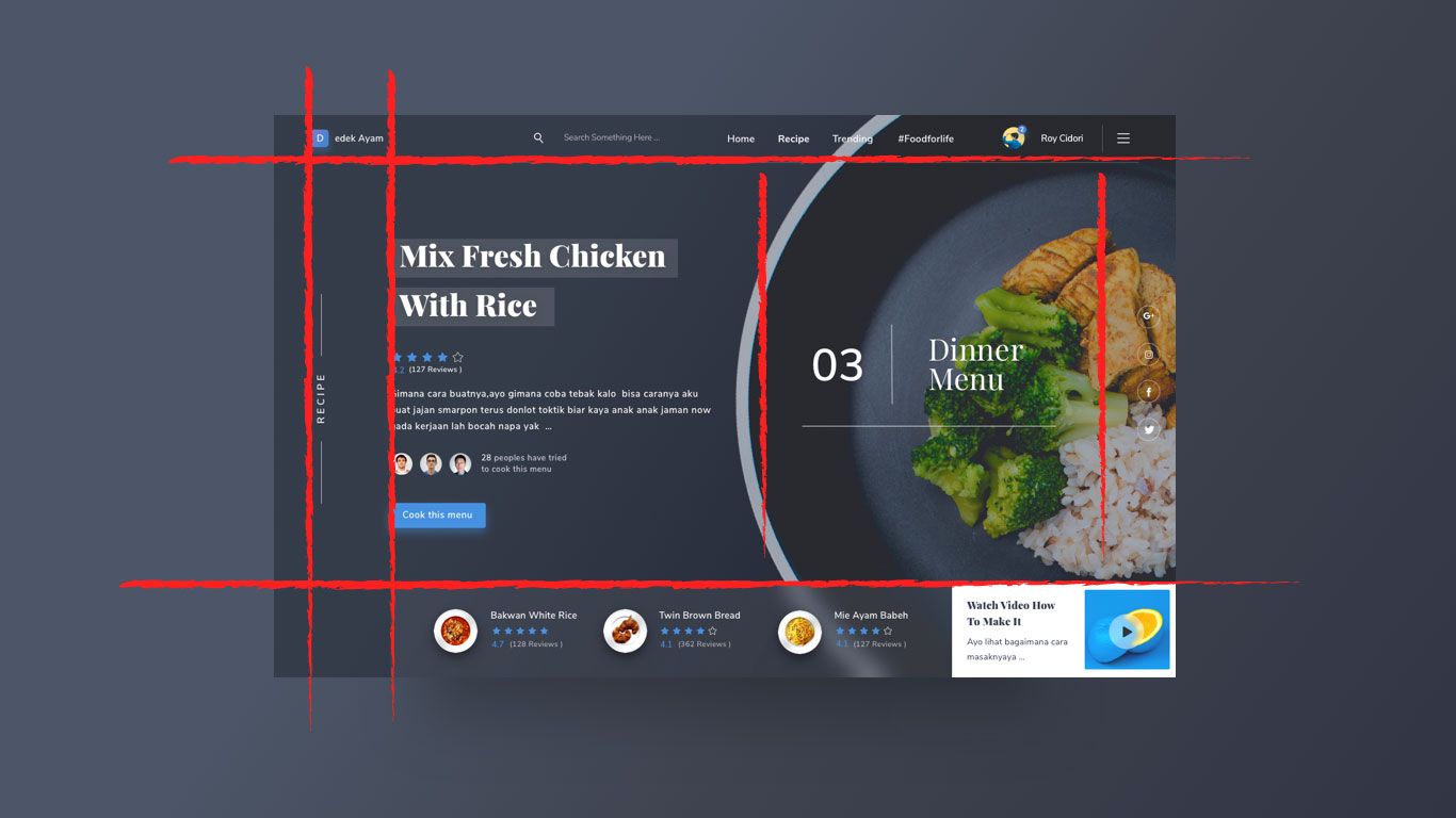
The overall page layout here could be expressed nicely with CSS grid. Remember that flexbox and grid are not at odds. An element placed in a grid cell can be flexbox! Like the header above, that makes perfect sense. The main content area and footer, as grid cells, could probably go either way.
Vertical writing
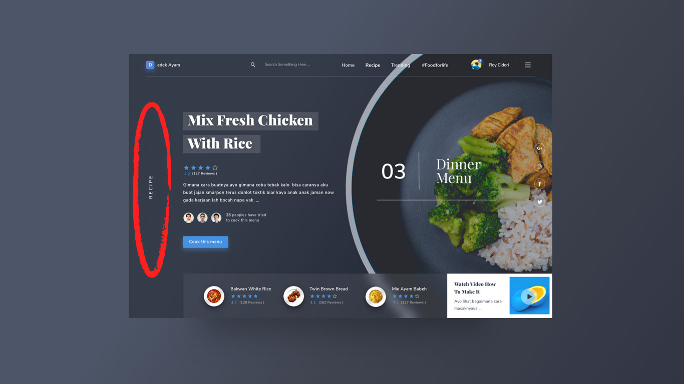
Not the most obvious thing to pull off! Your best bet is using writing modes. Jen Simmons has written about this, and here’s a demo:
See the Pen Writing Mode Demo — Headline by Jen Simmons (@jensimmons) on CodePen.
Line clamping
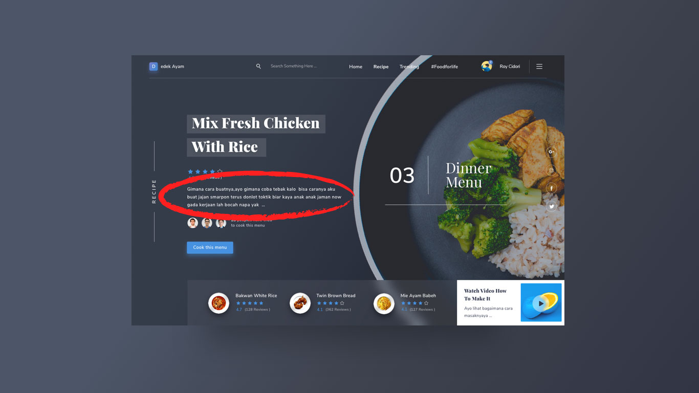
Looks like we have some truncation going on here. General performance-wise, we’d probably be wanting the data being sent only be a few lines long. But the front end can help with this too, if it has to. Three lines of text are shown here with ellipsis at the end. Perhaps the design really needs the copy to always be a maximum of three lines. That’s called line clamping.
See the Pen Line Clampin’ by Chris Coyier (@chriscoyier) on CodePen.
Custom fonts
Like most sites these days, this design is coated in custom web fonts. With a design this striking, I’d be very careful about my font loading technique. My gut tells me I’d be more into FOIT than FOUT here, and ideally I’d cache that font file as hard as I could so that we’d have neither as often as possible.
Text over images
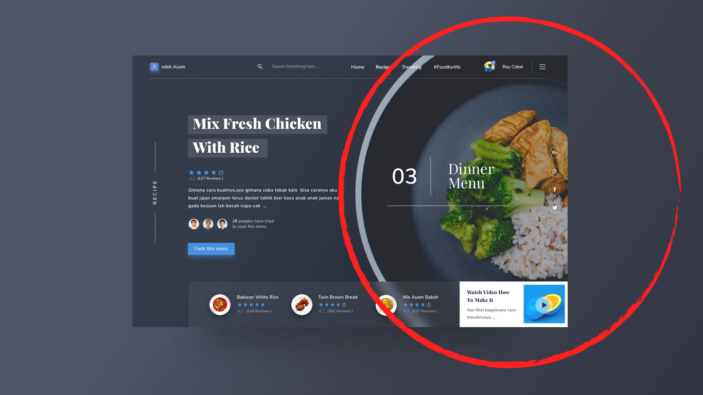
That text “Dinner Menu” is squarely over some busy photographic imagery below. It’s still readable though, largely because of the bright white of the text over a darkened image. We’ve covered thinking this through in the past in detail. White text over a darkened image is generally the way to go, and darkened enough such that just about any image will be OK. There are other options though, like gradients and blurring (which is also in use here in the footer)
See the Pen ByKwaq by Chris Coyier (@chriscoyier) on CodePen.
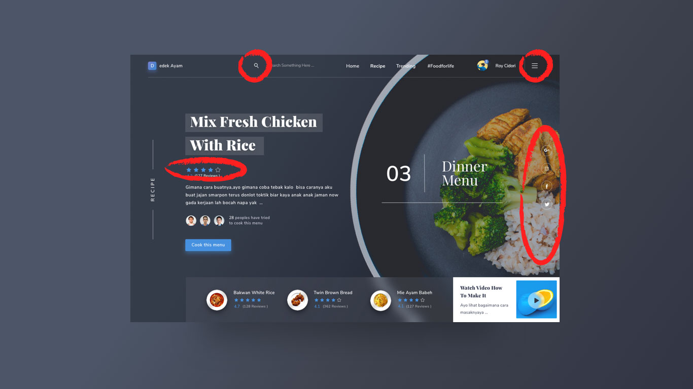
SVG icons / Star ratings
There are a number of simple, vector icons scattered around the design. Those are a sure-bet for an SVG icon system. This is my current recommendation for approaching an SVG icon system. Inline the SVG. Simple and powerful.
Those star ratings are probably SVG territory as well. Here’s a good collection of options. Progressively enhancing from radio buttons always seems like a smart way to go:
See the Pen CSS: Radio Input Stars by Jake Albaugh (@jakealbaugh) on CodePen.
Hamburgers
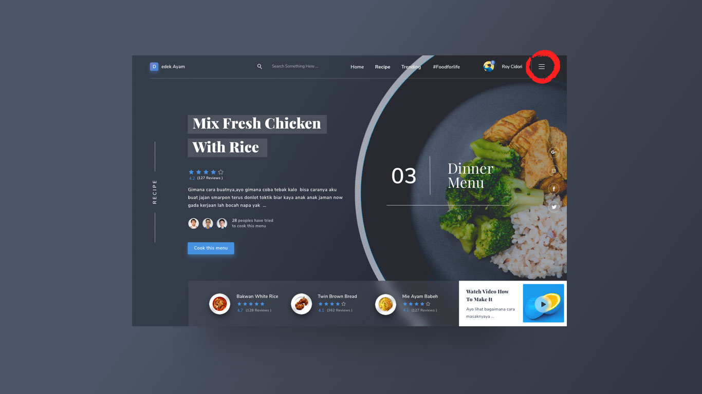
It might seem a little superfluous on a large screen design like this, especially as there is navigation already visible. But hey, it’s hard to avoid these days and there is something to be said about training users where site navigation can happen regardless of where you’re looking at the site.
Here’s a collection of those type of menus.
See the Pen Hamburger menu flip with text change by Eric Grucza (@egrucza) on CodePen.
Anything else in the design I didn’t mention that your mind goes to right away?
The post Your Brain on Front-End Development appeared first on CSS-Tricks.
Source: CSS-tricks.com