In this post we will explore Framer X, the new shiny design tool and try to make sense of its benefits as well as its capabilities.
Prerequisites: This post assumes that you have basic knowledge of React.
What is Framer X?
Framer X is the latest and greatest version of Framer Studio, the prototyping tool.

Framer Studio when initially released, gave designers the ability to create realistic app prototype designs and animate very advanced interactions than other design apps at the time.
Framer X, the newest version of Framer introduces the in-built use of React components to allow designers get closer to high-fidelity prototyping.
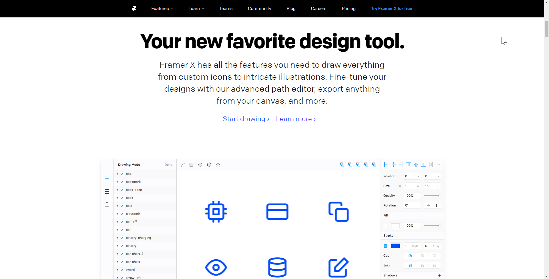
Framer X also has all the features you need to draw everything from custom icons to intricate illustrations. You could fine-tune your designs with the advanced path editor, export anything from your canvas, and more.
Why use Framer X?
In most design tools, designs are mostly visual — a picture of a button, slider or toggle. The big difference Framer X makes is that designs can now be made more interactive. Interactions such as scrolling, clicking, moving and handling input are now possible, all thanks to React components.
Under the hood, Framer X is built on top of framer.js, an open source library that does the work of converting React code to interactive design components. The React components that can afford these interactions could be coded from scratch or downloaded from the in-app design store.
Framer designs can easily translate to React Components. Props and all.
Framer X is packed with advanced fearures. Lets highlight a few essential ones.
Frames
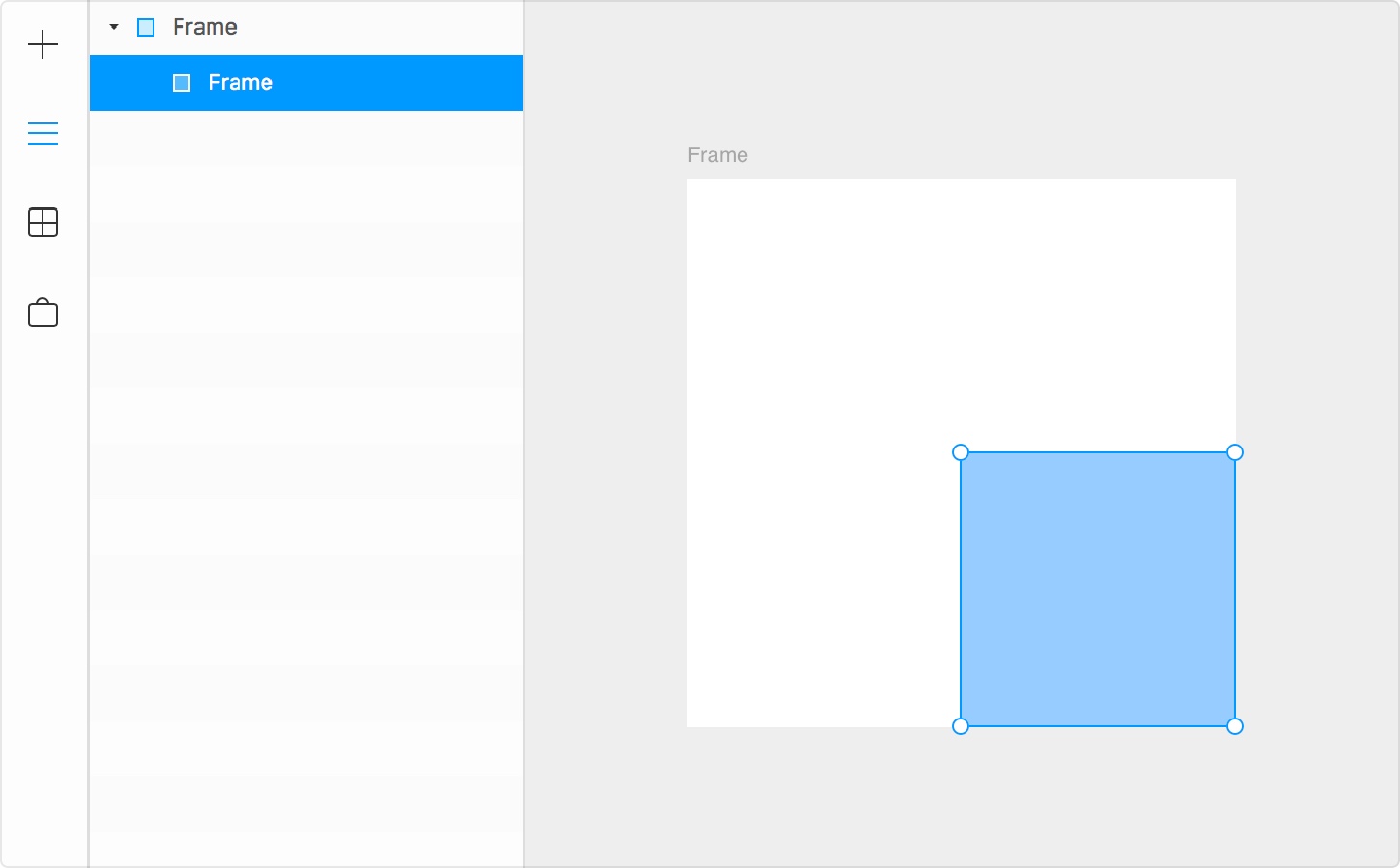
The Frame tool is used to create responsive layout in your design. Frames come with preset layouts for popular devices you can select to begin your design. Frames adapt when you resize. They can also be suprisingly used to create UI elements such as buttons and shapes if it is desired for them to be responsive to their environment.
Frames are intuitive. Any frame placed on top of another is automatically indicated as a child of the base layer to create clear hierachy. A Frame can be made by pressing F or from the plus icon on the left.
Stacks
Stacks in Framer X is an awesome layout tool that is useful for working with grids and lists. It works like an expression of Flexbox and CSS Grid technologies. It was made to automatically handle distribution and alignment in your designs. A Stack can be made by pressing S and then by making a selection on top of all the items that need to be placed within.

Components
In Framer X, Components are reusable items that you can visually compose into larger app screen interfaces. There are two types of components you should be aware of:
- Design components: These are static design elements you can reuse in designing a user interface.
- Code components: These are also design elements you can reuse in designing a UI but they are built with React and are interactive. Consider the interactive Youtube component demonstrated below.
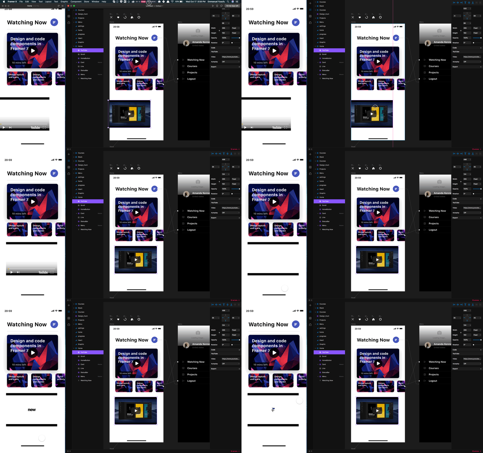
Code components
Code components as we mentioned before are React components you build from scratch or install from the Framer X store that allow you create interactive UI design components.
There is a properties panel on Framer X for changinng the properties of selected design elements such as color, border-radius and so on. When you create an interactive design component with React code, you can specify custom controls that will appear in the properties panel when that interactive component is clicked. To create a new component, you can navigate to the Components panel and click the New Component button located at the bottom.
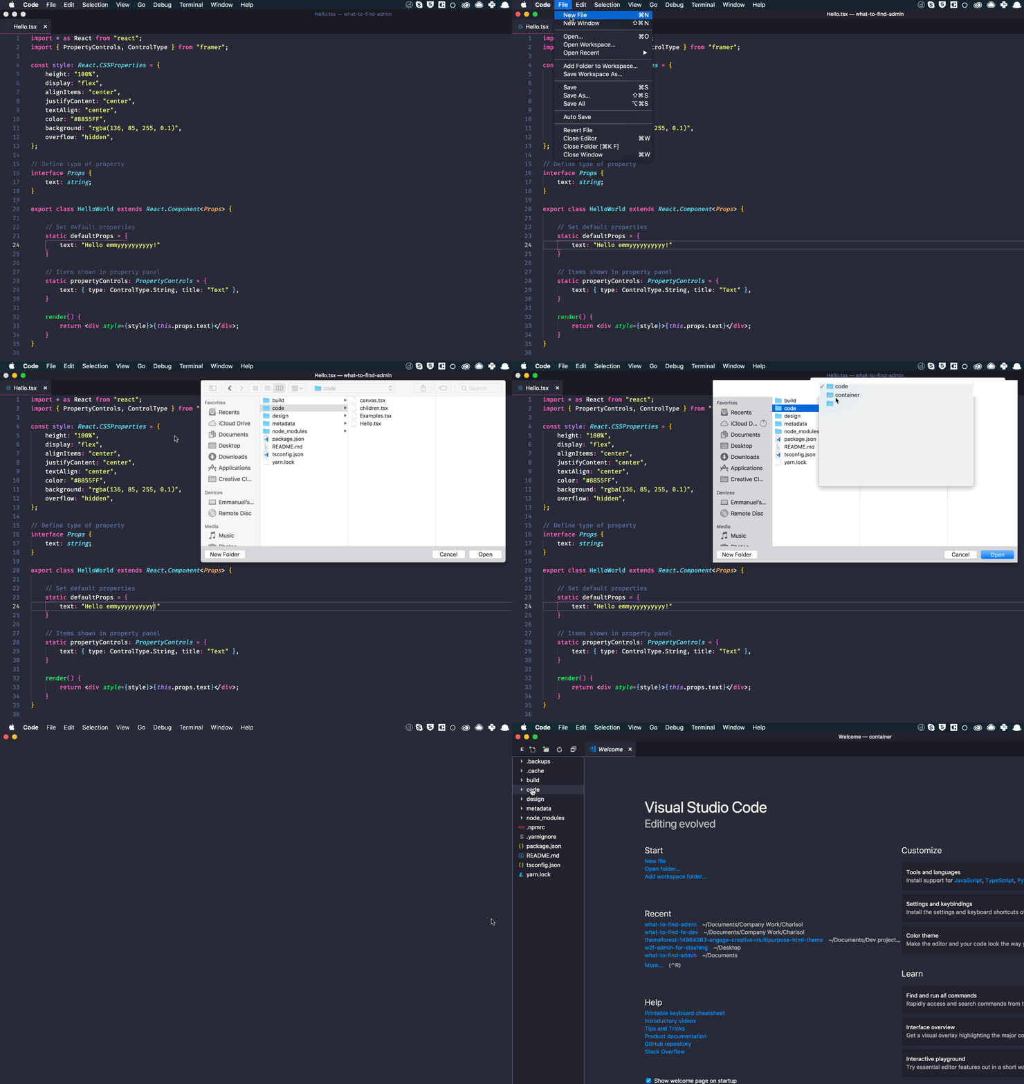
Select create from code then click Create and Editand you’ll be presented with a new .tsx file which is Typescript. Using Typescript with React can many benefits. More on that here.

The .tsx file will present a simple hello world component via your code editor. It is highly recommended to have VS Code and Prettier installed for Typescript auto-formatting and completion.
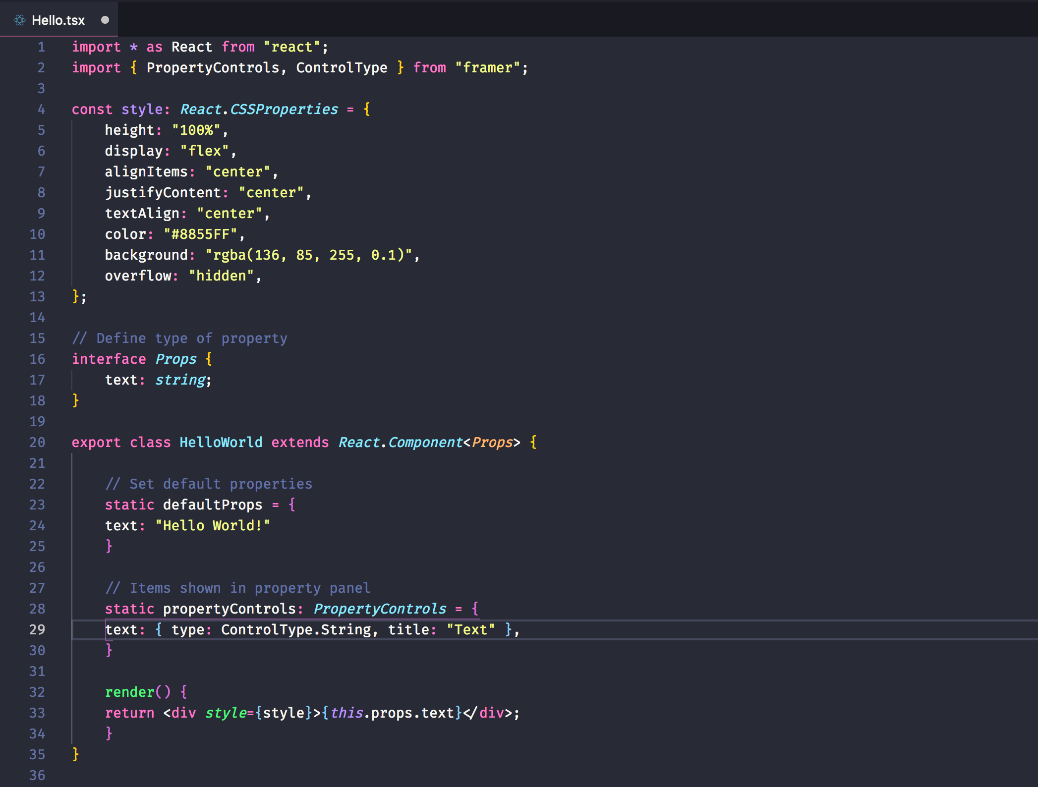
To open the full project folder container this file, go to file > open at the top of VS code and click the folder named container. This is the project folder for the code you will write. The component you created can ne found in a subfolder named code.
After creating a code component, its UI appears in the components panel and can be dragged to the canvas.

By default, the width and height of the component is passed to the code component through props.
import * as React from "react";
export class Example extends React.Component {
render() {
return (
<div>
{this.props.width} x {this.props.height}
</div>
);
}
}Because the code determines the contents of code components, you cannot directly edit code component contents on the canvas. But if you require your code component to display something from another element in your canvas (such as an image), you can accomplish it in 2 ways:
- Using props.children:
You can set up your react component to make use of react’s props.children API which when used, makes the children of the components to become settable by you.
import * as React from "react";
interface Props {
width: number;
height: number;
}
export class Example extends React.Component<Props> {
render() {
return (
<div style={{width: this.props.width, height: this.props.height}}>
<h1>Hello</h1>
{this.props.children}
</div>
);
}
}Framer detects you are using the props.children property in your render method and automatically adds a connector to each instance of the component on your canvas (a purple dot on the right side, like the scroll tool). You can drag a connection from this connector to any Frame on the canvas and it will use it as its children to render.
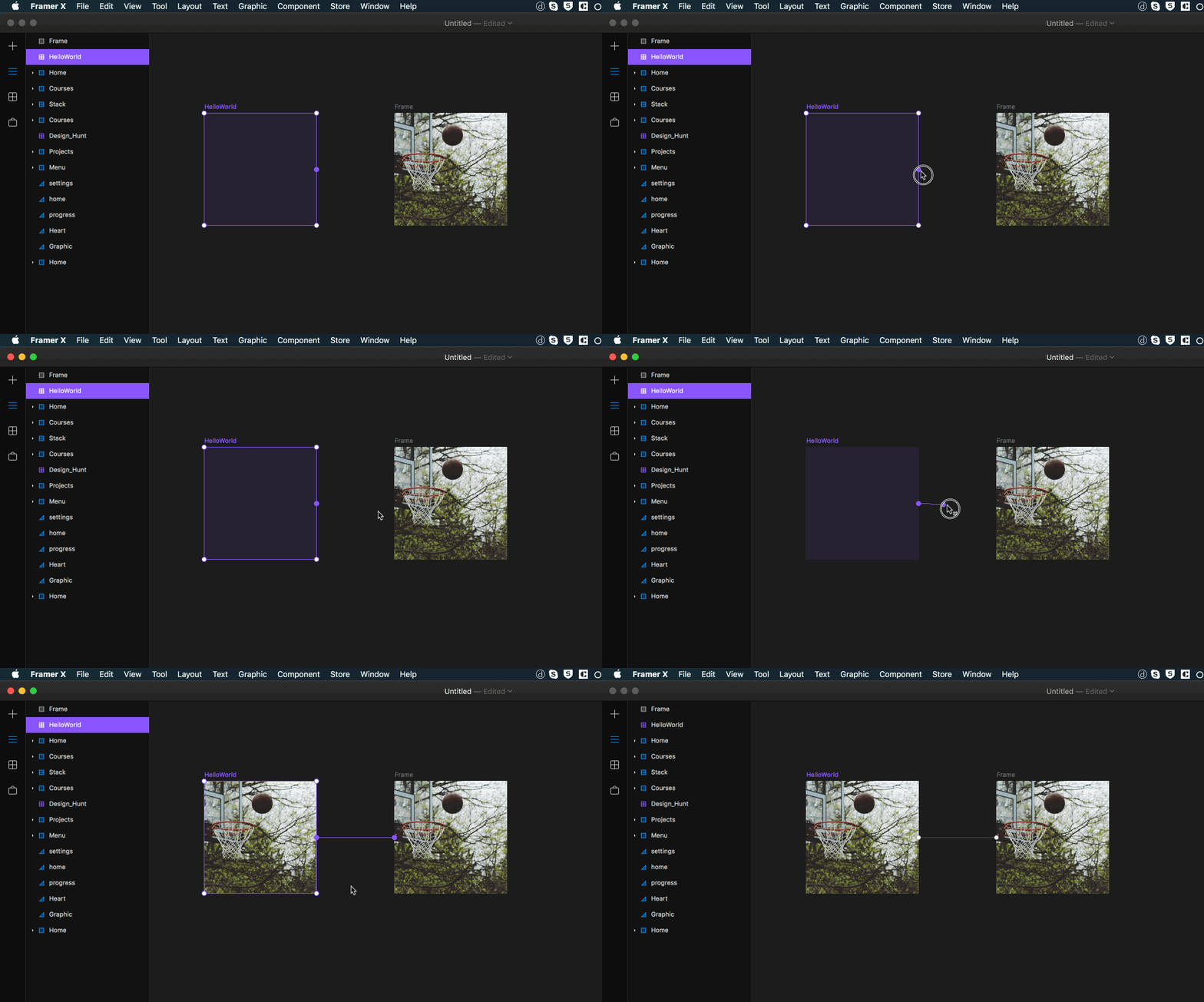
- importing components by their name from the canvas
You can easily import any named design component into your code and make use of them there. For instance if you have a component called Card:
import * as React from "react";
import { Card } from "./canvas";
export class Test extends React.Component {
render() {
return <Card title="Koen"/>;
}
}Customizing the Properties panel
As earlier mentioned, you can set what settigs show up on the properties panel of Framer X for modifying your interactive design component’s value. Remember that you cannot modify the contents of your components from FramerX but only from the code.
We can use propertyControls to allow customization of the user interface of your component, directly within our properties panel. We just need to add a static propertyControls method to your class with a descriptor.
import * as React from "react";
  import { PropertyControls, ControlType } from "framer";

  interface Props { text: string; }

  export class Example extends React.Component<props> {

    static defaultProps = { text: "Hello World!", };
    static propertyControls: PropertyControls = {
      text: { type: ControlType.String, title: "Text" },
    };

    render() {
      return <div>{this.props.text}</div>;
    }
  }
From Framer X, you can modify values such as:
- Boolean
- Number
- String
- Color
- Image
- File
- Enum
- SegmentedEnum
- FusedNumber
I do not intend to rehash the documentation but how to go about this can be found in the documentation.
Conclusion
Framer X is a great tool to bridge the gap between designer and developer. Code components allow designers and developers to talk a common language. Instead of creating a design and then having a developer translate it to code, a lot of the core work is already done thanks to Framer X.
Source: Scotch.io