Monday, June 23

Author: phpInfo

Representing Web Developers In The W3C
Web Tricks

Representing Web Developers In The W3C

Representing Web Developers In The W3CRepresenting Web Developers In The W3C Rachel Andrew 2018-09-27T14:15:00+02:00 2018-09-27T19:03:15+00:00 One of the many things that I do is to be a part of the CSS Working Group as an Invited Expert. Invited Experts are people who the group wants to be part of the group, but who do not work for a member organization which would confer upon their membership. In this post, I explain a little bit about what I feel my role is in the Working Group, as a way to announce a possible change to my involvement with the support of the Dutch organization, Fronteers. I’ve always seen my involvement in the CSS Working Group as a two-way...
A Minimal JavaScript Setup
CSS Tricks

A Minimal JavaScript Setup

Some people prefer to write JavaScript with React. For others, it’s Vue or jQuery. For others still, it is their own set of tools or a completely blank document. Some setups are minimal, some allow you to get things done quickly, and some are crazy powerful, allowing you to build complex and maintainable applications. Every setup has advantages and disadvantages, but positives usually outweigh negatives when it comes to popular frameworks verified and vetted by an active community. React and Vue are powerful JavaScript frameworks. Of course they are — that’s why both are trending so high in overall usage. But what is it that makes those, and other frameworks, so powerful? Is it the speed? Portability to other platforms like native desktop and mobile? Support of the huge community? The su...
CSS Tricks

The “Developer Experience” Bait-and-Switch

Alex Russell describes his thoughts on the current state of JavaScript and how we might sometimes put a ton of focus on the ease-of-use of development at the expense of user experience. So, for example, we might pick a massive framework to make development easier and faster but then that might have an enormous impact on the user. Alex describes it as substituting “developer value for user value.” The “developer experience” bait-and-switch works by appealing to the listener’s parochial interests as developers or managers, claiming supremacy in one category in order to remove others from the conversation. The swap is executed by implying that by making things better for developers, users will eventually benefit equivalently. The unstated agreement is that developers share all of the same go...
Tough Interview(er) Questions For The Job-Seeking Designer
Web Tricks

Tough Interview(er) Questions For The Job-Seeking Designer

Tough Interview(er) Questions For The Job-Seeking DesignerTough Interview(er) Questions For The Job-Seeking Designer Joshua Bullock 2018-09-26T13:30:31+02:00 2018-09-26T11:46:24+00:00 Whether you’re a multi-year veteran to the UX industry or fresh out of a higher education or boot camp style program, setting out into the job market can be a daunting task for any designer. From freelancing or working for a more boutique studio, doing agency work, or joining the enterprise, a myriad of positions, requirements, and organizations are available for a design practitioner who is looking to take the next steps in their career. In this article, I’ll present a list of q...
Grid Vs Flexbox: Which Should You Choose?
Web Tricks

Grid Vs Flexbox: Which Should You Choose?

CSS Grid and CSS Flexbox are complimentary web layout technologies that have been hotly anticipated for years. However, despite some superficial similarities they are actually used for very different tasks; they each solve a very different set of problems. In an ideal scenario, you may find that you employ both for different layout tasks. In this post we’ll look at their differences, look at how they solve various layout problems, and help you choose which (if either) is the right solution for your problem. Grid is Container-Based, Flexbox is Content-Based In flexbox layout, the size of a cell (flex-item) is defined inside the flex-item itself, and in the grid layout, the size of a cell (grid-item) is defined inside the grid-container. Confusing? Let’s look at an example, here’s the HTML ...
Web Tricks

Setting Up Your PyMongo Environment

Welcome to PyMongo Monday. This is the first in a series of regular blog posts that will introduce developers to programming MongoDB using the Python programming language. It’s called PyMongo Monday because PyMongo is the name of the client library (in MongoDB speak we refer to it as a "driver") we use to interact with the MongoDB Server. Monday because we aim to release each new episode on Monday. To get started we need to install the toolchain used by a typical MongoDB Python developer. Installing m First up is m. Hard to find online unless your search for "MongoDB m", m is a tool to manage and use multiple installations of the MongoDB Server in parallel. It is an invaluable tool if you want to try out the latest and greatest beta version but still continue mainline development on our cu...
CSS Tricks

Don’t use empty or low content for your design system grid examples

Dave and I had Jen Simmons on ShopTalk the other day. Jen was talking about Intrinsic Web Design and how one of the core tenets of it is grids with rows and columns that don't necessarily change at the same rate or ones that have essentially different rules for how they behave. For example, take this (contrived) grid setup: .grid { display: grid; grid-template-columns: 1fr minmax(50px, 100px) 20% auto; } Each of those columns will behave differently. I'm just wrapping my head about this, and definitely don't fully understand it. Here's what it seems like to me, numbered 1-4 based on the "strength" (I guess?) of the width. .grid { display: grid; grid-template-columns: 1fr /* #4 - Weakest, will fill remaining space */ minmax(50px, 100px) /* #3 - Will only...
CSS Tricks

Putting things on top of other things

A plain-language romp through the trials and tribulations of z-indexby Isabel Brison. On the surface, z-index seems simple. It's a number and it represents what is on top of what... assuming it is positioned... and assuming it is within the same stacking context as the other things. ... that is the gist of it: stacking contexts are caused by a variety of properties and the main reasons for their existence are performance concerns and ease of implementation by browsers. They are not always related to z-index or ordering; they pop up wherever it makes sense to have several elements all on the same layer for rendering purposes. Direct Link to Article — PermalinkThe post Putting things on top of other things appeared first on CSS-Tricks. Source: CSS-tricks.com
The Complete Guide to Lazy Loading Images
CSS Tricks

The Complete Guide to Lazy Loading Images

Images are critical. Whether it is marketing banners, product images or logos, it is impossible to imagine a website without images. Sadly though, images are often heavy files making them the single biggest contributor to the page bloat. According the HTTP Archive’s State of Images report, the median page size on desktops is 1511 KB and images account for nearly 45% (650 KB) of that total. That said, it’s not like we can simply do away with images. They’re too important to the overall user experience. Instead, we need to make our web pages load really fast with them. In this guide, we will cover all of the ins and outs of lazy loading images, a technique that helps improve the time it takes for a web page to load by deferring image loads until they are needed. Before we dive right in, he...
Building Websites With Tilda (Full Review)
Web Tricks

Building Websites With Tilda (Full Review)

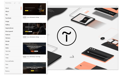
Building Websites With Tilda (Full Review)Building Websites With Tilda (Full Review) Nick Babich 2018-09-25T13:30:00+02:00 2018-09-25T11:38:17+00:00 (This is a sponsored article.) The modern web is very unified. Designers use the same patterns, and, as a result, websites created by different people look like clones. The only way to stand out from the crowd is via content. Content is what brings people to your website in the first place. Tilda is a website builder that can be used to create websites, landing pages, online stores and special projects. Tilda’s creators practice a “content-first” philosophy: Content precedes design. Being big fans of storytelling,...
10 Reasons Why You Will Never Let Placeit Go
Web Tricks

10 Reasons Why You Will Never Let Placeit Go

Placeit offers thousands of smart templates which you can customize by simply clicking a few options, while still keeping a professional layout. You won’t have to worry about resolution, dimensions or proportions. We promise your designs will always look sharp since there’s no way you can mess it up. The Brilliance of Web Designing 1. It’s as Easy as Breathing Anyone can design, even you. Yes, you! Don’t trust us? Give it a try. 2. It’s so Fast You’ll Think You Just Missed It It’s like watching a movie, the hard part is choosing which one, after that you just have to enjoy. You can play with all of Placeit’s smart templates before deciding which design suits your brand the best. 3. Get Yourself an Original Design You can customize each template as much as you want to ensure you get an ori...
Web Tricks

Demystifying The Service Worker Lifecycle

In an earlier article of mine, I talked about 4 essential things every PWA must have, which service worker happens to be part of. Service worker plays a very vital role when it's comes to Progressive Web Apps (PWA), as it is responsible for offline caching, push notifications, background sync etc. In this article, we'll be demystifying the service worker lifecycle and what can be done at each stage of the lifecycle. For effective use of service worker, an understanding of the service lifecycle is essential. The service worker lifecycle consists of mainly 3 phases, which are: Registration Installation Activation Let’s go over each of them. Registration A service worker is basically a JavaScript file. One thing that differentiate a service worker file from a normal JavaScript file, is that s...
Control the Internet With Chrome Extensions!
CSS Tricks

Control the Internet With Chrome Extensions!

As a web UI developer and designer, there are countless things to learn and only so many hours in the day. There are topics I’ve purposefully avoided, like mobile and offline application development because, at some point, you have to draw a line somewhere in the millions of shiny new topics and get some work done. One of the areas I’ve avoided in the past is browser extension development. I didn’t understand how they worked, what the development environment was, or how permissions interacted with overriding pages because, frankly, I didn’t think I was interested. Then one day, my very talented designer/developer friend Natalie Schoch asked me to get her Chrome Extension across the finish line. She had the front-end prototyped, but needed some help plugging in the data set and with inter...
Dark Patterns And Other Design No-Nos For Mobile
Web Tricks

Dark Patterns And Other Design No-Nos For Mobile

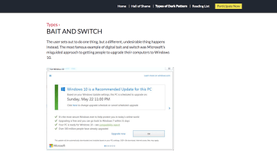
Dark Patterns And Other Design No-Nos For MobileDark Patterns And Other Design No-Nos For Mobile Suzanne Scacca 2018-09-24T14:00:18+02:00 2018-09-24T20:02:24+00:00 When it comes to making money, some companies will do whatever it takes to get people inside their establishment. But does that kind of business tactic even work? In my opinion, if you have to lie or trick your consumers into a sale, well then, that won’t obviously work! You might be able to attract a good amount of foot traffic (and even make some sales from the deceitful strategy), but let’s look at the big picture. If traffic levels won’t sustain and you’re handling more refunds than sales, the a...
10 Free Font Alternatives to Gotham
Web Tricks

10 Free Font Alternatives to Gotham

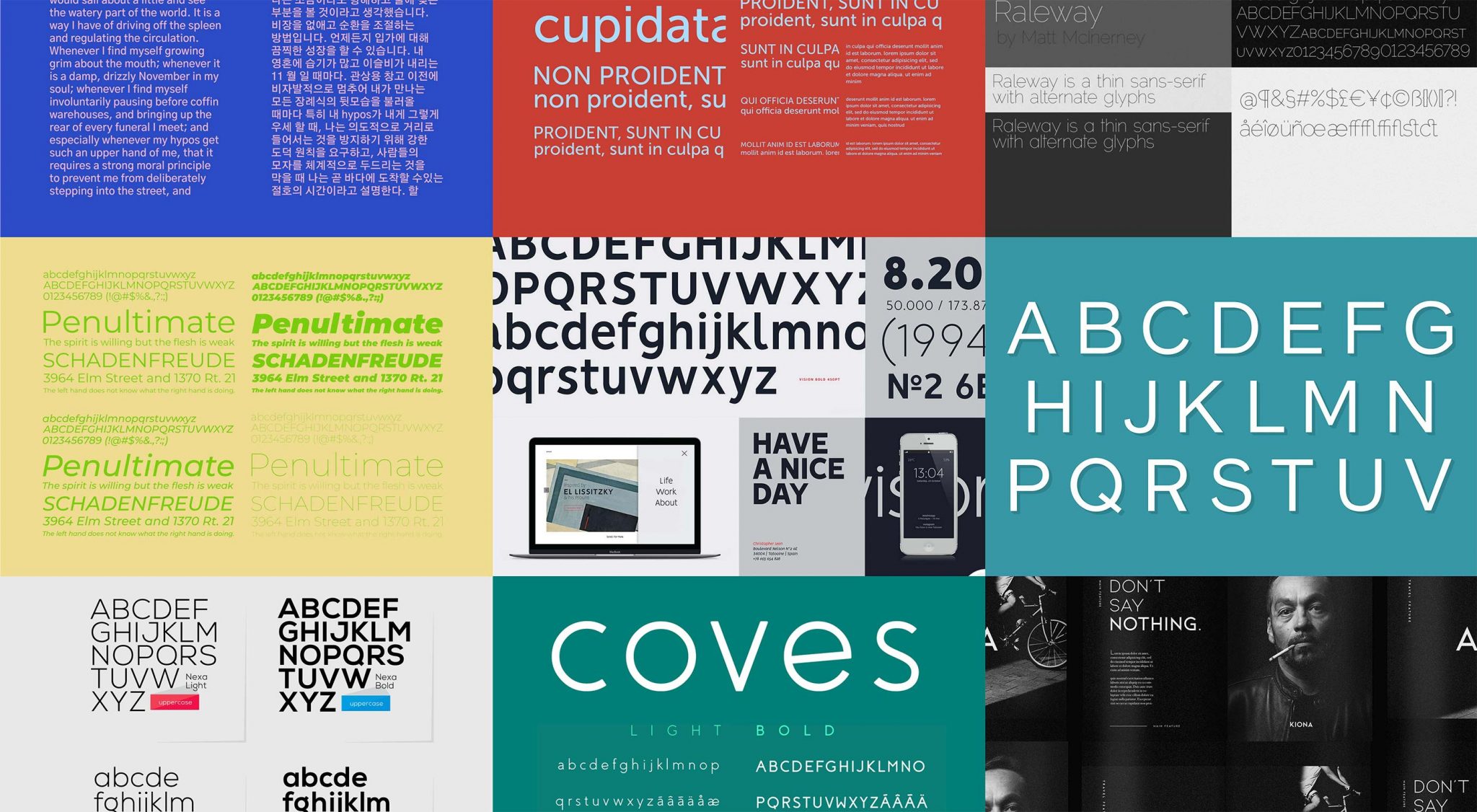
The typeface Gotham is one of the most popular sans-serifs in circulation. Designed at the turn of the millennium by Tobias Frere-Jones for the Hoefler & Co. type foundry, it is based on the basic letterforms that Frere-Jones saw in use on buildings around Manhattan, in signage and architectural lettering. The quintessentially American feeling in the design has resulted in the typeface’s use in countless branding projects—Barack Obama’s presidential campaign, the National September 11 Memorial & Museum, and Saturday Night Live, as well as many other household names have adopted Gotham. Described by Hoefler & Co. simply as, “What letters look like” it’s the typeface’s modernity, honesty, and assuredness that make it so popular. As with many typefaces, with great popularity com...