Sticky elements are predominantly used for keeping something shown on the screen throughout scrolling. As cool as that is, we can also hide elements in the same way!
Here’s a typical (um) sticky situation:
See the Pen position:sticky (CSS) by Preethi Sam (@rpsthecoder) on CodePen.
Sticky elements (position: sticky;) are very similar to fixed elements ( position: fixed;) in that they both maintain their position on the screen, even as the user scrolls up or down the page. The difference? A sticky element remains confined to the parent container it is in. Compare sticky example above with this one that uses the same concept using a fixed element instead:
See the Pen position:sticky (CSS) by CSS-Tricks (@css-tricks) on CodePen.
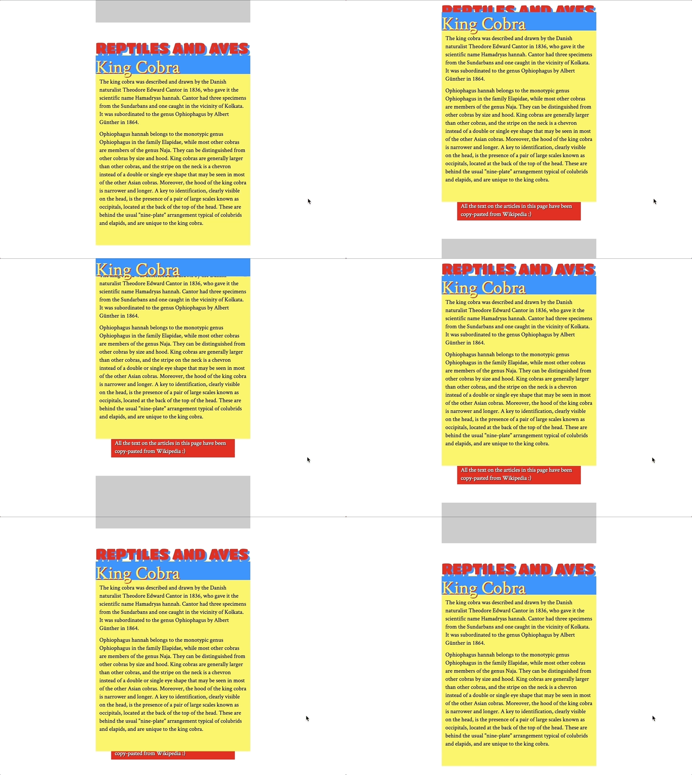
Say we want to create an effect where elements either slide in or out of view on scroll — sort of like parallax. For example, a header that slides out and a footer that slides in:

Well, guess what? We can do that with sticky elements!
See the Pen Slide In and Out Effect using “position:sticky” by Preethi Sam (@rpsthecoder) on CodePen.
How do we do that? Glad you asked. Let’s break it down.
HTML setup
There are three sticky elements in our example:
- The first one is the category header that slides under the body of the article once it reaches the top of the screen.
- The second is the title of the article and it stays visible at the top of the screen, while the body of the content disappears behind it on scroll (which is the typical sticky element behavior).
- The third element is a footer that slides out of the article and is revealed when the article is scrolled above a certain threshold.
Let’s see how it’s done. Here’s the HTML we’re working with… basically two articles:
<article>
  <div class="category">Category Header</div>
  <h1 class="title">Article 1 Title</h1>
  <p>Body content would go here.</p>
  <!-- More content -->
  <div class="footer">
    <p>Article 1 Footer</p>
  </div>
</article>

<article>
  <div class="category">Category Header</div>
  <h1 class="title">Article 2 Title</h1>
  <p>Body content would go here.</p>
  <!-- More content -->
  <div class="footer">
    <p>Article 2 Footer</p>
  </div>
</article>
The sticky CSS
The .category, .title, and .footer elements will get position:sticky; along with a placement property saying where on the screen they’ll start “sticking” when scrolled.
.category,
.title,
.footer {
  position: -webkit-sticky; /* Required for Safari */
  position: sticky;
  height: 50px;
}

.category {
  top: 0;
}

.title {
  top: 0;
}

.footer {
  bottom: 100px;
  z-index: -1;
}
I’m not doing much to the sticky elements, except styling them. They’re already doing what they need to do: stick to the screen. All that’s left is to create a cover and some space for the elements to come in and leave as the page scrolls.
There are probably a bunch of ways we can create a cover on the article that sticky elements can pass and hide under on a page — I went with a background-image.
article {
  background-image: linear-gradient(
    to bottom,
    transparent 50px,
    #F5A623 50px,
    #F5A623 calc(100% - 50px),
    transparent 0
  );
  margin: auto auto 50px auto;
}
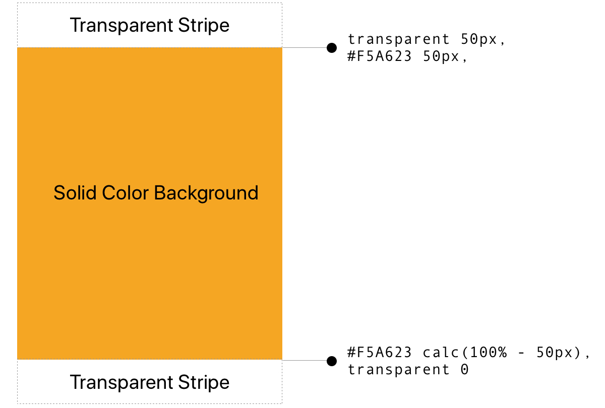
The background linear gradient is applied to the article and runs from top to bottom, starting with 50px of transparency and a color change with a hard stop at 50px. The calc stuff? That’s how I’m telling the color to continue but leave 50px at the bottom. Then we go transparent again. That means we have two 50px transparent stripes, one at the top and one at the bottom with equal heights matching the heights of the category heading and the footer.

The category header and the article footer are the elements that slide in and out of the text, so their heights are the ones that determine how long the transparent stripes will be at the top and bottom of the gradient.
How this all comes together is that both the category header and article title stick to the screen when their tops align with the top of the viewport. The title stacks on top of the category header and, when it starts sticking at the top of the viewport, hides the category header altogether.
As for the footer, it’s already stuck 100px above the bottom of the screen (within the article’s boundary), but you won’t see it since it’s pushed behind the content using z-index:-1. It’ll be visible once we scroll past the beginning of the last transparent stripe of article’s background.
.footer {
  bottom: 100px;
  margin: 50px auto auto auto;
  z-index: -1;
}
Because the category header is just content with nothing to conceal with but the text itself, it’s a good idea to give the last sticky element (the footer) a top margin of 50px (to keep things equal) so that you won’t see it behind the category header while scrolling.
That’s it!
Now, of course, you’ll want to make this your own and change it up, like the dimensions, number of elements, and type of content. The key is to create those covers that allow your sticky elements to hide behind and be revealed as they pass through — again, probably different ways to go about that, but I went with transparent stripes in a gradient.
What, another example? Sure!
Here’s another example with horizontal scrolling (and a horizontal gradient), that might be ideal for applying this concept to mobile devices:
See the Pen Horizontal slide in and out effect using sticky elements by Preethi Sam (@rpsthecoder) on CodePen.
See how the food gets revealed as one article leaves the viewport and then is hidden when the next article passes over it?
Same sort of HTML setup:
<article>
  <div class="title">Article 1 Title</div>
  <p>Article content goes here.</p>
  <img class="image" src="https//codepen.io/path/to/revealed/image.png">
</article>

<article>
  <div class="title">Article 2 Title</div>
  <p>Article content goes here.</p>
  <img class="image" src="https//codepen.io/path/to/revealed/image.png">
</article>
I’m going to my linear gradient solution for creating the covers, this time going from left-to-right to account for a horizontal scroll:
article  {
  background-image: linear-gradient(
    to right,
    transparent 50px,
    #F5A623 50px,
    #F5A623 calc(100% - 50px),
    transparent 0
  );
}

.title,
.image  {
  position: sticky;
  position: -webkit-sticky;
  z-index: -1;
  width: 50px;
}

.title  {
  left: 20px;
  margin-right: 52px;
}

.image  {
  left: 150px;
}
Notice again that we’re going with the same two 50px transparent stripes as before — the only difference being that we’re applying it to the width instead of the height.
Both of the sticky elements (the title and image) will slide under and through the article. So, in order to avoid overlapping them during scroll, the title gets a right margin that’s equal to the image’s width, which is 50px (plus an additional 2px for a cleaner line in Chrome).
Here’s what’s going on: as we scroll horizontally, the title sticks 20px from the screen’s left edge and the image sticks 150px from the same. Because they both have z-index: -1;, they’ll disappear under the article (well, the background gradient) — they are hidden as they pass through the solid color of the gradient and are revealed by the transparent stripes.
OK, one more example
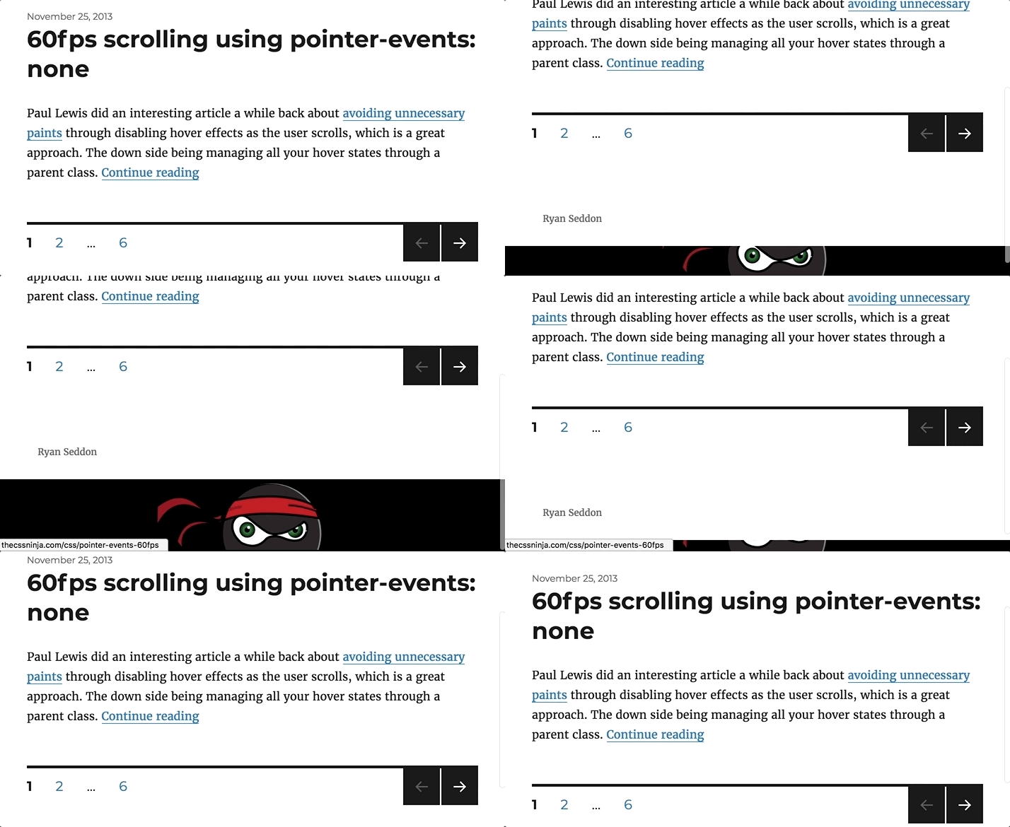
Before wrapping up, let me show you one more example that inspired this post. It’s a site footer that reveals itself on scroll. I first saw this design at Ryan Seddon’s website a long time ago.

This design is usually done by using a “fixed” footer that’s given some space at the end of the page to come out to, using margin. I thought if fixed elements can do that for the whole page, then maybe sticky elements can do something similar for individual elements — and hence what I came up with so far.
Consequently, we can accomplish this same effect using the sticky techniques we’ve covered so far.
First, our HTML:
<main>
  <h1>Site Title</h1>
  <p>Site content</p>
</main>
<footer>
  Site Footer
</footer>
html {
background-color: #fff;
}
body {
background-image: linear-gradient(
to top,
transparent 60px,
#fff 60px,
#fff 0
);
}
footer {
position: -webkit-sticky;
position: sticky;
bottom: 0;
height: 50px;
padding: 5px 0;
z-index: -1;
}See the Pen Page footer slide-out using “position:sticky” by Preethi Sam (@rpsthecoder) on CodePen.
A sticky footer and background gradient on the body does the trick.
The post Creating sliding effects using sticky positioning appeared first on CSS-Tricks.
Source: CSS-tricks.com