Creating is the most intense excitement one can come to know.
—Anni Albers, On Designing
I recently wrote a post — that was shared here on CSS-Tricks — where I looked at ways to use Unicode characters to create interesting (and random) patterns. Since then, I’ve continued to seek new characters to build new patterns. I even borrowed a book about Unicode from a local library.
(That’s a really thick book, by the way.)
It’s all up to your imagination to see the possible patterns a Unicode character can make. Although not all characters are good as patterns, the process is a good exercise for me.
And, aside from Unicode itself, the methods to build the patterns may not be so obvious. It usually takes a lot of inspiration and trial and error to come up with new ones.
More tiling
There are actually many ways to do tiling. Here’s one of my favorite tile patterns, which can be easily achieved using CSS grid:

.grid {
  /* using `dense` to fill gaps automatically. */
  grid-auto-flow: dense;
}

.cell {
  /* using `span` to change cell size */
  grid-column-end: span <num>;
  grid-row-end: span <num>;
}
Grid Invaders by Miriam Suzanne is a good example of this technique.
Now, what I’m trying to do is put some Unicode characters into this grid. And most importantly, update the font-size value according to the span of its cell.

f3c through f9fI only tested with Chrome on Mac. Some of the examples may look awful on other browsers/platforms.
.cell {
  /* ... */
  --n: <random-span>;
  grid-column-end: span var(--n);
  grid-row-end: span var(--n);
}

.cell:after {
  /* ... */
  font-size: calc(var(--n) * 2vmin);
}
It’s a bit like the Tag Cloud effect, but with CSS. Lots of patterns can be made this way.

86 through 89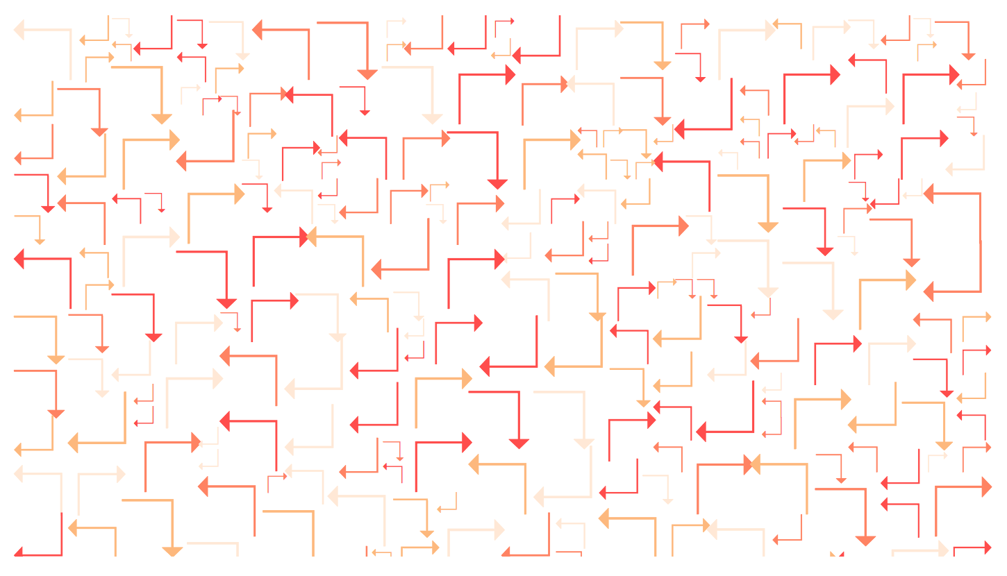
b0, b1, b2 and b4The span of the columns and rows don’t always have to be the same value. We can make small modifications by changing how many rows each cell spans:
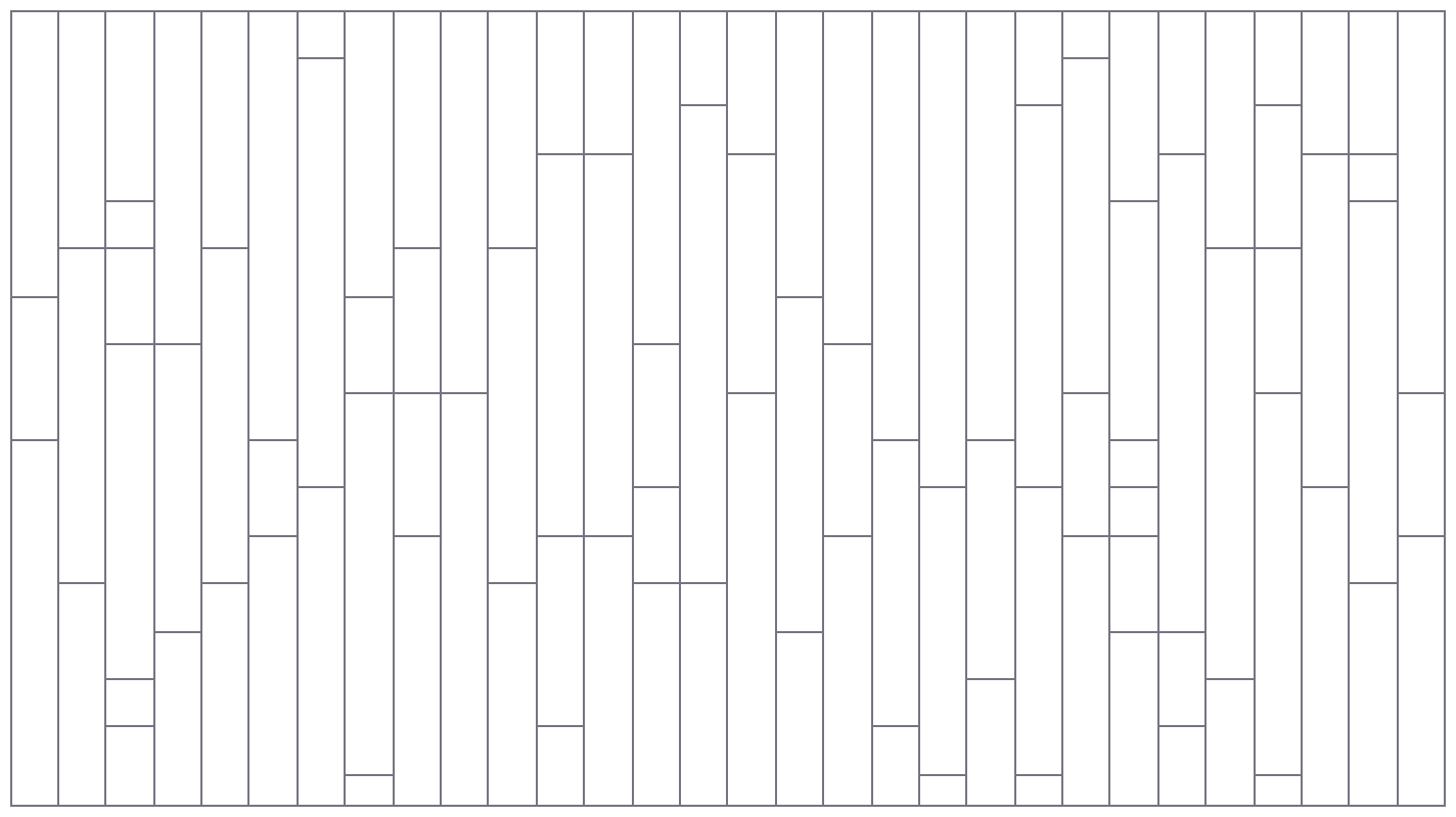
.cell {
  /* only change the row span */
  grid-row-end: span <num>;
}
Since the font-size property scales up/down in both directions (vertically and horizontally), the scaleY() in the transform property will be used instead.
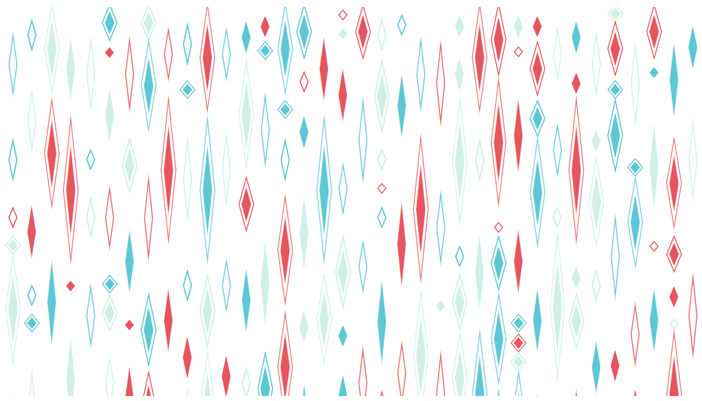
c6 through c8:after {
/* ... */
transform: scaleY(calc(var(--span) * 1.4));
}And here’s another one, made by rotating the inner container of the grid to some degree.

The triangles also can be drawn with clip-path and will be more responsive, but it’s nice to do something in a different way.
More modifications to the layout:

.column-odd {
  transform: skewY(40deg);
}

.column-even {
  transform: skewY(-40deg);
}
Now follow these transformations for each column.

90 through 94Composition
Many Unicode pairs share some kind of shape with different angles. For example, parentheses, brackets, and arrows with different that go in different directions. We can use this concept to combine the shapes and generate repeatable patterns.
This pattern uses less-than and greater-than signs for the base:
(min-width: 1251px) calc( (100vw – 530px) / 2 )
(min-width: 1086px) calc(100vw – 480px)
(min-width: 626px) calc(100vw – 335px)
calc(100vw – 30px)” alt=”Wavy pattern using
< and >” />:nth-child(odd):after {
content: '<';
}
:nth-child(even):after {
content: '>';
}Here we go with parentheses:
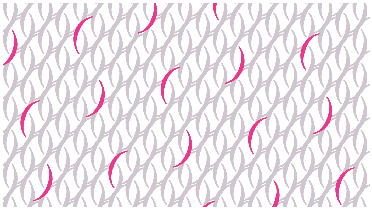
( and ):nth-child(odd):after {
content: '(';
}
:nth-child(even):after {
content: ')';
}These are characters we use everyday. However, they give us a fresh look and feeling when they are arranged in a new way.
There’s another pair of characters, ᚛, and ᚜. Placing them in the grid and scaling to a proper value connect them together into a seamless pattern:
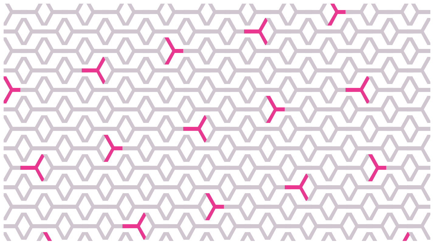
It’s like weaving with characters! We can even take it up a notch by rotating things:
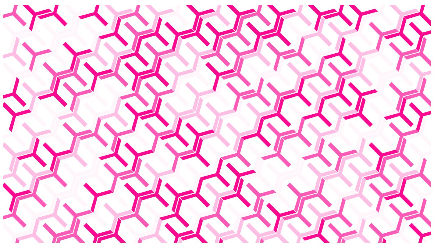
9b and 9cRings
Last week, I joined a CodePen Challenge that challenged the group to make a design out of the sub and sup elements. As I experimented with them, I noticed that the two tags scaled down automatically when nested.

So, I tried to put them around a circle:
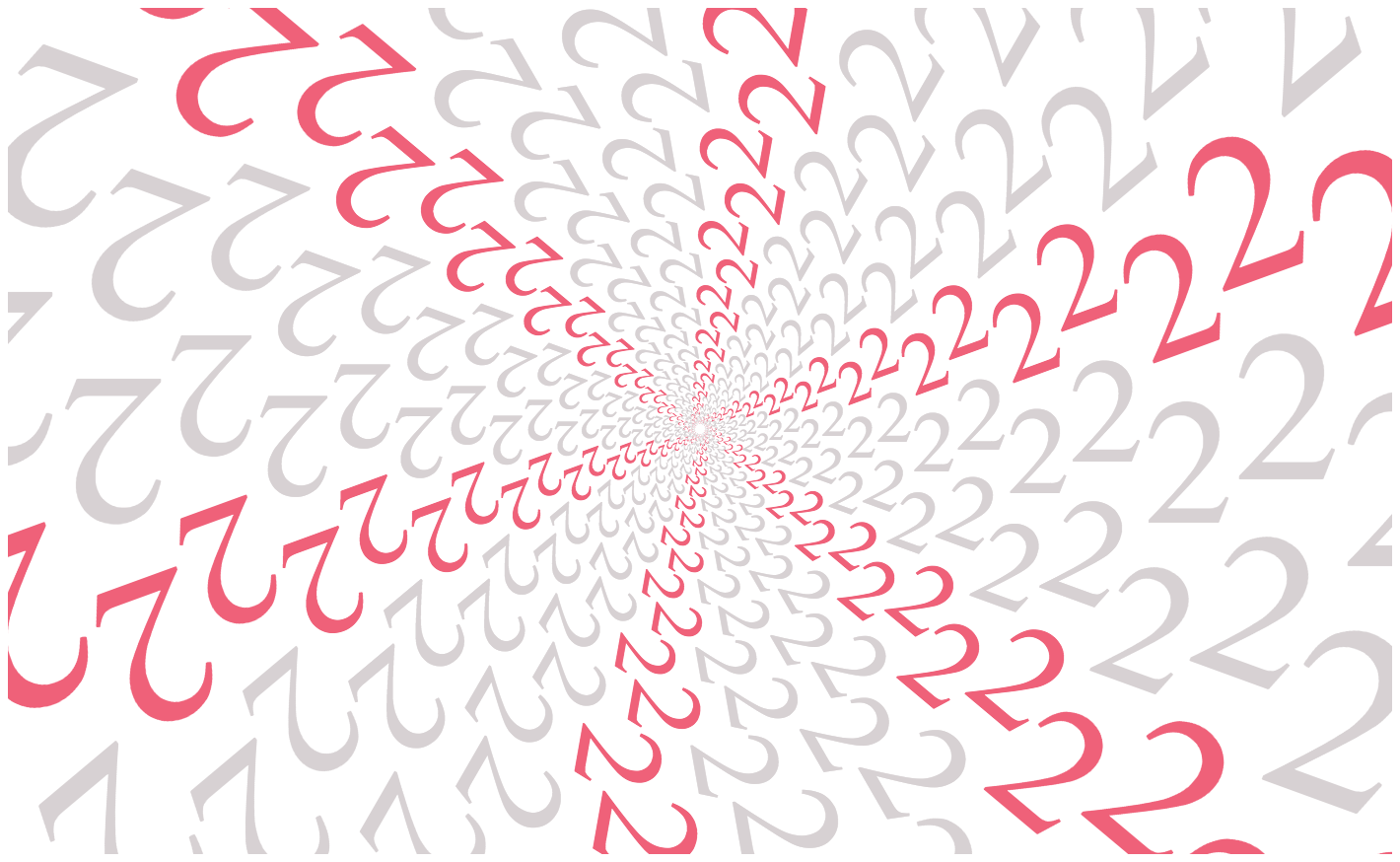
.first-level {
  /* Slice the circle into many segments. */
  transform: rotate(
    calc(360deg / var(--slice) * var(--n))
  );
}
Suddenly, I realized this method can be used to generate background patterns, too. The results are pretty nice.

{$content}3esub:after, sup:after {
content: '{$content}3e';
}The interesting thing is that changing a single character can end up with very different results.
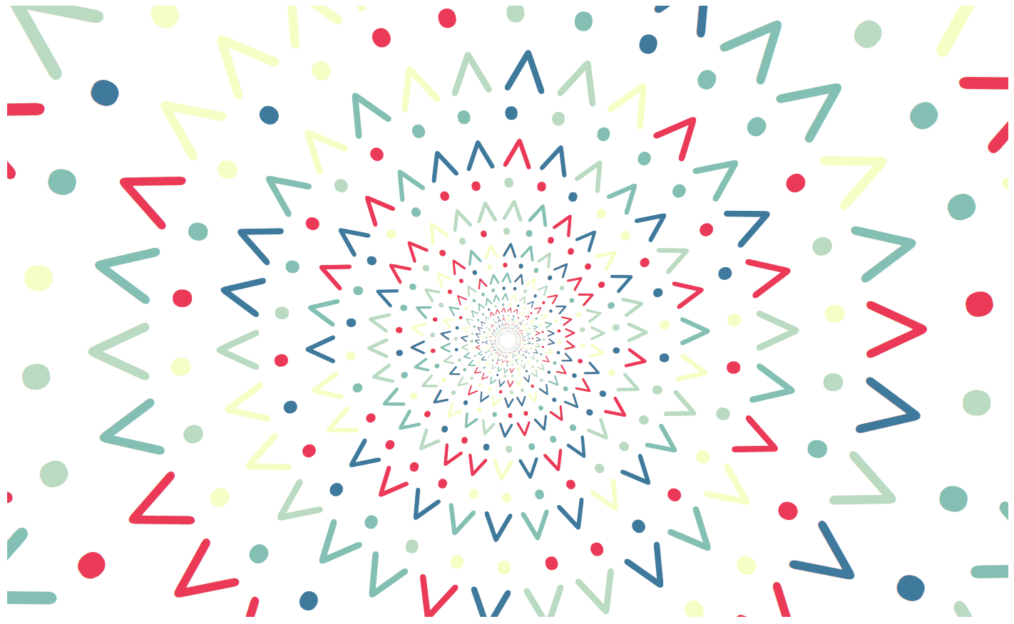
{$content}2e and {$content}3e together to form a pattern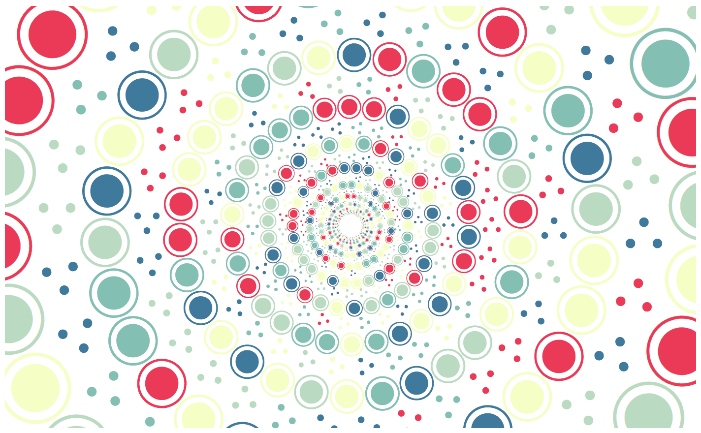
c9 and 34 creates a different effect in the same circular layoutWrapping up
That’s all for now! The color palettes used in this article are from Color Hunt and Coolors.co.
The examples are generated with css-doodle, except for Ring examples in the last section. Everything here can be found in this CodePen collection.
Hope you like them and thanks for reading!
The post More Unicode Patterns appeared first on CSS-Tricks.
Source: CSS-tricks.com