Wednesday, February 5

CSS Tricks

CSS Tricks

Writing Good Support Requests

My take on trying to be helpful to a support staff. One bit is just as relevant for learning development: Writing out a ticket will help you figure out the problem. Sometimes when you have to take a second to collect your thoughts and explain something, the problem will become clear and maybe even the solution. Oftentimes, a bug is a bug and just needs to be fixed — but sometimes your support ticket might actually be something you can sort out for yourself and writing things out might be the first step toward that. You know what they say, the best way to learn something is to teach it. Just replace "ticket" with "forum topic" or whatever, on something like Spectrum. Direct Link to Article — PermalinkThe post Writing Good Support Requests appeared first on CSS-Tricks. Source: CSS-tr...
CSS Tricks

One-Offs

There is this sentiment that you don't design the homepage of a site first. For most sites, it's an anomaly. It's unlike any other page and not something to base the patterns you use for the rest of the site or help inform other pages. You might call it a one-off.1 One-offs are OK! A world without one-offs is very boring. But a site chock-full of one-offs leads to familiar problems: inconsistency and non-reusable CSS that leads to bloating and maintainers that don't really know what's used and what isn't. What are we to do? Brad Frost thought about this recently with his article Where to put one-off components?: It’s quite likely that individual applications contain components that fit the very real needs of a specific application (think calculators, holiday-season parallax hero units, ...
CSS Grid in IE: Debunking Common IE Grid Misconceptions
CSS Tricks

CSS Grid in IE: Debunking Common IE Grid Misconceptions

This is the first in a three-part series all about how to use CSS grid in a way that will work not only in modern browsers but also in Internet Explorer (IE). Imagine writing CSS grid code without having to write a fallback layout! Many of us think that this is some far off future that is many years away. If the only thing holding you back from that reality is IE11 (check caniuse.com), then you’re in luck! That day is today! Or at least it will be when you finish reading this series. ? Article Series: Debunking Common IE Grid Misconceptions (This Post) CSS Grid and the new Autoprefixer (Coming Soon!) Faking an auto-placement grid with gaps (Coming Soon!) To start off, this first part is going to debunk some common misconceptions around IE11’s native gri...
CSS Tricks

Fitting Text to a Container

There are a number of ways to go about putting some text in a container and having it size itself to fill that container. There are different technologies we can use and different considerations to think about. Let us count the ways. Magic Number it with viewport units If you set type with vw (viewport width) units, you can find an exact number where the text pretty closely fits the container and doesn't break as you resize. I'd call this a magic number. In this case, font-size: 25.5vw; works down to a 320px viewport, but still will break much lower than that. See the Pen Fitted Text with Viewport Units by Chris Coyier (@chriscoyier) on CodePen. This is kind of a less exotic version of fluid typography, which involves more of a sprinkling of viewport units and min/max sizes. FitText Da...
CSS Tricks

How to create a logo that responds to its own aspect ratio

One of the cool things about <svg> is that it's literally its own document, so @media queries in CSS inside the SVG are based on its viewport rather than the HTML document that likely contains it. This unique feature has let people play around for years. Tim Kadlec experimented with SVG formats and which ones respect the media queries most reliably. Sara Soueidan experimented with that a bunch more. Jake Archibald embedded a canvas inside and tested cross-browser compatibility that way. Estelle Weyl used that ability to do responsive images before responsive images. Another thing that has really tripped people's triggers is using that local media query stuff to make responsive logos. Most famously Joe Harrison's site, but Tyler Sticka, Jeremy Frank, and Chris Austin all had a go as w...
CSS Tricks

Empower Through Web Development

As a person with a disability, I appreciate the web and modern-day computing for their many affordances. The web is a great place to work and share and connect. You can make a living, build your dream, and speak your mind. It’s not easy, though. Beginners struggling with the box model often take to Google in search of guidance (and end up at this very website). More seasoned developers find themselves hopping from framework to framework trying to keep up. We experience plenty of late nights, console logs, and rage quits. It’s in times like these that I like to remember why I’m doing this thing. And that’s because of the magic of creating. Making websites is empowering because it allows you to shape the world—in ways big and small, public and personal. It’s especially powerful for people w...
CSS Tricks

Free E-book: ​Modernize for Mobile Apps

(This is a sponsored post.)No sign up required to read the free e-book. Building modern apps (mobile, PWAs or Single Page Apps) that connect to legacy or enterprise systems is a pain. We put together an e-book that discusses the various options for how to make it all work. Here are some of the chapter contents: The Challenges of Migrating to a Modern Mobile Architecture Strategies for Migrating to Mobile Strategies for Migrating to the Cloud Data & Mobile Applications Future-Proofing Your Modernization Efforts Check out our Mobile Modernization: Architect Playbook Direct Link to Article — PermalinkThe post Free E-book: ​Modernize for Mobile Apps appeared first on CSS-Tricks. Source: CSS-tricks.com
Vue + TypeScript: A Match Made in Your Code Editor
CSS Tricks

Vue + TypeScript: A Match Made in Your Code Editor

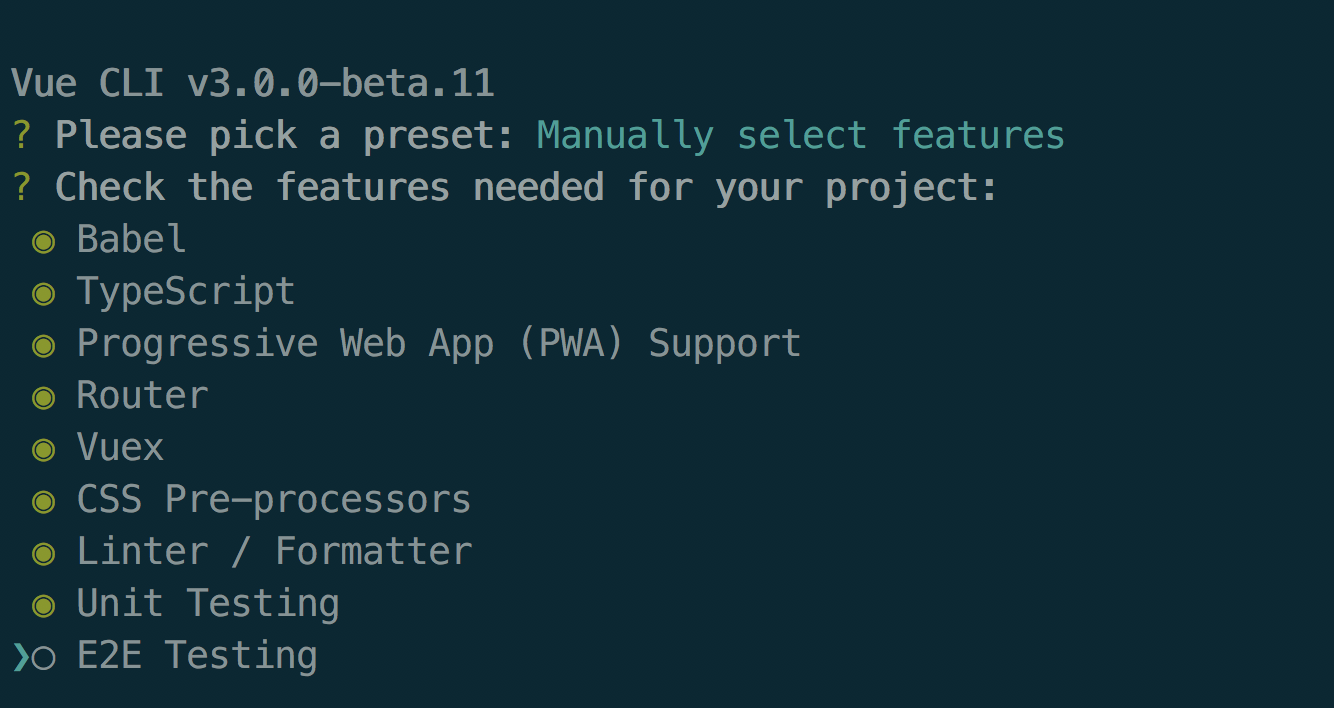
Vue is so hot right now and I’ve been thinking of doing a serious project with it since quite a while, so when the opportunity popped up, I hopped in. But there was a little problem — one of the requirements of the project was to write it in TypeScript. At first, I was super stressed about how I was going to ever get started on this combo, but vue-cli made it so easy. I’d be lying if I said this ride was super smooth. There were frustrations, hours of staring at the screen and some fistbumps with my table but after working with Vue + TypeScript for over a month now, I can say it was worth it — and if I had to code another app with Vue, I wouldn’t do it without TypeScript. Prerequisites This article is about pairing Vue and TypeScript and assumes some basic knowledge of both. If you haven’...
CSS Tricks

Better rendering for variable fonts

I was messing around with a variable font the other day and noticed this weird rendering issue in the latest version of Chrome where certain parts of letterforms were clipping into each other in a really weird way. Thankfully, though, Stephen Nixon has come to the rescue with a temporary hack to fix the issue which using a text-shadow on the text that’s using the variable font: .variable-font { text-shadow: 0 0 0 #000; /* text color goes last here */ } Once you do that, you shouldn’t be able to see those weird clip marks in the letterforms anymore. Yeah, it feels pretty hacky but I’m sure this rendering bug will be fixed relatively soon. It doesn’t look like it affects other browsers, as far as I can tell. Direct Link to Article — PermalinkThe post Better rendering for variable fonts ap...
Handling Errors with Error Boundary
CSS Tricks

Handling Errors with Error Boundary

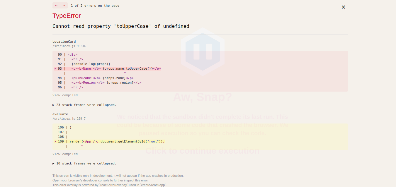
Thinking and building in React involves approaching application design in chunks, or components. Each part of your application that performs an action can and should be treated as a component. In fact, React is component-based and, as Tomas Eglinkas recently wrote, we should leverage that concept and err on the side of splitting any large chunking into smaller components. Splitting inevitably introduces component hierarchies, which are good because they bloated components and architecture. However, things can begin to get complicated when an error occurs in a child component. What happens when the whole application crashes?! Seriously, React, why do the parent and sibling components have to pay for the sins of another component? Why? Error Boundaries React 16 came with a lot of goodies, o...
CSS Tricks

​Add real-time comments to a Gatsby blog

(This is a sponsored post.)This tutorial will show you how to add realtime comments to a Gatsby blog. You will use Node and Express to create a simple backend, allowing users to add and view comments instantly. Direct Link to Article — PermalinkThe post ​Add real-time comments to a Gatsby blog appeared first on CSS-Tricks. Source: CSS-tricks.com
CSS Tricks

Resilient, Declarative, Contextual

Keith J. Grant: I want to look at three key characteristics of CSS that set it apart from conventional programming languages: it’s resilient; it’s declarative; and it’s contextual. Understanding these aspects of the language, I think, is key to becoming proficient in CSS. Like HTML, unknown or slightly broken CSS doesn't stop a site in its tracks. You write something you want to happen in CSS, it happens, and a bunch of related things may happen to. I like Keith's example with font-size. Increase it, and the container will also grow in height without you having to tell it to. You can't understand what CSS is going to do without understanding the DOM structure it is paired with and the other styles at play. And it’s my suspicion that developers who embrace these things, and have fully inter...
Drawing Images with CSS Gradients
CSS Tricks

Drawing Images with CSS Gradients

What I mean by "CSS images" is images that are created using only HTML elements and CSS. They look as if they were SVGs drawn in Adobe Illustrator but they were made right in the browser. Some techniques I’ve seen used are tinkering with border radii, box shadows, and sometimes clip-path. You can find a lot of great examples if you search daily css images" on CodePen. I drew some myself, including this Infinity Gauntlet, but in one element with only backgrounds and minimal use of other properties. Let’s take a look at how you can create CSS images that way yourself. The Method Understanding the shorthand background syntax as well as how CSS gradients work is practically all you need to draw anything in one element. As a review, the arguments are as follows: background: <'background-co...
CSS Tricks

Users DO Change Font Size

Evan Minto: The question was “How many users browse the main Internet Archive site with a default font size other than the common value of 16 pixels?” By knowing this, we would determine how many users would be affected by sizing with relative units like rems/ems. Using the methodology I describe below, we found that the answer is 3.08% of our users. So if you set type in pixels, and your traffic is anything like the Internet Archive's, 3% of your users won't have their explicitly-asked-for font-size alteration accommodated. It's true. I made two little reduced test cases. First I left the default medium font-size preference on and set one with pixels and one with ems and sized them to match. Then bumped up the preference to large, and only the ems changed, the pixel-set one stays the s...