CSS Grid Level 2: Here Comes Subgrid
Rachel Andrew 2018-07-03T13:00:47+02:00
2018-07-10T16:18:00+00:00
We are now over a year on from CSS Grid Layout landing in the majority of our browsers, and the CSS Working Group are already working on Level 2 of the specification. In this article, I’m going to explain what is currently part of the Working and Editor’s Draft of that spec. Note that everything here is subject to change, and none of it currently works in browsers. Take this as a peek into the process, I’m sure I’ll be writing more practical pieces as we start to see implementations take shape.
CSS Specification Levels
The CSS Grid features we can currently use in browsers are those from Level 1 of the CSS Grid specification. The various parts of CSS are broken up into modules; this modularisation happened when CSS moved on from CSS 2.1, which is why you sometimes hear people talking about CSS3. In reality, there is no CSS3. Instead, there were a set of modules which included all of the things that were already part of the CSS2.1 specification. Any CSS that existed in CSS2.1 became part of a Level 3 module, therefore, we have CSS Selectors Level 3, as selectors existed in CSS2.1.
New CSS features which were not part of CSS2.1, such as CSS Grid Layout, start out at Level 1. The CSS Grid Level 1 specification is essentially the first version of Grid. Once a specification Level gets to Candidate Recommendation status, major new features are not added. This means that browsers and other user agents can implement the spec and it can become a W3C Recommendation. If new features are to be designed, they will happen in a new Level of the specification. We are at this point with CSS Grid Layout. The Level 1 specification is at CR, and a Level 2 specification has been created in order for new features to be worked on. I would suggest looking at the Editor’s Draft if you want to follow along with specification discussions, as this will contain all of the latest edits.
What Will Level 2 Of CSS Grid Contain?
Ultimately, the level 2 specification will contain everything that is already in Level 1 plus some new features. If you take a look at the specification at the time of writing, there is a note explaining that all of Level 1 should be copied over once Level 2 reaches CR.
We can then expect to find some new features, and Level 2 of the Grid Specification is all about working out the subgrid feature of CSS Grid. This feature was dropped from the Level 1 specification in order to allow time to properly understand the use cases for subgrid, and give more time to work on it without holding up the rest of Level 1. In the rest of this article, I’ll be taking a look at the subgrid feature as it is currently detailed in the Editor’s Draft. We are at a very early stage with the feature, however, this is the perfect time to follow along, and to actually help shape how the specification is developed. My aim with writing this article is to explain some of the things being discussed, in order that you can understand and bring your input to discussions.
What Is A Subgrid?
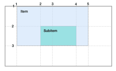
When using CSS Grid Layout, you can already nest grids. In the example below, I have a parent grid with six column tracks and three-row tracks. I have positioned an item on this grid from column line 2 to line 6 and from row line 1 to 3. I have then made that item a grid container and defined column tracks.
.grid {
    display: grid;
    grid-template-columns: 1fr 2fr 1fr 2fr 1fr 2fr;
    grid-template-rows: auto auto auto;
}

.item {
    grid-column: 2 / 6;
    grid-row: 1 / 3;
    display: grid;
    grid-template-columns: 2fr 1fr 2fr 1fr;
}
The tracks of our nested grid have no relationship to tracks on the parent. This means that if we want to be able to line the tracks of our nested grid up with the lines on the outer grid, we have to do the work and use methods of calculating track sizes that ensure all tracks remain equal. In the example above, the tracks will look lined up, until an item with a larger size is added to one cell of the grid (making it use more space).


For columns, it is often possible to get around the above scenario, essentially by restricting the flexibility of grid. You could make your fr unit columns minmax(0,1fr) in order that they ignore item size when doing space distribution, or you could go back to using percentages. However, this removes some of the benefits of using grid and, when it comes to lining up rows in a nested grid these methods will not work.
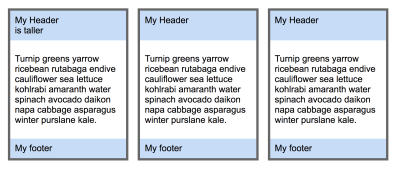
Let’s say we want a card layout in which the individual cards have a header, body, and footer. We also want the header and footer to line up across the cards.
.cards {
    display: grid;
    grid-template-columns: 1fr 1fr 1fr;
    grid-gap: 20px;
}

.card {
    display: grid;
    grid-template-rows: auto 1fr auto;
}
This works as long as the content is the same height in each header and footer. If we have extra content then the illusion is broken and the headers and footers no longer line up across the row.

Creating A Subgrid
We can now take a look at how the subgrid feature is currently specified, and how it might solve the problems I’ve shown above.
Note: At the time of writing, none of the code below works in browsers. The aim here is to explain the syntax and concepts. The final specification is also likely to change from these details. For reference, I have written this article based on the Editor’s Draft available on June 23rd, 2018.
To create a subgrid, we will have a new value for grid-template-rows and grid-template-columns. These properties are normally used with a track listing, which defines the number and size of the row and column tracks. When creating a subgrid, however, you do not want to specify these tracks. Instead, you use the subgrid value to tell grid that this nested grid should use the number of tracks and track sizing that the grid area it covers spans.
In the below code, I have a parent grid with 6-column tracks and 3-row tracks. The nested grid is a grid item on that parent grid and spans from column line 2 to column line 6 and from row line 1 to row line 4. This is just like our initial example, however, we can now take a look at it using subgrid. The nested grid has a value of subgrid for both grid-template-columns and grid-template-rows. This means that the nested grid now has 4- column tracks and 2-row tracks, using the same sizing as the tracks defined on the parent.
.grid {
    display: grid;
    grid-template-columns: 1fr 2fr 1fr 2fr 1fr 2fr;
    grid-template-rows: auto auto auto;
}

.item {
    grid-column: 2 / 6;
    grid-row: 1 / 3;
    display: grid;
    grid-template-columns: subgrid;
    grid-template-rows: subgrid;
}
This would mean that any change to the track sizing on the parent would be followed by the nested grid. A longer word making one of the tracks in the parent grid wider would result in that track in the nested grid also becoming wider, so things would continue to line up. This would also work the other way: the tracks of the parent grid could become wider based on the content in the subgrid.
One-Dimensional Subgrids
You can have a subgrid in one dimension and specify track sizing in another. In this next example, the subgrid is only specified on grid-template-columns. The grid-template-rows property has a track listing specified. The column tracks will therefore remain as the four tracks we saw above, but the row tracks can be defined separately to the tracks of the parent.
.grid {
    display: grid;
    grid-template-columns: 1fr 2fr 1fr 2fr 1fr 2fr;
    grid-template-rows: auto auto auto;
}

.item {
    grid-column: 2 / 6;
    grid-row: 1 / 3;
    display: grid;
    grid-template-columns: subgrid;
    grid-template-rows: 10em 5em 200px 200px;
}
This means that the rows of the subgrid will be nested inside the parent grid, just as when creating a nested grid today. As our nested grid spans two rows of the parent, one or both of these rows will need to expand to contain the content of the subgrid so as not to cause overflows.
You could also have a subgrid in one dimension and the other dimension use implicit tracks. In the below example, I have not specified any row tracks, and gave a value for grid-auto-rows. Rows will be created in the implicit grid at the size I specified and, as with the previous example, the parent will need to have room for these rows or to expand to contain them.
.grid {
    display: grid;
    grid-template-columns: 1fr 2fr 1fr 2fr 1fr 2fr;
    grid-template-rows: auto auto auto;
}

.item {
    grid-column: 2 / 6;
    grid-row: 1 / 3;
    display: grid;
    grid-template-columns: subgrid;
    grid-auto-rows: minmax(200px, auto);
}
Line Numbering And Subgrid
If we take a look at our first example again, the track sizing of our subgrid is dictated by the parent in both dimensions. The line numbers, however, act as normal in the subgrid. The first column line in the inline direction is line 1, and the line at the far end of the inline direction is line -1. You do not refer to the lines of the subgrid with the line number of the parent.
.grid {
    display: grid;
    grid-template-columns: 1fr 2fr 1fr 2fr 1fr 2fr;
    grid-template-rows: auto auto auto;
}

.item {
    grid-column: 2 / 6;
    grid-row: 1 / 3;
    display: grid;
    grid-template-columns: subgrid;
    grid-template-rows: subgrid;
}

.subitem {
    grid-column: 2 / 4;
    grid-row: 2;
}
Gaps And Subgrids
The subgrid will inherit any column or row gap set on the parent grid, however, this can be overruled by column and row gaps specified on the subgrid. If, for example the parent grid had a column-gap set to 20px, but the subgrid then had column-gap set to 0, the grid cells of the subgrid would gain 10px on each side in order to reduce the gap to 0, with the grid line essentially running down the middle of the gap.
We can now see how subgrid would help us to solve the second use case from the beginning of this article, that of having cards with headers and footers that line up across the cards.
.grid {
    display: grid;
    grid-template-columns: 1fr 1fr 1fr;
    grid-auto-rows: auto 1fr auto;
    grid-gap: 20px;
}

.card {
    grid-row: auto / span 3; /* use three rows of the parent grid */
    display: grid;
    grid-template-rows: subgrid;
    grid-gap: 0; /* set the gap to 0 on the subgrid so our cards don’t have gaps */
}
Line Names And Subgrid
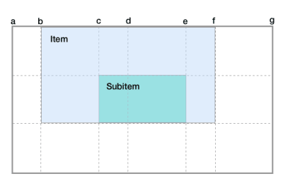
Any line names on your parent grid will be passed down to the subgrid. Therefore, if we named the lines on our parent grid, we could position the item according to those line names.
.grid {
    display: grid;
    grid-template-columns: [a] 1fr [b] 2fr [c] 1fr [d] 2fr [e] 1fr [f] 2fr [g];
    grid-template-rows: auto auto auto;
}

.item {
    grid-column: 2 / 6;
    grid-row: 1 / 3;
    display: grid;
    grid-template-columns: subgrid;
    grid-template-rows: 10em 5em 200px 200px;
}

.subitem {
    grid-column: c / e;
}
You can also add line names to your subgrid, grid lines can have multiple line names so these names would be added to the lines. To specify line names, add a listing of these names after the subgrid value of grid-template-columns and grid-template-rows. If we take our above example and also add names to the subgrid lines we will end up with two line names for any line in the subgrid.
.grid {
    display: grid;
    grid-template-columns: [a] 1fr [b] 2fr [c] 1fr [d] 2fr [e] 1fr [f] 2fr [g];
    grid-template-rows: auto auto auto;
}

.item {
    grid-column: 2 / 6;
    grid-row: 1 / 3;
    display: grid;
    grid-template-columns: subgrid [sub-a] [sub-b] [sub-c] [sub-d] [sub-e];
    grid-template-rows: 10em 5em 200px 200px;
}

.subitem {
    grid-column: c / e;
}
Implicit Tracks And Subgrid
Once you have decided that a dimension of your grid is a subgrid, this removes the ability to have any additional implicit tracks in that dimension. If you add more items that can fit, the additional items will be placed in the last available track of the subgrid in the same way that items are dealt with in overly large grids. A Grid Area created in the subgrid that spans more tracks than are available, will have its last line set to the last line of the subgrid.
As explained above, however, you can have one dimension of your subgrid behave in exactly the same way as a normal nested grid, including implicit tracks.
Getting Involved With The Process
The work of the CSS Working Group happens in public, on GitHub just like any other open-source project. This makes it somewhat easier to follow along with the work that it was the everything happened in a mailing list. You can take a look at the issues raised against Level 2 of the CSS Grid specification by searching for issues tagged as css-grid-2 in the CSS Working Group GitHub repository. If you can contribute thoughts or a use case to any of those issues, it would be welcomed.
There are other features that people have requested for CSS Grid Layout, and the fact that they haven’t been included in Level 2 does not mean they are not being considered. You can see the levels as a feature release might be in a product, just because some feature isn’t part of the current sprint, doesn’t mean it will never happen. Work on new web platform features tends to take a little longer than the average product release, but it is a similar process.
How Long Does This All Take?
Specification development and browser implementation is a somewhat circular, iterative process. It is not the case that the specification needs to be “finished” before we will see some browser implementations. The initial implementations are likely to be behind feature flags — just as the original grid specification was. Keep an eye out for these appearing, as once there is code to play with it makes thinking about these features far easier!
I hope this tour of what might be coming soon has been interesting. I’m excited that the subgrid feature is underway, as I have always believed it vital for a full grid layout system for the web, watch this space for more news on how the feature is progressing and of emerging browser implementations.
 (il)
(il)
Source: Smashingmagazine.com