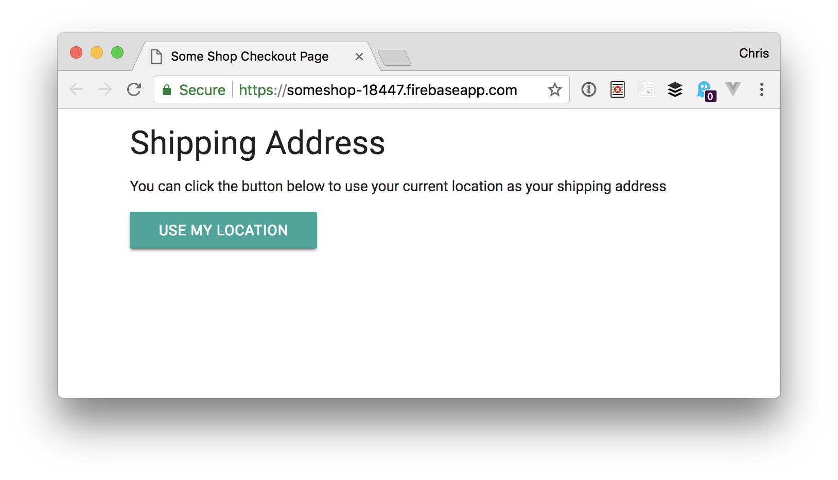
Let’s make a form that puts current location to use in a map!
I love shopping online. I can find what I need and get most things for a decent price. I am Nigerian currently working and studying in India, and two things I dread when shopping online are:
Filling out a credit card form
Filling out shipping and billing address forms
Maybe I’m just lazy, but these things are not without challenges! For the first one, thanks to payment processing services like PayPal and e-wallets, I neither have to type in my 12-digit credit card number for every new e-commerce site I visit, nor have to save my credit card details with them.
For the second, the only time-saving option given by most shopping websites is to save your shipping address, but you still have to fill the form (arrghh!). This is where the challenge is. I've had most of my orders returned because ...