Thursday, November 21

Tag: css

CSS Tricks

One Invalid Pseudo Selector Equals an Entire Ignored Selector

Perhaps you know this one: if any part of a selector is invalid, it invalidates the whole selector. For example: div, span::butt { background: red; } Even though div is a perfectly valid selector, span:butt is not, thus the entire selector is invalidated — neither divs nor span::butt elements on the page will have a red background.   Normally that's not a terribly huge problem. It may even be even useful, depending on the situation. But there are plenty of situations where it has kind of been a pain in the, uh, <code>:butt. Here's a classic: ::selection { background: lightblue; } For a long time, Firefox didn't understand that selector, and required a vendor prefix (::-moz-selection) to get the same effect. (This is no longer the case in Firefox 62+, but you...
CSS Only Floated Labels with :placeholder-shown pseudo class
CSS Tricks

CSS Only Floated Labels with :placeholder-shown pseudo class

The floated label technique has been around for a good long while and the general idea is this: we have an text input with the placeholder attribute acting as a label. When a user types into that input, the label moves from inside the input to outside of it. Like so: Although I don’t see this pattern used on the web all that much, I do think it’s an interesting one! There are different approaches to it, but Nick Salloum describes a new one using a combination of :not and :placeholder-shown: This UI technique does indeed slightly bend the definitions of label and placeholder listed above, in the sense that we’re giving the placeholder more initial importance in having to explain the input to the user, but it’s a tradeoff for a neat UI component, and one that I’m personally comfortable mak...
CSS Tricks

Moving Backgrounds With Mouse Position

Let's say you wanted to move the background-position on an element as you mouse over it to give the design a little pizzazz. You have an element like this: <div class="module" id="module"></div> And you toss a background on it: .module { background-image: url(big-image.jpg); } You can adjust the background-position in JavaScript like this: const el = document.querySelector("#module"); el.addEventListener("mousemove", (e) => { el.style.backgroundPositionX = -e.offsetX + "px"; el.style.backgroundPositionY = -e.offsetY + "px"; }); See the Pen Move a background with mouse by Chris Coyier (@chriscoyier) on CodePen. Or, you could update CSS custom properties in the JavaScript instead: const el = document.querySelector("#module"); el.addEventListener("mousemove", (e) =>...
CSS Tricks

The industry’s best open API

(This is a sponsored post.)With our robust SDK, super clean dashboard, detailed documentation, and world-class support, HelloSign API is one of the most flexible and powerful APIs on the market. Start building for free today. Direct Link to Article — PermalinkThe post The industry’s best open API appeared first on CSS-Tricks. Source: CSS-tricks.com
CSS Tricks

The Codification of Design

Jonathan Snook on managing the complexity between what designers make and what developers end up building: Everything that a designer draws in a Sketch or Photoshop file needs to be turned into code. Code needs to be developed, delivered to the user, and maintained by the team. That means that complexity in design can lead to complexity in code. That’s not to say that complexity isn’t allowed. However, it is important to consider what the impact of that complexity is—especially as it relates to your codebase. Jonathan continues in that post to argue that designers and developers need to be in a constant feedback loop in order to properly assess whether the complexity of the design is worth the complexity of the engineering solution. I’ve been thinking about this sort of thing for a really ...
CSS Tricks

How Do You Put a Border on Three Sides of an Element?

I saw a little conversation about this the other day and figured it would be fun to look at all the different ways to do it. None of them are particularly tricky, but perhaps you'll favor one over another for clarity of syntax, efficiency, or otherwise. Let's assume we want a border on the bottom, left, and right (but not top) of an element. Explicitly declare each side .three-sides { border-bottom: 2px solid black; border-right: 2px solid black; border-left: 2px solid black; } While that's pretty clear, it's still making use of shorthand. Completely expanded it would be like this: .three-sides { border-bottom-color: black; border-bottom-style: solid; border-bottom-width: 2px; border-left-color: black; border-left-style: solid; border-left-width: 2px; border-...
CSS Tricks

Selectors That Depend on Layout

"Why the heck don't we have ::first-column?" I heard someone ask that the other day and it's a valid question. I'd even take that question further by asking about ::nth-column() or whatever else relates to CSS columns. We have stuff like ::first-letter and ::first-line. Why not others? There are many notable things missing from the "nth" crowd. Seven years ago, I wrote "A Call for ::nth-everything" and it included clear use cases like, perhaps, selecting the first two lines of a paragraph. I don't know all the technical details of it all, but I know there are some fairly decent reasons why we don't have all of these in CSS. Part of it is the difficulty of getting it specced (e.g. words and characters get tricky across written languages) and part of it is the difficulty of implementing the...
CSS Tricks

Apply a Filter to a Background Image

You can apply a filter to an entire element quite easily with the filter property. But what if you want to apply a filter just to the background of an element? It's weirdly tricky. There are CSS properties that specific to backgrounds, like background-blend-mode — but blending and filters are not the same thing. It sorta seems to be the reason we have backdrop-filter, but not quite. That does filtering as the background interacts with what is behind the element. There is no background-filter, unfortunately. What are we to do?   Use a pseudo-element instead of a background If you put the contents of the element in an inside wrapper, you can set that on top of a pseudo-element that is simply pretending to be a background. .module { position: relative; } .module::before ...
CSS Tricks

Preventing a Grid Blowout

Say you have a very simple CSS grid layout with one column fixed at 300px and another taking up the rest of the space at 1fr. .grid { display: grid; grid-template-columns: 1fr 300px; } That's somewhat robust. That 1fr column will take up any remaining space left behind by the fixed 300px column. It's true that the auto value would do the same, but auto isn't quite as robust since it's size is based on the content inside. So, if you had too little content, then your column might not fill the entire space you want it to. But while 1fr is slightly more robust, it won't quite protect you from content that is too big!   Here's the grid behaving just fine with some text content: Now, watch that right column get blown off the page when we drop a gigantic image in that colum...
CSS Tricks

The Shapes of CSS

CSS is capable of making all sorts of shapes. Squares and rectangles are easy, as they are the natural shapes of the web. Add a width and height and you have the exact size rectangle you need. Add border-radius and you can round that shape, and enough of it you can turn those rectangles into circles and ovals. We also get the ::before and ::after psuedo elements in CSS, which give us the potential of two more shapes we can add to the original element. By getting clever with positioning, transforming, and many other tricks, we can make lots of shapes in CSS with only a single HTML element.   Square #square { width: 100px; height: 100px; background: red; } Rectangle #rectangle { width: 200px; height: 100px; background: red; } Circle #circle { wid...
Developing With Automad
CSS Tricks

Developing With Automad

Selecting the right CMS for a blog or website can be difficult. Every web project has its own needs and requirements, meaning one CMS may be a better fit for one site but not so much for a different site. Simple solutions might be lacking some essential features, while more complex systems can create easily overhead for a given task. I want to cover Automad, a CMS that is less-known than, say, a behemoth like WordPress, but still offers some powerful features like it while maintaining the nimbleness of smaller, simpler solutions, like static site generators.   Specifically, Automad fills a gap between larger and smaller offerings in a few key ways: It is file-based, but does not require a database. This ensures quick setup, portability, security, speed, and easy deployme...
Nested Links
CSS Tricks

Nested Links

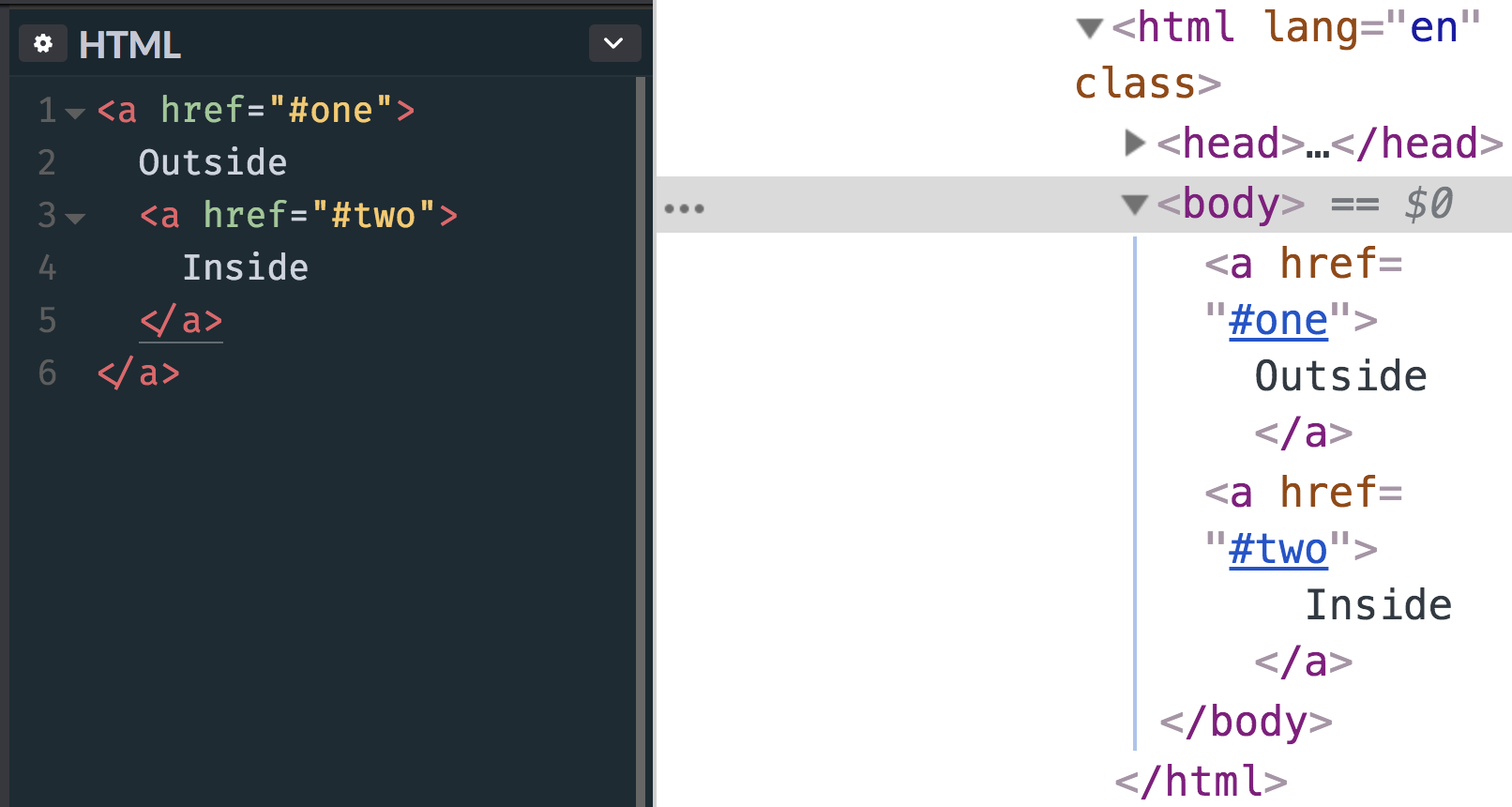
The other day I posted an image, quite literally as a thought exercise, about how you might accomplish "nested" links. That is, a big container that is linked to one URL that contains a smaller container or text link inside of it that goes to another URL. That's harder than it might seem at first glance. The main reason being that... <!-- this is invalid and won't render as expected --> <a href="#one"> Outside <a href="#two"> Inside </a> </a> Eric Meyer once called for more flexible linking, but even that doesn't quite handle a situation where one link is nested inside another. Here's what happens with that HTML, by the way: The nested link gets kicked out.My first inclination would be to simply not nest the links in the markup, but make them appear...
CSS Tricks

Test out the cloud platform developers love for free with a $100 credit

(This is a sponsored post.)DigitalOcean invites you to experience a better, faster and simpler cloud platform designed to scale based on your needs. Get started for free with a $100 credit toward your first project and discover why the most innovative companies are already hosting on DigitalOcean. Direct Link to Article — PermalinkThe post Test out the cloud platform developers love for free with a $100 credit appeared first on CSS-Tricks. Source: CSS-tricks.com
A Minimal JavaScript Setup
CSS Tricks

A Minimal JavaScript Setup

Some people prefer to write JavaScript with React. For others, it’s Vue or jQuery. For others still, it is their own set of tools or a completely blank document. Some setups are minimal, some allow you to get things done quickly, and some are crazy powerful, allowing you to build complex and maintainable applications. Every setup has advantages and disadvantages, but positives usually outweigh negatives when it comes to popular frameworks verified and vetted by an active community. React and Vue are powerful JavaScript frameworks. Of course they are — that’s why both are trending so high in overall usage. But what is it that makes those, and other frameworks, so powerful? Is it the speed? Portability to other platforms like native desktop and mobile? Support of the huge community? The su...
CSS Tricks

The “Developer Experience” Bait-and-Switch

Alex Russell describes his thoughts on the current state of JavaScript and how we might sometimes put a ton of focus on the ease-of-use of development at the expense of user experience. So, for example, we might pick a massive framework to make development easier and faster but then that might have an enormous impact on the user. Alex describes it as substituting “developer value for user value.” The “developer experience” bait-and-switch works by appealing to the listener’s parochial interests as developers or managers, claiming supremacy in one category in order to remove others from the conversation. The swap is executed by implying that by making things better for developers, users will eventually benefit equivalently. The unstated agreement is that developers share all of the same go...