Friday, November 22

Author: phpInfo

ABeamer: a frame-by-frame animation framework
CSS Tricks

ABeamer: a frame-by-frame animation framework

In a recent post, Zach Saucier demonstrated the awesome things that the DOM allows us to do, thanks to the <canvas> element. Taking a snapshot of an element and manipulating it to create an exploding animation is pretty slick and a perfect example of how far complex animations have come in the last few years. ABeamer is a new animation ecosystem that takes advantage of these new concepts. At the core of the ecosystem is the web browser animation library. But, it's not just another animation engine. ABeamer is designed to build frame-by-frame animations in the web browser and use a render server to generate a PNG file sequence, which can ultimately be used to create an animated GIF or imported into a video editor. First, a little about what ABeamer can do A key feature is its ability...
CSS Tricks

“Old Guard”

Someone asked Chris Ferdinandi what his biggest challenge is as a web developer: ... the thing I struggle the most with right now is determining when something new is going to change the way our industry works for the better, and when it’s just a fad that will fade away in a year or three. I try to avoid jumping from fad to fad, but I also don’t want to be that old guy who misses out on something that’s an important leap forward for us. He goes on explain a situation where, as a young buck developer, he was very progressive and even turned down a job where they weren't hip to responsive design. But now worries that might happen to him: I’ll never forget that moment, though. Because it was obvious to me that there was an old guard of developers who didn’t get it and couldn’t see the big ...
Onboarding Users Of Your Product: From Trial To Payment
Web Tricks

Onboarding Users Of Your Product: From Trial To Payment

Onboarding Users Of Your Product: From Trial To PaymentOnboarding Users Of Your Product: From Trial To Payment Joe Leech 2018-08-21T14:20:21+02:00 2018-08-21T13:33:03+00:00 (This is a sponsored article.) In part one of this series, we looked at the Attraction phase of the customer lifecycle. This three-part series outlines the three phases of the product lifecycle, the future for UX, and the skills and approach you’ll need to design modern digital products. Part 1: AttractionGoing out there to get users to evaluate your product. Part 2: ActivationSigning up, onboarding users, asking for payment. Part 3: RetentionEncouraging users to come back and keep using an...
Introducing Crello Animation Maker
Web Tricks

Introducing Crello Animation Maker

Crello is an innovative design tool from Depositphotos that’s simple to pick up and use, and outputs high-quality results. In an increasingly saturated design tool market, it could be the best tool you’ve never tried. Now, after the popularity of Crello, Depositphotos are releasing Crello Animation Maker. A brand new set of features that enable anyone to convert design assets into engaging animation for the web, in just a few clicks. Introducing Crello Animation Maker Crello Animation Maker is designed to enable anyone to quickly and easily convert Crello designs into animated assets for use on social media, or in adverts. It’s an incredible tool for marketing teams, who can take existing designs and create new campaigns in minutes, without having to pull the design team away from other ...
Web Tricks

Build a Reusable Component with Angular Elements

Code reuse can be significant in any software project. By reusing code, developers can drastically cut development and maintenance time for software projects. This is the reason that every framework for developing software has a way to encapsulate functionality and reuse it. Whether it's classes in C# and Java or modules in JavaScript, it's a safe bet that you've considered extracting some piece of functionality to reuse it somewhere else. The only place that has never had a good story for reusing code is in HTML. Until now. Projects like Stencil from the Ionic team, SkateJS, and now Angular Elements are making it easier than ever for developers to create components in the frameworks that they love and export them as Web Components so that they can use them in projects that may or may not ...
Web Tricks

Building CLI Applications with NodeJS

As a developer, chances are you spend most of your time in your terminal, typing in commands to help you get around some tasks. Some of these commands come built into your Operating System, while some of them you install through some third party helper such as npm, or brew, or even downloading a binary and adding it to your $PATH. A good example of commonly used applications include npm, eslint, typescript, and project generators, such as Angular CLI, Vue CLI or Create React App. Shebang This is the wikipedia definition: In computing, a shebang is the character sequence consisting of the characters number sign and exclamation mark (#!) at the beginning of a script. Whenever you look at any scripting file, you'll see characters such as the ones below in the beginning of the file. #!/usr/...
What I learned by building my own VS Code extension
CSS Tricks

What I learned by building my own VS Code extension

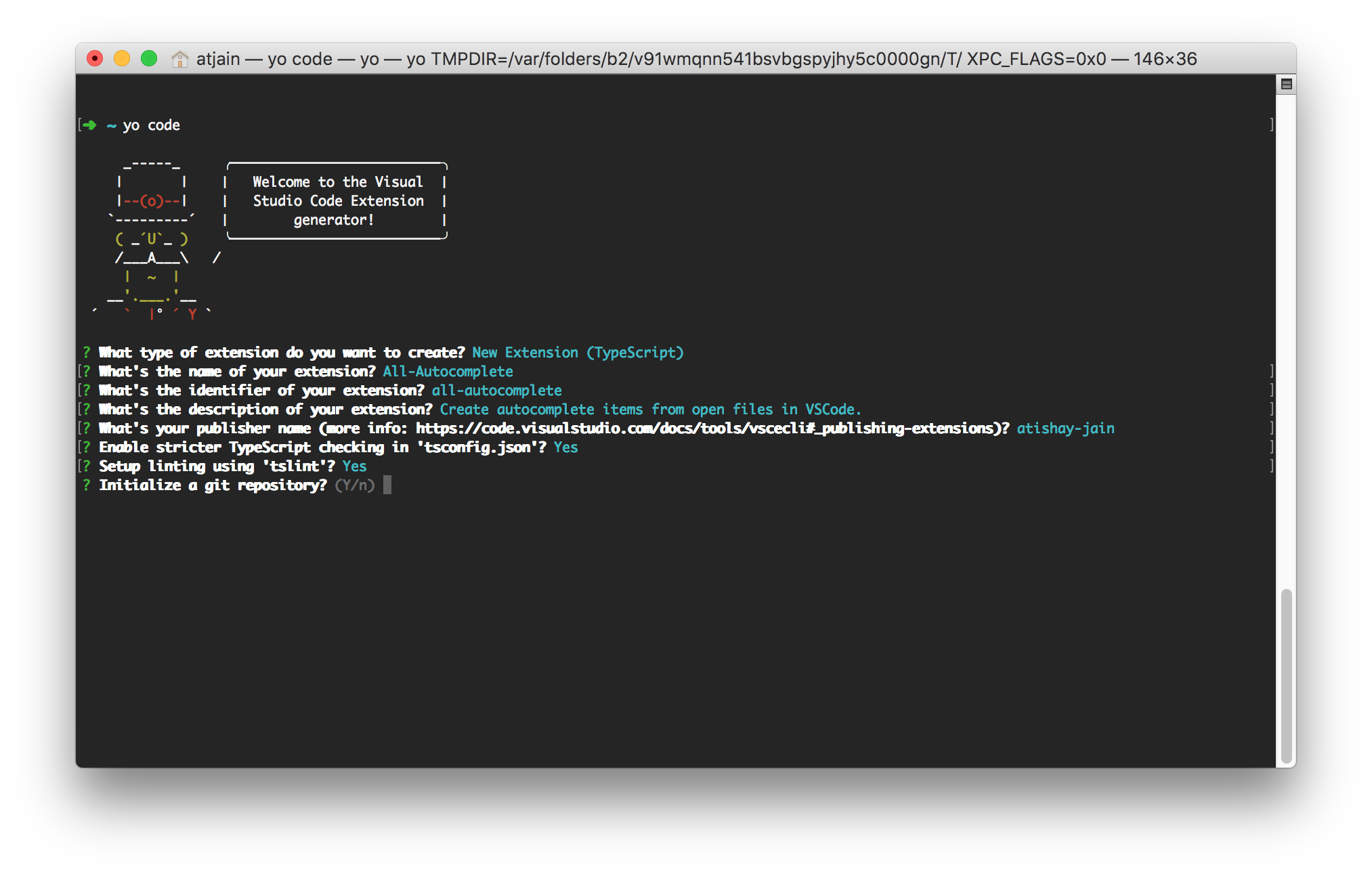
VS Code is slowly closing the gap between a text editor and an integrated development environment (IDE). At the core of this extremely versatile and flexible tool lies a wonderful API that provides an extensible plugin model that is relatively easy for JavaScript developers to build on. With my first extension, VS Code All Autocomplete, reaching 25K downloads, I wanted to share what I learned from the development and maintenance of it with all of you. Trivia! Visual Studio Code does not share any lineage with the Visual Studio IDE. Microsoft used the VS brand for their enterprise audience which has led to a lot of confusion. The application is just Code in the command line and does not work at all like Visual Studio. It takes more inspiration from TextMate and Sublime Text than Visual Stu...
Web Tricks

UX And HTML5: Let’s Help Users Fill In Your Mobile Form (Part 1)

UX And HTML5: Let’s Help Users Fill In Your Mobile Form (Part 1)UX And HTML5: Let’s Help Users Fill In Your Mobile Form (Part 1) Stéphanie Walter 2018-08-20T13:45:31+02:00 2018-08-20T11:56:00+00:00 Forms are one of the most basic primary interactions users will have with your websites (and mobile apps). They link people together and let them communicate. They let them comment on articles and explain to the author how they strongly disagree with what they’ve written. They let people chat directly on a dating app to meet “the one”. Whether for forums, product orders, online communities, account creation or online payment, forms are a big part of users’ online lif...
20 Freshest Web Designs, August 2018
Web Tricks

20 Freshest Web Designs, August 2018

Welcome to our roundup of the best websites launched (or relaunched with significant updates) this August. The Summer’s almost over, vacations are less frequent, and we’re starting to see businesses gearing up for the Fall. This month we’ve included some great e-commerce, some design agencies with a difference, and some products with marketing challenges. There’s a huge trend for bold color, subtle animations, and scrolling effects this month. And not before time, big type is making a comeback. Enjoy! Epicurrence The creative conference for creatives that don’t do conferences, Epicurrence 2018 takes place in Yosemite later this month. The accompanying site uses stunning illustrations and subtle parallax to draw the user into the spirit of the event. Angelo Sanvito Angelo Sanvito is an il...
Popular Design News of the Week: August 13, 2018 – August 19, 2018
Web Tricks

Popular Design News of the Week: August 13, 2018 – August 19, 2018

Every week users submit a lot of interesting stuff on our sister site Webdesigner News, highlighting great content from around the web that can be of interest to web designers.  The best way to keep track of all the great stories and news being posted is simply to check out the Webdesigner News site, however, in case you missed some here’s a quick and useful compilation of the most popular designer news that we curated from the past week. Note that this is only a very small selection of the links that were posted, so don’t miss out and subscribe to our newsletter and follow the site daily for all the news. Scroll Bouncing on your Websites   Site Design: Kommigraphics   How Ikea Quietly Tweaks its Design Around the World   Screenlife App – A UI/UX Case Study   Reviewed: New Logo and Id...
CSS Tricks

Firefox Multi-Account Containers

It's an extension: Each Container stores cookies separately, so you can log into the same site with different accounts and online trackers can’t easily connect the browsing. A great idea for a feature if you ask me. For example, I have two Buffer accounts and my solution is to use different browsers entirely to stay logged into both of them. I know plenty of folks that prefer the browser version of apps like Notion, Front, and Twitter, and it's cool to have a way to log into the same site with multiple accounts if you need to — and without weird trickery. This is browsers competing on UI/UX features rather than web platform features, which is a good thing. Relevant: Opera Neon and Refresh. Direct Link to Article — PermalinkThe post Firefox Multi-Account Containers appeared first on CSS-T...
CSS Tricks

Seriously, though. What is a progressive web app?

Amberley Romo read a ton about PWAs in order to form her own solid understanding. “Progressive web app” (PWA) is both a general term for a new philosophy toward building websites and a specific term with an established set of three explicit, testable, baseline requirements. As a general term, the PWA approach is characterized by striving to satisfy the following set of attributes: Responsive Connectivity independent App-like-interactions Fresh Safe Discoverable Re-engageable Installable Linkable Direct Link to Article — PermalinkThe post Seriously, though. What is a progressive web app? appeared first on CSS-Tricks. Source: CSS-tricks.com
CSS Tricks

Level up your .filter game

.filter is a built-in array iteration method that accepts a predicate which is called against each of its values, and returns a subset of all values that return a truthy value. That is a lot to unpack in one statement! Let's take a look at that statement piece-by-piece. "Built-in" simply means that it is part of the language—you don't need to add any libraries to get access to this functionality. "Iteration methods" accept a function that are run against each item of the array. Both .map and .reduce are other examples of iteration methods. A "predicate" is a function that returns a boolean. A "truthy value" is any value that evaluates to true when coerced to a boolean. Almost all values are truthy, with the exceptions of: undefined, null, false, 0, NaN, or "" (empty string). To see .filte...
Designing For Micro-Moments
Web Tricks

Designing For Micro-Moments

Designing For Micro-MomentsDesigning For Micro-Moments Suzanna Scacca 2018-08-17T13:50:09+02:00 2018-08-17T11:59:10+00:00 A couple of years ago, Google announced a new mobile-first initiative it wanted web designers and marketers to pick up on. This was our introduction to micro-moments. These are not to be confused with micro-interactions, which are miniscule engagements websites have with visitors when they "touch" key points of the interface. A mouse changes its appearance when a user hovers over a clickable element. A display error appears after a field is incorrectly populated. A checkbox briefly enlarges and changes color after it’s been ticked off. Thes...
The Real Problem With Pre-Made Themes
Web Tricks

The Real Problem With Pre-Made Themes

Designers, developers, site owners… lend me your eyeballs for a bit. There’s something rotten in the state of pre-made website themes. Alright, I’ve offended The Bard quite enough. But you get my point, right? Themes have gotten a bad rap for a variety of reasons: they can have bloated code, content must be designed to fit in them rather than designing them to fit the content, et cetera. But they’ve also gotten really good. Many are made to be modular, so you only use and load the code you need. People have gotten a lot better at coding things to load fast, and there’s a theme for nearly every conceivable need. So maybe it’s not as optimized as it could be, if you’re not getting Amazon levels of traffic, regular hosting should be fine, right? And again, there’s a theme for every conceivab...