Monday, October 27

Tag: css

CSS Tricks

itty.bitty

Mark this down as one of the strangest things I’ve seen in a good long while. Nicholas Jitkoff has made a tool called itty.bitty that creates websites with all of the assets being contained within their own link. You can create a website without any HTML or CSS resources at all because it’s all been base64 encoded into the URL itself. Take this crazy looking URL, for example: https://itty.bitty.site/#How_it_works/XQAAAAJdDAAAAAAAAAAeHMqHyTY4PyKmqfkwr6ooCXSIMxPQ7ojYR153HqZD3W+keVdvwyoyd+luwncAksxo8PWJs+831jtAVty8rDpGXmyebtxMTP3PSa4g8/593sWue8WaPjJZKXPqJ+G6ffUrBFhdclCfPRZ1gVobusxdd5g4xI5328XhoOoeADUFQZMeRzfBVzcSlEdUqLcxhD5c7kYCBo79g1FR9+rRyw0U3Jyc+5Axt5HWUqKPcEBfQpO35dwvNhCOOZQ/83PRzl51VrpqJ+zwl7UT1JUUK24g/b9zCUO6EIGg1bcZW0VBL53SSK4LE+UkJNv3WKY04UQnISAISa4WghBZjXT5ID0S61leAohaQ9Kqkv6fGfZKI+...
Little Tip: Draw Your Grid in ASCII in Your CSS Comments for Quick Reference
CSS Tricks

Little Tip: Draw Your Grid in ASCII in Your CSS Comments for Quick Reference

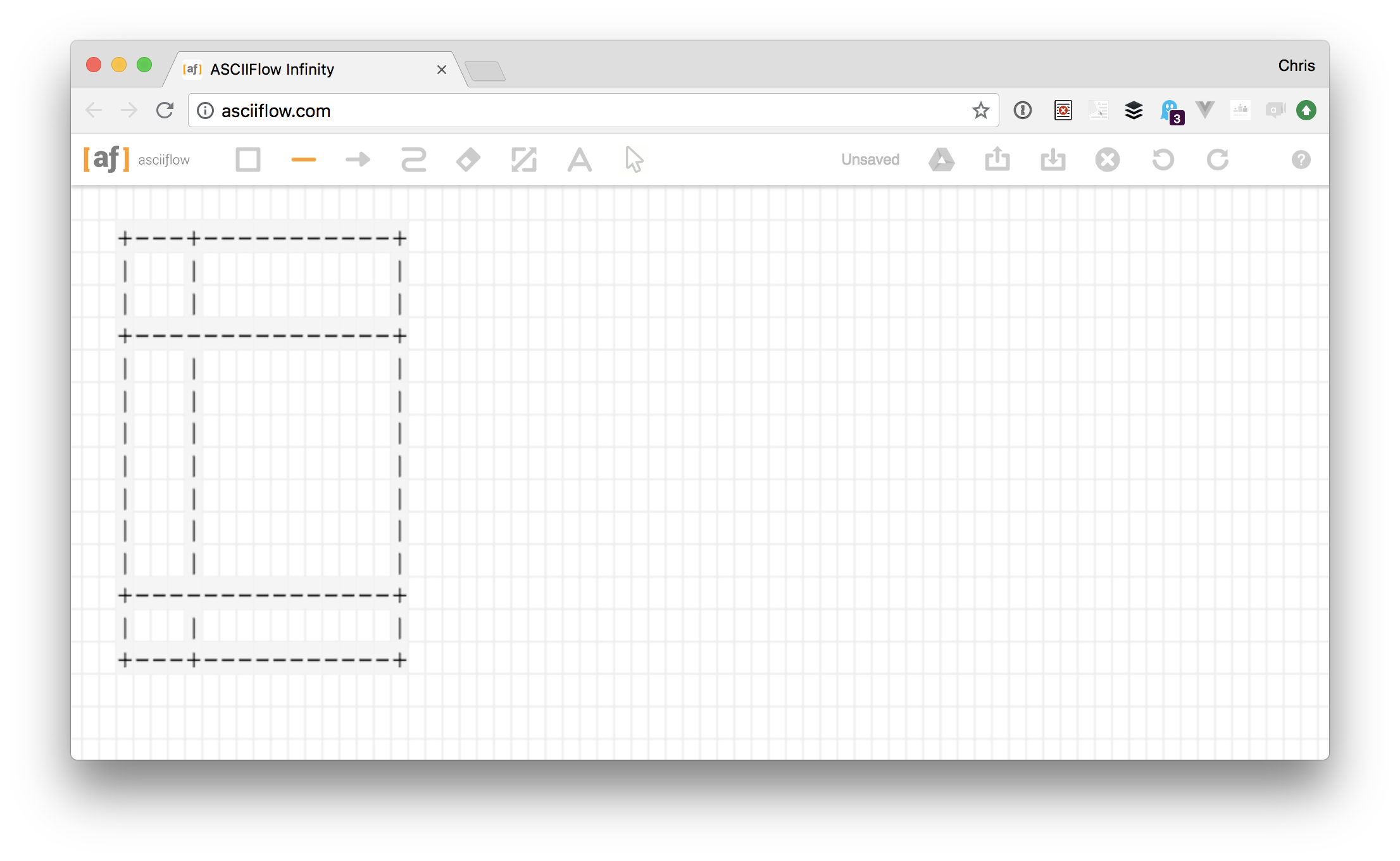
Say you declared a grid like this: body { display: grid; grid-template-columns: min-content 1fr; grid-template-rows: min-content auto min-content; } This depends on content, for sure, but how it's likely to play out is like this: +---+-------------+ | | | | | | +-----------------+ | | | | | | | | | | | | | | | | | | +-----------------+ | | | +---+-------------+ That's really easy to draw out quick in ASCIIFlow Infinity. Now you want to place elements in that grid, and arguably the easiest way to do that is to specify the grid rows/columns they should start/end at. /* grid-area: row-start / column-start / row-end / column end */ .logo { grid-area: 1 / 1 / 2...
The CSS Paint API
CSS Tricks

The CSS Paint API

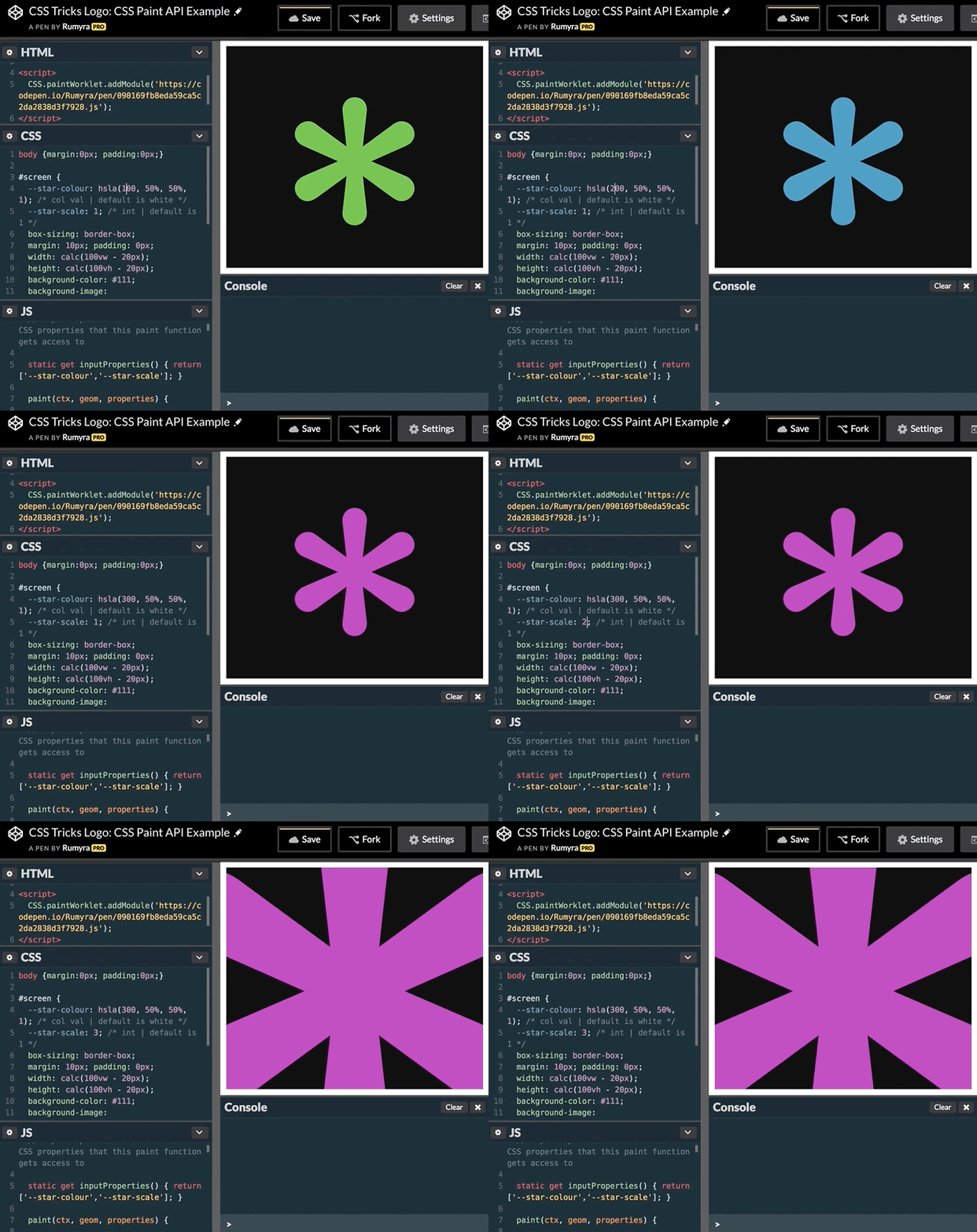
The CSS Paint API is extremely exciting, not only for what it is, but what it represents, which is the beginning of a very exciting time for CSS. Let’s go over what it is, why we have it and how to start using it. What is the CSS Paint API? The API is just one part of a whole suite of new specifications all under the umbrella of what is known as CSS Houdini. Houdini, in essence, gives developers lower level access to CSS itself. No kidding. The CSS Paint API specifically allows you to call a paint() function wherever you would normally write a value where an image is expected. A common example is the background-image property, where you might use the url() function to a link to an image file, like this: area { background-image: url('assets/myimage.jpg'); } The CSS Paint API allows you t...
CSS Grid in IE: Faking an Auto-Placement Grid with Gaps
CSS Tricks

CSS Grid in IE: Faking an Auto-Placement Grid with Gaps

This is the third and final part in a three-part series about using CSS grid safely in Internet Explorer 11 (IE11) without going insane. In Part 1, I covered some of the common misconceptions that people have about IE11’s native CSS grid implementation. In Part 2, I showed the world how easy it actually is to write IE-friendly CSS grid code. Today, I’m going step away from CSS grid for a moment to show you a flexbox technique that replicates basic CSS grid auto-placement functionality. This CSS grid replica will even look like a grid-gap has been applied to it. I need to be super clear though: this is not about how to make actual CSS grid auto-placement work in IE. Article Series: Debunking Common IE Grid Misconceptions CSS Grid and the new Autoprefixer Faki...
CSS Tricks

Prototyping in the Browser

Prototyping animations and interactions is vital for a number of reasons: they can make your interface feel deceptively fast, they can help focus the user on a specific task, and they can provide a better sense of the current state of your application. Is data being loaded? Is something now unclickable? How long do they have to wait until they can perform an action? At Gusto, I’ve been working on a lot of tiny interaction details and prototypes lately for these very reasons — sadly there’s not much that I can show you all in detail just yet. But, I think the process of how I’m doing this is far more interesting than what I’m actually working on so that's what I'm going to share here. The problem I’ve faced with prototyping animations comes down to the tools because they ultimately feel r...
CSS Tricks

​Reinvest Your Time with HelloSign API

HelloSign API makes it simple to embed secure and legally binding eSignatures directly into any website. It's 2x faster to implement than other eSign solutions and is also the only eSign API that allows customers to completely white label the integration, meaning our customers can give their customers a seamless, native signing experience. The three key features of the HelloSign API are the ability to collect signatures, request signatures, and format documents for signing directly on any site. Integrations go smoothly with help from tools like the API Dashboard, an industry-first feature that makes it easy for developers to debug and view critical information about API requests and responses. What are you going to do with all that time you saved by using HelloSign API? Try it free today T...
The Eleventh Fourth
CSS Tricks

The Eleventh Fourth

Holy heck it feels like the last year has flown by! Longtime readers will remember that the fourth of July is CSS-Tricks birthday and we blog it each year. We turned 10 last year, and now we welcome our first palindromic number birthday. Huge thank you First, as ever, thank you for being part of CSS-Tricks. However you end up here, we hope that we're useful to you, know that we're always trying to be even more useful to you, and know that you make the site possible. Can we ask you some questions? The whole point of this survey is to understand you better and use that understanding to make choices that serve you better. That's it! It's super helpful to us and totally anonymous. Take the CSS-Tricks Reader Survey A new design is coming Hate to be a tease, as there is nothing to show you ye...
CSS Tricks

CSS Grid in IE: CSS Grid and the New Autoprefixer

In Part 1 of this series, I debunked a few misconceptions that many people have around the Internet Explorer (IE) implementation of CSS grid. This article builds on that knowledge. It would be best to go back and read that article first if you haven’t already. Today I’m going to be tackling the biggest misconception of all: that utilizing the IE implementation of CSS grid is extremely difficult. You can easily use CSS grid in IE right now without having to give it any sort of crappy fallback layout. It really isn't that hard. Article Series: Debunking Common IE Grid Misconceptions CSS Grid and the new Autoprefixer (This Post) Faking an auto-placement grid with gaps (Coming Soon!) Giving IE a crappy fallback layout is a bit of a tough sell to clients. It...
Clearfix: A Lesson in Web Development Evolution
CSS Tricks

Clearfix: A Lesson in Web Development Evolution

The web community has, for the most part, been a spectacularly open place. As such, a lot of the best development techniques happen right out in the open, on blogs and in forums, evolving as they’re passed around and improved. I thought it might be fun (and fascinating) to actually follow this creative exchange all the way through. To take a look at a popular CSS trick, the clearfix, and find out exactly how a web design technique comes to be. The clearfix, for those unaware, is a CSS hack that solves a persistent bug that occurs when two floated elements are stacked next to each other. When elements are aligned this way, the parent container ends up with a height of 0, and it can easily wreck havoc on a layout. All you might be trying to do is position a sidebar to the left of your main ...
CSS Tricks

Writing Good Support Requests

My take on trying to be helpful to a support staff. One bit is just as relevant for learning development: Writing out a ticket will help you figure out the problem. Sometimes when you have to take a second to collect your thoughts and explain something, the problem will become clear and maybe even the solution. Oftentimes, a bug is a bug and just needs to be fixed — but sometimes your support ticket might actually be something you can sort out for yourself and writing things out might be the first step toward that. You know what they say, the best way to learn something is to teach it. Just replace "ticket" with "forum topic" or whatever, on something like Spectrum. Direct Link to Article — PermalinkThe post Writing Good Support Requests appeared first on CSS-Tricks. Source: CSS-tr...
CSS Tricks

One-Offs

There is this sentiment that you don't design the homepage of a site first. For most sites, it's an anomaly. It's unlike any other page and not something to base the patterns you use for the rest of the site or help inform other pages. You might call it a one-off.1 One-offs are OK! A world without one-offs is very boring. But a site chock-full of one-offs leads to familiar problems: inconsistency and non-reusable CSS that leads to bloating and maintainers that don't really know what's used and what isn't. What are we to do? Brad Frost thought about this recently with his article Where to put one-off components?: It’s quite likely that individual applications contain components that fit the very real needs of a specific application (think calculators, holiday-season parallax hero units, ...
CSS Grid in IE: Debunking Common IE Grid Misconceptions
CSS Tricks

CSS Grid in IE: Debunking Common IE Grid Misconceptions

This is the first in a three-part series all about how to use CSS grid in a way that will work not only in modern browsers but also in Internet Explorer (IE). Imagine writing CSS grid code without having to write a fallback layout! Many of us think that this is some far off future that is many years away. If the only thing holding you back from that reality is IE11 (check caniuse.com), then you’re in luck! That day is today! Or at least it will be when you finish reading this series. ? Article Series: Debunking Common IE Grid Misconceptions (This Post) CSS Grid and the new Autoprefixer (Coming Soon!) Faking an auto-placement grid with gaps (Coming Soon!) To start off, this first part is going to debunk some common misconceptions around IE11’s native gri...
CSS Tricks

Fitting Text to a Container

There are a number of ways to go about putting some text in a container and having it size itself to fill that container. There are different technologies we can use and different considerations to think about. Let us count the ways. Magic Number it with viewport units If you set type with vw (viewport width) units, you can find an exact number where the text pretty closely fits the container and doesn't break as you resize. I'd call this a magic number. In this case, font-size: 25.5vw; works down to a 320px viewport, but still will break much lower than that. See the Pen Fitted Text with Viewport Units by Chris Coyier (@chriscoyier) on CodePen. This is kind of a less exotic version of fluid typography, which involves more of a sprinkling of viewport units and min/max sizes. FitText Da...
CSS Tricks

How to create a logo that responds to its own aspect ratio

One of the cool things about <svg> is that it's literally its own document, so @media queries in CSS inside the SVG are based on its viewport rather than the HTML document that likely contains it. This unique feature has let people play around for years. Tim Kadlec experimented with SVG formats and which ones respect the media queries most reliably. Sara Soueidan experimented with that a bunch more. Jake Archibald embedded a canvas inside and tested cross-browser compatibility that way. Estelle Weyl used that ability to do responsive images before responsive images. Another thing that has really tripped people's triggers is using that local media query stuff to make responsive logos. Most famously Joe Harrison's site, but Tyler Sticka, Jeremy Frank, and Chris Austin all had a go as w...